Software
Houzz Logo Print
patriciacinque

Geometric Living Room

11 years ago
last modified: 11 years ago
Geometric Living Room · More Info

Geometric Living Room · More Info

Geometric Living Room · More Info

Geometric Living Room · More Info

Geometric Living Room · More Info

Geometric Living Room · More Info


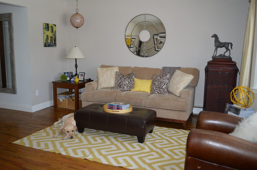
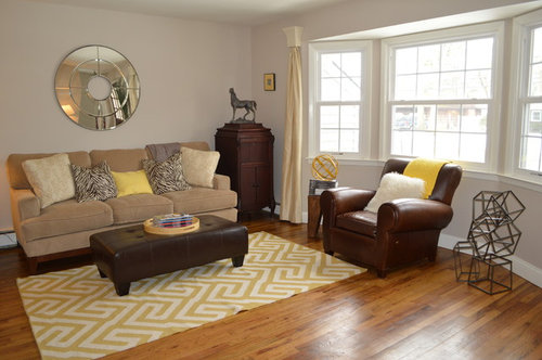
Geometric accents and touches of sunny yellow make this
space come alive. The focal point is the
yellow wool Greek key Dhurrie rug.
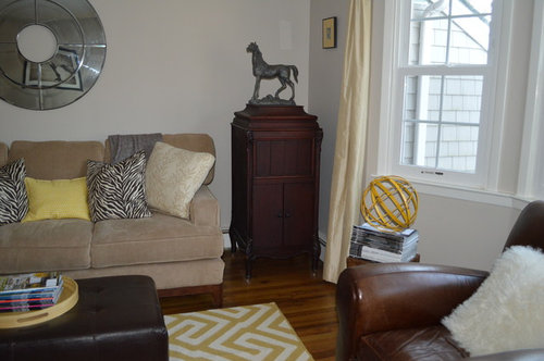
Geometric sculptures and glass orbs also make a statement. Equestrian accents can be found in the horse
picture and sculpture, as well as the brown leather chair. A corduroy couch, velvet & leather side
chairs, silk curtains, and cashmere & sheepskin pillows are all soft to the
touch and add rich texture to the room. The best part of this room is the budget. All furniture and accessories were purchased
for approximately $4,000. To accomplish this, most were obtained at store
outlets, on clearance, or as floor models.
Wallpaper removal, painting & wood floor refinishing were additional
costs.

Architects/Designers: Patricia Cinque & Glen Tilkin

Couch: www.outoftheboxli.com

Parsons
table: www.ethanallen.com

Dhurrie rug: www.westelm.com

Leather
Chair: www.potterybarn.com

Velvet
chair: www.homegoods.com

Leather
Ottoman: www.target.com

Lamps: www.hubbardtonforge.com

Piano &
Victrola: antiques, inherited by the
owner

Accessories: English Country Antiques www.ecantiques.com, Pottery Barn, West
Elm, HomeGoods, Ikea

Comments (30)

  • 11 years ago
    Looks good, the yellow makes it feel very welcoming and friendly :)
    patriciacinque thanked kellyma13
  • PRO
    11 years ago

    What a fun house, even the dog looks like he is having a good time! :)

    patriciacinque thanked Italmond
  • 11 years ago

    I forgot to add that the couch is sustainable! It's made of recycled materials and the foam is made from soybeans!

  • 11 years ago
    I think the piece to the right is ver nice bit too big next to the couch. I love the color that have been used. I think some house plants would add some warmth to the room. I don't care for the mirror over the couch. It would be better to have a painting. It reminds me of a hotel. I would put the mirror on another wall. A pop of red would be a nice addition. Love the dog!!
  • 11 years ago

    Love the metal sculpture on the floor.

    Where is it from?

  • 11 years ago
    Love your room !! but don't get the hanging round pink ball above the lamp ;-)
  • 11 years ago
    I love the style
  • 11 years ago
    Lyn16, thank you for your comments. There actually is a big plant in a corner of the room not shown in the photo. I like the tall piece next to the couch - didn't want everything at the same level - and there is another tall piece on the other side of the bay window, so they balance each other. And I love the round mirror! It really brings the light from the window into the room.
  • 11 years ago
    Juanitac, that's a globe! It's brown. Lol.
  • 11 years ago
    Brazuca, the sculpture is from Pottery Barn, but I don't think they have it anymore. Www.potterybarn.com
    West elm has a smaller version...
    http://www.westelm.com/products/cubed-sculpture-d1230/?cm_src=AutoSchRel
  • 11 years ago

    Your place looks great! It looks like people with personality actually live there, not like it's been decorated by some stranger.

  • 11 years ago

    I don't care for yellow or geometric patterns, but as long as the dog is there, I'd hardly notice. The rest of the room looks great.

  • 11 years ago

    What is the wall paint color?

  • 11 years ago

    Looks good, but a few tweaks and it can really be awesome. I would move the standing lamp to the other side of the couch and try the tall standing piece somewhere else. Looks like you need some additional/balanced light in couch area. The arm chair needs to be closer to the sofa so that you create a conversation area. If you put the standing lamp in the corner the sculpture can sit in front of it and the chair is in the right spot. Maybe even pull the other chair into the conversation area as well, angle it towards the coffee table. Try the vase on top of the tall piece from the corner and put the horse sculpture where the vase was. The scale is all wrong on top of the piano. And sorry, I totally agree that the round mirror is in the wrong spot. I would switch it with the horse painting. You will still get reflective light, but the whole area will be pulled together.


  • 11 years ago

    Wall color is Benjamin Moore - Edgecomb Gray

  • 11 years ago

    It's a really nice looking room! The only thing missing for me personally a green plant or two.


  • 11 years ago

    Most of it is very nice, some is excellent. The piano tableau is lovely, the leather chair looks comfy, and there is nothing better for double use than a big ottoman. I'll never have another coffee table. What I didn't like was the rug, because it's more like a blanket on the floor. Also if you sit in the club chair there's no place for your drink because style was place over function.
    I didn't like the couch, but that's just a difference in taste. I'm uncertain about the window treatment. Loved the colors.


    patriciacinque thanked 954donnah
  • 11 years ago

    I love the whole setup. The round mirror is a great contrast to the couch and think it would look odd next to the piano, besides the larger picture gives more weight to that side of the room to help balance it out. The armchair is centered in the big window, so I would not move that at all, and the smaller chair next to the piano is perfect for someone who wants to be close by for a performance.

    patriciacinque thanked pixie53
  • 11 years ago

    Pops of red? No that would look 80's. The mirror is very pretty btw.

  • 11 years ago

    A few comments: the hanging lamp and the table lamp, either one or the other, accessories should be grouped in an odd number (three or five) on the piano, moving them in from the edge, swap one of the print pillows from the sofa for the chair with the yellow pillow (using both). Angle the chairs a little towards the sofa. I would try the vase of yellow flowers on the floor in front of the tall branches in the corner. The curtains don't work, perhaps try something like what's on the door. BUT over all nice, it looks like people really live there.

  • 11 years ago

    Nice, but did they change that ugly front door?


  • 11 years ago
    Thanks for sharing where you bought things! I'm off to target!
  • 11 years ago

    What do you call those curtain holders and where did you get them? My walls are different but I have the same window and couldn't figure out the curtains! Thanks!

  • 11 years ago

    Love how the mirror offsets the angles in the carpet, and the hanging globe ties into the colour of the couch. Not loving the side window treatments, but a really nice, clean, interesting room-good job!


  • PRO
    11 years ago

    Nicely done. I think a little furniture rearranging might make a difference. I would suggest moving the large antique piece hidden in the corner to the wall with the small painting on it and then move the coffee end table to the other end to fill what will not be an open spot. Push the brown chair a little closer to the couch with its front legs on the rug and move its little end table to the other side so as not to compete with the coffee end table. When budget allows, a large coffee table to service both pieces would be nice. I would move the geometric art piece to the wall near the front door next to the bay window and also angle the white chair towards the piano if there is not space for it to be placed on the corner of the rug, which would create a conversation circle. Love the bright and sunny colors and use of interesting accessories.

  • 11 years ago

    Love your room I probably would have gone with the next size up rug LOVE the YELLOW pops of color looks great awesome job :)


  • 11 years ago
    last modified: 11 years ago
    Geometric Living Room · More Info

    Geometric Living Room · More Info

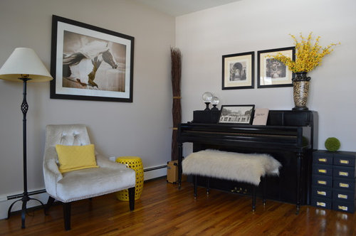
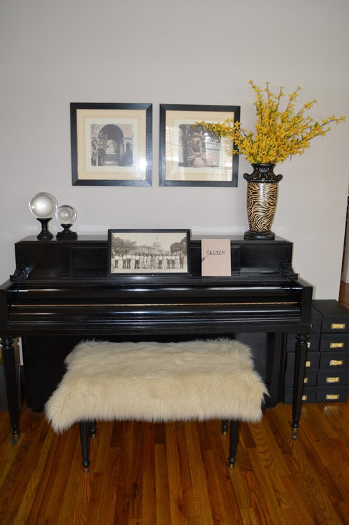
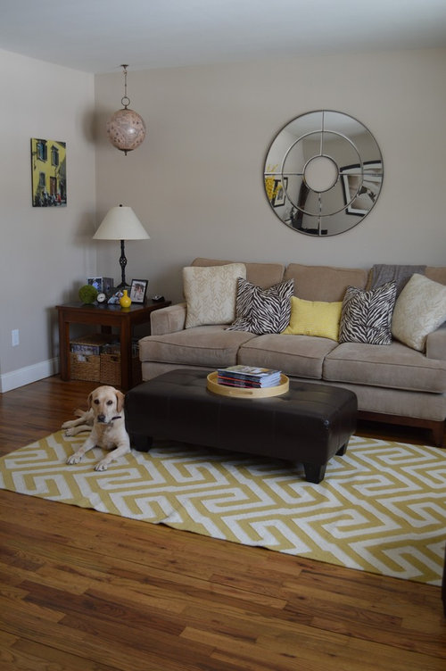
    Based on the comments, it seemed warranted to add another view of the room. This is a formal living room made for conversation, reading, or to listen to the piano player (no TV in this room).

    The tall pieces (yellow flowers & victrola) that some thought were out of place are balanced by another tall piece next to the front door. The tall plant next to the front door creates a little entryway.

    In response to the "ugly" front door comment, the front door will be replaced soon, and the entry rug will be replaced with a bigger one. Also, the wall behind the horse photo may be opened up to the attic stair in the future, once the attic space is finished.

  • 11 years ago
    I love your front door! I'll take it if you replace it :)
    patriciacinque thanked ceemimi
  • 11 years ago
    If the room is for conversation, furniture should relate to each other. Leather chair is lovely centered on the bay but is lonely. Place it off the end of the ottoman, then it is part of the conversation group. Cozier! Place a shallow (glass and metal?) console in the bay with a lamp on the right end to balance the moving of the chair. Pull that lovely grey chair into the group at an angle. Replacing it with a small old wooden chair painted a soft yellow. Sofa and chairs should all have their front legs on the rug, anchors it all. Maybe a throw or tray on the ottoman. Can't go back and look it see what is there. All this may sound like I don't like your room, no, no , love it. Just needs warming. Often notice in mags that decorators forget conversation. Almost too perfect. Do , don't do. You have already won.