Software
Houzz Logo Print
rodzilla2015

Two colors one wall

11 years ago
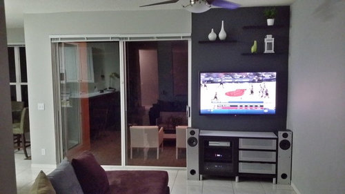
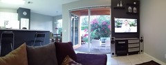
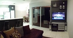
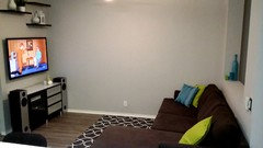
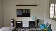
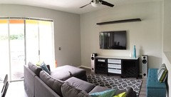
Need advice if this split paint works or if I should go ahead and extend the dark grey to the entire wall.

Comments (46)

  • 11 years ago
    I'm no decorator. (I lurk) However, I say keep painting. Love the dark gray!
  • 11 years ago
    last modified: 11 years ago

    Any thoughts on the floating shelves (ignore the green vase)? Not sure if I want to keep or if I should do something else.

  • 11 years ago

    Any thoughts form anyone else?

  • 11 years ago

    I' m ok with either choice...just need to ensure it looks purposeful; i.e., furniture, accents, curtains, etc all tie in.

  • 11 years ago

    Hmmm.. 1 for 1 against. So I originally split the paint to define the TV wall, but felt funny about a paint line with where there was no architectural detail or transition. . If I paint the entire wall , will it now become unbalanced due to everything stacked right? Do I lose the shelves or add floating cubes opposite over the light switch? Or perhaps a floor lamp opposite? Also do the shelves accessories work (the green thing is no longer there? Do the shelve size/layout/color work?

  • 11 years ago
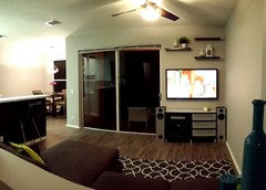
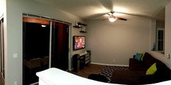
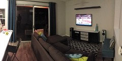
    panoramic view
  • 11 years ago
    We have a situation very similar to yours. Our whole wall is dark gray. I like the shelves, we have those too, and we added very small recessed lights, on dimmers, above our shelves. It provides a very soft light when watching tv, and accents the items on the shelves - in our case it is album covers from the '50's and 60's.
  • 11 years ago
    I'm not fond of the two colors together. Shelves over tv is good use of wall space :) looks like you have the grey in the kitchen too? Maybe define the living room in all grey and the kitchen in the green
  • 11 years ago

    keep going! I like it.

  • 11 years ago

    HI -- Continue with the dark color on that wall . You should never end a color in the middle of a wall . The shelves look fine . Not sure why you chose to push everything into the corner like that ... what are your plans for the other wall ?

  • 11 years ago
    vpryor , the paint color is not green it's a light grey but looks different from the other wall because of the light. The dark color is on the bottom of the breakfast bar (attached another panoramic showing this) , and the closet/pantry pictured. I also have a matching dark grey on the lower kitchen cabs. I'm thinking of removing from closet but feel it would be too much in the entire family room.
  • 11 years ago
    aaand the shot looks the same. my images are being cut off upon upload.
  • 11 years ago
    Lefty, it's a very small space. a wanted to put the TV on the other wall but then it becomes cramped. Switching the orientation of the couch also obscures view out double doors when entering the space.
  • 11 years ago

    HI -- I see the problem of the small space . You could have a large floor mirror or a wall photo mural that has some perspective to it or just a big modern painting . Just so that wall isn't so bare looking .

  • 11 years ago
    I plan on large art work. The idea of adding something with perspective is a great idea. Any other thoughts on how I can accessorize the space without overdoing it
  • 11 years ago

    Get a smaller stereo maybe soundbar or sub and sattelites


  • 11 years ago

    I think that once you bite the bullet and put up a couple pieces of larger scale art on the lite wall and the kitchen wall, your space will be complete. You like the green vase, so keep it. Just bring the color green in with some of that color in your art and maybe one more time in a pillow or another accessory.

  • 11 years ago

    Also, what about a cool floor lamp that arches over the corner of the sectional?they also have small end tables that slide under the edge of the sofa and hover over the cushions, for beverages.

  • 11 years ago
    last modified: 11 years ago

    mjzurita never though of bringing green into the artwork - neat idea. Didn't like the vase because it kind of seemed out of place and I coundlnt find anymore peaces i liked to incorporate. Originally planned on black and white graphic art. Is that too monochromatic? Also where would the lamp land? Wouldnt it busy the space with the ceiling fan?

  • 11 years ago
    last modified: 11 years ago

    Looking at it from the spot where the first picture was taken, I'd say paint the dark gray all across the other side of the sliders, down that narrow strip of wall. It gives a visual "support" to the extended strip of dark gray above the sliders. Plus, it frames the view out the windows. I hope you have something lovely to see out there? If not, then set up something good for a view. Then nobody will be focused on where the paint color stops or starts. Play down the TV, play up the view.

  • 11 years ago

    I am inputting only b/c you asked. smile. I am not liking the black wall for the TV. It is somehow throwing everything else off for me. Just do what YOU like. Keep the vase if you like it.


  • 11 years ago

    ljmeade the dark color behind the TV really lends itself to comfortable viewing the picture just seems to float in space since the borders blend in the wall. I'm a videophile so that sort of thing is important to me, but the paint line bothered me which is why I wish I could have done this to the other wall (I do also have a dedicated theater so probably didn't need to take these extremes in the family room - its a sickness).

    Moccasin - The view out the window really is the focal point. I bit the bullet and painted the rest of the wall dark grey. Couple surprise: That extending the paint really cut the light in the room and made the space feel closed in (much like it did to that one corner. With the light paint the view out the sliders was very natural when you walked in the first thing you would see is the view (which includes and outdoor living space and seamless transition). Now when you walk in the first thing you notice is the wall and then a square cutout that you can see through. safe to say I didn't like it.

    So then I painted the whole wall with the light grey and this room was again clean and bright while I don't like how this color anchors the TV the space is more cohesive.

  • 11 years ago
    I think it would look great if you keep with the dark color all over the wall.
  • 11 years ago

    Hi Leticia. I reverted to the light grey as much as I lark the dark color. See reason above.

  • 11 years ago

    Hang drapes on the balance of the wall from the ceiling to the floor (the same color) and it will look fine.

  • 11 years ago

    Rod, I hear you about the light! So very very important to luxuriate in light if you have it. In viewing the picture, my attention was drawn to the doorway...good to have a feature that draws your guests (or you) into the home. That is always a nice welcoming feature.

    Keep on until you tinker around and get it tuned for what makes you happy.


  • 11 years ago

    Personally I don't like the shelves but I seem to be the only one so if you like them, you should keep them. Eventhough you didn't ask, I would switch out the light/ceiling fan to pot lights. You have a comfy looking place for TV viewing. I like small areas--they're very cozy.

  • 11 years ago

    The whole wall in dark grey would look good with the light coming in.

  • 11 years ago

    I'm on the "for" side. I think the darker color defines the purpose and makes seeing what's on the TV easier for less than perfect eyes. I have no problem with the line between paint colors. You can even see people painting stripes on wall just for some interest on HGTV and DIY networks.
    As for the shelves and drapes - ehh, either way, whatever works for you. Myself, I like something to look at besides the TV which we have off more than on. I'd probably add a radio or CD player on top of the table, if you can find one. They're becoming scarce.


  • 11 years ago

    Extend the paint.

  • 11 years ago
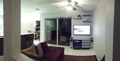
    Here is the wall all light grey, unfortunately I didn't snap a pic all dark grey. Would love to ditch the fan , but here in Florida it's way too functional.
  • 11 years ago
    attachment
  • 11 years ago

    You must extend the dark paint if you like it. The door is incorporated into the whole wall so it can't be ignored and changing paint without an architectural reason leaves the result ungrounded. One paint color will tie it together like in the above photo. Don't know how thick the shelves are but larger objects would be more in scale. Try fatter shorter objects. If you like the green vase keep, never get rid of things you like but find a place you like it. Good luck! You are brave to experiment and it looks great!

  • 11 years ago
    How about rotating the sectional and putting one side against the big wall? I think that would visually open the space, then maybe the dark gray wouldn't close off the view so much. The light gray is really boring behind the TV. I can't believe you didn't get a picture of it all dark gray!!
  • 11 years ago

    Nicole - The couch wont work in that config. And yes I agree it is boring. not sure what to do

  • 11 years ago
    Why won't it work? Also, is the sectional new? I read the whole thread, but it's been at least a week, and I can't remember...it's really too big for the space. Can you get something different? Like a smaller couch to fit on the wall facing the TV and a couple smaller swivel chairs that could face the conversation area or the TV?
  • 11 years ago
    last modified: 11 years ago

    I actually moved my couch down from the media room but its still eating some space Its comfy though. If I keep it im thinking of a Barcelona style chair to accompany it. Ill post a pic when I get home.

  • 11 years ago
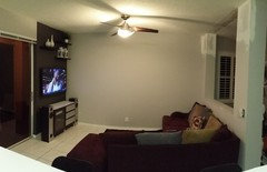
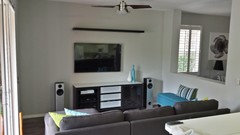
    Here are pics with different couch
  • 11 years ago
    Second couch is better scale for the room. Like the room all light grey.
  • 11 years ago
    So I did this this weekend. Thoughts; suggestions?
  • 11 years ago

    I like the use of the larger wall -- the room feels more natural to me and the TV zone less crowded. Not sure about off-centering TV from console, though -- it looks more accidental than stylish. Also, think I'd prefer the original mix of shelf heights to the current... unibrow. :) Like rug and bits of color too -- all coming together style-wise. Couch is great too.

    (p.s.) I know it's been some time, but dark half-wall looked like an entertainment center to me. This looks more open and modern.

  • 11 years ago
    acm: unibrow.. haha :) . My plan for off centering the tv was to add short floating shelves to the right that end at the length of the top shelf. what do you think?
  • 11 years ago
    Oh! I like it so much better this way! Add more turquoise accents, including a vertical tall piece of artwork to the right of the sliding glass door. I would suggest floor-to-ceiling dark gray drapery panels on the sliding glass door.
  • 11 years ago
    Nicole I actually hung some turquoise drapes earlier. still trying to find a piece of art I love.