Software
Houzz Logo Print
lindamarie1

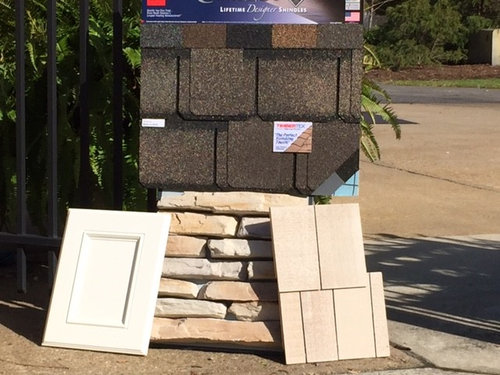
Do the stone's undertones clash with the shingles?

11 years ago

Comments (23)

  • 11 years ago
    not to my eye
    lindamarie1 thanked acm
  • 11 years ago
    Nope. Looks good!
    lindamarie1 thanked Brian
  • 11 years ago

    I think it looks good.

    lindamarie1 thanked carolynrodgers
  • 11 years ago

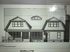
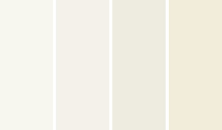
    The shingles are for the 5500 sq ft of exterior walls. The white cabinet panel is White Dove, the color being considered for all the exterior trim and lastly, the roof is GAF/ELK Camelot in "Weathered Wood". Although the roof is attractive, there is a lot of it and I am concerned it's pattern will be in conflict with the shingle pattern.
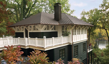
    Here is the home:


  • 11 years ago

    I would choose the second from right.

  • 11 years ago

    Second from the right?


  • 11 years ago
    no doesn't clash to my eye.
    lindamarie1 thanked Devon Harland
  • 11 years ago

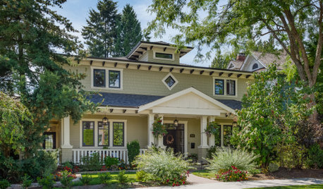
    yes the lighter color, like fresh cedar shingles. look at my house with that color:


    my own · More Info


    lindamarie1 thanked sacapuntaslapioz
  • 11 years ago

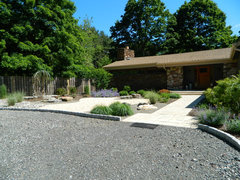
    I don't think they clash but I think there might not be enough contrast between the stone and the shingles. Maybe a darker shade on the shingles, unless you are looking for a monocromatic look.

    lindamarie1 thanked maureen214
  • 11 years ago

    Roof color is good - don't go lighter on that.

    lindamarie1 thanked maureen214
  • 11 years ago

    I'm seeing pink undertones in the shingles now that they sitting next to the yellow/gold stone. Maybe it is just me.......

  • PRO
    11 years ago

    Weathered Wood is usually one of my favorites..but not always the perfect choice. In this case, the contrast between dark roof and the rest is too great. Second, I would not put the shake shingles on the entire body of the house. In looking at the drawing, I have to say it is just "too much shingles". And second the shake shingles are too light in color, I would choose a shade closer to the darkest shade in the stones. I do like the stone for the base. I would only put the shake shingles on the large dormers (in the new darker shade). If you do not like regular siding for the base of the house..would you consider the stone on the wall space and the fiberglass shake on the lower base. The shutters...as the roof will be the darkest shade, I would use a similar color on the shutters. In that case the dove white trim will work, but not now..it will just look washed out. While we are at it, I would beef up the pillars on the porch. I would like to see them twice as wide as in the drawing and with some detail at the top and bottom.

    lindamarie1 thanked Barbara Griffith Designs
  • 11 years ago

    Clients want a shingle house so other material is out, they also selected the color out of all the others. She relies on my judgment and would change her mind if I recommended it but, yikes so much responsibility. We are her builders not decorators and I've tried to help as much as possible. Bigger columns is changeable.


  • PRO
    11 years ago
    I think the color on shingles need to be a shade darker. It's a really big home, I don't want to seem washed out. The darker shade defines the house's shingles style. Also I like dog ear roof shingles on smaller roofs. Architecture shingles are beautiful, I would go without the dog ear cut. You want the roof shingle not to dominate the house, it's such a big part.
  • PRO
    11 years ago

    I understand your dilemma. But most clients do not have the ability to visualize the impact of their choices. Look at wall shingles in colors such as "Toffee" or "Oatmeal", "Putty" or "Sahara" The base color needs to be darker. That would also make the "dove white" shutters look better. It's about contrast..but not the dramatic one you have now with the roof & siding. Then you or have someone else, do a "mock-up" of the colors on the drawing. They need to see the overall picture so to speak.

    lindamarie1 thanked Barbara Griffith Designs
  • 11 years ago

    The White Dove is for the trim, there isn't any shutters spec'd for the home, they don't want them. I'll look at a shade or two darker for the shingles tomorrow and also a regular architectural shingle as opposed to the designer series Camelot offers. Thanks everyone......such a huge financial investment customers make, we all want a beautiful result. I'm thinking about a stone with more gray/brown in it too, less yellow.

  • PRO
    11 years ago

    Sounds like you are on to it.

  • 11 years ago

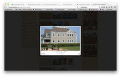
    Here is a picture of the same shingle finish and, it is clearly a weathered wood roof. Doesn't look washed out at all really.


  • PRO
    11 years ago

    I think the weathered wood shade is perfect. In the photo above, however, the siding seems to be just a little darker than the one on your sample group..which was really my point.

  • PRO
    11 years ago

    One way to help clients see how colors work (or don’t) together is ironically to have them close their eyes a little, i.e. squint. It may be more obvious to experienced folks that the shingles, stone and trim will wash into one another, but a way to help clients see it is to ask them to look at materials together (or photos of them each next to each other) and squint. When they do their eyes kind of blur out the details more or less and see the base hue of each material in relation to one another without the specific details you notice when you are standing up close and inspecting small samples of the materials and seeing every little difference. If those differences don’t translate into the squinted view, they will not be noticed in the full-scale completed scheme. When I squinted at the materials pic, I saw the stone, shingles and trim as a creamy/beigey mass topped by a mid-toned neutral brown roof. Ask your clients if that is the look they were going for in their probably not cheap and custom home?? One of the hardest parts of this and related jobs is getting clients to trust in your expertise, so I get where you’re coming from. There is no contrast in color on the exterior walls with the selected finishes, use some of the suggested ideas here to convey that to your clients.

    lindamarie1 thanked adalisa frazzini
  • 11 years ago

    I'm going to suggest the Slateline roof in Weathered Wood, it's muted sitting next to the Camelot so it should be a bit "quieter" on this massive roof. In addition, I've requested a couple darker shingle samples even though she, through a process of elimination chose this one earlier on. So glad I took that picture as it caused me to take pause and see all that is wrong with the combination.


  • 11 years ago

    BTW, I've done, and still do, the squinting thing:) It totally works looking at whites........