Software
Houzz Logo Print
melissa_walker451

living room paint/carpet

13 years ago
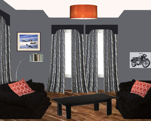
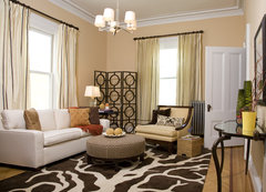
I am working on a new living room design. I need suggestions for other wall paint colors and color/design/texture for an area rug. I don't have children, but have one dog and one cat.

Comments (80)

  • 13 years ago
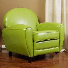
    @Maureen McClintock - I like the colors there! ...and I agree about the curtains.
  • 13 years ago
    last modified: 13 years ago
    ? Out with the bright saturated and into more muted, rich hues. Have no idea if this appeals to you, but wanted to throw it out there. :)
  • 13 years ago
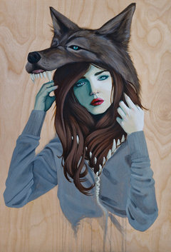
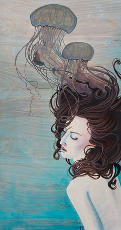
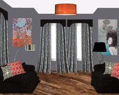
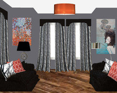
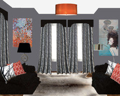
    Ok, I went through all of the artwork, pillows, rugs etc. and came up with what I liked best at this point. I love the jellyfish painting! Though they're not exactly perfect, the black/white pillows did alot to tie in the curtains. The other painting is one I've had on one of my Pinterest boards. I also added a table lamp with black shade. I can easily change the shade color. Thoughts?? I'm still at a loss for the area rug... sigh.
  • 13 years ago

    Ohhhh Yessssssssssssss I ♥ this...
    GORGEOUS!!!!
    That last rug didn't work for you eh? It looked so good on my end.
    Let's go hunt for pillows...
  • 13 years ago
    Definitely more cohesive. Can you switch the lamps? What about a colorblocked rug or maybe texture? Rag rug or faux fur if you're feeling gutsy? :)
  • 13 years ago
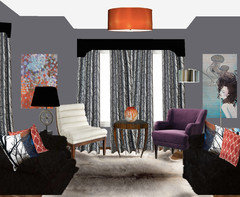
    I switched the lamps. Do you like them better like that?
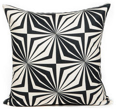
    What do you think about these b/w pillows?
    I'll search for some rugs...
  • 13 years ago
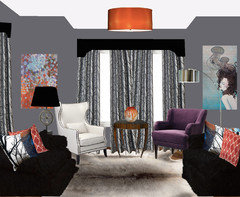
    room
  • 13 years ago
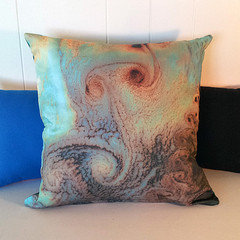
    These are quite different and beautiful---Unique...
  • 13 years ago
    oooh, I LOVE those pillows...
  • 13 years ago
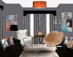
    if it was me i would add green maybe. solid rug. love the standing lamp. how about two lighter gray chairs standing next to eachather. keep the orange blue art and try adding a room devider on the other side just for the looks.
    South Boston Living Room · More Info


    for the green about about real or silf fiddle leaf tree? they are kind of spendy but i think its worth it.
  • 13 years ago
    last modified: 13 years ago
    If you like more BOLD pattern---
    Happy you like those pillows. They are Beautiful! Never seen them before. I'll send you over a link...
  • 13 years ago
    fur rug??
  • 13 years ago
    last modified: 13 years ago
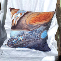
    Hmmm...nope. lol Well maybe. It depends. Now we're kind of losing the more formal look that you had in the beginning. Though it does look comfy! I like the lamps switched for balance. I think the pillows are a bit too whimsical, IF you want a more formal stream-lined look and feel. Again, it's about you and what you're going for. The drapes are quite stately and formal. It all depends on what you want the room to be.I think it can handle the switch in artwork but if you add science inspired pillows and more whimsical touches it will be a completely different room. And obviously you can go in any direction you please because it's important that you love everything in the room. ;)
  • 13 years ago
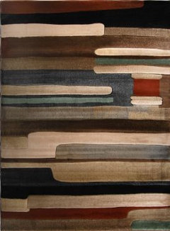
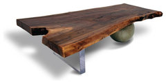
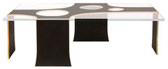
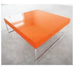
    I do like the rug... Tables?
    [houzz=
    Walnut Coffee Table - Acrylic & Metal Base · More Info
    ][houzz=
    Philip Nimmo Ironworks · More Info
    ]
  • 13 years ago
    Thanks so much for those links!
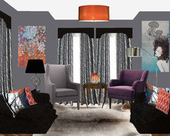
    Here's a bit more... tables didn't mesh so well. I'll have to look more.
    Anyone have thoughts about the chairs I added? Are they too much?
    I like cozy, not too formal. It is a living room that will be used to hang out/watch tv.
  • 13 years ago
    Amazing what different perspectives can do to transform a space! I really love where it's going everyone!!! Thank you! :D
  • 13 years ago
    If you're going for cozy and eclectic, I do like the rug then. :D What you want it to feel like when you walk in or hang out in it makes all of the difference.
  • 13 years ago
    last modified: 13 years ago
    It's coming along---I LOVE it too...
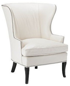
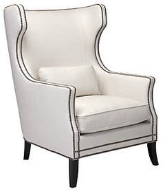
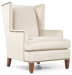
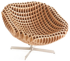
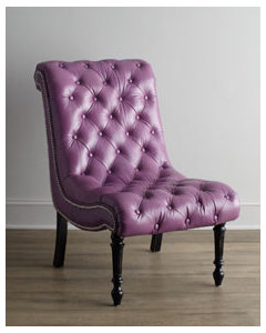
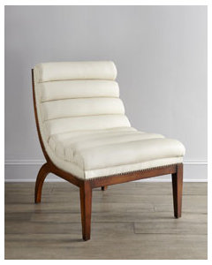
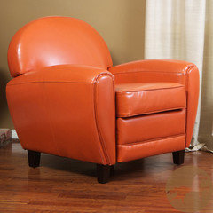
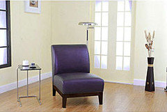
    Here are a few more chairs-nothing wrong with those you have pictured, but the gray one sort of blends into the walls/drapery hues... Anyway, here you are---I'll stop in tomorrow and see how it's evolved... Good Luck!
    [houzz=][houzz=
    Chelsea Wing Chair · More Info
    ][houzz=
    Transitional Armchairs And Accent Chairs · More Info
    ][houzz=
    Kalinda's Chair · More Info
    ][houzz=
    Nexus Swivel Chair · More Info
    ]
  • 13 years ago
    Love the chair idea, but would have to agree with Natalie white once would look really goo there. are you planing on keeping both of the paintings? or one of them?
  • 13 years ago
    I think both the paintings work well here-hopefully they will stay. I was wondering if one valance should span across for both windows---might be something to play around with. I just showed my hubby the before picture of this room and how it has evolved---he said WOW-Beautiful-I love it! There's a man's point of view. :)
  • 13 years ago
    Another man's perspective:
    Agree with one valance on the close windows...and just have two fuller drape panels on the ends.
    Lose one of the art pieces. I think the two you have are too matching in scale and looks crowded with the windows.

    Edit the design.
  • 13 years ago
    More furnishings to play with...
  • 13 years ago
    and...
  • 13 years ago
    last modified: 13 years ago
    I agree about the valances, but the art-not so much. The art is hung too high in the photo---needs to be tweaked in reality... The "center" of a painting/picture/art should hang approx. 57"-60" from the floor.
  • 13 years ago
    ...
  • 13 years ago
    I appreciate all of your comments/suggestions. I changed the 2-window valance, went from 4 to 3 curtains on center windows, scaled down & moved the paintings, and added a white leather chair. Will try some different chairs now. It felt like a Tang explosion with the orange table (though I like it!). Other suggestions for tables? Did I move paintings enough? Are both paintings really too much?? What do you suggest as an alternative and which one would I remove? I love them both. :)
  • 13 years ago
    last modified: 13 years ago
    The woman can be raised slightly as it is longer and narrower than the other painting. I do not like the chair---it does nothing for the space. The gray looked better. :) The legs of this chair are similar in tone to the table so it really takes away, rather than accentuate...
  • 13 years ago
    white fabric chair & painting slightly raised
  • 13 years ago
    ♥ it!!!
  • 13 years ago
    last modified: 13 years ago
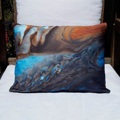
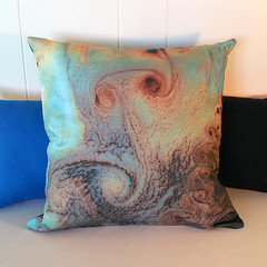
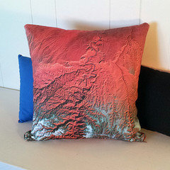
    I'd like to see what this pillow looks like in place of one of the colored pillows---whichever of the two looks best to you-you decide... Maybe just add it on the left sofa---leave the right as is..
  • 13 years ago
    Will do this afternoon, for sure... thank you so much, Natalie! Have a spectacular day! :)
  • 13 years ago
    You're welcome Melissa... You have a FantaBulous day as well...
  • 13 years ago
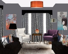
    Did a real slop job on this but it looks right... Check back later in the day... :)
  • 13 years ago
    ///
  • 13 years ago
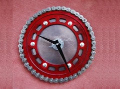
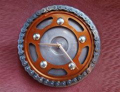
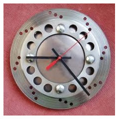
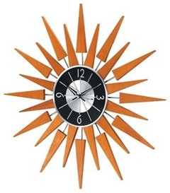
    Coming together Natalie! You know so much of this is a matter of personal taste. I love the white wing chair; I'd do a matching set just like the sofas. LOVE the fluffy white rug and the photo pillows. I still think a cool vintage with some wood and stainless steel color sunburst clock instead of the woman picture ( keep the one on the left) would liven things up and tie in to the wooden table. Be sure it is plenty BIG to balance the painting.
  • 13 years ago
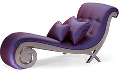
    I like the leather chair better...but agree the legs should be black. I like the change in the drapes Honestly, I think the artwork is the only thing you see. Everything else kind of fades from focus. I like the painting on the right but maybe for a different room? The outer space pillows seem more appropriate for a boys' bedroom or a den imho. Although they do match the painting on the left and as I said before, it's all about you I like the purple chair and miss the original orange floor lamp. I liked the style of the grey chair but agree that the color blended into the drapes and walls. If you like blues and purples why not try a new color pallet rather than sticking with the orange? I think black and white prints would be a nice addition. It's tough to read what direction you want to take though. :)
  • 13 years ago
    last modified: 13 years ago
    I would remove the art with the woman on the right and move the orange abstract over to where the woman art is now. Leave the corner wall blank.

    Put a larger floor lamp in the corner.
  • 13 years ago
    I would also remove the women picture and move the orange one to the other side and put a fiddle leaf tree in that corner. C
  • 13 years ago
    Ok, I like the "mellower" pillow colors.
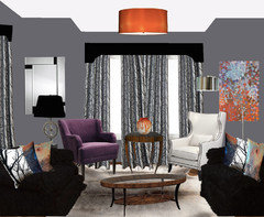
    How about art deco mirror on left wall, other painting moved to right side, one purple & one white chair? Thoughts on coffee table?
    What kind of lamp would you put on left side? I REALLY like the "gear" lamp. :)
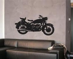
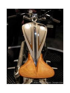
    I like some masculine touches (specifically, motorcycles are my passion).
  • 13 years ago
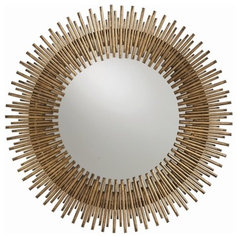
    Hi---I didn't even notice the gear lamp-it disappeared. :) Try this mirror instead. The coffee table and side table are too similar, one needs to be changed... Are you set with the purple and orange hues---100% sure you want to keep both in this space?
    [houzz=
    Arteriors Prescott Antiqued Gold Leaf Round Iron Mirror · More Info
    ]
  • 13 years ago
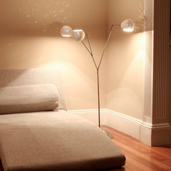
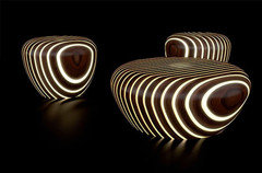
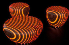
    mm [houzz=
    Claylight Floor Lamp by Lightexture · More Info
    ]
  • 13 years ago
    Motorcycle accents...I looked for a motorcycle chain mirror...Maybe you could have one made? Maybe too industrial?
  • 13 years ago
    or
  • 13 years ago
    Ooooohh, VERY cool!!! I will pop those in tonight. :) Thx!
  • 13 years ago
    last modified: 13 years ago
    In each re-do pic of ur room..the one thing i notice is that the length of drapes r too long..maybe shorten drapes and i agree w/ an earlier comment of using muted hues as accent colors.:)
  • 13 years ago
    The room looks very different from how it first started out. Not sure which direction you're going in now. Keep us posted and Good Luck!
  • 13 years ago
    i liked the picture with the woman better than the mirror
  • 13 years ago
    I love the addition of the chairs and that rug. I liked the first set of chairs best. Definitely like the singular valance better, too! I liked the artwork of the woman better than the mirror as well- there is color one side and none on the other which makes it look imbalanced to me.
  • 13 years ago
    Yes, there is no color in that corner---that was a suggestion someone made-remove the woman, switch the painting to the right and leave the corner blank with a lamp. Hmmm, maybe a colored lamp?