Software
Houzz Logo Print
malna_gw

I need a "Happy" Room (Sorry, Long Rambling Post)

11 years ago
last modified: 11 years ago
The back story - our house was built in 1929 and was intended to be a summer cottage on a lake. We bought it 25+ years ago. We spent those years building our home business and working on the garden/outside in our spare time so we never did much with the interior. The interior remodeling was DH's retirement project.

DH retired in September. He passed away in January. So...the ball is in my court.

I need one "happy" room that's freshly painted and nicely decorated. I'm thinking it should be our bedroom first. That's easier right now than the bathroom and kitchen, and I can do almost all of it myself.

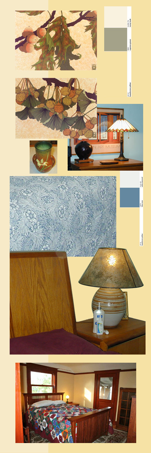
Here's my first attempt at an inspiration board:


The background is about 1/3 BM Windham Cream on the left and BM Hawthorne Yellow on the right. I have the two lithos on the top (Pin Oak and Ginkgo). The Pin Oak colors are truer to real life than the Ginkgo one is. They are framed with dark green linen matting and a quarter sawn oak frame (darker than our furniture, but I don't mind mixing stain colors). They are also very large - 28" high and 32" wide. I grabbed the "Goes Well With" strips from the BM site for Hawthorne Yellow. I have a lot of green "stuff" so I threw that in there. I have some pieces of Roseville's Zephyr Lily (the vase under the Gingko print) that were my grandmother's. The lamp to the right of that is one I got from L.L. Bean when they were big into bungalow stuff years back. I only have one. Behind the lamp is the wall color currently in the bedroom. IRL, it looks a lot worse than that. It's a sickly turquoise that I can't wait to get rid of and has darker turquoise painted trim. Yuck :-)

I like the way the blue strip goes with Hawthorne Yellow. The blue duvet cover is another set I got from L.L. Bean - it's a knockoff of the William Morris Marigold print. I have the same cover in green. I also have a lot of artwork and framed stuff with blue matting and some touches of red. I thought it would be nice to be able to switch out some artwork and bedding and have a totally different feel.

Below that is our furniture (part of the headboard and a glimpse of the nightstand). DH and I designed and built it when we still had a cabinet shop. It's oak with some maple trim and that's staying. The pottery lamps with the mica shades (I have two - one on each nightstand) were made about 40+ years ago by a friend of his in California. I don't like the grey and brown with the yellow, but I love the lamps so they can go upstairs in the guest room. I like the bungalow lamp better. I wish I would have bought another one.

The bottom picture is one I found on Houzz for inspiration. I want to strip my woodwork (it's 80+ year old fir and is in pretty good shape underneath all the layers of paint. At least the piece I test stripped is). Again, I don't mind the mix of wood stain colors. I adore stained wood trim. I'm not a fan of painted trim (nothing personal to anyone that paints it - that's just me).

There is hardwood flooring underneath the ratty beige carpet. I pulled back one corner of the carpet, and it looks to be in decent shape, but I won't know for sure until I rip all the carpet up. Since this was a summer cottage, the flooring is laid directly on the floor joists. Yeah, I know.

I originally said "Nah" to yellow. And I do realize that I will have to paint some sample patches to see how it will really look. The one double window faces west, so it's not a terribly bright room. No neighbors on that side so no curtains or shades. It's very pretty when the moonlight shines in at night :-)

So if you've managed to stay interested in my incredibly rambling post, do you have any other suggestions for paint color on the walls/decorating ideas? I nixed green paint, as I thought that was too limiting. Same with blue. I thought of beige/grey/griege, but I couldn't find a "happy" color. Also have to apologize for the lousy pictures - they are old random shots. My point and shoot camera finally broke, I don't have a cell phone, and I haven't gotten around to reading the manual for DH's honkin' big Nikon digital camera.

And naturally, I have a VERY small budget, hence wanting to use and coordinate what I have. At the moment, the budget consists of rolling up spare change from the jars around the house. Surprisingly, you can collect a pretty good amount in 25 years :-)

Comments (29)

  • 11 years ago

    I have no suggestions but just wanted to say how sorry I am for your loss. You definitely need a happy room and incorporating some of the things you and your dh loved is a wonderful testament to your marriage.

    malna thanked akl_vdb
  • 11 years ago

    Malna, I'm so very sorry to hear about your husband. Your happy room plans sound like just the ticket.

    I like all of your choices and that LL Bean duvet cover is lovely. I've always been a fan of yellow walls, because I think they look nice with darker wood and because they're cheery. My previous house had a yellow bedroom, living room, and kitchen, and in this house I have a yellow bedroom and kitchen, and they're esp cheery in the winter. My choice between the two above is BM Hawthorne Yellow, but then I do a like a yellow that's not wishy-washy : ) .

    I'd paint one wall -- maybe the one behind the bed -- yellow and live it with it for a while to see what you think. Can't wait to see what it looks like when you're finished.

    malna thanked beckysharp Reinstate SW Unconditionally
  • 11 years ago

    Yes, you need a happy room! I'm very sorry for your loss. Maybe this project will be a good diversion and bring you some joy.

    I love Arts and Crafts, and you have lots of great items to incorporate. Love your prints, lamps, bedding, and Roseville. The plan to strip your woodwork and reveal your wood floor will be perfect. Perhaps you could add insulation under the wood floors, if they're laid directly on the joists?

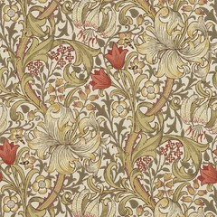
    I like the Hawthorne yellow. It would be cheerful and pretty with everything you have. I think it would be beautiful to do one wall in an A&C wallpaper.

    This is a William Morris paper, Golden Lily:

    It's expensive, but I bet you could find a more reasonable reproduction wallpaper, or just do a small area. It would be gorgeous!

    If you wanted to go less yellow, more cream, you could do BM Waterbury Cream-- here's a link to some A&C colors that pair with Bradbury wallpapers:

    http://www.bradbury.com/ac2_colors.html

    Keep us posted, I'd love to see how it goes!

    malna thanked jlc712
  • 11 years ago

    Malna, you have my favorite colors in your inspiration board. Of course you should have a happy room and I think your choice to begin with your bedroom as a doable space is wise. I've been considering a similar warm soft yellow for a guest room.

    My experience with yellow to date was a glazed treatment to the upper kitchen cabinets in my former house, but my brothers craftsman has it in more than one room and its wonderful with all the wood trim and built ins - especially in a dreary pacific northwest winter. I hope you'll show us more as you define you choices and keep us up with your progress.

    malna thanked morz8 - Washington Coast
  • 11 years ago

    I am sorry for your loss. You deserve a happy room! I like your inspiration board it is cheerful!

    I had intentions of stripping all my wood work in my 1920s home but after beginning I realized it was to much for me with a job at the time and starting a family I settled for doing just the doors and kept the moldings painted I regret not doing it fully so I hope you do not find the job to daunting but if it is you too can just do the doors it was a tradition look in the 20s too and stained fir is so lovely and warm even in little bits.

    I look forward to following your project and hope it helps you during this very difficult grieving period. I admire your strength.

    malna thanked roarah
  • 11 years ago

    I, too, was dismayed to hear of your loss. Your resolve is inspirational. I like the idea of yellow and blue and your furnishings are lovely. The pottery lamp can be painted similar to painting ceramic lamps as discussed in the link: Painting ceramic lamps


    I hope you share your progress!

    malna thanked User
  • 11 years ago

    I love your lamp! Would you consider getting a similarly shaped but not matching lamp? o.co has "tiffany style" lamps - maybe one there might take your fancy?

    When I look at your lithos, which I love, and your pottery, which I also love, and your lamp, I'm not getting a "blue" feel at all. More a warm feel like I see expressed in your final inspiration picture. I could even picture a warm off white, or warm cream, or a pale yellow. Something that looks good with all your art pieces and sets them off without competing with them.

    malna thanked robo (z6a)
  • 11 years ago

    Wow, what bad timing...not to say anytime is good but when you finally have the time to work together on this life project. Did your DH have any input or thoughts about the colors? If yes, could that be inspirational?

    I like your first inspiration board.

    malna thanked mustangs81
  • 11 years ago

    malna, I'm so sorry. I've been in your shoes, and I just want to offer you some encouragement, and to say that I love your style. I really like the paint color in the last picture--closer to Hawthorne Yellow?


    malna thanked mama goose_gw zn6OH
  • 11 years ago

    I am so sorry for your loss, Malna. You do deserve a happy place to be, and your bedroom is a perfect place to start. I love the Hawthorne Yellow as it seems to be that happy color. Love your lamps too and think you could use both of them as well as your existing pottery pieces. Once you get the hardwood floors exposed I think you will be well on your way.

    malna thanked OutsidePlaying
  • 11 years ago
    last modified: 11 years ago

    On my lunch break, so I thought I'd respond to the comments.

    First, thanks to all of you for the sympathy messages. Yes, it was sudden and unexpected. Yes, it has been a weird journey to a different "normal" for the past few months. Gosh, how I miss him.

    Second, to answer one of the last questions from mustangs (Hi, Cathy) "Did your DH have any input or thoughts about the colors? If yes, could that be inspirational?" <grin> He painted anything that would stand still long enough...white. "Hon, white goes with everything." I won't even mention his fascination with John Deere Green. I did manage to confine that color to outside :-)

    ppbenn, I like the Behr Rejuvenation. I'm still on the fence about greens (it is my favorite color). What the heck - I'll get a pint and paint a wall.

    akl_vdb, thanks. Yeah, I really want to incorporate things that meant a lot to DH and me. Now getting them to look decent together in the same room is a challenge.

    beckysharp, I might just do that - get a sample can and paint behind the headboard. Or maybe above the dresser (I don't have any pictures of it in the "cave"). A weird 1940's addition tacked onto the bedroom that was included when they finally put in indoor plumbing. Hey, old houses are always interesting.

    jlc, I love, love, love that wallpaper. It's frickin' gorgeous. I still pull out my Bradbury & Bradbury architectural binder (jeez, the price list in the front is dated 1999, so I've been drooling over this stuff for a while). And I have some samples from William Morris (it's been so long I can't even remember where I got them from - a designer's show in NYC, I think).

    morz8 and roarah and javachik, it will be a sweat equity project for sure but if all else fails and I can't afford to keep the house, at least one room will show what can be done. Oh, I just discovered (totally by accident) that the house is listed as a local historic landmark. Too funny.

    robo, yep, I'm all about stuff not matching. I just haven't found another one (for whatever reason) that I liked as much as the L.L. Bean one. Go figure. I agree, a lot of the stuff on the inspiration board doesn't go with "blue". I have a LOT of other stuff that does. That's a whole 'nother set of pictures as soon as I can figure out DH's camera.

    Yes, mustangs, the timing could not have been worse. You are right - it's never, ever, ever good. But this was so sudden, I can't even find the words to describe it. How is HG doing? I don't go over to the CF much anymore (cooking for one doesn't lend itself to that forum).

    mama_goose, I couldn't find the paint color, but it looks kinda sorta like it might be? I'll figure it out when I slather my ugly turquoise walls with swatches of...whatever samples might fall into my hot little hands.

    Thank you all again for the sincere sympathy and I very much appreciate the critiques. I appreciate every single tidbit from another point of view :-)

  • 11 years ago

    I'm so sorry for your loss. I rue the day my own DH will pass. It's got to be so terribly hard. My deepest sympathies and am glad for your strength and courage.

    Honest opinions on your mood board. I completely understand wanting a happy room but when I look at your mood board, I see a warm yellow and a happy blue and beautiful prints, but somehow, they don't all mesh for me. Rather than the blue, I think I would pick up on the very soft sage green that's on the back side of the ginko leaf in the print. But that would yield a warm and cozy atmosphere which would go beautifully with your gorgeous woodwork...but I wouldn't call it "happy". To me it would be lovely and comforting.

    To me, a "happy" room would be even lighter and brighter and more whimisical.

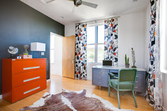
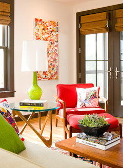
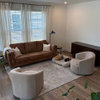
    Something with bold colors and prints

    Ava Lane · More Info


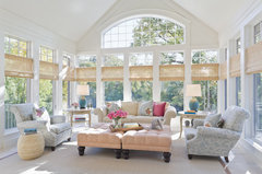
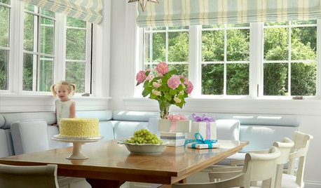
    Or something that has some pop

    Sunroom Serenity · More Info

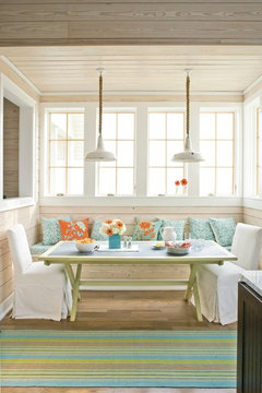
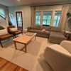
    or a little more energy

    Southern Living Photos · More Info


    Living Room · More Info


    So I guess the question is, do you want an energetic bedroom that's happy? Or do you want something that is more warm and comforting?

    malna thanked Annie Deighnaugh
  • 11 years ago
    last modified: 11 years ago

    Malna, I'm so very sorry that your husband died. I was in the same situation 20 years ago when mine died unexpectedly at 48. It does take a very long time to settle into a new "normal" and I think your project will be a great way to begin that journey. I do hope you will be able to stay in your home. That's one change I just fought to avoid! Love your bedroom furniture and some of the choices you've made. It will be lovely!

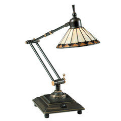
    I was determined to find a matching lamp for you, but have had no luck! Maybe someone else can. Surely, they are around. But when I was looking, I noticed some lamps that might work on the other beside table and look like a deliberate mismatch rather than a miss mismatch :). For example, something like this, which might make a good reading light if you read in bed.
    Or maybe you could put your existing lamp on your dresser and buy two new lamps for bedside, something that would coordinate with your style, but be much more plain than the one you have now, letting it be a feature in your room. You might be able to find a pair on CL for not much $. Good luck on your project.

    malna thanked Olychick
  • 11 years ago

    Malna, I am so sorry for your loss. I lost my first DH when he was 45. It was a tough time indeed.

    Your comment about your husband's fascination with JD green and painting everything white made me smile. I remember how the things that my DH did that just drove me around the bend when he was alive were the same things that made me smile with fondness after he died.

    I love the earthy colors in your lithographs and think that green would be a wonderful choice but I am very fond of yellow. It is such a lovely, cheerful color.

    malna thanked Holly- Kay
  • 11 years ago

    Malna, you have my sympathy, I'm so sorry your husband died and before he got to really enjoy retirement. I love your spirit and humor. This is what he would have wanted you to do and it's okay if you don't use white lol. I love the top litho, the blue bed cover is yummy. You have good taste so I'm sure you'll make a more than "happy" space. Below are some inspiration photos.
    https://www.google.com/search?q=arts+and+craft+bedroom&source=lnms&tbm=isch&sa=X&ei=RHItVcPVDu7lsASn8oGoCw&ved=0CAcQ_AUoAQ&biw=1025&bih=452


    malna thanked Yayagal
  • 11 years ago

    Annie D,
    Thanks for the pictures as examples. I have to tell you that last one just sorta transported me back to the MCM house I grew up in (yes, I remember the '50s. I think that makes me an official antique, yes? :-) If I never have to look at Danish Modern furniture, turquoise and orangy/peachy paint (holy carp, the paint color names were "Serenity" and "Peach" - why in the world would I dredge that 50 year old memory up as I was typing???) and/or fabrics, grey countertops with pink/white boomerangs in a bathroom or Green Linen laminate with knotty pine cabinets in a kitchen ever again, I will be a happy camper. Oh, and my Apple Blossom Pink bedroom. Ewww. I know people love it. And do some beautiful things with it. Just not my taste (hey, nothing personal!)

    To me, "happy" is not bold and vibrant or energizing. I guess I'm reverting back to the '20s -'40s. Why? I dunno. Maybe because I feel a sense of love, comfort and permanence from my grandmother's and my aunt's houses. We did move a few times when I was growing up, and I always felt like I was being ripped up by the roots every time. From MCM to an early '70s colonial (don't get me started on avocado, harvest gold, pumpkin with coppertone appliances - I WILL run screaming from the room) to another '70s colonial to another '80s...oh, never mind, by that time, I had mentally moved out and worked hard to get a promotion so I could afford to physically move out.

    Olychick, I like that lamp. A lot. I do have a pair of old milk glass lamps upstairs that would "do". To me, the - OK, I'll call it froufrou - can wait. Gotta get the bones in shape first. Lord only knows what's hidden in those old walls and under the carpet.

    Thank you all for your help! I hope you will continue to guide me as I venture into these uncharted waters :-)


  • 11 years ago
    last modified: 11 years ago

    Thanks, Holly Kay and Yayagal. I get interrupted so many times with phone calls and emails that sometimes it takes an hour to finish typing what I started an hour before that!

  • 11 years ago

    Malna, I too am sorry for your loss. I think a happy room is a great idea and happy does speak to each of us differently doesn't it? For as long as I can remember my go to colors have always been yellow, blue and green so I love the direction you're moving in. While the sage green would be pretty with those wood tones, yellow is such a cheery color, give it a try, if it doesn't feel right, it's just paint and can always be changed right?

    malna thanked User
  • 11 years ago
    last modified: 11 years ago

    Malna, you have many great suggestions and ideas here, and I'm very much looking forward to seeing your "Happy Room's" metamorphosis. I'm so glad that you've chimed in here and are sharing this fun project with us. Please stick around and post updates and pics (we LOVE pics!) as they happen. Like everyone here, I'm very sorry for your loss . . . and very glad that we have a new friend who's come to play with us!

    Lynn

    malna thanked LynnNM
  • 11 years ago

    A happy room! I love that and I agree that you deserve just that. I think it is wonderful that you realized what you wanted (needed) and decided to really follow through on it. I cannot wait to watch your progress. I hope you enjoy every moment!

    malna thanked cyn427 (z. 7, N. VA)
  • 11 years ago

    I don't know if this is good or bad. I went to the local BM paint store today. I was going to grab some paint chips of Hawthorne Yellow (is that what you call the paper strips with three or four or five colors on them?) to put next to "stuff". None in the rack. The only slot out of the 47,000 they have that was empty.

    I went to the 2 oz. sample rack. Nope, no Hawthorne Yellow (didn't think I'd get lucky). Not a lot of other neat colors, either, but the paint mixer-upper did tell me they are not restocking the small sample jars. The pints are only $7 and the 2 oz. sample jars were $5, so all of us cheapskates around here just buy pints.

    I did have them mix up a sample pint. Dang, it looks oh-so-different in the can than it does on the chip. Wonder what it's gonna look like on the walls. Guess I'll find out.

    So do you think in my neck of the woods, it's the color slathered on everyone's walls? Here I thought I was going to pick something unique :-)

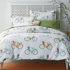
    Now for something completely different: saw these euro shams on clearance plus an additional discount plus free shipping. They didn't have anything else in the pattern which was probably a good thing :-)


    Does the bicycle print go with anything else in my universe? Nope. Do I care? Nope. We haven't had a car in years, so DH and I rode bicycles everywhere. I saw the pattern, it brought a smile to my face thinking of our many bike rides together so, for somewhere around 12 bucks, I got a much needed dose of temporary happy. I put green sheets on the bed, the blue in the two shams make the icky turquoise on the walls look almost palatable, and the yellow matches Hawthorne Yellow almost exactly.

    Sometimes it's just little things that put a silly grin on my face :-)


  • 11 years ago

    That post is my smile for the day!

    malna thanked cyn427 (z. 7, N. VA)
  • 11 years ago

    I hope you enjoy your cute pillows. What a sweet reminder for you, I love it.

    Let us know how the yellow looks!

    malna thanked jlc712
  • 11 years ago

    What a perfect reminder of your DH and they are very cheerful and cute.

    malna thanked OutsidePlaying
  • 11 years ago

    Oh wow, I love your story and that print is adorable! I will throw this out there because of the references to green in prior posts, but I love how the green sheet looks with the print too. We have that color in our mud room and pantry, we used Grass Cloth by Behr.

    malna thanked User
  • 11 years ago

    Malna,
    I'm so very sorry about your loss but admire your courage and determination! I absolutely adore the bike print.
    Now to Hawthorne Yellow. I, too, considered and tested it but ended up with a different yellow, actually several different yellows (plural). HY read too dark and greenish in my house. Ended up with BM Lighthouse, Mellow Yellow, and Windham Cream.


    malna thanked nosoccermom
  • 11 years ago

    YES to the bicycle print because of the memories so no apologies!!


    malna thanked mustangs81
  • 11 years ago

    You have probably already ordered the shams, but I wanted to tell you about a bicycle pillow I saw on Joss & Main -- navy background that would go with a lot of things and not limit your color choices as much. Bicycles seem to be a popular motif in spring and early summer. They are fun, but I like that they would bring you a special joy.

    malna thanked lascatx