Software
Houzz Logo Print
akl_vdb

Fireclay samples for backsplash-any good?

11 years ago
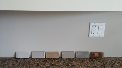
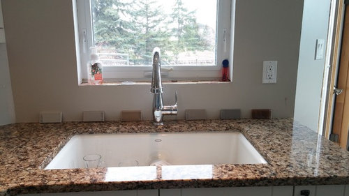
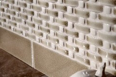
Here are some samples from left to right.

Foggy morning

Shetland wool

Feather grass

Pumice

Barnwood

Bark

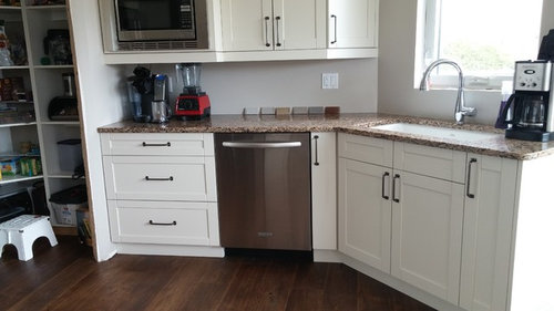
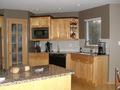
Counter is Cambria Canterbury quartz. Cabs are Kitchen Craft seashell. Floors are engineered oak. Any other direction to go in? What do you all think?

Walls revere pewter and ashley grey.

Thanks!

Comments (35)

  • 11 years ago

    I personally like the third from the left with the very pretty counter.

    akl_vdb thanked User
  • 11 years ago

    yes , #3....not too light, not too dark and goes nicely with your floors too. You could also do some sort of accent with the dark one on the end as well....a row, or randomly placed tiles for some interest.

    akl_vdb thanked joaniepoanie
  • 11 years ago

    I like Feather Grass too. I wasn't sure until I enlarged the first photo and saw the pretty variation in the glaze. Don't know how it will do with Revere Pewter, but matching to the counter is more important.

    akl_vdb thanked User
  • 11 years ago

    I think I also like the Feather Grass the best. I don't think the two on the left work at all. The 4th is my second faviorite.

  • 11 years ago

    I am surprised that feather grass looks good. I thinking it might be too golden? But I did pick that one all by myself. The fireclay people suggested some other colours but they had blue or green undertones. They did suggest foggy morning. I like pumice colour (3rd from the right) but it's too matte. I like a little shine!

  • 11 years ago

    I like the 4th from the left (pumice), but I can't really see it behind the faucet. Might be too grey, and as you said, it may be too matte. I think the feather grass would be too much brown with as much back splash as you will have showing.

    akl_vdb thanked OutsidePlaying
  • 11 years ago
    last modified: 11 years ago

    I'll be the outlier - I like foggy morning. It is nice and bright.


    I love fireclay tiles - they really are beautiful.

    akl_vdb thanked rockybird
  • 11 years ago

    my vote is 3rd from left too! Looks pretty!

    akl_vdb thanked User
  • 11 years ago

    Got these in the mail too! So exciting!


  • 11 years ago

    Feather grass, if you want warm; Pumice if you want cool.

    akl_vdb thanked jlc712
  • 11 years ago

    the pumice seems to clash with the warmth of both the granite and flooring while the feather grass might be golden overload. I don't really see a great match with the samples you have.

    akl_vdb thanked k9arlene
  • 11 years ago

    My initial response was feather grass as it seems to pull a golden color from the granite. However when I consider the rest of your kitchen, I think more limiting - as k9arlene puts it "golden overload".


    Foggy morning seems to be a more neutral color that works with everything but will fade into the background as your granite counters, kitchen appliances and accessories take center stage. Plus you can change your color scheme more easily than with feather grass gold.

    akl_vdb thanked alexamorrie
  • 11 years ago

    Feather grass.

    akl_vdb thanked User
  • 11 years ago

    I do have to agree with k9arlene. Of the ones I have there isn't one that stands out for me as worth getting. I was hoping for barnwood as when I put these up it was night and it looked more taupe and not as grey. Amazing how light changes everything!

    Thanks all!

  • 11 years ago

    I agree with KArlene.

    I would like the look of the feather grass, but lighter.

    Close up, yes the color seems to go well with the counter. So, going in the right direction. When you step back, the counter seems to give an over all beige impression. I think then too much beige.

    None of the other colors would work, in my opinion.

    All said and done, the feather grass is doable. Backsplashes are by far the hardest decision when you don't have a complete vision of the three elements of the kitchen beforehand. Cabinet color, counter and backsplash.


    akl_vdb thanked eld6161
  • 11 years ago

    Thanks may_flowers and ellendi for helping me see the whole picture. There are tons of flecks in the counter that are cooler but your comments about really looking at it from afar and seeing the whole thing and getting the look I want. Thank you for the other tile company name.

  • 11 years ago

    We do really like our counter but picked it out 2 years ago when we had maple cabs that had yellowed with age. This quartz seemed to go the best with that. Then we had the flood and changed the cabs to what we wanted as my dh said weren't doing this again in 5 years. Now i would probably pick a different counter, but I did not want to spend the 5 k as it is gorgeous and we do love how easy it is to keep clean, and it is warm. We do like warm. Just trying to be not so beigy!

  • 11 years ago
    last modified: 11 years ago

    Feather Grass has slight variation. From their website: "A pale brown hue infused with gray undertones gives Feather Grass a warm and rustic feel, highlighted by a high crackle finish and earthy variation."

    My favorite crackle tile is Encore. There's something special about the sparkle. They have a quick ship line of their most popular colors called Bravo, which I believe is less expensive than their regular line. Smoke is one of their Bravo colors that might work well. I've seen a lot of Smoke as Romy, kitchendetective, oldbat2be, and I went through four threads of helping someone with tile, and she chose Smoke.


  • 11 years ago

    I definitely have to look at that may_flowers! I like the description of feather grass more than the colour.

  • 11 years ago
    last modified: 11 years ago

    Yeah, I thought the description sounded like you, which is why I posted it!

    In your last photo, the three lightest tiles look much warmer than they do in the other photos. They work there, so maybe that tone is something to shoot for. I wouldn't call them boring beige in that photo, but they're also not gray.

  • 11 years ago

    The description was why I ordered the feather grass! So glad to hear that the description sounds like me, totally what I'm going for!

    So I've taken stock. I would like a backsplash a warmish colour that is darker than the cabs, lighter than the counter. Enough to give some soft contrast on both ends. Something with interest but not too much, the counter has enough. But perhaps the crackle, and of course, gloss. I love shine. I do love natural materials I have recently discovered. I'll try and find my old bs post, or at least a pic when I go on the computer if it will let me post a pic from there.

  • 11 years ago


  • 11 years ago

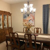
    Our old kitchen. I hated the backsplash we picked out. I liked the shiney pieces, hated the dull ones and it was a hack job too. So everytime I looked at it I was disappointed. Then we had to paint the walls darker or it just blended. I much like our kitchen now. But it will be so nice to be done and move on. I just picked up the fireclay samples as we were in California and could get a few to see. Otherwise in Canada we don't have the same selection or things cost more $.

  • 11 years ago
    last modified: 11 years ago

    Well, there. That's a perfect example of what a cool color does to your counter.

    akl_vdb thanked User
  • 11 years ago

    Thank you may_flowers for helping me realize the obvious when I'm too close to the situation to realize the obvious!:)

  • 11 years ago

    Could you give us an idea what your color scheme is for the room....paint color, window treatments, upholstery, etc.

  • 11 years ago

    k9arlene-it's all such a work in progress! The walls in most of the house are BM revere pewter, and along with windows it's Ashely Grey for some darker accent. I am getting some new roller shades installed this week into the kitchen, kind of a greyish brownish look. The table and chairs will go at some point. My projects are too big and they are getting the best of me! I'm going to wait on backsplash, just thought since I had the samples I'd see what the consensus was. Thank you!

  • 11 years ago

    Have you ever thought about getting a stainless backsplash? it would be an easy solution.

  • 11 years ago

    K9arlene, I was thinking of what 'neutral' i could throw up there without introducing another element. Thanks for the advice!

  • 11 years ago

    http://ths.gardenweb.com/discussions/2674126/i-think-ive-fallen-in-love-please-tell-me-hes-ugly-and-not-goo?n=65


    This was an old post of mine from last year. We have come a long way since then! It is entertaining. Thank God for you guys helping to spread my crazy around so it's not all stuck with my DH!

  • 11 years ago

    That's a great thread! I remember the tile. How do you feel about it now?

    Your home is so contemporary. Your quartz is contemporary. I'm not convinced crackle is a good choice for contemporary, but it gives that nice, soft variation. Were you planning on doing a shape or size different than traditional subway tile to bring in the contemporary vibe? I'm not really sure where tile is heading for contemporary kitchens. Seems skinny tile is on its way out. I know sheet glass is being used in metropolitan areas.

    akl_vdb thanked User
  • 11 years ago

    I'm trying to go with a timeless traditional feel with modern finishes. Not modern like the look, but modern like indoor toilets ;) i would stick with traditional subway shape. I was looking at some suggestions from that thread and the brown with whitish grout is interesting. Not sure it's for me though.

    This project is not a rush (obviously!). We have the tile guy coming next week for the laundry room and powder room floors. And the plumber never got back to me from 3 weeks ago regarding a quote. Hope he shows up before the tile guy!

  • 11 years ago

    I have Fireclay skinny crackle tile in my decidedly contemporary/modern industrial loft apartment, and I personally love it.

  • 11 years ago

    I did get some more samples, so we'll see how that goes! Thanks again all!