Software
Houzz Logo Print
terri_amb

Color help!!

11 years ago
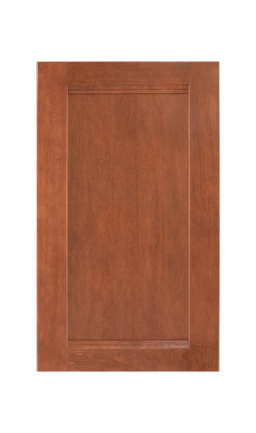
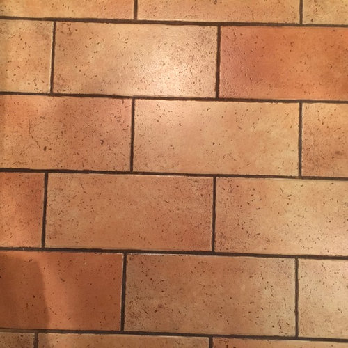
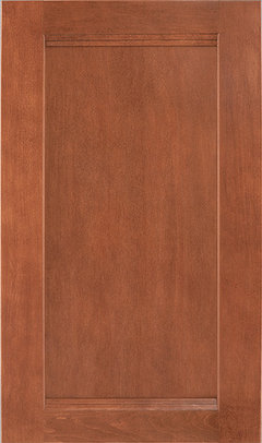
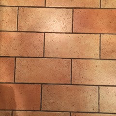
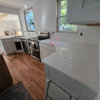
http://www.benjaminmoore.com/en-us/paint-color/homesweethome#ce_s=fennel%20seedI am installing Shenandoah Maple Cognac cabinets. My floor is an EmilCeramica, with hints of pink, but earthy tones, some orange. I am having trouble with picking out the wall color ...mostly for one wall. Trim will all be Navajo white.


I have almost settle on Benjamin Moore's Home Sweet Home Natura Paint, Matte finish.

With picture groupings on wall, don't think the wall color will be too light. It is a beige-ivory with definite pink in it...that seems to go with Cognac and with the floor . Any ideas?


Comments (16)

  • 11 years ago
  • 11 years ago

    personally, I think it's a mistake trying to get your paint to match your other tones. I would go for contrast. Find a nice light gray with a hint of green to bring out the colours you have. If you go with home sweet home, it is all going to look a little blah.

  • 11 years ago

    WAY too much orange.

    I'd do BM Soft Fern


    Or if a neutral, maybe BM Greenbrier Beige


  • 11 years ago

    You could go on the BM website and click on the paint colours that are similar to your cabinet doors and flooring. You will then get suggestions of colours that work with yours. I've had a go and it seems the greys and the greener neutrals are good

  • 11 years ago
    last modified: 11 years ago

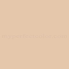
    Your idea the the wall color should match the floor is one reason you're in the color family you find yourself in. Here's a swatch of your color choice and it does seem to blend, but do you find it a pleasing color? Might you consider just using BMs Navajo White as the wall color with a lighter trim color?

    I would definitely go lighter and brighter with the wall color and trim, and possibly just prettier. This is Slipper Satin by Farrow and Ball shown with Wevet as the trim color, and it's more in the neighborhood you should be considering. It's not terribly far from BM Navajo white, although it is a touch pinker. In the final analysis, any color that makes you happy is probably the right choice for you, but don't feel so limited. There are plenty of options that will work for you.


  • 11 years ago

    I'd take a look at some pale greens.

  • 11 years ago

    Thank you all so much!! My contractor has a similar kitchen. His cabinets, too, are cognac, and he went with a rich , darker yellow-gold, more gold than yellow. I don't have the swatches, but it really works!! Lighter is too blah. Thinking about the floor didn't work for me. But when I saw the color up against the cabinets , the gold color, it really worked!! The floor will come along for the ride! Greens were only out for me because I do not like greens at all, although I agree they work with the cognac. Home Sweet Home was just blah. Completely. Once he paints a full wall, if I get crazy and think it is too dark, we can go a to a lighter shade of the same gold.

  • 11 years ago

    I will post a swatch of the color once he brings it in.


  • 11 years ago

    Also, somersetlass, my entire living and dining room and my kitchen trim are already Navajo White. If I paint the walls too light a color, the darkness of the cognac, the floor, the stainless (and some black on them) appliances, call for a darker shade of color. Home Sweet Home is too pink. Trying to out of the 60s, since my whole bathroom that was gutted was PINK! Really , really pink.

    Thank you all so much for your suggestions.

  • 11 years ago

    Not sure how to embed the color from the BM page, but we are going with Dorset Gold. At first I thought my kitchen was too small, but the color is very rich, and my trim, baseboards, window frames, door are going to be Navajo White. The Dorset Gold will be matte finish.Dorset Gold

  • 11 years ago

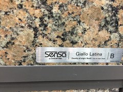
    Any further thoughts appreciated. Gold is an accent color in my living room as well. A gold chair, also forrest green and golds. We are using a tile pictured in tile frame above the induction cooktop, embedded in a very light subway tile arrangement, that has hints of gold in it, but not much contrast via pattern because of granite countertop, the Giallo Latina from Sensa.


  • 11 years ago

    This is a link to the framed tile mural, 16x20 to go in backsplash behind induction cooktop


    http://www.tileshop.com/product/tuscany+mural+16+x+20+in.do?from=Search&cx=0

  • 11 years ago
    last modified: 11 years ago

    I would at least consider cpartist's suggestion. The paint color is Lookout Point. Pretty.

  • 11 years ago
    last modified: 11 years ago


    I did get some light blue and even soft peach/pink colors and they seemed too light for my overall taste. I think I wanted to feel "enclosed" in the warm colors.

    I ended up painting walls Dorset Gold and LOVE the color. Final coats going on this week. Now I am looking for framed art for single wall that is 63 inches wide in dining corner. One side is a mullioned window in Navajo White. Room has Navajo White trim. Looking for ideas for pictures for Gold wall. Some are beautiful and bright as pops of color but no frames. Somehow with the Dorset Gold, I think I should have some bright botanicals but with off white matting and a frame so that I don't have all medium toned colors on wall.

    One idea:

    http://www.ballarddesigns.com/vibrant-botanical-gicl-c3a9e-prints/42332?SourceCode=BDSBT1

    Another would be two of these "moderns" by Zhee Singer, but love the traditional feel of the bright colors. This link is one of many in the line, all with persimmons, reds, golds, greens.

    http://www.wayfair.com/Studio-Works-Modern-Vintage-Botanical-No.-20aA-by-Zhee-Singer-Framed-Giclee-Print-Fine-Wall-Art-SWMN1514.html

    I love these two but together they are 52 inches spanning across a 63 inch wall.

    http://www.kohls.com/product/prd-1895511/wild-field-floral-2-piece-framed-wall-art-set.jsp?pfm=rrrecs-pdp-gtab1

    This one is so tempting, but all medium level of darkness against my already Dorset Gold Wall. I do have the tile picture framed above my induction cooktop in backsplash. Not up yet, but love the Tuscan sunflowers.

    http://www.napastyle.com/tuscan-sunflower-original-art.html

    Also could go with grouping of several green only botanicals on white background with light matting.

    Like these...more monotone but against all gold wall might soften things up a bit.

    http://www.paragonpg.com/botanicals-pk4_1210.aspx

    Thanks for any help! BTW. The Dorset Gold is a lovely light gold/marigold during the day and rich darker gold by evening. Love it!

  • PRO
    11 years ago

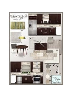
    Putting together a kitchen color palette can be challenging!
    Here is a great article that might help: Kitchen
    Color Palette