Software
Houzz Logo Print
slaurajones

Understanding LRV?

11 years ago
(I'm moving this to the design dilemma forum, not sure best place)

I've been searching for a paint color to work with the slightly lightened BM Urban Nature in my dining room. Good folks here suggested Coastal Fog and Paris Rain, which I originally thought was too dark but now I think my be in the right range and are definitely contenders.

So now I'm wondering if I should be looking at the LRV when considering colors? We are going from very very dark colors so I think we've swung to far looking at light colors. I"m looking for a greigy/warm gray colors. I'd love to understand a bit more about the LRV. Does it help you understand how saturated a color looks, as in, not washed out? For example, we have Revere Pewter up as a sample, and it just looks a bit washed out.

We live in MN so spend a lot of time with artificial lighting and the room doesn't get tons of natural light. We want something that has some depth but doesn't feel heavy. Thanks for any input on narrowing the field! In addition to Coastal Fog and Paris Rain, I'm now curious about: Thunder, Shale, Winterwood, Cumulous Cloud, Stone Hearth, Horizon Gray and Senora Gray, Old Soul

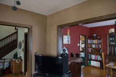
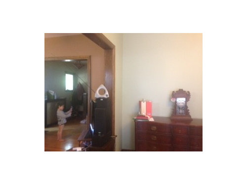
This is not a great photo. The green looks washed out here, but it's Urban Nature lightened by about 25%. It looked very close to Croquet LRV 45 when I swatched on the wall. We live in MN so spend a lot of time in the darkness of winter. I'm looking for something that has depth but isn't heavy. The current coffee brown feels like a total trap for light, the room always feels too dark.

Thanks again, this forum is worth it's weight in gold (interior paint?)! :)

Comments (11)

  • 11 years ago

    That is all very helpful, thanks so much. Why do you think the Revere Pewter and Grant Beige are looking washed out to me?


  • 11 years ago

    It could be a result of the contrasting colors surrounding the samples. Did you tape up paper color sheets, or did you paint swatches on the walls? It might seem like overkill, but I always prime the walls even if I am painting a test sample. I prefer BM primer, too, because it is a pure white instead of a blue white, like Valspar. I like to make sure I'm getting the true color. Revere Pewter and Grant Beige are so similar to each other that they could be canceling each other out. I'm guessing it's either that, or the wall color that you've sampled over is washing them out.

    I've been checking out some Sherwin-Williams beiges lately, as I think the BM beiges are lacking. Take a look at SW 6148 Wool Skein, SW 6149 Relaxed Khaki, and SW 6155 Rice Grain. I think these colors have more depth than the BM beiges.

  • 11 years ago

    Yes, it's probably b/c we painted right on the walls. I do have the colors on large white board, but still find it hard to visualize on the walls. I'll put up some white paint...I have BM Aura Pure White or Simple White, can't remember. Uggh...I'm sure SW has some great colors but I'm afraid to open up a new can of worms!!

  • 11 years ago

    Ok, another question: our lv is tucked in between our foyer and dining room. Of the three, the LR actually has the least natural light due to a tree outside 3 season porch. So, it seems natural to me that the color of the LR would be slightly deeper/darker than the dining room and foyer? Not sure this makes sense, but it def has more of a cozy corner feel. I don't want it to be so so dark, but also feel like it might be a bit odd to be lighter than two surrounding colors. Interested to hear thoughts on that. It's not a larger space and is framed by the dining room. I can show some pictures from before I painted dining room the lightened Urban Nature.


  • 11 years ago

    The old kahki color of the foyer is going to stay for a while (orig to house) and the dining room has been changed to lightened Urban Nature.

  • 11 years ago

    I understand what you're saying about the room being tucked between two other rooms. Senora Gray could actually be perfect if you want to retain that cozy feeling. I also like Inner Balance 1522 and Embassy Green 1523 with the lightened Urban Nature!

    slaurajones thanked Kate L
  • 11 years ago
    For anyone who wants to learn more about color (hue family, hue bias, chroma, LRV, etc., thelandofcolor.com blog is excellent. You will learn how to use the color notations to understand the color you are looking at.
  • 11 years ago

    Great, thanks so much! And a final question for the more stylistically inclined: I've been looking at the greigy colors b/c it feels like a pretty safe compliment to the green. But my husband is kind of interested in something that feels like a color. IF I were to consider a color ibtw the urban nature and kahki walls in the foyer (don't know color, orig to house) w/o a greyed blue be an option, or would that just be too much going on? Just considering options. Thanks again!

  • 11 years ago

    Again, the LR walls basically frame the dining room.

  • 10 years ago

    I would like to suggest some great alternatives that are Sherwinn Williams beiges; please look at Balanced Beige, Loggia, Shiitake, and Urban Putty. These are great neutrals-some are just a tiny bit lighter and some are just a tiny bit darker than 50 LRV.