Software
Houzz Logo Print
anne_walker188

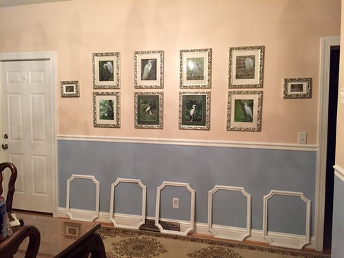
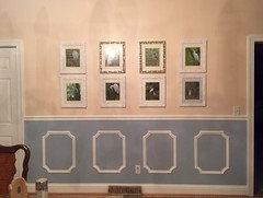
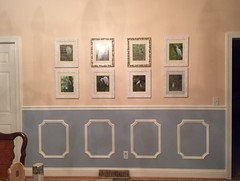
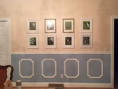
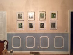
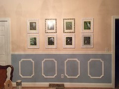
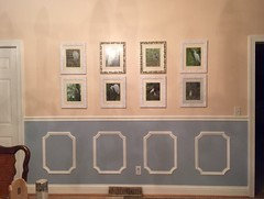
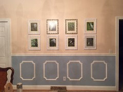
Will Putting these panel frames up below these pictures be too much?

11 years ago
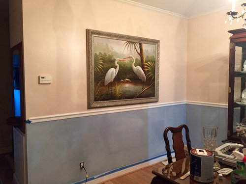
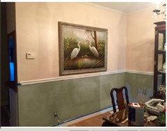
I have repainted the dining room walls. The pictures are of local birds I took myself. Do you think adding the white frames will be too busy? The large painting on the perpendicular wall is going to be moved higher. Thank you for your help:)

Comments (30)

  • 11 years ago

    As long as you're going to put up only 5, the white framework will be a big improvement and up-dating of the photo array. Decide if you're going to use all matted or unmated configurations. Consistency will look best. Not too happy with the frames you've got; they don't seem to go with the white frames you want to use. Consider replacing the actual frames with white. I can't see another color working as well.

    Move the 2 little oblong photos on the side to another location. They may be attractive photos that you like, but they don't work in this location.

    This will be a stunning look when you're done.


    AE Walker thanked inkwitch
  • 11 years ago

    HI -- If your putting those on the lower half then that lower half should be one color , frames , rail and all . I hope you are also doing the same frames on the other wall too, the one under the bigger picture . Sorry, I know you just painted but I am not a fan of all those colors . Too many colors for one room. Just too much going on .

    AE Walker thanked lefty47
  • 11 years ago
    Thank you, Inkwitch for your insight. Visualizing your suggestions made me realize you are exactly right. That large painting on the perpendicular wall, should I paint its frame white as well? I am going to make a long shelf using ornate wooden corbels underneath that painting that I wanted to paint white. Thanks again:)
  • 11 years ago
    Hi Lefty 47- thanks for your thoughts. So the bottom half wall should be white instead of the blue-grey? I'm not set on the blue-grey, it was some paint I had from another room and Wanted to use it.
  • 11 years ago

    It's so much fun to frame your own shots. I wouldn't put any picture below the chair rail. I might be misunderstanding what you are saying though. I agree on moving the little tiny pictures some where else. I can't decide on the blue.

    AE Walker thanked michelesample
  • 11 years ago

    You have beautiful photos. I would do as lefty suggests, paint the bottom of the wall white. Then I would reframe and re matt Your photos. Use all white frames with a thin black or dark brown wood frame. Your large art I would stain the frame a rich dark brown. And I also agree you should take out the two smaller photos. You are going to have a beautiful room to show off your photography.

    AE Walker thanked Jean Benelli
  • 11 years ago

    Painting the lower section (below the molding) white would be less "busy" and classier than the 2-tone scheme. Pink (apricot?) and gray (blue? It looks blue in the photos.) are not the best combination in these specific shades.

    I would not paint the frame of the large painting just yet. In this instance, the frame compliments the painting. I'm not sure painting it white would improve it, and it doesn't have to match the other framing. It does need to be raised about 2 inches.

    Unless the shelf has a real purpose (substituting for a buffet, for instance), I would not put it up there. You have rather formal furniture; a white shelf sounds more "cottage" and unless you plan on changing your style (by painting the cabinet, which I would not advise), it won't fit. If you were going to stain it to match the furniture, it might work, but it sounds like a "gilding the lily" addition.

    I had another thought about those 5 photos - putting them in plain glass without frames inside those white frames might be interesting, but it is a more "modern" look, so before you commit to something like that, consider if it fits your style.


    AE Walker thanked inkwitch
  • 11 years ago

    I would change the bottom color. NOT white. Here is from the Sherwin Williams color changer. This color is Palm Leaf ( I think- lost it while 'playing'). It enhances the frame on your large painting but still lets you use your white frames on your photos. NOT too much white in the room and then a more elegant compliment to your furniture.


  • 11 years ago
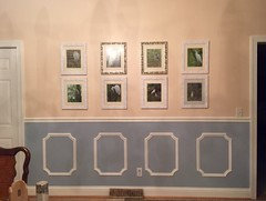
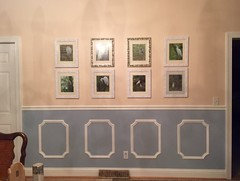
    Diane,thank you so much for suggesting that green shade for the lower half. It is gorgeous And I love it! When i get a chance i will be painting it. I did paint some of the frames white and now it's very apparent the look is cottage, which is not what I wanted. The blu-grey wasnt right but the green is:) i also used only 4 of the decorative frames on the bottom because the electrical outlet got in the way. Thanks, anne
  • 11 years ago
    Here is the pic that was to go on the previous comment.
  • 11 years ago
    Here is the pic that was to go on the previous comment.
  • 11 years ago
    The photo i forgot to attach.
  • 11 years ago
    The photo i forgot to attach.
  • 11 years ago
    The photo i forgot to attach.
  • 11 years ago
    The photo i forgot to attach.
  • 11 years ago
    The photo i forgot to attach.
  • 11 years ago
    The photo i forgot to attach.
  • 11 years ago
    The new photo
  • 11 years ago

    Do not paint the frames white, they will lose all definition. Changing the two darker mats to the same color as the others and hanging them closer together side by side will enhance your gallery wall. Move the two smaller ones to another wall.

    AE Walker thanked babbs50
  • 11 years ago

    Three inches apart would be more eye appealing.


    AE Walker thanked babbs50
  • 11 years ago

    Anne, happy you liked the green! I thought it really brought out the color in the painting and complimented your peachy color. Have fun.

  • 11 years ago
    I would ditch the chair rail, take it off and paint the room all one color. You have low ceilings and it makes the room feel closed in. If you want a very pale blue, put it on the ceiling as your 5th wall. I agree al the frames should be the same.
    AE Walker thanked gtcircus
  • 11 years ago
    And whatever is below the chair rail, has to go. I get dizzy looking at it all. You have beautiful photographs and that should be the focus. I do like the green if you keep the chair rail. But loose the white frames below the chair rail. When the were used, the proper color combination was one shade darker on the trim piece and two shades darker on the space inside the trim piece. It is suppose to have a 3 dimensional quality to it - to make it look like wainscoating.
    AE Walker thanked gtcircus
  • 11 years ago

    I agree with above in that you need to paint the bottom a warm white that isn't glaring. Also, I am no art critic nor a photographer but since you have so many prints I would have them reprinted and then cropped so that each bird was in the center of the picture There is such contrast that the birds all together make for a jumpy nervous display. I would frame them in a narrow plain rubbed metal finish that matches the chandelier in the room. Then for fun I would find a green frond fabric in similar colors to print background and upholster the chairs.

    I would also consider making the one large print the first thing you see when you enter the room and then the photos on a less obvious wall as a counter point to the large print. Large print should be 65 inches at center of wall for height.

    AE Walker thanked Susan Davis
  • 11 years ago

    Hey, I thought you were going to put the pictures in the frames. Did not get that you were mounting the white trim on the lower section. Love the suggestion of green lower half. That looks very classy. Do not like the trim frames in the lower section - the comment about it being "dated" was apt. However, all the photo frames should match (as I'm sure you know). Once you paint the lower part green (assuming you do), it's going to come together in a way the blue doesn't. Wait for it.

    AE Walker thanked inkwitch
  • 11 years ago

    Why don't you do a poll and ask "with" or "without" for the panel frames on the lower wall?

    Sorry but they look like a cheap imitation of something that was once an expensive feature from days gone by.

    AE Walker thanked leelee
  • 11 years ago

    Maybe three horizontally and paint them out the white or the green to lower the contrast; there is already enough contrast in the room as it is!

    AE Walker thanked Susan Davis
  • 11 years ago

    In my opinion, you should paint the bottom white (below the railing), remove the frames that you placed below (they are very dated). Try selecting a frame color other than white (it looks washed out on the peach paint color. I would select a frame that is probably similar to the one of the larger artwork -- unless you are open to painting over the peach wall with another color. Best of luck!


    AE Walker thanked rcarterworld
  • 11 years ago

    Another option, how about only showcasing a few of your photos (like maybe only 3) on that wall and blow the photos up to be larger? Every so often you can "switch them out" if you wish to another photo. I think having 12 frames on that wall that is not very tall to be a bit distracting. However, I'm sure fellow houzzers can offer some great suggestions for you!


    AE Walker thanked rcarterworld