

The Old Convent
13 years ago
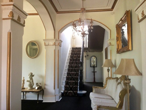
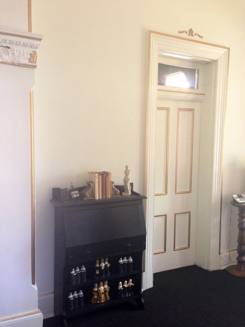
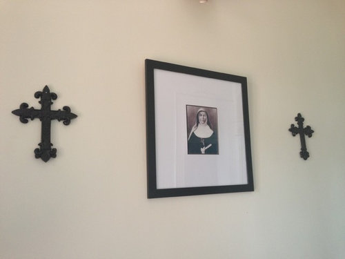
Sort by:Oldest
Comments (4)

Related Stories

ARCHITECTURE8 Modern Hamptons Homes Buck Convention
Defying the overblown architecture popular in this affluent Long Island area, these modern residences take a more modest approach
Full Story

MOST POPULARHouzz Tour: A Playful Home Drawn Up by 8-Year-Old Twins
Plans for this innovative tower home in Melbourne were going nowhere — until the homeowners’ twins came to the rescue
Full Story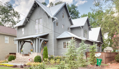
FARMHOUSESHouzz Tour: Some Old Tricks for a New Atlanta Farmhouse
A ‘pretend story’ helped this builder create a new farmhouse that feels like it was added onto over several generations
Full Story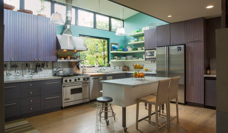
HOUZZ TOURSMy Houzz: 2 Old Cottages Become 1 Cool, Colorful Home
A central entry unites 2 small houses, creating a home with an open living area, private bedrooms and eclectic decor
Full Story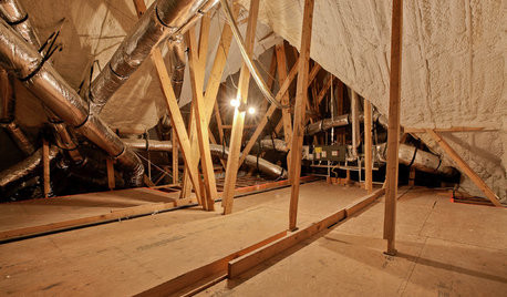
GREEN BUILDINGEcofriendly Cool: Insulate With Wool, Cork, Old Denim and More
Learn about the pros and cons of healthier alternatives to fiberglass and foam, and when to consider an insulation switch
Full Story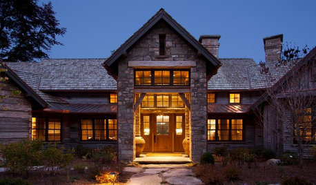
RUSTIC STYLEOld Southern Highlands Style for a New North Carolina Retreat
Antique woods add a sense of history to a gracious part-time home in the Blue Ridge Mountains
Full Story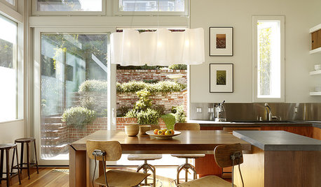
FURNITURESurprisingly Versatile: Old-School Stools
Pull Up a Vintage Stool to Any of These Styles
Full Story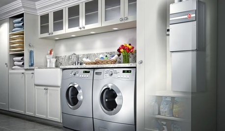
GREAT HOME PROJECTSHow to Switch to a Tankless Water Heater
New project for a new year: Swap your conventional heater for an energy-saving model — and don’t be fooled by misinformation
Full Story
Beth Leasure-Hudson
michigammemom
Related Professionals
Dayton Interior Designers & Decorators · Kankakee Interior Designers & Decorators · Pittsburgh Interior Designers & Decorators · Guymon Interior Designers & Decorators · Idaho Falls Interior Designers & Decorators · Waycross Architects & Building Designers · Emporia Architects & Building Designers · Corpus Christi Architects & Building Designers · Branson Kitchen & Bathroom Designers · Meridian Kitchen & Bathroom Designers · Worcester Kitchen & Bathroom Designers · Providence Kitchen & Bathroom Designers · Wausau Kitchen & Bathroom Designers · San Bernardino Kitchen & Bathroom Designers · Sanford Kitchen & Bathroom DesignersPLATEMARK DESIGN
merrillydelight