Software
Houzz Logo Print
joemaaried

entrance way detail

13 years ago
Hi all

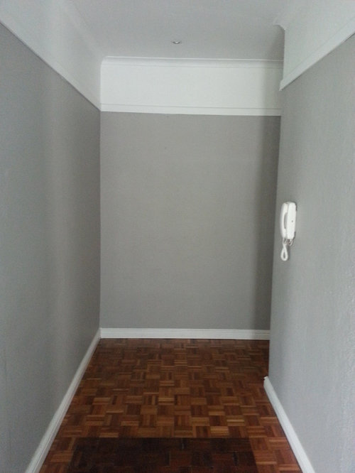
As you can see my entrance way is pretty dull, the photo is the view you will get as soon as you walk in the front door. id like to know what i can add to make it look more appealing, baring in mind that i have just painted it the grey color that it is now?

Comments (58)

  • 13 years ago
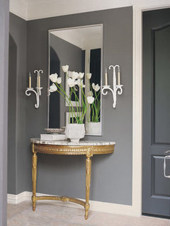
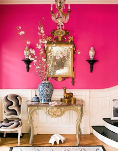
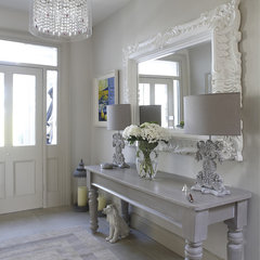
    I saw the perfect idea~ Small demi lune table, a big mirror to reflect some light around or a fabulous colorful painting, and some great wall sconces or wall vases. http://www.decorpad.com/photo.htm?photoId=12379
  • 13 years ago
    Tracey, i had a look at the link and i think its perfect too, definitely something i will look into. thank you
  • 13 years ago
    Demilune entry
  • 13 years ago
    The phone is there for the convenience of Jeeves. We can't have him straying from his post.
  • PRO
    13 years ago
    Entry ways are such perfect spots for humour and fun, this is the first area a visitor sees when they arrive and can really set the tone of the visit. Have the basics covered as others have mentioned, a place for keys and such, somewhere to hang a hat, a chair or stool for putting on shoes, depending on how much room you have. It's such a small space but has potential for big impact. What's your style?
  • 13 years ago
    Susan, I could lost for days in your image library.
  • PRO
    13 years ago
    Me too! Manon I am taking an art course this week, and loving it!
  • PRO
    13 years ago
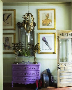
    Pink wall or purple console Manon, which one is you?
  • PRO
    13 years ago
    Tracy's suggestion works well, the grey is a great color and very current, you obviously like the grey so this option is an easy way to dress things up. The jewel tone table and the mirror to open up the space works great. Definitely adding some scones or a great hanging light fixture would help brighten the space and add more interest. Layering prices like this in small space is tricky, keep the pieces fresh, uncomplicated and sophisticated ,
    Good luck
  • 13 years ago
    the phone is there for the intercom. I want to remove it and place it somewhere else. don't like it in the entrance way
  • PRO
    13 years ago
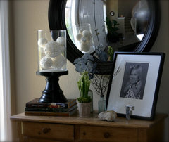
    Susan is correct that the entry way introduces your guests to you and your family. I love a small vignette that can tell a story about family, collections, etc. Nice thing is, it doesn't require much space to give a clue as to your taste and what is important to you.

    Entry way · More Info
  • 13 years ago
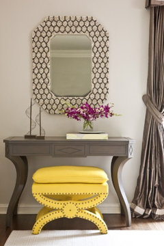
    Here's another idea that features sunny yellow. I like that the yellow kind of tickles the serious grey in the ribs and keeps it from being too serious. Perhaps something like this would work against the long wall. A personal vignettet, as recommended by Karen, will make it meaningful.

    I would like to mention that Feng Shui advises against putting a mirror directly opposite the front door. It is believed that it pushes all of the fresh incoming chi right back out. That may be something to consider.

    Susan, I think I have to choose the pink wall. It'll be perfect with my pink cha-cha shoes!
  • PRO
    13 years ago
    as i judge from the wood flooring there is likely 3.5 feet in the hallway once it turns to the right ...is that about it?
  • PRO
    13 years ago
    a great many wonderful ideas but my concern is that furniture is not the answer as the width of the hall likely wondt allow ....what is the dimension....or have they been given earlier....i'll check
  • 13 years ago
    last modified: 13 years ago
    Imagine coming home and having 6 inches in which to pass that hulking, non-returnable hall table. Ask me, I know! Use paint or relatively flat decore. Maybe a 4 inch shelf for keys and wallet, a floor covering that indicates the path to the open rooms. Use color indicating what is to come.
  • PRO
    13 years ago
    did that happen to you Joe
  • PRO
    13 years ago
    last modified: 13 years ago
    Yes, I also figure it is about 3'5". That's why if anything is put into place, it needs to be quite slim and not so wide as some of the suggestions made. Manon makes a point regarding Feng Shui regarding the mirror facing the front door. Feng Shui has a lot of good sense behind it. This mirror could cause a glare and will obfuscate the purpose of the mirror. I would suggest an adjustable gimbal in the existing recessed light and hang a sizable piece of art that runs vertically. Also, I might add if you have other recessed lights in the area, you will need to run a separate line and put that one on a dimmer.
  • 13 years ago
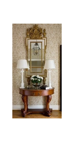
    Console Table Detail · More Info
  • 13 years ago
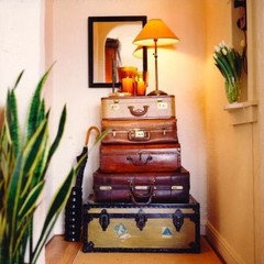
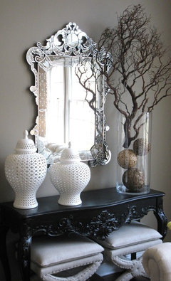
    Hall · More Info
  • PRO
    13 years ago
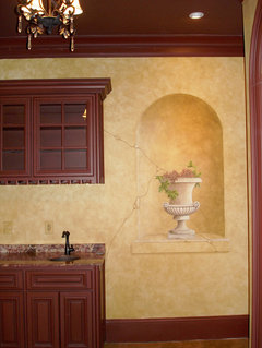
    not really my 'thing' to suggest "decoratie' things however this space could actually be a space where appling art to the surface of the wall makes sense......this seems to be a space from early in the last century, maybe the thirties ......if would be really cool to introduce niches painted on the two walls. One before youo as you walk in and two to your left
  • PRO
    13 years ago
    Chateau Wine Cellar · More Info


    I woiuld never do this! however it's thte idea, I would do a more architectural style like a modling
  • PRO
    13 years ago
    a local art school might be a place to start to find an artist
  • PRO
    13 years ago
    Gary, that's a perfect idea. So lighted niches can be placed in the side walls and an actual art wall can occur on the end wall. This could be a perfect opportunity for a miniature art gallery. Brilliant....and so in keeping with the era.
  • PRO
    13 years ago
    NO NO NO NO................................the concept must have been lost in translation....THREE EQUAL SIZE motifs......boob boom boom.....two on the left and one on the facing wall.....with variations on the theme ......the beauty here is that they are mostly the same. Repeating the theme, with only the same size shape color niche......then maybe a large jar is in each niche (and the jars are each a bit unique)
  • PRO
    13 years ago
    i'm projecting that the change in color of the wood floor is from a 3 x 5 rug at the front door.....so two on the left (hopeing the door swings to the left......so just beyond where the door is as it is open.....boom boom then 90 degree corner to the facing wall and boom .....we're done!
  • 13 years ago
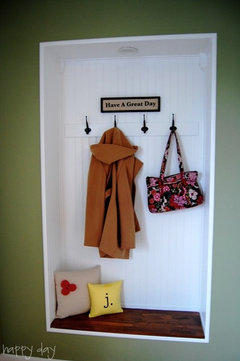
    Interesting idea. Space could be carved out between the studs to accommodate the niche. The ledge could include a sill that protrudes a bit to serve as a landing for keys and what not. I would recommend a skilled trades person for this job, unless you're a pretty advanced DIY type with the appropriate tools.
  • PRO
    13 years ago
    Manon, there could be issues with the wall condition with the age of this space who knows what is behind the plaster
  • PRO
    13 years ago
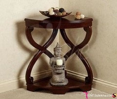
    How about a corner table?
  • 13 years ago
    I misunderstood, Gary. I see now that you were suggesting faux niches not actual ones.

    Yes, whenever walls are opened, the proverbial can of worms may await you. If it were something Joe were interested in pursuing, I'd highly recommend a skilled trades person familiar with the architecture and building materials of the era.

    What's appealing about the concept is that floor space would be saved because there would be no need for a stand alone console.
  • PRO
    13 years ago
    I understand, but my thought is there may be more room to the side of the door (not pictured) or a console may be used around the corner where there is room.....I'm just not into changing the space to commodate handing items....there is likely a closet either out of view or around the corner.....I'm really hopin for a great deal around that corner aren't I ?

    lol
  • PRO
    13 years ago
    Oh my Gary, did we have a little Freudian slip there? I think the niches are a great idea nonetheless.
  • PRO
    13 years ago
    OHHHH what did I say ..? must have missed it
  • 13 years ago
    "boob boom boom"
  • 13 years ago
    I like the Black and white Ideas from Tracy Taylor!
  • PRO
    13 years ago
    Gallery walls are a classic, yet modern look. Mingle vintage art and old architectural details, with family photos for a one of a kind display.

    www.GraceArchives.etsy.com
  • PRO
    13 years ago
    Good catch Maureen! :)
  • 13 years ago
    I would paint the top part of the wall gray as well and keep the molding piece below the ceiling white. The top portion that is white makes the walls look really short. Definitely put something fabulous on the wall before you turn the corner into a different room. Add a long rug running the length of the hall.
  • PRO
    13 years ago
    Karen.....I got it ...better be careful hadnt I
  • PRO
    13 years ago
    You were just coming off all caps. That can be very tricky! :)
  • PRO
    13 years ago
    So Gary, to further pursue your niches. If you can't do the real ones, then if you were thinking of a trompe l'oeil, then you would be able to only address the back wall to fool the eye. As you know, these need to be viewed head on (from the front door). So the side walls will loose their fun and mystery when 3-D disappears. I do love this idea and I'm also very enthused about making the hall into a miniature art gallery. The texture/color that comes from a long runner as Christine has suggested is imperative. The treatment of the upper area (currently in white) should be rethought as well. Until we are provided with photos of what's around the corner and a view in the opposite direction of the front door, this remains a "crap shoot", as it were.
  • PRO
    13 years ago
    the two images that would be on the side wall will be viewed as one walks for the area beyond the corned.....the trompe l'oeil is all in fun and not ever to be talken seriously to really fool the eye, so I have no 3-D issues with the way using urns in niche's will play out for these two walls.....most anytime trompe l'oeil would be used there is some angels that are better than others....
  • PRO
    13 years ago
    The pictures I posted are for ideas as to how interesting the space can be, of course the width and depth of everything placed here has to be taken into consideration. Interesting collections of prints, paintings, small shelves, narrow tables all can be incorporated once a sense of style has been decided. For that we need guidance from the homeowner.
  • 13 years ago
    last modified: 13 years ago
    :D anyone considered the need for storing coats, shoes, keys and hats? A large mirror? It's an entry after all.
  • 13 years ago
    and a chair to sit down and put your shoes on
  • 13 years ago
    Some coat hangers and wall art or pictures.
  • 13 years ago
    last modified: 13 years ago
    Is this gentleman in southern Florida or Southern California? If so, he does not need a coat rack nor a hat rack. If in SoCal, skip the umbrella rack, too. Also, if in Southern California, you don't need a mud room.
  • 13 years ago
    South Africa, just checked :)
  • 13 years ago
    Simple beginning would be a mirror. Can't tell how much room there is to walk through. A table would be great under the mirror, if not enough room a lovely shelf.
  • 13 years ago
    i love the grey walls with the wood floors.
    swap the phone out for a black vintage looking wall phone if you need to keep one there.
    http://www.brookstone.com/crosley-302-wall-phone?bkeid=compare|mercent|googlebaseads|search&mr:trackingCode=83811FBC-B12D-E211-BFCC-001B21A69EB0&mr:referralID=NA&mr:adType=pla&mr:ad=6403226004&mr:keyword=&mr:match=&mr:filter=20101249044&gclid=CIf3gI65lLUCFQfhQgodGz4Afg

    a simple mirror is all you need to brighten the dark hallway up. keep it simple in clean. i think it's too dark to add tables and "stuff" to the area.

    here's one from ikea for $40 that will look really good and keep up with fresh look of your hall.
    http://www.ikea.com/us/en/catalog/products/40047883/

    post a photo when you're finished!