Software
Houzz Logo Print
jennla

What can I do to make these 2 color blues work together ?

13 years ago
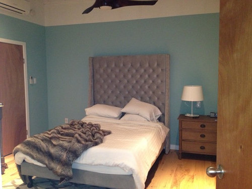
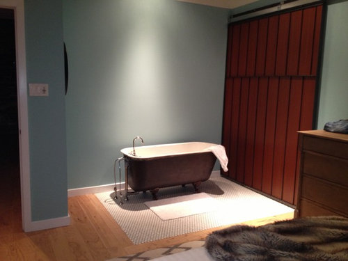
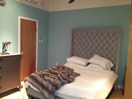
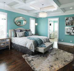
I recently bought this beautiful bed but I also recently moved into this beautiful apartment and the bedroom paint color clashes with the bed. I actually love the paint color and I don't want to repaint. What can i do or
What colors can I add to make these 2 colors look nice together? The walls are a true bright Tiffany blue and the bed is a dull silverish blue velvet. Any suggestions?

Comments (82)

  • PRO
    13 years ago
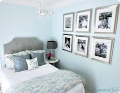
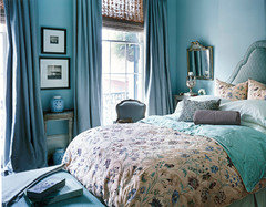
    The two blues are from totally different palettes - meaning two different energies. The reason they don't "go together" is the headboard covers a relatively large area and has created an undesirable focus in the room against the high energy wall color. Every element in the room supports the beautiful clear blue wall color except the headboard which is muddy by comparison. Best solution for a standout room is to reupholster or slipcover the headboard in a "clear" print incorporating the two blues with browns and a white background. Attached are suggestions covering alternate styles. The walls and the room will support a lighter headboard or a more dramatic darker one against the blue wall.
  • 13 years ago
    I loved the blue room by Martha Stewart that ispeakwhale posted. It is very soothing and is a palette that is not often used.
  • PRO
    13 years ago
    Martha Stewart's comment on the blues is that they have an undertone of grey or beige. When working with colors with undertones all major colors need to be in the same undertone scale. Otherwise the scheme is off. In this case the blue walls are rather pure with no undertones but the headboard is distinctly greyed.
  • 13 years ago
    These two colors do not work.
  • PRO
    13 years ago
    I agree Jayme
  • PRO
    13 years ago
    Jayme I agree
  • 13 years ago
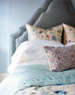
    Your headboard could work with a blue like this
  • 13 years ago
    Jayme's color scheme is similar to Aja's and it is very soothing and would work very well with your beautiful headboard. Not so hard to paint its just the cut- ins that take time. Use a good primer to cover up the bright blue and then a good quality blue paint with grey undertones as suggested by Gloria Jarrod. A good roller with long attachable handle makes quick work of the job. Farrow and Ball, an English company, makes colors that are muted with gray undertones. They will send you a free color chart which you can order online. Thier paints are expensive but very rich looking colors...you could always have them color matched at your favorite paint store.
  • PRO
    13 years ago
    But she LOVES the "true bright tiffany blue" on the walls. and they work well with the dark wood furniture. It all hangs together except the headboard which could be reupholstered in a solid - ultra suede or vinyl - dark navy, medium tan or even white would work - something with the punch of the tone of the furnishings in either a very light or very dark tonal value to create a transition between the tonal values of the walls and furniture.
  • PRO
    13 years ago
    Jayme I love the Farrow and Ball paints. They make it easy because it's a small collection and the colors are all in a similar undertone series. Benjamin Moore and Sherwin Williams have many more palettes so you have to use your "design eye" to isolate the undertone you want.
  • 13 years ago
    Correct me if I'm mistaken,but I think she mentioned twice in the above that she thought she should repaint the bedroom. The headboard is brand new and beautiful. It is the more cost effective and practical solution to repaint rather than reupholster. I agree that BM and SW have a greater selection of color to choose from but sometimes less is more or at least helps someone, who is not used to choosing color, a reference or jumping off point and aids in the decision making process. The F&B paints can also be lightened up a bit with the addition of some white if that's desired.
  • 13 years ago
    last modified: 13 years ago
    I pick what I think looks good together...I seem to be able to tell somehow..many years of painting my homes and making observations..I love the neutrals and soft colors, and like a lot of Ben Moore colors! Oh..and I forgot..learned by making mistakes!!!!!
  • PRO
    13 years ago
    I was going by her comment in the second sentence about loving the wall color and not wanting to repaint.
  • PRO
    13 years ago
    Jayme we all learn that way - by making mistakes. Fortunately paint is not that expensive to correct.
  • 13 years ago
    last modified: 13 years ago
    I am on my way to the paint store as we speak...to hopefully not make a mistake...:) I have a room to do!!!
  • PRO
    13 years ago
    Jayme: I like your comment about walking into a room and finding you feel about it. The story or theme is what it's about. What's your theme and what room are you painting?
  • 13 years ago
    I am painting a very small bedroom/office/t.v. room...small but has a vaulted ceiling. I am going to look into a greyish beige-like color...I am experimenting since we are planning a re-do of our open kitchen, dining, living areas and I want one color throughout! We have the dreaded light-hardwood look laminate that horrifies people nowadays..pergo was here when we moved in and really, with 3 dogs and kids it's fine for now!!! (Although at least ours is not one-tone, it has some variation mixed in)!
  • PRO
    13 years ago
    Since the Pergo dominates the spaces determine the undertone. Match it as closely as you can to a Farrow and Ball paint color. Determine if the floor is a light, medium or dark value. Choose the wall color to vary the tonal value (dark to light). If the floor is light - make the wall color medium, If the floor is medium value lighten the walls and add a darker accent somewhere else. If you send some photos I can be more specific.
  • 13 years ago
    I figured for the main rooms, a lighter to medium...I have been experimenting with samples for some time...not quite ready to paint main area yet. Don't want the color too dark as there is some dark in our brick fireplace and I don't want to accentuate that at all. We are also going to paint our oak cabinets white..again..the dreaded light oak 90's look! Our woodwork will be white, we have vaulted ceilings and I do not want it to get too dark on the walls also not too light. I like a very clean, neutral look with color in the accessories. Thanks.
  • 13 years ago
    last modified: 13 years ago
    You seem to understand color very well , Jayme, based on the comments you have made on various posts. I like the same light colors you do since I find them restful. I like more saturated colors when I see them in other people's homes, but they are personally, hard for me to live with. Painting out
    the oak will make a HUGE difference in updating your home. Good luck. ( you
    may just want to order a free F&B color card, their colors are complex and interesting and there are some soft choices that might be just what you had in mind, more of a European aesthetic)
  • 13 years ago
    Been there. Just paint. It's cheap. If you keep trying to make this work by buying lots of stuff, in the end it still will not work, in my opinion. Then you'll have to paint anyway.
  • PRO
    13 years ago
    Hire a decorator. Do it once and do it right!
  • 13 years ago
    I think you should paint the doors and night stand white, then add pillows and duvet as ohers have suggested above. Its coming together well, Ilike what you have going on in the room so far
  • PRO
    13 years ago
    I think the headboard is beautiful. Your question was how to make the two blue colors work? as in your not wanting to get in the mess of painting right? So, these colors don't got together. But to make them work I think you make a great change trying to cover up the floor. Its to yellow and since your light is also yellow that is what really catches my eye. Try some white fluffy rugs like sheepskin or in a dark rich color like navy blue , violet or charcoal grey. If you do decide to change the colors go ahead and still try to cover up the floor anyways I think it will really bring down all de tones in the room. The yellowness must go!. I see you have a rug but I would try something larger and with no patterns, just go for a solid color and ad some cushions with patterns like the ones they recommend before. Pattern in the bed instead of the floor. I think the nightstand could work because its in the same tones as the wood on the doors. It give the room an eclectic spin. The white stripe around the room also catches my eye and out balances everything. Like I said maybe you don't want to paint the whole room but getting that white off the top will also look a lot better. Try a mid tone grey instead not so dark not so light and just paint the white off. It's not such a hassle as to painting the whole room again.
  • 13 years ago
    I bet if you consulted with a decorator for an hour they would be able to offer suggestions as to how you can marry the wall color and the bed. It's really not as bad as some are suggesting. Before putting in any work painting or shopping have a design professional step into the space and see the colors in real life.

    Good luck and don't give up so easily, lol.
  • 13 years ago
    Thank you aniluap 2. I try to see what looks right and works together even if it's not my style preference...I grew up with very resourceful people, I guess that helped.
  • 13 years ago
    Leave the blue in the tub area & put a greyish color that will match the headboard on the rest of the walls...I guarantee it will look better. No need to hire a designer.
  • 13 years ago
    The colors are fine together. The room need more art, some fun lamps, period nightstands (could be painted to almost match headboard). The bath tub is very cool, except for the wood paneling over the window (?). Quick-paint it white.
  • 13 years ago
    Went to a large retailer today to buy paint for a spare bedroom and have concluded that they offer a lot of weird colors and tones...I swear...I think it's to get people to screw up and come back to buy more!
  • 13 years ago
    Wow lots of ideas. I was hoping more people would say to just add more hues of blue accessories. I'm still not sure if ill paint but in leaning that way. Not to be lazy but my last house had 22 foot walls and I painted every inch. And I DO really like this blue I actuslly told the previous owner to just repaint the same color for me before i moved in; BIG mistake. I don't want to paint the dressers bc they are new and expensive too /although its a good idea. O the ugly paneling btw is really beautiful in person, it's a customer made steel and wood sliding door that leads to the bathroom. So I think I'll hire a professional for color choice and then paint and add artwork. The yellowish floors and dressers could make another mishap if I'm not careful. I was hoping everyone would just have the same magical solution. Design makes my brain hurt. Or maybe it's just this clashing bedroom !
  • PRO
    13 years ago
    Guess you got more than you expected. There is no perfect solution. Just go with what makes the most sense to you and tells "your story".
  • 13 years ago
    last modified: 13 years ago
    Return the headboard.

    It's lacks any interest or design and adds nothing to the bedroom.

    Buy some new bedding.
  • PRO
    13 years ago
    Bravo.
  • 13 years ago
    Here you go! House Beautiful.
  • 13 years ago
    "A Fabulously Feminine New Orleans Home" at housebeautiful.com
  • 13 years ago
    Looking at that picture above,they have definitely made the colors work together. I think now that I relook at the original picture it is the color of the furniture that throws a wrench into the picture. The grey and blue might work if the furniture was darker or lighter but it makes it all clash. Since the furniture is a big investment and you like it change the walls just in the bedroom section as Jayme suggested and leave the bath section as is? It will help visually separate the two spaces and you will still have a pop of your fun Tiffany blue
  • 13 years ago
    Tones of colors are so tricky..what looks great in a pic is not always what we have...such as in this case.
  • PRO
    13 years ago
    last modified: 13 years ago
    Good morning Jenn,
    I haven't had a chance to read all the other comments, so I hope I'm not repeating anything.
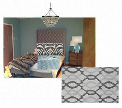
    All you need to do to make the blue and the grey blue work together is find something to tie them together. (Like this area rug I digitally added to your space) This will make everything look "intentional". Also, repeating each colour at least once like I did with the lamp and the blanket will ensure everything looks like it belongs.
    Have fun with your adorable room and please post "after" pictures!
    I hope this helps!
    Caroline
  • 13 years ago
    Thanks..but it's not my space...appreciate the thought though!
  • 13 years ago
    last modified: 13 years ago
    Not a designer, but what about a wallpaper on the wall behind the headboard? Perhaps then the headboard (that is new and that the owner loves) won't be right against the Tiffany blue (that the owner loves) and might then work? Wallpaper is less expensive than new flooring and new furniture and might help to marry some of the colors. Again, I am not a designer so I am very interested to see what those of you who are think of the wallpaper idea? Would love to learn if/if not this would work.
  • 13 years ago
    The colors are actually pretty in sync. My advice would be to paint the brown wood doors white or glossy black. Spread the bed keeping the white duvet you have there but folding the fur throw nicely down at the bottom of the bed and then adding some oversized pillows and a small bolster for the bed in a third color. Then consider a large area rug for under the bed (something in a trellis pattern in a gray that matches the headboard and bring some uniformity to the bed by putting in a second nightstand and then you need the scale to match so I would find 2 much taller lamps that are in a bolder shape to go on the bedside tables. Since you have a mitsubishi ac, you should get rid of the ceiling fan and drop a crystal chandelier over the bed.

    As for the bathroom area, you need to glam it up. Get a small white leather or white linen slipper chair and put a large basket of towels in the room. Warm it up by having another basket filled with books and magazines. Get a console table (in lucite) to put some decanters and lotions and cottonballs in a jar on it. Those types of things. Then pick out some re-positionable wall paper and jazz up the panels of that wood wall. Get a large italianate mirror and put that over the long wall where the tub is and then put a large fluffly area rug by the tub. and maybe you want to add a touch of kitch and by a dress dummy to hang your robe on or go to restoration hardware and get some chrome and glass hooks. Then the whole place needs art.
  • 13 years ago
    last modified: 13 years ago
    Whether you paint or not, change the headboard, etc., I would consider painting the doors in your bedroom white or staining them to match the beautiful sliding door on the bathroom. From the pictures it seems that, in addition to the two blues, you have a lot of different wood tones competing with one another.
    I think your room has great potential--you're almost there! Lots of good advice has been given and I will just bet that you will find the way to make everything work together. Good luck!
  • PRO
    13 years ago
    Jayme: sorry about your experience at the paint store. I used to teach interior design and because I know how overwhelming it can be looking at all those shades and tints I am currently writing a book about color in interior design. There is a definite order to the organization of a paint companies color chips and once you are aware of it you can match it to your mood or theme. But first you have to determine your theme or "story". Want to play with it? I can help
  • 13 years ago
    Thank you Gloria! So sweet of you to offer!! What I found at this particular store yest. was that much of the marketing was aimed at somewhat trendy colors...there were a lot of lovely colors..but I had to work to find what I wanted....to the average person, this can be difficult. I did get the shade I wanted..and it looks nice, and I am pleased. Your book sounds wonderful!!
  • PRO
    13 years ago
    So glad it came out well. You seem pretty sure of what pleases you and that's the most important thing.
  • PRO
    13 years ago
    What color(s) did you decide on?
  • 13 years ago
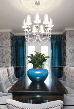
    I think that this is the sort of color problem that is really hard to do via computer screen. The cheapest solution is paint. Trying to find the right linens etc. is going to be hit or miss, but you might just do it. Do paint the bedroom door white though. I think your headboard is beautiful and should not be covered up. I see exactly how you got into this predicament. Changing the floor color is not an option, finding the right rug is an expensive option. Maybe you could glaze over this color with a metallic silver??? That might be easier than repainting the base color. When I look at the examples below, I think the answer is adding silver and white in the right doses.

    [houzz=
    Master Bedroom #1 · More Info
    ]

    [houzz=
    Sask Cres Dining Room · More Info
    ]
  • 6 years ago

    Jenna ~ I read your request for help to pull 2 shades of blue together & all 81 comments with a variety of suggestions. I was about to suggest painting only the wall behind the headboard in Navy blue, but realized this all happened in 2013. I am disappointed you didn't post photos of what you finally did with that beautiful room. If you posted, where?