Software
Houzz Logo Print
mene72

The Perfect Gray Against an Aqua Couch

11 years ago
last modified: 11 years ago
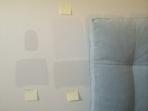
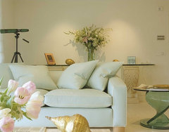
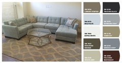
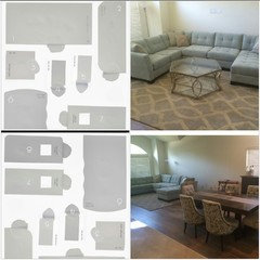
Hi! Can anyone offer some suggestions/advice for a very neutral, lightening, clean, cool, barely-there gray that would work in a north facing room with my aqua/seafoam sectional? Many I've tried are picking up too much blue, purple or khaki, green and look drab/murky. The closest compliment is Farrow & Ball's Strong White but it's just slightly too light. Would you darken it? Does that work? Any advice would be great/ thx!

Comments (54)

  • 11 years ago

    Wow! Super helpful- huge difference! Thank you :) All great suggestions- which do you like best? I'll def revisit BM colors and check these out as I know they have a great selection of gray - I had only tried 2- Horizon and Paper White and they both pulled too much blue. What program did you use to add the color btw? Really do need to see larger swatches to at least determine which undertones are going to work best- thx again! :)

  • 11 years ago
    last modified: 11 years ago
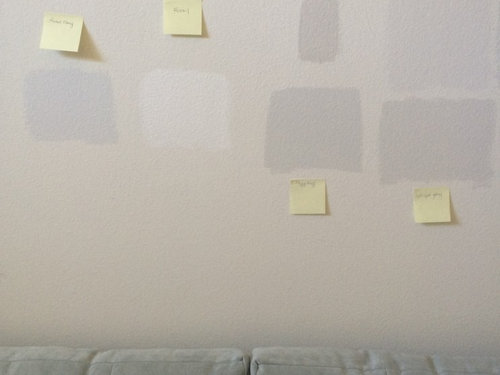
    BM has a color visualizer that you can upload photo and add paint. OF all the photos (which are never as on wall) I like skipping stone for more contrast, but for tying the rug in I like Chateau, but it is darker. Penthouse does have some blue.

  • 11 years ago

    Oh, so cool to know about the visualizer- and funny, I totally agree and think Skipping Stone is my #1. With the couch, I think I have to stay away from anything with any blue - it's too tough to get that contrast otherwise. Thanks again- so appreciate it! Hope to be able to neutralize and balance a lot of these colors I chose which I loved with a lot of white accents and trim work.

  • 11 years ago

    Be sure to get sample and put it on wall for test drive :>)

    mene72 thanked susan2494
  • 11 years ago

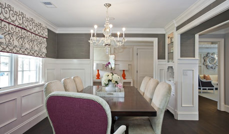
    I very much agree with Maureen about working with the color from your rug. I think it will tie in especially well with your lovely dining room chairs. You can always go a few shades lighter if you want.

    mene72 thanked katinparadise
  • 11 years ago
    last modified: 11 years ago
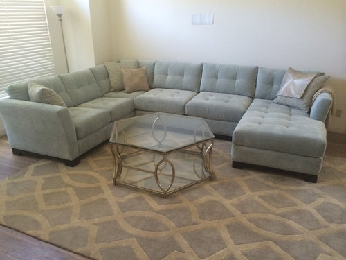
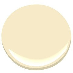
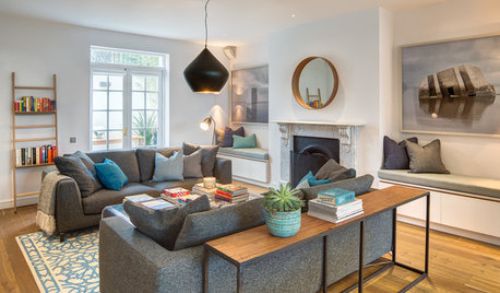
    I might look to your rug's cream - maybe something like BM Windham Cream. Again, you will have to test out a lot of creams to get it right. Good luck.

    Living room · More Info

    mene72 thanked Maureen
  • 11 years ago

    You beat me to it Maureen :))


    Living room · More Info

    mene72 thanked Geneviève
  • 11 years ago

    I think that this is very similar


    Fernwood Green 2145-40 by Benjamin Moore · More Info

  • PRO
    mene72 thanked Mae Day Organizing and Interior Design
  • 11 years ago


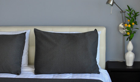
    Tait Coastal Pillow Aqua Yellow · More Info

  • PRO
    11 years ago

    Sorry to say that a photo displayed on a computer to choose wall colour does not appear the same depending on the kind of screen or computer..it is a risky way to do it !

    mene72 thanked Studio NOO Design
  • 11 years ago
    last modified: 11 years ago
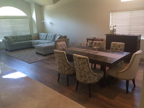
    @Genevieve - funny! I was leaning more towards softer shades - a hint more of creamy yellow. It's so personal...how color speaks to us - lol. Any of the art examples in Mae's posting would also be really complimentary.

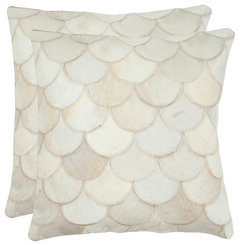
    Elena Pillows, Set of 2 · More Info

    mene72 thanked Maureen
  • 11 years ago
    Picture these colours with your sofa . Purchase a few samples and paint sheets of Bristol board use them as a guide .

    http://www.art.com/products/p17721890305-sa-i6883755/karen-lorena-parker-aqua-light.htm?sOrig=CAT&sOrigID=1822&dimVals=1822&ui=F6A43C5F7DCA4050B9E10A1561635D06

  • 11 years ago
    None of the grays seems to be working for you ,venture a bit and instead of all pastels consider something a little darker for background .

    mene72 thanked Geneviève
  • 11 years ago

    Watercolor Hand-Knotted Ocean Rug, Aqua and Navy, 5'x7' · More Info

  • 11 years ago

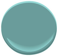
    Azure Water 677 Paint · More Info

  • 11 years ago

    Capri Blue Crystal Table Lamp MADE WITH SWAROVSKI® ELEMENTS · More Info

  • 11 years ago

    Heidi Jennings "Blue Lagoon" Aqua Navy Pillow Case, Standard, 30"x20" · More Info

  • 11 years ago
    That's so cool to hear bc DE paints are def not even close to being true to their chips, it's actually more like a guessing game! Thx for the suggestions and glad you're super happy with finally finding yours! I just don't want to settle for close enough :(

  • 11 years ago
    last modified: 11 years ago
    and actually funny enough, Behr's Irish Mist has the only suggested color palette I've seen thus far that's included an almost spot-on replica of my seafoam couch color so I'm hopeful that I'm not crazy to try and combine these two! ha

  • 11 years ago
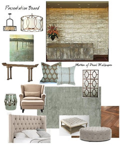
    this is actually my "wish board" of how everything will hopefully all come together- if I can jst find a decent paint then my next project is narrowing down mirrors, art and end tables- does this ever end?? LOL

  • 11 years ago
    Mene - no, it does not, lol! Now that I see your wish board (how did you make that, btw?), I'm going all in on my recommendation of Irish Mist. I can't tell you how much I love it - it's just a hint or blush of color and will be perfect for the look you're going for!

    mene72 thanked hapagrrl
  • 11 years ago
    mene - actually, it's not green at all, it's an incredibly light greige. Don't believe the what your computer shows you - go get a sample and see for yourself, then you'll know what I mean
  • 11 years ago
    Thx so much again for the rec! Can't wait to try it and love the endorsement of Irish Mist! Since getting our house, I've lived on copying the images I want, dropping them into a Power Point slide page, arranging, cropping and removing bkrounds then saving maybe just one slide page as a desktop JPEG for reference or taking a screen shot and saving the image that way in case anything gets cut off- SUPER helpful when trying to narrow down all these options!!
  • 11 years ago
    I do the same think with Power Point! Plus it's nice to be able to pull I. pics of exact accent pieces to see how you like them before purchasing, how colors and fabrics work together, etc. I love your board!
    mene72 thanked Karen Carter
  • 11 years ago

    Mene - that is brilliant and I am SO doing that!!

  • 11 years ago
    Maybe BM silver satin
    mene72 thanked Mazal Abayev
  • 11 years ago

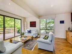
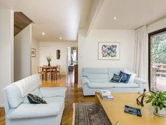
    I have a similar coloured sofa and initially the walls were a pale grey. But the winters are grey and even in summer I found it depressing. The walls are now a simple ivory and I'm much more cheerful! We have a different design aesthetic, but see what you think. Sorry, I don't have any photos of the walls when they were grey. (The photo distorts the image; the coffee table is square!)


  • PRO
    11 years ago

    The color you chose is so important and depends on whether you live in an area that is sunny or overcast most of the winter.

  • PRO
    11 years ago
    last modified: 11 years ago

    I strongly recommend painting any sample paint colors on 16x20 canvas boards from a store like Michaels. They are usually sold in packs of 4. Trying to make a decision off small samples on existing walls are not usually successful.

    mene72 thanked BeverlyFLADeziner
  • PRO
    11 years ago

    some inspiration

    Blue Atlas · More Info

    mene72 thanked Celery. Visualization, Rendering images
  • 11 years ago
    Ingrid- what a beautiful view/ space you have! Where is that? Totally hear what you're saying about gray - we live in LA- and it's super hot in our area & the sun is almost always beaming turning everything yellow which I dislike so I'm doing my best to 'cool down' my env lol but thx again, the more I'm chatting w you great ppl the more I'm thinking a light griege is what's going to wk best to balance it all ☺️ v tricky feat tho!
  • 11 years ago
    That's a great gray on that wall fr your pict!
  • 11 years ago

    mene72 - I'm in CA, too (Bay Area), so that makes me even more excited to hear if the Irish Mist (or Statuesque) work out for you!

  • 11 years ago

    Thank you. I'm in South Australia - very similar climate to LA. But we live in the Hills behind the city, so it's cold and grey in winter.

    mene72 thanked ingridscholten
  • PRO
    11 years ago
    last modified: 11 years ago

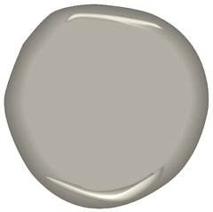
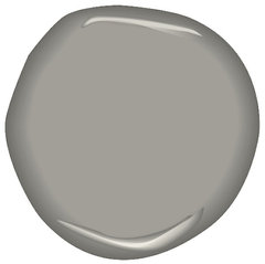
    Here are some thoughts/suggestions for grays/pewters and one blue silver. Just did a house with these grays. It turned out to be an amazing background palate. We were able to put some wonderful splash of color throughout the room and the gray complimented it all beautifully. Gray is a great neutral color to work off of. It's smart to try to cool it down especially in a hot location like LA. Pun intended. =)

    Pebble Beach 1597 Paint · More Info

    smoke & mirrors CSP-105 · More Info

    vintage pewter CSP-110 · More Info

    Benjamin Moore Revere Pewter HC-172 · More Info

    mene72 thanked Mae Day Organizing and Interior Design
  • PRO
    11 years ago

    Best of luck.

    mene72 thanked Mae Day Organizing and Interior Design
  • 11 years ago
    last modified: 11 years ago

    Hi hapagrrl! Omg so after a week of studying Irish Mist, you're SO right- I'm ALL about it! Thank you thank you! :) I def can't use it through the whole house bc my other rooms are SO dark and yellow which makes it look florescent but that's totally fine bc it looks beautifully neutral against my aqua couch which was the real struggle. The only thing is the color completely disappears when you're not looking at it dead on bc there's a big window that shines directly into the room so I was wondering if you used Behr's super flat (I think they have a "commercial flat" which has no sheen) or just the same cleanable flat finish they give in the samples which has a slight sheen? I know the finish is just one more thing that changes how the color looks and I'm just wondering if I can see it more if I do 100% flat, maybe..? It's so beautiful, I can't get enough of it! Ha Any addl advice would be so appreciated! Thanks again!!!

  • 11 years ago

    Hi, mene - HOORAY!! So, I have pets, which means I need to be able to wipe down a wall easily; so I went with eggshell. I'm not sure how going flatter would look, though? Did the flatter color or the sheeny color on the little swatch look darker to you?

    Also - did you get the sample of Statuesque, too? If not, try it - it might actually work well in your yellow-y rooms, too (I had that exact problem in my living room, which is why I ended up going with Behr colors to begin with).

    I'm so happy that you like the Irish Mist!

  • 11 years ago

    Ahh...and funny, I was going to ask you which rooms you chose Statuesque for and how it varied/worked for you and differed from Irish Mist. So you used it in the darker rooms? It looked like it had a slight lavender undertone so I wasn't sure. I'm finding the chips need to be almost completely brown to look even kind of gray in the south/west facing darker side of the house and I'm exploring with lightening BM's Edgecomb Gray (Thank you too Combine!!) or maybe Behr's Chocolate Froth or Mineral (I need to stop, really ha). Flatter colors are suppose to look lighter by absorbing light but I think that's more typical when its a darker color bc all the flat samples in this super bright room of mine look darker and more apparent than the ones with any sheen. But again, thank you for suggesting this beautiful color and Behr for being so true. It was amazing, even having DE try to duplicate colors, they couldn't and I have a ton of baby blue, lavender and heavy flat gray samples to prove it. I think for a tricky color like gray when you want it to be light, neutral, weightless maybe a little ambiguous and not depressing it's almost impossible to pull off but you found it!! I'm so impressed with your feat and thankful for Houzz to know I'm not the only person who cares this much! haha

  • 11 years ago
    last modified: 11 years ago

    Ok, mene - my living room is weird because it faces northeast; so it's dark. The statuesque in there reads the way the Irish mist does in my hallway, guest bath and guest room.

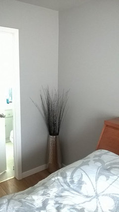
    But now that I hear you saying that your living room faces southwest, then maybe you can go a wee bit darker - I believe I have"silver city" in my bedroom, which faces southwest (and used statuesque on the ceiling, haha). So it reads gray, not griege, but because that room is flooded with light for most of the day, I think it looks great - a true gray, but doesn't bring the room down or feel depressing..

  • 11 years ago
    last modified: 11 years ago

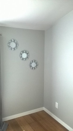
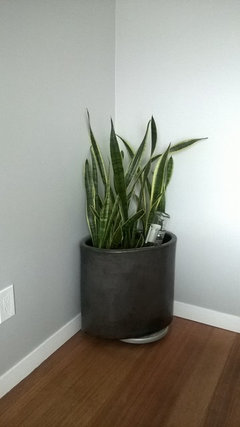
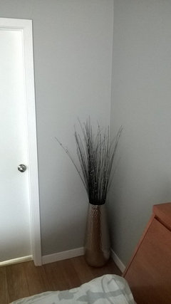
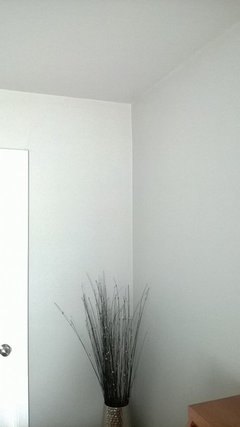
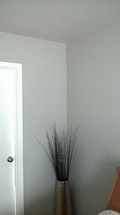
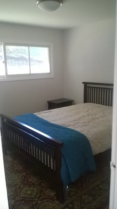
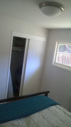
    Ok, here are some photos - silver city on the walls and statuesque on the ceiling. I tried to get different lighting, too, but my phone's camera isn't great (ignore the lack of decor right now - too many other battles to fight in this house) ;)


    mene72 thanked hapagrrl
  • 11 years ago
    I like repose gray by Sherwin Williams.
    mene72 thanked kdefrance
  • 11 years ago

    Oh wow! Your room turned out gorgeous! Thx for sending- such a good, true relaxing gray for a bedroom! I'd love to see your biggest space in Irish mist too if you dont mind sharing & if the photo picks it up ok. I'm def a lil concerned about doing the whole house & so many spaces w diff grays bc I want it to hv the rt flow & compliment to eachother. I think I'll start w the main entryway, formal living/ dining, staircase, kitchen & my master bath in Irish mist & go fr there. Those all hv a good white light, higher ceilings & allows IM to look v crisp & contemporary. I was also told color darkens over time..? Not sure and def think this light gray is the way to go to explore color & not feel suffocated by it since it's going on a lot of wall space. Did you paint in stages? It seems really tough to decide on each room entirely before seeing how any gray will 1st look in the house in a space to start. Cute room accents!!

  • 11 years ago

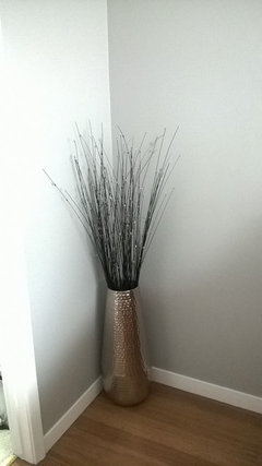
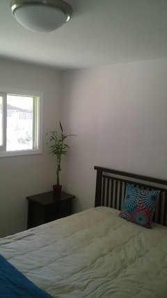
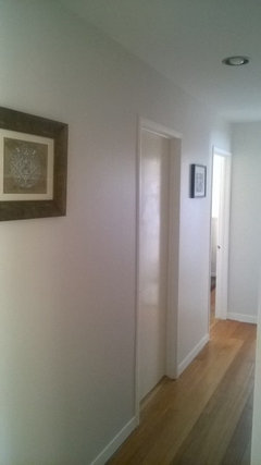
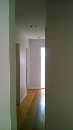
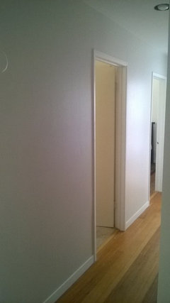
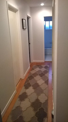
    I was hoping that I could pm you these photos, but here it goes - all the below are of "irish mist" in my guest room and hallway:


  • 11 years ago
    last modified: 11 years ago

    Once I saw how great the Irish Mist looked in the hallway, I decided to use it in the 2 guest rooms (on the left-hand side of the house). And I recently used Irish Mist in my gues bath reno - because it looked great with the floor tiles and because i. love. it. I knew in advance that I would go a lot darker in my bedroom and office - because they both face southwest and are flooded with light - also, both those rooms are on the right-hand side of the house. I did Statuesque in my entryway, because it flows into the living room. So - front of house is "Statuesque," left (or east side) of house is Irish Mist and right (or west side) of house is dark grays (I'm going with SUPER deep charcoal for my office). So I know it might be weird, but I split the paint colors in the rooms that way -- and honestly, the flow is fantastic - even the inspector complemented it, lol.. The way it looks in my house, there is very litle variation in color between the Irish Mist and Statuesque. I can see it because I love them both so much (they're *fraternal* twins, not *identical!).

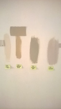
    Last, but not least, this was my life for *weeks* until I found these Behr colors:

    I now have really expensive closet paint!


  • 11 years ago
    Oh that's so funny about the closet paint! The Irish Mist looks great, thx so much for sharing- you can really see it in the hallway & I can def see why you love it. Your rooms & the directions are v similar to mine so v good to know multiple light and dark grays all wk together! Great job & tho this process is a pain, it's sooo worth it when u get it right and love the result!! I can't wait!
  • 11 years ago

    mene - yes, you're absolutely right - the process was SUCH a pain in the neck (I even cried several times), but it was well worth it in the end: I look at these colors every day, and every day they make me happy, because my house looks so good compared to what I started with (I've been posting some of my work in the Before and After section - we had some serious ugly goin' on).

    Please be sure to keep us posted on what you decide on - I can't wait to see the end result!

    mene72 thanked hapagrrl
  • 11 years ago

    Hi---

    I recommend painting the walls a darker gray--at least 1-2 shades deeper than the sofa---otherwise, there will not be enough contrast in value between the wall, sofa, and rug. Any of the attached grays could work---if too dark then you could have it custom mixed using 50-75% of the colorants. Hope this is helpful. Good Luck!

    mene72 thanked Natalie