Software
Houzz Logo Print
stephf25

Upholstery advice?

10 years ago
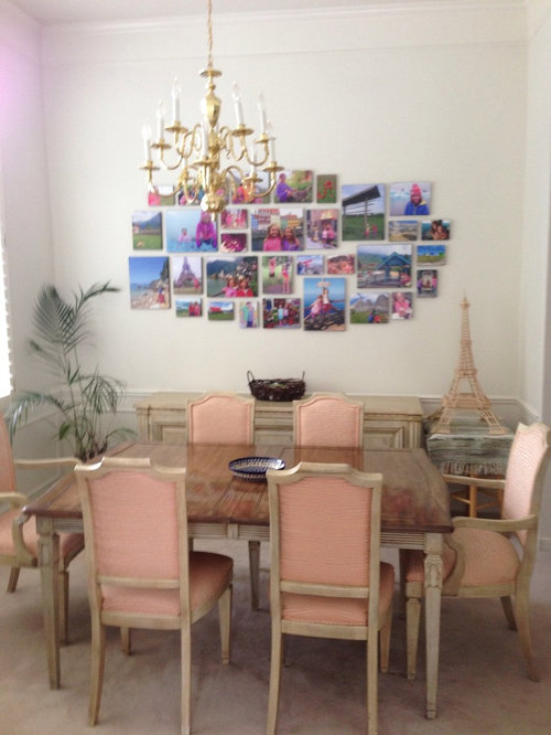
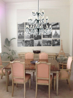
We inherited my grandmother's 50+ year old formal dining set. We need to update the upholstery and want something a little less formal that works with our existing collage. Husband and I are miles apart on color (bright or neutral) and pattern (contrast or almost none.) Please advise!

Ps - 1990's chandelier will soon be a repainted shabby white.

Comments (21)

  • 10 years ago
    Love your collage and your Eiffel Tower! How about neutral on the front and seat and then put a pop of color or pattern on the backs only. Then you can bring in your collage colors and if you want to change it out later on, you only have to do the backs.
    stephf25 thanked Nancy Ingram
  • 10 years ago
    last modified: 10 years ago

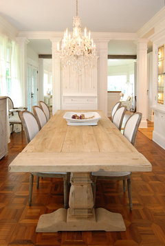
    If you are heading towards a shabby chic look, I would go all white or ivory. In regards to your chandelier, you might be able to add crystals, which would be fun and I would accessorize your buffet and you could place the Eiffel tower there (to the left) and remove the small table, as well as the plant.

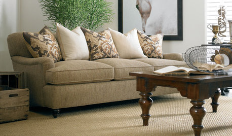
    Traditional Dining Room · More Info

    stephf25 thanked Maureen
  • 10 years ago

    Thank you both. I love your shabby chic photo, but I'm not sure it'll work with the dark glossy top on our hand-me-down table. I hadn't thought about making the chair backs a different color. I'll have to look for some images of that.

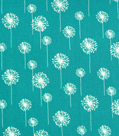
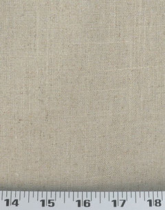
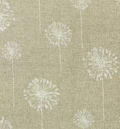
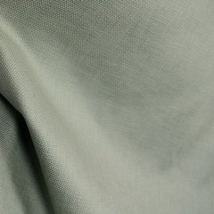
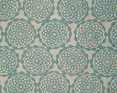
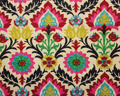
    We're looking at two diverging directions -- something bright that brings out the photos, or something that will blend into the background and hopefully disguise the dark top / light trim situation on the table which we don't particularly love. Below are some fabric examples:

    Any thoughts? Is a pattern like this too much for six chairs? Will a beige wash out the room too much? I am a complete design rookie, so all advice is appreciated.

    ps - I'm with you on removing the sickly-looking plant and accessorizing the buffet!


    Fun print 1


    Invisible beige

    Possibly a compromise?

  • 10 years ago

    I do like your turquoise, but I'd cut down on colors for both of you, and instead choose a muted green which I see a lot in photos/ as well as purple. This is slubby cotton in Mineral:

    Slubby Basket Mineral Blue Grey Fabric · More Info

    stephf25 thanked everdebz
  • 10 years ago

    Not a 'soft' pattern / it's transitional / mineral:

    Euclid Fabric, Mineral · More Info

  • 10 years ago
    Disclaimer: I like bright color!

    I like your blue dandelion puff fabric much more than either neutral choice. The room is already a very neutral background to the wonderful colors in your collage; I think you could have some fun with your chair fabric and not overwhelm the space. That blue/teal is nice, and bright pink really stands out from your photos.

    The Eiffel Tower would block your collage if on the console, and while that poor plant needs to go somewhere for R&R (sometimes they will resurrect themselves) I think a big healthy dramatic plant is great for that corner still.
    stephf25 thanked Melynda
  • 10 years ago

    Pizelle is pretty for part of:

    Pizelle Fabric · More Info

  • 10 years ago
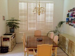
    You guys are good. Here's a photo from the living room that shows the dark/light table we're trying to play down. I closed the shutters for the photo, but they're usually open so the room is naturally bright.
  • 10 years ago

    Nice. Meet him in the middle. :)

  • 10 years ago

    I could see the chandelier painted like verdigris. Aqua, chartreause, black mixture. Use the hubby's choice of fabric on one side of the chairs & your choice on the other side. I think your room will be dazzlingly wonderful.

    stephf25 thanked sandradclark
  • 10 years ago

    I actually do like the pinkish color on the fabric. It picks up those colors from the photo gallery.

  • 10 years ago

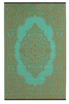
    Try something like this for an area rug. You may not need to change the upholstery:

    Istanbul Reversible Rug, Fair Aqua and Bronze, 5'x8' · More Info

  • 10 years ago

    I think a beautiful, colorful suzani fabric on the back panels would be beautiful. You could then go for a darker ivory similar to the background for the front of the back and the seats. Then pick one of the bright colors to paint your chandelier!

    stephf25 thanked katinparadise
  • PRO
    10 years ago

    I guess I would have created the collage of pictures in B/W to create an artistic statement and then change the chandelier out to something much larger to fill the room

  • 10 years ago
    I agree with others that chandelier is too high. Needs to come down. I don't think the fabric on the chair is horrid, as it does go somewhat with your collage. To save yourself a bunch of reupholstering costs, I'd just do the back of the chairs a solid navy or royal blue to pull in more color from the collage.
    stephf25 thanked Sue
  • 10 years ago

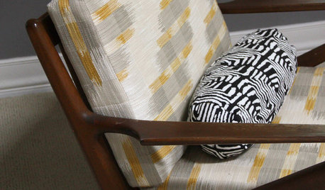
    I guess hubby and I aren't the only ones with a wide range of opinions! Thanks for all of the creativity and the lovely fabric choices. Great starting points for the next round of negotiations. Beverly - I love those eclectic chairs!

  • 10 years ago

    purple, sky blue or grass green. solid or tonal. I think a patterned fabric will compete with your collage


  • 10 years ago
    I feel like a dark color needs to ground your dining room.

    The table is FABULOUS. Love the idea of a print on the back! Love the suggested pink and black and blue print above!
  • 10 years ago

    what about a linen/grey for the side chairs. and a full chair cover on the ends? can you paint the chairs a shabby chic white?