Software
Houzz Logo Print
glas2melt

Can't pick a gray!

10 years ago
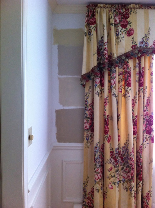
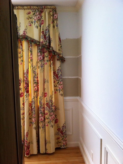
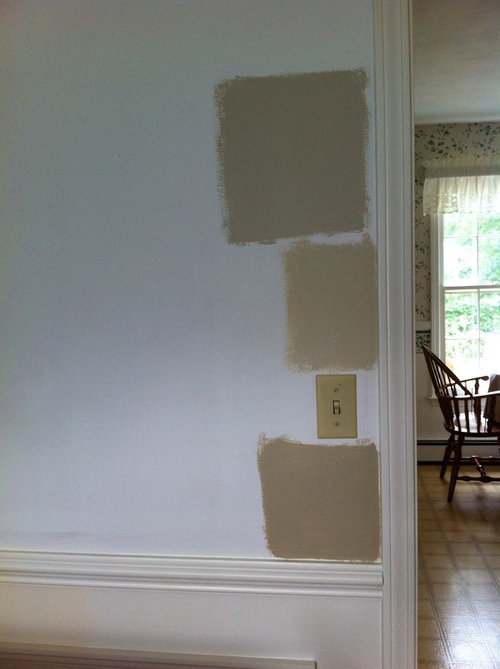
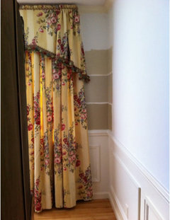
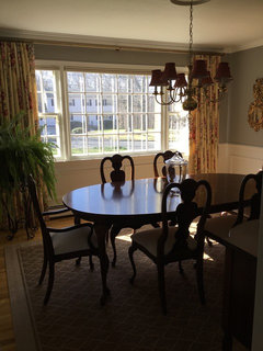
After 15 sample pots, I am color blind! I need help selecting a paint color to update some intense yellow/golden drapes. I was looking to grays and beige so as to reduce the intensity of the drapes. These are in a south facing dining room with light oak floors and cherry furniture--traditional. Though traditional I would like to give it a little twist away from that total look. So which color would look best? In the first picture, I have painted BM abingdon putty, grant beige, Manchester tan and the darkest bennington gray. I am changing trim and wainscoting to BM dove white. The rest of the house is being redone so this room will dictate other colors except that my living room has an olive green sofa which I think will stay. All help would be welcomed. The living room is separated by a hallway.

Comments (196)

  • 10 years ago
    Er612, I love that rug from crate and barrel.of course you would have to see it up close for color and pattern size but I like the subtle pattern and the color is great!
  • 10 years ago
    I'm not to fond of the fabric on the left of the chair; to granny for me. The ikat is traditional and hip at the same time.
  • 10 years ago

    My opinion is that if you want to use the ikat fabric, then I would go with a rug that is more subtle (a rug that when you squint your eyes, it almost looks like a solid color) and that would be the one that Olivia D suggested. If you want to go with the fabric on the left, then you could have a little more pattern in the rug, like the one from crate and barrel.

  • 10 years ago
    Er612, did you happen to know the color of the rug from crate & barrel? The ability to add the components on screen like that is so helpful. I anticipate looking for more fabric for seats as I now see that i have to be careful what I pick with the rug. But it helps me keep in mind the possibilities. Yes, lynartist, I have to agree about the granny fabric...just trying to think outside the box and keep open minded.
  • 10 years ago
    Well Glas, I think you have a good eye to pick that fabric in the first place, it adds a bit of unexpected whimsy and I have know problem whatsoever mixing patterns if done well. The rug from C&B rings by bell! If it looks like that in person, yea! This pattern is a subtle geometric that looks great with the large floral in the drapes, the color is perfect with the wall and the drapes and has a bit more modern vibe which I like. I think because the drapes are so traditional you have to be careful not to get to fuddy duddy. There are all sorts of rules that have been printed over the years on how to mix prints that involve size and style etc. I think you can usually trust your instincts here as you have been doing great so far!
  • 10 years ago
    The reason I asked about the C&B rug color is because I was @ C&B before you suggested the rug and it was a much darker gray in person then on the monitor. I tried a mid-tone gray rug remnant for color and it doesn't look. I think a neutral is the way to go. But I'm not locking myself in yet.
  • 10 years ago
    Ah, the notorious color monitor strikes again!!! Well if that is not the rug exactly, still love the feel of it in principle. The trellis pattern is perfect with the floral and if you can find one in the the color tone that it appears to be great. One of the other rugs was to yellow and the other to beige. Of course , who knows up close and personal!
  • 10 years ago

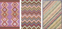
    Bummer. Here are some other grey rugs. Middle two are from Pottery Barn. One on the right and colorful ones below are from Dash & Albert.

  • 10 years ago
    I'm not sure if you have a good rug shop in your area Glas, but if you do usually they will let you take a rug home on loan to see if you like it. This way you can get a feel for what you may like in this space instead of spinning your wheels.
  • 10 years ago

    Benjamin Moore Revere Pewter, someone else mentioned this color it is great ahve I have yellow walls in some of my rooms and it flows beautifully

  • 10 years ago

    Hi Glas,

    Sorry - I have been busy and away as well. Have read all the comments and seen your sneak peek. Love your choice of wall colour - it's what I was envisaging in my mind, think it is great with the curtains, creating a nice contrasts well as toning them down. Depth of colour is perfect and it all looks so good with the wainscotting, floor boards and furniture. I am not a fan of the ikat, I don't really think it works with the curtains, maybe if it was a miniature version! I think the scale of the pattern is too big in relation to the curtains. I like the mulberry random dots fabric on the left of the chair and surprising, against everyone else's opinion, I think it gives a contemporary edge to your scheme without overpowering the curtains. Having said that I believe you should choose your rug first, as the choice available will be less than the amazing array of fabrics available. You should choose decor items from the largest items down. Then once you have decided on your rug it can them inform your choice of fabric for the chairs. For your rug choice I would look at something in the same depth of colour and grey as the walls to balance and 'ground' the room, in a very small pattern such as a fine grey and white/cream stripe (to go with walls and wainscotting) with a raspberry border or a more traditional choice would be a small scale persian type carpet in the butters, reds, and greys (would disguise and spills!!!!). Your could even go for a plush pile plain colour, or a carpet with a small damask type pattern in all one colour. I think you need something darker on the floor than the pics already posted above. The furniture and rugs are fairly traditional and I am not sure the contemporary patterns are the way to go - celebrate the heritage of all your wonderful furniture! Good luck!

  • PRO
    10 years ago

    Note to all commenters: she already painted the walls and loves the curtains. So any suggestions on those are not necessary.

    Regarding the rug, would you consider a seagrass bordered in leather? I think that would be awesome!

  • 10 years ago

    I wanted to recommend a sea grass rug too. I love the texture. And it would make your area just a tad less formal. that would be nice too.

  • 10 years ago
    Diana Bier, I do love your idea of a sea grass rug to tone down the formality of this space! I just wonder about practicality though; guess it depends on how much use this room gets . Perhaps at least a sea grass look that would be easier clean up. At any rate , the idea of the border is wonderful !
  • PRO
    10 years ago

    Thanks, lynartist! I know what you're saying about the ease of clean up (or lack thereof) of a seagrass rug. Clearly a tug of war between aesthetics and practicality.

  • 10 years ago

    Favorites are BM Revere Pewter and BM Worldly Gray

  • 10 years ago
    Please don't paint those walls gray. Khaki/tan, maybe but not gray. Gray will suck the life right out of your gorgeous wood furniture.
  • 10 years ago

    I'm an experienced artist. I prefer the second color down from the top in the first photo and like others suggested I wouldn't use the valances. A dynamic rod can do wonders. Also, I would narrow your color choices and just paint those samples. Too many choices can become confusing. Try one color on the left side of the drapery and a different color on the right side. Also, look at your wall at all different times of the day during all different lighting situations. You'll be amazed at the changes. You might also try hanging a favorite piece of art close by the samples, looking at the setting in a mirror and photographing the wall with different objects included. Sometimes it's nearly impossible to find accessories to coordinate with an unusual color. Something that looks simple can be difficult. Just try matching blacks without the sample with you. You won't believe the different shades, hues, and values in one color. Good luck and trust your gut!

  • 10 years ago
    Glas2melt, it would seem that many have not read through this thread and don't realize you have already painted your beautiful dining room! I hope all is well with you and look forward to seeing more posts when it is all done. All my best: lynartist:)
  • 10 years ago

    Ditto lynartist! Look forward to seeing the completed room with the new rug, furniture in place and the new upholstery on chairs. Hope all these post from everywhere have helped you in your decor choices, Lynn

  • 10 years ago
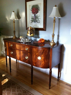
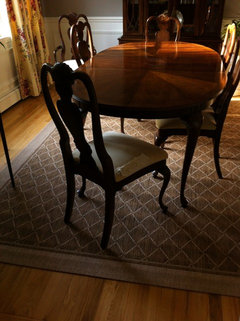
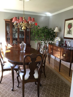
    Hi all and thanks for the continued interest. I am slowly continuing on the project. The sideboard refinishing was troublesome but completed. Items on the sideboard are out of scale--but for now... The picture above the sideboard was pulled from another room for the red. Looking for a larger piece over time. I was going to change the chandelier shades to white so I could do raspberry seats but lit at night it looked awful. It seems a lite ecru or such seems best. So I am still on the hunt when time permits. The drapes need to be reworked as they are shirred on a rod and fixed to the valance board--- which I will eliminate. PS: with the amount of light in the room, I love the gray both day and night. I think the red shades help at night.
  • 10 years ago
    Oh Glas, love love love your sideboard! You are a girl after my traditional heart! Your botanical print is perfect, don't even think of moving it; love the lamps too! The rug looks great! You have bean busy. If you use the cream fabric on the chairs the why would you change the shades?
  • 10 years ago

    The refinishing looks fabulous!

  • 10 years ago

    Hi Glas2melt, I too love the sideboard - just gorgeous and the reno has definitely brought out the beautiful woodgrain. I think the ecru of the lamps is perfect choice against the wall colour and the botanical artwork is perfect for the vignette you have created and works very well with the curtains and furniture. ( For styling I would move the glass bowl with fruit etc to the left for a more interesting asymmetrical arrangement as it's size will be balanced by the stronger colour of the pumpkin and autumn leaves on the right, maybe adding another item or two to this area - all about balance even if it is asymmetrical!). Rug choice is great, pattern not too dominating and good depth of colour, love the border as well. Not 100% sold on chair fabric as I liked the raspberry random dot type fabric for the colour and scale of print. Can see though that it goes well with the rug and would be more versatile if you eventually change your scheme as the colour will be an excellent neutral to work with. Almost there - must feel good to nearly have it all done! :)

  • 10 years ago
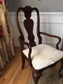
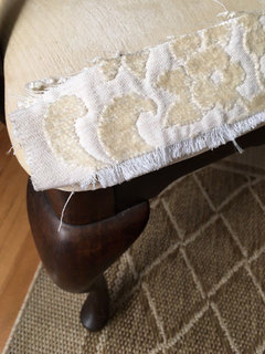
    Lynartist, I was going to change the chandelier shades to white so I could use a color on the dining seats based upon a comment made here about having reddish shades with 6 seats in red--having the reddish color broken up like that as opposed to having it in a larger swatch of color. But I kept the shades as is because of the fabulous light it provides at night, so the seats need to be rethought. I returned the dotted red fabric as the color shade was more red or paprika than raspberry. Now I don't know if going raspberry on the seats would work or stick with a neutral brighter color-ecru or the like. I could decorate with more color with tableware if going with the ecru. And I'm not sold on my current selection for the seats either. And thanks everyone for the kudos on the sideboard--it's my baby and I adore it more then the rest of my furniture. I am pleased with how it turned out. I will try to work out a better asymetrical arrangement as I would preferred it--I do struggle with that. I've done watercolor paintings and there too I tend to be too tight and structured. I'm trying to loosen up--that's why I went with gray walls--not my norm!
  • 10 years ago
    I think it all looks fabulous! You don't need to rush on the seat fabric, something may jump out at you when you are shopping around or least expect it! Meanwhile, enjoy your beautiful dining room! The holidays are right around the corner:)
  • 10 years ago
    The sideboard with the wall color and rug choice is amazing! I like the neutral lampshades, but you can buy the lamp shades in red if you like, and try them out for a couple of days. If they don't work, return them. If you are recovering the chair cushions yourself, you can try a couple of chairs in your favorite fabric without stapling them in. These are small items that can be easily changed to match the season or your china pattern.

    Can you post an updated photo of the curtain wall? It looks like you're ready to host Thanksgiving dinner!
  • 10 years ago

    Hi Glas2melt---

    Furniture looks beautiful with the new wall color--any chance you could post a pic of the window wall? :))

  • 10 years ago
    Since the valance is still attached and the drapes need to be reworked for use with rod and rings, I'm holding off and will post that pic when I get the rod and drapes up without the valance.
  • 10 years ago

    Agree with Lynartist - just keep your eye out for the right chair upholstery - I think you'll know when you see it! Perhaps the ecru jacquard just a bit too coarse a texture with the other more refined elements, if that helps? and maybe hold out for something that has Raspberry and cream in a small pattern? Or go a slightly more buttery neutral. Enjoy your thanksgiving/ holiday season! It's spring here in Australia!

  • 10 years ago
    Hi,
    Hope this finds you well and your is mother doing OK.

    You have done an amazing job with the gray paint, refinished sideboard, and the art over the sideboard ties in all your colors and is the right style for drapes and furniture.

    If something is bothering you about the art, try lowering it closer to the sideboard and let it layer behind the glass and silver tray items.

    Much easier to pick your rug first, and then chair fabric.
  • 10 years ago
    I love the room! You have done a wonderful job! I'm a HUGE fan of red, so I'd prob keep those shades. ;) I LOVE the rug. That is something I struggle with. I know there are many "rules" when it comes to interior design, but at the end of the day, it's your home, and if you feel good when you walk into the room, then you've done a good job!
    I hope your mom is doing well.
  • 10 years ago

    I'm sorry, I'm not joking, but when I opened the link I said "wow, what a cool paint treatment!" ...then I realized you were looking for one color, not a band of colors. I'd stick with the band of colors in photo one, personally. Nice character. I own Old Town Guesthouse B&B in Old Colorado City/Colorado Springs, and sometimes the quirkiest fallback solutions turn out to be the guests' most favorite.

  • 10 years ago

    Grays are akin to whites/off whites as far as being neutrals. I would try BM's Galveston Gray. I think it would be beautiful with that chamois/yellow background in your draperies.

  • 10 years ago

    I would choose a rich yellow a la Nancy Lancaster's yellow room! Fabulous fun and your curtains would look amazing!

  • 10 years ago

    none of colors selected have warm enough tones; drapes have a lot of golden in them.

  • 10 years ago

    Your dining room is beautiful! With so many suggestions, I don't know how you are deciding, but you're doing a wonderful job! Please post the end result. I'm really looking forward to seeing it. I once had a skirt that reminds me of your drapes....memories of Scarlett O'Hara. lol. I love yellow.


  • 8 years ago

    Wondering how this room finally worked out. Is it possible for the OP to post final photos? :-)

  • 8 years ago
    I would change the drapes .
  • 8 years ago
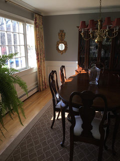
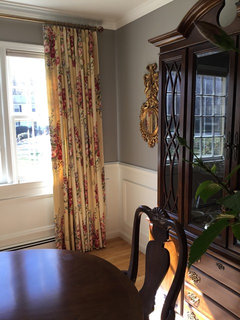
    Sorry for not giving a final photo—much was going on. So I decided to just reupholster the chairs neutral with texture instead of driving myself crazy. Next time I will make the walls darker as I just love the mood it creates. I had to pinch the pleats on the drapes and redo a a solid bright brass rod. Photographing with the changing light makes it difficult to capture the true atmosphere especially when facing into the windows. I would have brought down the rods a little bit but would have had to hem the drapes but at that point I just couldn’t. Unfortunately I overwintered my hibiscus and I normally cut it way back to fit the space. It decided to bloom so I let it.I am pleased with the results. Thanks for everyone’s help and interest. Couldn’t have done it without you.
  • 8 years ago

    I think your room looks warm and inviting! Glad you removed the valances and installed a new brass rod - looks great and new paint colours tie the whole room together with the contemporary pattern rug looking great with the neutral recovered chairs! The light fitting adds the right amount of contrast to the walls and furniture and picks up on the floral colours in the curtains!! Well done - you should be very pleased with the final result! Thoughts from Australia! :)

  • 8 years ago

    very pulled together. Great job on everything

  • 8 years ago

    I like the room just the way it is. I like the decisions you made. Love the white fabric on the chairs. I don't think it would be worth hemming all those drapes to lower them. I think they look great. I was surprised you picked the darker gray, but it works. I'm sure you are enjoying it. :-)

  • 8 years ago
    Wonderful! Thank you for posting the final results. I hope you love the wall color and drapes minus the valance as much as I do!
  • 8 years ago
    Oh glas2
  • 8 years ago
    Oh glas2melt! How wonderful to see this beautiful room again! One of my all time favorites!!! You did such a splendid job and the drapes look great!!! Hope you are well:)! Love this gorgeous dining room!
  • 8 years ago
    Hi lynartist. Thanks so much. I am loving how the room changed and though I know the drapes were not everyone’s favorite, I just needed to refresh without going overboard. I am pleased with the results. My challenges continue—mom now 91.
  • 8 years ago
    So happy to hear your Mom is 91! Bless her heart! I love your drapes and your beautiful furniture! It’s such a warm, inviting room! Who wouldn’t want to sit and enjoy a dinner in here;)?
  • PRO
    8 years ago

    It looks lovely, glas2melt, you did a fabulous job! Now go enjoy it!