Software
Houzz Logo Print
kittybart

Help me with my dining room walls

10 years ago
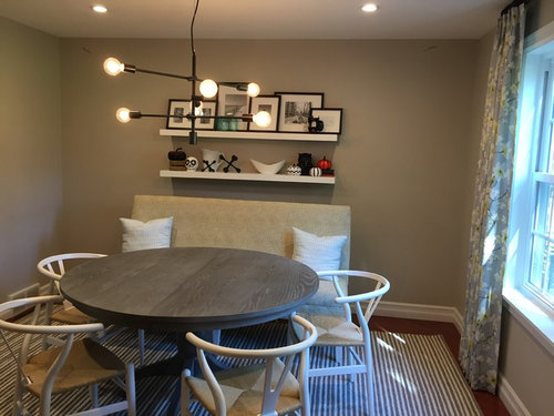
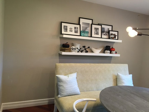
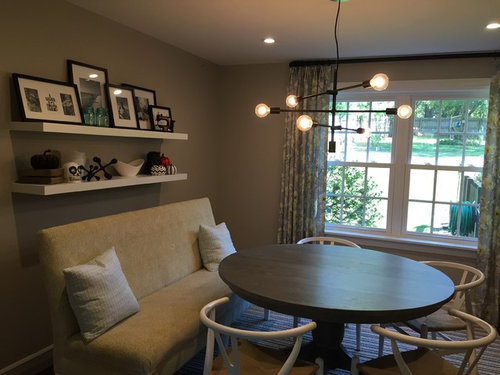
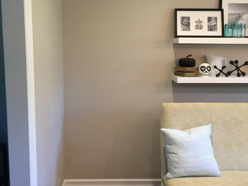
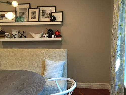
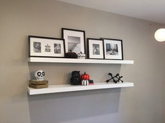
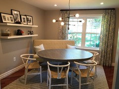
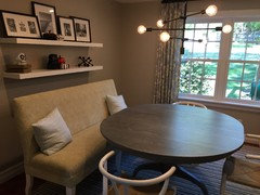
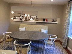
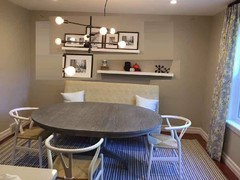
I need something on either side of the shelves, but I'm not sure what. Any ideas? I don't really need storage and I would like to keep the floor clear. I have thought of a plant, but that would take up major floor space. I'm thinking something on the walls but I'm open to other ideas. Thanks!


Comments (86)

  • 10 years ago

    bossyvossy - I heard what you're saying. Unfortunately, they're likely to stay (until my kids ruin one of the other) but I totally get it. I think angling it helps too. Luckily, the height doesn't bother me as much...but my eye is not as good as yours!!


  • 10 years ago

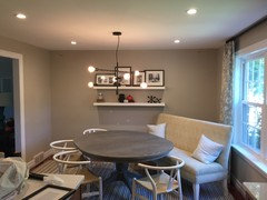
    Ok busybee - this is for you!! Haha!! I'm still working on them though. I welcome feedback. You can see I have seasonal fun kid stuff up there so be gentle. My pumpkins are here to stay! Although I will remove one...or two. Maybe.


    ;)

  • 10 years ago

    LOVE the table with the leaf in! That makes for a much more unified grouping that looks like it will just work better for everyone who sits there.

    I don't see anything wrong with the shelves just as you have them. Adding anything in the corners is going to make the space feel too cluttered, I think.

    Can you angle the settee back in the corner like you had it, now that you have the leaf in the table?

  • 10 years ago

    I would get the seating right before thinking about the other elements, you may need to balance the room out according to the seating arrangement - with the shelves, etc.

  • 10 years ago

    Going to try and add the leaf in now. I agree it works better with the table angled, rather than in front of the window.

  • 10 years ago

    Well, heck - I'm blind. I thought one of the pics above was one of the table with the leaf already IN.

    OK. Put it in and THEN show us. **cleaning glasses**

    :-D

  • 10 years ago

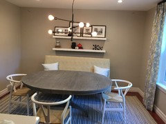
    Ok, leaf added. I have another leaf too, but that may be overkill. Especially when it's just family sitting at the table.


  • 10 years ago

    No problem Aunt Jen. ;)

  • 10 years ago

    You may not need to angle it now. I would try it with the back of the settee where you originally had it to see if it looks ok there, of course those shelves would have to move if it works.

    Katie A. thanked katrina_ellen
  • 10 years ago
    last modified: 10 years ago

    Yes, try putting it back where you add it with the leaf - one leaf should do it.

    Katie A. thanked blfenton
  • 10 years ago
    last modified: 10 years ago

    Can I chime in? You have so many opinions. If you put your bench under the shelves, as you had it first, could you stagger the shelves (with less on them, of course). One more to the left and the other to the right. And with the leaf in the table now, it will look fine . Oh yes, use some colorful pillows on your bench and a table runner on the table of the same color. That said, I do like the bench in front of the windows...seems you could move your table farther away from the bench....... but you would have to swag your chandelier over the table. Would people hit their heads on the shelves if you left them with nothing under them? I am not a floating shelf person but since your father made them, they are special.

    Katie A. thanked erinsean
  • 10 years ago

    I'll have to wait to try and move the shelves, staggered. Just not something I can do on my own. Leaf added and back to square one, so to speak. ;)


  • 10 years ago

    That's much better, now the table doesn't look dwarfed by the settee. Of course now the shelving is emphasizing the height of the settee, which you want to de-emphasize by moving those. Staggered may work.

  • 10 years ago

    Staggered and further apart? Maybe some genius could photoshop it for you?

    The leaf in looks 100% better :)

  • 10 years ago
    I may be able to photoshop it. I'll try and see.
  • 10 years ago

    I like the sofa against the wall, but I think you need a graphic print above it as I said earlier. Since your dad made the shelves, you might have him cut them in half and put two on each side of the print. Then the shelves aren't hanging right over your head. A whole wall of shelves will be too cluttered and distract from the light. You need fewer, bigger things with that light.

  • 10 years ago
    Yeah I think I agree with the graphic print. Not sure these will cut well, though. Maybe I can repurpose them somewhere else.
  • 10 years ago

    If you do the photoshop, I would try both shelves together to make one longer shelf, but at the lower height that you have now, then put some of your taller pictures towards both ends of the shelves to add height away from the back of the settee. Just a thought.

  • 10 years ago
    Good idea.
  • 10 years ago

    It looks so much better with the larger table. Also, really love your light fixture.

    When you sit on the settee, do you bonk your head on the shelves? Could you put them on the wall to the left? And what would you need in terms of function in the DR? if you have enough storage, I'd just use art work behind the settee.


  • 10 years ago

    That size of table is much better and you have the room for it so that's great. (So you're not really back to square 1).

    I like the idea of putting the shelves on one level - they don't have to actually touch though.

    You might only need one level of shelving and then do art work above it. You would have to see what the height is like, or add some taller things onto the shelf such as pictures or tall pottery. Some artwork on the left wall to sort of envelope the area and it will look great.

    Lots of good ideas for you.

  • 10 years ago

    Staggered wall décor bugs me, so I wouldn't do that. (But I think I'd still like to see it Photoshopped just to prove my point to myself! ;-))

    The table looks so much better with the leaf in. Good call.

  • 10 years ago

    Nosoccermom - no we don't hit our heads surprisingly. It's never been
    an issue. Function wise, we're good. Not much is needed in the room so
    that is why I didn't really want to add furniture or anything on the
    floor. I do prefer less.


    blfenton - I was wondering
    about them touching. Also, if I did move them to one level, would you
    put that at the same height the bottom is now, or lower behind? I can't
    decide...but I am definitely leaning that way.


    DH did some CRUDE photoshop for me. Doesn't he know how important this is?! HAHHA! You can kind of get the idea from these.


  • 10 years ago

    Aunt jen - Staggered bugs me too, but when there is filled in art (kind of what I asked him to do above), I don't mind it. I can't STAND just floating staggered shelves or just staggered shelves in general.

  • 10 years ago

    Not digging it. I still think the way you've got your shelves now looks great. Clean, simple lines, uncluttered. (Although your DH was sweet to do that for you! -- and us!)

  • 10 years ago

    how about a pair of prints on either side of the shelves as they are now with the prints centered with the height of the two shelves?

  • 10 years ago

    I like that Annie. It adds interest without too much clutter.

  • 10 years ago

    I would put a tall plant at one end and a vertical mirror mounted on the wall at the other, so it's not too crowded, but uses the space and opens up the room. I wouldn't move anything including the sofa if you use it, especially not in front of that gorgeous window. Quite a dilemma, good luck!

  • 10 years ago

    I think the settee looks great now that the leaf is in the table. So glad you were able to find a solution that didn't involve buying new or getting rid of any existing furniture.

    Katie A. thanked cawaps
  • 10 years ago
    last modified: 10 years ago

    I was going to ask if you use all 4 chairs and see you are down to 3, which I think looks much better. It's nice how the table now seems to fit the room and the settee better, too.

    If you don't like staggered shelves, what about putting them to one side with a larger piece of art to the side of them?

  • 10 years ago

    table with settee does look better with leaf...

    the bottom shelf (and therefore both!) looks better with less stuff spread across it! I like them either as are or staggered-- don't like them both at same level.

  • 10 years ago

    Huge difference with the leaf in the table! I still don't like the settee in front of the shelves, though. It looks crammed in and like whoever sits there will bang their head on the bottom shelf. I think the settee should be either square in front of the window, or on the other side of the table facing the window, with its back to that doorway. Should be able to do that.

  • 10 years ago

    The space between the doorway and the settee would be way too tight, IMO, to move it across from the window. I don't love blocking that window. As something mentioned up thread, it is a very pretty window and lets in great light. Guess I have to lay in the bed I made with the dreaded settee, couch, futon mess! HAH! Luckily, it doesn't bother me that much. Now, if anything, the shelves just look dwarfed. Which is why I wanted to beef up that wall with art. But now, I think the better bet may be to add something larger scale in the middle, and get rid of the parallel lines that is being created by the back of the couch, and the double shelves. That is all my eye sees now.

  • 10 years ago

    I'm not a designer but I like everything about your room. The color is great, the settee and your personal items on the shelving are nicely done and not cluttered at all. While the larger table looks nice, there was nothing wrong with the beginning picture. Put a plant in the corner and call it done. Good job.

    Katie A. thanked JustDoIt
  • 10 years ago

    I had the same question as @nosoccermom - perhaps the photos are deceiving but the shelving looks like a huge head bonker. Presumably that's why you have the settee pulled out from the wall? Isn't there any other spot that would work for the shelves?

    I used to have a similarly sized settee in our small kitchen, have since moved to a corner banquette, and what's on the walls definitely matters in terms of making it a comfortable place to sit (and safe around small children). Also round tables are great for conserving space but they don't work as well for bench-style eating; adding the leaf will make that much easier. The nice thing is that you can't really go wrong: your colors are so lovely and it must be a wonderful light-filled space to enjoy your coffee.

  • 10 years ago
    last modified: 10 years ago

    The head bonking just doesn't happen. Think about how you eat - one doesn't really recline, even though you could. You scoot up close to the table. I sat down just to try it, and I'm kind of short, but I had to wretch my head backwards completely over the top of the couch in order to even come close to hitting my head...and I still didn't hit it. I wasn't tall enough. So it hasn't been an issue at all.

    I'm still messing with the wall issue. DH and I had a talk about it and he thinks a larger scale print/photo on the top will make a difference. I just need to find something I like. I don't love stock prints...I want something personal. He also wants me to gut the shelves and go super minimal. But that isn't happening...at least not to his liking. He wants like 2 things on the bottom. Nope...sorry!! HAH!

  • 10 years ago

    I know you said no plants and didn't read all the comments, but I think that corner behind the futon is just calling out for a tall, skinny plant. Plants are considered "out" now, I guess, but I've always had some, get lots of compliments on them, and think they add so much "life" to a room.

  • 10 years ago

    I would try staggering the shelves, but only have them over lap a little, not as much as in your photoshopped pic. If that doesn't work, what about replacing the shelves with a large mirror?

    Katie A. thanked oaktonmom
  • 10 years ago

    jab65 - I'm not totally opposed to a plant. I actually would like a tall plant but I have a 1 year old. I think I may need to wait a year or two so I don't end up with a floor full of dirt.


    I may live with it for a while. I do think the leaf in the table has helped. And I MAY take DH's advice and add a larger scale photo or graphic print to the top row and see what it does for the space. Someone else up thread also suggested adding something to the left wall to draw your that way. I actually like that idea since it is relatively low investment. I don't really want to move those shelves at the moment and patch/paint.

  • 10 years ago

    Another vote if you are going to use the shelves to stagger and overlap a little. I think more "kitchen" type items would look good - such as some blue plates in the mix, or pictures that have more of the seaside colors. Your table and chairs look like its set up well for traffic flow. I would not want to block that window either. In a small space, traffic flow is really important.

  • 10 years ago

    I'm a bit late to the party, but wanted to say the oval table and settee behind looks so much better. I also like the edited shelves but would prefer the shelf items to be pulled in away from the ends and having the photos overlap as you had them originally. I don't think I would like the shelves to extend beyond the width of the setteee whether directly next to each other or staggered. Pretty room!

  • 10 years ago

    KAtrina- I agree on the more "kitchen" type stuff. I actually usually have a few more kitchen-y type stuff but put it up for the seasonal items. But I should maybe consider getting some seasonal kitchen-y type stuff too. Next season...Christmas or Thanksgiving!


    Deliliah - what do you mean pulled away from the ends? Like group the items more toward the center? I am arranging and re-arranging all the time now! With so much good feedback.

  • 10 years ago

    Also late to the party, but since I came I will tell you that I really like the table extended and think the chairs and settee look great. I would opt to overlap the shelves. And maybe put, as Annie suggested, a print on one. Something a little bit more than just the family pictures. To my eye, the problem seems to be that the shelves are one on top of another, not staggered. Otherwise, I really like the room and what you've done.

  • 10 years ago

    Just wanted to say I really like your room, especially the paint color and drapes. A very cheerful spot for little kids!

  • 10 years ago
    last modified: 10 years ago

    I think it is looking better with a little less on the shelves. The light is gorgeous, but is part of the cluttered look. Your husband may be right with minimal artwork on the wall, like one large modern painting. Could the shelves be relocated to the wall on the left, large painting in middle and a tall vase on right with curly willow for height? Or you could get a more simple single shade light?

    Love your wall color! What is it?

  • 10 years ago
    last modified: 10 years ago

    Thanks Karenseb - It's SW Metro Gray.

    The wall on the left is very narrow...not wide enough for the shelves. I will play around with the print/painting idea.

  • 10 years ago

    Kitty- I just meant to move the left and right end items more toward the center. For example on the bottom shelf make more empty space on the ends by moving the two outside items to the center. On the top shelf, overlap the photos somewhat which will leave a little open space on the ends. Just a little tweaking.

  • 10 years ago
    Ok got it. Thanks!
  • 10 years ago

    Why not do 2 large pieces of art on either side of the shelves? The light fixture tells me you've got a bit of a modern streak, so I think a couple of funky poster sized pieces on either side of the shelves would finish the room nicely.