Software
Houzz Logo Print
just_terrilynn

Would this look stupid?

11 years ago
last modified: 11 years ago
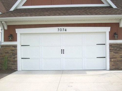
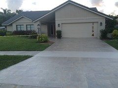
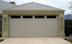
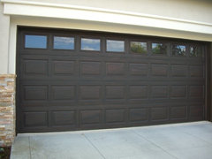
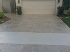
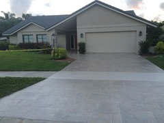
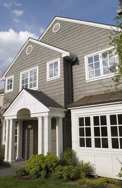
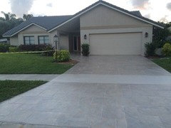
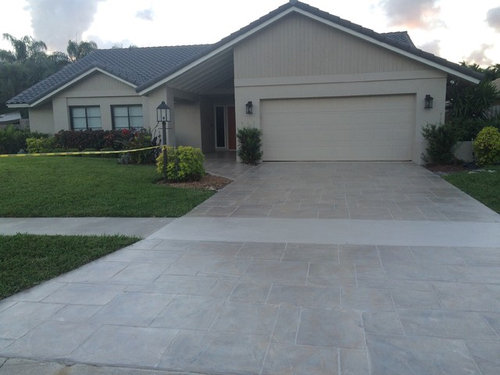
Even after my driveway improvement the garage door is still bugging me in its plain-ness. My husband refuses to buy something new as the door is newish and hurricane code. Would adding some garage door hardware help (see sample picture)? Or, is that going way to far against what ever the heck my house style is? Sample.

My house.
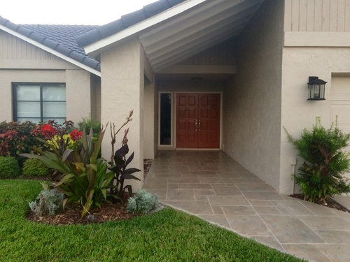
Front.

Comments (63)

  • 11 years ago
    last modified: 11 years ago
    but, most modern day doors go up and I think the carriage house hardware looks great on some!!! (not everything needs to 'make sense'! like 'flame' shaped lightbulbs in chandeliers- nobody's fooling anybody, but they look nice!)

    just_terrilynn thanked busybee3
  • 11 years ago

    That's quite true, busybee! Although the style of jt's house is fresh and modern, and carriage door hardware is just not the right fit here, IMO.

    just_terrilynn thanked User
  • 11 years ago

    totally agree with you there auntjen!!

    just_terrilynn thanked busybee3
  • 11 years ago

    Well I never heard of fake windows on a garage door so I simply googled:

    'How to add fake windows to a garage door' and there were several videos - here's just one of them.

    who knew?


    https://www.youtube.com/watch?v=1x3eFKXqPOc

    just_terrilynn thanked maire_cate
  • 11 years ago
    last modified: 11 years ago
    It's the right door for the house just as it is. Maybe large vertical modernist address numbers close to the right edge?

    just_terrilynn thanked palimpsest
  • 11 years ago

    Don't like the hardware....that much expanse of door kind of dwarfs it and it ends up looking like you're trying to make the door look like something it's not.


    My neighbors have a very similar style ranch to yours and they put a pergola thing across the front of the garage. It's beautiful. Looks kind of like this: http://themaisonette.net/wp-content/uploads/2012/11/Charming-arbor-enhances-cape-cod-garage-from-atlanta-decking-and.jpg


    Even without plants on it, it gives enough architectural interest to break up the monotony of the door. Good luck!


    just_terrilynn thanked lkplatow
  • 11 years ago

    I vote to leave it as is. Let your beautiful new driveway and the landscaping be the stars.

    just_terrilynn thanked joaniepoanie
  • 11 years ago
    last modified: 11 years ago

    I would paint the garage door, the wood siding, and the crosswise trim a slightly different color than the stucco. Maybe a slightly darker tan or gray. Pull a color out of your walkway. As someone else said, it is a big expanse of beige. I don't have good photoshop skills, but maybe someone can do that to give you an idea.

    Oh, and no to the hardware. Totally wrong for your house.

    just_terrilynn thanked annac54
  • 11 years ago

    just_terrilynn thanked palimpsest
  • 11 years ago

    Another vote no for hardware and Yes to numbers, but not like Pal's suggestion. Screams "fire station."

    Health Ceramics makes house numbers that would look fabulous on your home.

    Swanson Studios also makes address plaques worth taking a look.

    just_terrilynn thanked User
  • 11 years ago

    What about painting the cross trim above the garage door and the windows to the left a grey - something that ties the driveway and roof together. It might help to give the front of the house some visual dimension.

    Can you put the numbers above the garage door either left-centered or absolute centered. But not to the right - most people look for addresses to be near the front door.

    just_terrilynn thanked blfenton
  • 11 years ago

    I vote for leaving the garage door as is. People aren't staring at it on its own, but rather as part of the collective facade. As such it fits in well. Between the driveway, roof, vertical siding in the pitch, windows and landscaping, why would you want to draw more attention to the garage?

    just_terrilynn thanked User
  • 11 years ago

    I would leave as-is and add landscaping to each side of the drive to add more interest. It's really looking fantastic.

    just_terrilynn thanked anele_gw
  • 11 years ago
    last modified: 11 years ago

    Yes, I see...it was a stupid idea and would bring more attention to a door I really don't like. I wouldn't be able to do the vertical right numbers as there are four slightly raised panels down. I have five numbers.

    Off to check Allison's site...Will be back!

  • 11 years ago

    I most definitely would leave as is, except perhaps a house number above the left light fixture.

    just_terrilynn thanked nosoccermom
  • 11 years ago

    "Thanks everyone! I love the window idea but it would have to be $$$$$ a type of hurricane approved glass"

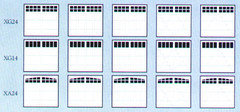
    No, not real glass windows, faux. You really can't tell the difference unless you try to peek in. Goggle 'Faux Garage door windows', there are lots of options. Like these, not real.

    just_terrilynn thanked maddielee
  • 11 years ago

    Based on what you've accomplished so far, Justerrilynn, I don't think any of your ideas are stupid! You've done wonders for that home.

    just_terrilynn thanked User
  • 11 years ago

    I think the garage door's plainness is an asset. I wouldnt want anything to call attention to it.

    just_terrilynn thanked localeater
  • 11 years ago

    Great looking house; I would LOVE a driveway like yours. I'm with the house numbers group.

    When house shopping (15 years ago) my focus was on a side-entry garage so:

    1) the house would look larger

    2) functionality like a garage wouldn't be a focus

    3) potentially messy garage wouldn't be exposed when the garage door was open

    just_terrilynn thanked mustangs81
  • 11 years ago

    Hi, Justterrilynn.


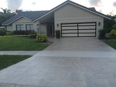
    I usually just lurk here. Before reading all the responses I thought the garage door should mimic your windows, to balance out the front of the house. I think this is what Blfenton was suggesting. Here's a mock up I did in MSPaint.


    just_terrilynn thanked zmith
  • 11 years ago

    Leave the garage as it is. It looks simple and clean, and recedes into the background instead of calling attention to itself, which you don't want. I would do larger, a bit more funky/different lights on the garage and light post.

    just_terrilynn thanked chispa
  • 11 years ago

    The consensus seems to be “don’t touch that”. So, I think
    you are all right. Maybe if I were in a less conservative neighborhood I could
    get a little jiggier and try out some faux windows or creative garage paint
    (thanks for the mockup zmith).

    The Garage side lights and post light were very inexpensive
    as I’m somewhat close (as the crow flies) to the beach. When they blow bouncing
    down the road in a storm of the future I will go bigger and a bit funkier for
    replacements. Outdoor light sizing is tricky isn’t it? I made templates for
    sizing as there were no garage lights at all. My wall template looked a little
    too big but I knew it was better to be a tic larger than something that looked
    like a dot. I wish they were a bit bigger but I don’t mind them. The lantern
    light looked grossly humongous when I took it out of the box and then it shrunk
    when I put it on the pole.

    I love the first house numbers link Allison posted and need
    to think about that.

  • 11 years ago
    last modified: 11 years ago

    I usually love the hinges, trim, do-dads, whatnot, but NOT on your beautiful home's exterior! What strikes me is the simplicity and serenity of the plainness, which elevates the full garage facade into it's own design element, and sweetly balances with the remainder of the home. Looks fabulous as it is!

    Edited to add I started my post before your last response was there - glad you will be embracing your lovely home!

    just_terrilynn thanked gramarows
  • 11 years ago

    It looks good as is. I'd leave the garage doors alone. I think the only thing I would consider is painting the horizontal trim just above the garage door, and above the front windows. Either a darker stone or taupe color, or even a darker shade of the front door color. I think the best place for house numbers would be centered above the garage door.

    just_terrilynn thanked jlc712
  • 11 years ago

    Great house...the door is fine. What bugs me (and I bet I would not notice it in person) is the garage sconce on the viewer's left. It seems like it should not be there; instead it should be on the pillar way over supporting the roof on the left.

    just_terrilynn thanked Fori
  • 11 years ago

    It's perfect, as is.

    just_terrilynn thanked Olychick
  • 11 years ago

    As is the garage door doesn't stand out. If you add anything I think you would be drawing attention to it. I would leave it as is.

    just_terrilynn thanked Gigi Johnson
  • 11 years ago

    I vote for leaving it as is...simple, clean, attractive.

    just_terrilynn thanked Annie Deighnaugh
  • 11 years ago

    I love, love,love the exterior of your home. It is gorgeous. I think you should be happy with it as it is. If anything I had the same thought as zsmith, about having some black on the garage to mimic the windows. However, I think the mock up is too much with all the panels highlighted. Maybe just a frame around the outside in black - not even on the door, but on the door jamb. And then the big black modern house numbers as someone else mocked up. To my eye, you don't want to do too much (and I think the hardware you showed is too much and not of the right era), but just a tweak would be okay.

    just_terrilynn thanked daisychain Zn3b
  • 11 years ago
    last modified: 11 years ago

    Honestly, I think your issue with looking at your garage isn't it's lack of interest, it looks great, but the large uninterrupted space above the doors. If I broke it up, I'd do it higher than the door. Something above it? I rather like the extra piece of wood above the door in your example picture more than the hardware. Food for thought.

    just_terrilynn thanked rob333 (zone 7b)
  • 11 years ago
    last modified: 11 years ago

    I'm a firm believer in mock ups because I am so visual. If you'd
    consider the fake window route (which might look good, even tho I think
    it's perfect, as is), I'd get some dark gray/blackish construction paper
    and cut out fake windows and tape them on the garage where they would
    be, in some different configurations.

    These are FAUX!

    just_terrilynn thanked Olychick
  • 11 years ago

    Thank you all!


    Oly, I think for fun I'll do a mockup on my photo today or tomorrow. The problem I maybe see is that there are eight slightly raised panels across the top. If there were four it would jive better whereas eight might bring on a different look that leaned more traditional. Due to the slight raise and design I couldn't get away with joining two for a total of four. I will try it out though and post in the next day.

  • 11 years ago

    JTL, is this like your garage design? These are faux, too.


    Faux My Garage Door · More Info

    just_terrilynn thanked Olychick
  • 11 years ago
    last modified: 11 years ago

    To minimize the door i would paint it a shade darker than the body of the house ----you could actually paint it the same color as the gable and it will recede. The other suggestions, incliding but not limited to tiny hinges, windows, faux windows and house numbers, will only draw more attention to the door and will not improve it.

    just_terrilynn thanked User
  • 11 years ago

    The faux windows ... I can't even. I probably shouldn't even say anything since it seems like a lot of you think they look good, but ... no. I think they're awful! (Crawling back into my little hole of negativity now.)

    just_terrilynn thanked User
  • 11 years ago

    I would not do anything to emphasize the garage door: it's a HUGE visual element that would dominate the house.

    Doing something to break up the 'wall o' beige" would be easy and inexpensive with 2 shades of paint.

    I didn't show it, but painting the inner part of the entry walls the same paler beige as the part near the roof could look good.


    just_terrilynn thanked User
  • 11 years ago

    I think those faux window could look nifty on the right house but do not think it good for mine. It would give a decent illusion but would distract or even clash with my new windows that I love.

    I'm simply going to have to come to terms with a front facing garage and a house style that doesn't allow much in that area. I have tried to swing the eye in the other direction with a red/orange door and colorful landscape so I'm just going to have to get over it.


  • 11 years ago

    lazy did a great rendering for what I agree would help it! It's that big blank expanse that throws off the balance a little.

    just_terrilynn thanked rob333 (zone 7b)
  • 11 years ago
    last modified: 11 years ago

    Oh sorry lazy gardens! I came back from my unfinished post an didn't see yours. That looks nice! However, the house was painted a year ago so I'm not making changes on that at this time.

    How about just the band's painted the darkest color on the paint chit. A color between the roof color and the darker upper shade?

    Kswl, see, the driveway didn't turn out too bad did it? I had many a bad nights sleep worried it would look like this coloration...

  • 11 years ago
    last modified: 11 years ago

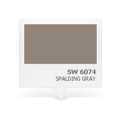
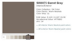
    For the bands maybe? Next color up from top shade is SW Spalding Gray.

    Next darker is SW Garret Gray.
    The Spalding Gray would be in my comfort zone for the banding color change. What do you think? Should I just leave it as is? Here is SW Spalding Gray on an Exterior.

    EDITED to ADD: oh I don't know! Here's a mockup but I'm not sure. Kinda looks like an engineer named Rodger lives here.

  • 11 years ago
    last modified: 11 years ago

    I really prefer how it is now over the darker bands. It looks like just one too many colors/elements.

    It looks totally wonderful! Go in the house. :)

    just_terrilynn thanked Olychick
  • 11 years ago

    Yep I need to let it go already. This is my first time with this type of home ( can you tell hehe).

  • 11 years ago

    Your house is fabulous. I wouldn't change a thing.

    just_terrilynn thanked ILoveRed
  • 10 years ago

    I think I would do more to showcase your pretty entrance. I think the pole lamp distracts from the entrance and the shrub there is too large. I'm late to the discussion, but I would widen your walk way there to evoke the feel of a little court yard, use a stylish sconce mounted on the wall to the left of the entrance and match it to the garage sconces. A slightly brighter paint in the entrance area to pull one in, and perhaps some large potted ferns or other green.


    just_terrilynn thanked donnagwd
  • 10 years ago
    Kinda looks like an engineer named Rodger lives here.

    LOL!

    I agree that what you have now is already perfection, but I so understand that need to keep mulling it over and thinking, "Maybe if ...". Letting go and letting it be is sometimes so hard to do!

    just_terrilynn thanked User
  • 10 years ago
    last modified: 10 years ago

    Thank you Red!

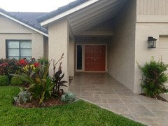
    Donna, I can't do anything about the pole light as they are mandatory. They look very nice at night throughout the neighborhood. I took the house photo (above) at dusk because in the bright of day I was just getting a glare for the driveway. That whole other side of the house is much more colorful than what is showing. I planted bright plants on purpose to swing the eye away from the fugly front facing garage. I'm thinking about "maybe" putting some very nice house numbers on that column. I like the ones Allison posted.

    Hi Auntjen! Yes I need to let it go. It is my usual way to over analize when working on my personal projects. Wish I could stop doing that.

  • 10 years ago

    Oh, honey. I've just spent almost 24 hours obsessing over freakin' mobiles. I totally feel your pain.

    just_terrilynn thanked User
  • 10 years ago
    last modified: 10 years ago

    Hey I thought of you today when looking on my local craigslist. There is an artist north of me doing those plexy boxed real butterflies in flight patterns. They are not cheap but much much cheaper than ones I saw at a gallery in Puerto Rico. I love butterfly art. Your mobile will be very peaceful to look at near the tub.

  • 10 years ago

    Ooooooh, that sounds lovely! I think I know what you're talking about, but now I'm off to Google.

    just_terrilynn thanked User
  • 10 years ago

    It's fine as it is - though maybe play with a darker shade on the garage door and a lighter one on the walls of the entry. Or, some sort of reflective wall surface in the entry area? (I assume you've been looking at similar homes in your community to see how they deal with these issues.)