Software
Houzz Logo Print
hzdeleted_21006250

This is crude....

10 years ago
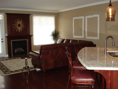
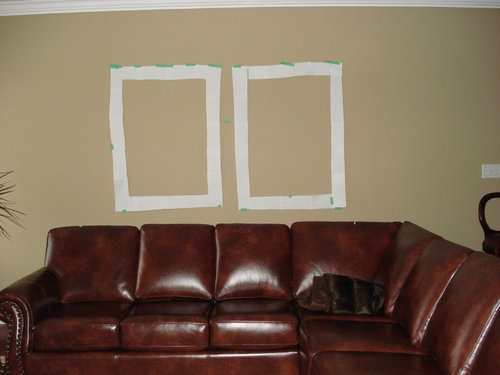
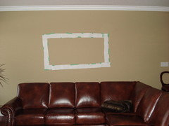
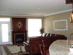
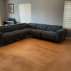
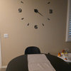
did I get your attention..lol.. MOCKUP of two art pieces I am still contemplating. Want to make darn sure I want them, so size wise, are they good or two big. The white shows the actual frame size, they 36 x 48 overall. If I dont actually get these landscape ones, I want to know what size to look for so this will help me in that sense as well.

Shutters on order ( hope to get them installed any day now), red tufted ottoman on order (wont be here until after Christmas :>( but I want to really get serious about some art on that big blank wall so I can get some pretty cushions too and move on to the dining room. TIA

Comments (28)

  • 10 years ago

    Can you share the art in which you are considering? It helps to see the frame and the art colors etc.

  • 10 years ago

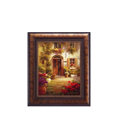
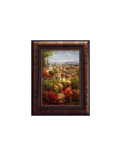
    Here they are, I have shown them before, I just love the subject, as they remind me of our trip to Italy. On the website they show the same size measurements, even though here they dont look it. The only thing I worry about is the scale of the subject The other wall art I have are mostly all large still life pieces. I dont know if these would appear too busy or off in some way.

  • 10 years ago

    The size is okay, but I wouldn't hang those two right next to each other. They don't make a good pair for me. Okay for the same room, but not right next to each other.

  • 10 years ago

    good to know, thanks lascatx

  • 10 years ago

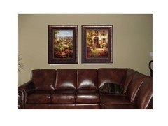
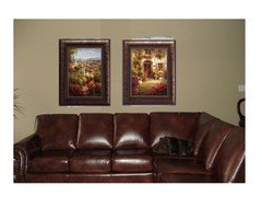
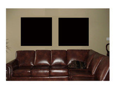
    I think it will look too heavy. Here is a mock up.


  • 10 years ago

    You're a doll aktillery, that really helps me see it. It does look heavy doesnt it, no so sure I like the two of them together either. I thought I needed something heavy as the sectional is big and across from it is a big enterainment centre and bombay chest. Hmmm, do you still think it looks too heavy when you see what is also in the room?

  • 10 years ago

    Maybe that is why I am so hesitant about ordering those, I am trying to convince myself that they will work.

    Good point about wider cream color matting, but I dont want anything under glass, as the big window would cause too much glare on the piece in the day time. I might have to consider maybe just two large pieces of canvas art with no frame. I guess my search is still on.

  • 10 years ago

    How about something lighter and airy. Art.com has lots, just type in Italy.

  • 10 years ago

    I have been on so many of those sites, but just cant commit myself to anything. I think I dont want to do the Italy thing anymore, maybe abstract, or still life but better but would love to see something in person not on line. I admire how many of you order things on line and it works out so well for you,

  • 10 years ago

    Now I am wondering would one large horizontal piece look better than two vertical pieces?

  • 10 years ago

    Can you photoshop them a little further apart? Put some more wall space between them and see how it looks. I actually like them. They're on quite a long wall but you want to leave them above the couch so they're anchored.

  • 10 years ago

    I cant photoshop, it was aktillery that did that for me. They could be moved maybe an inch more a part, that space is 2 inches. I wish I could photoshop it would be alot easier to figure out what would look best.

  • 10 years ago
    last modified: 10 years ago

    I agree with your thought that the scale of the subject is too small...try looking at large scale geometric print artwork, or abstract paintings in colors that you like. I think a larger scale subject of the art would mix in great with your classic furnishings. Or, you could do actual photos from Italy in large frames. Three is a row enlarged in 24 x 24 frames? Below is from Ballard Designs and comes in various sizes.

    http://www.ballarddesigns.com/gleam-art/wall-decor/art-by-subject/abstract/356358

    User thanked goldendoodle56
  • 10 years ago

    I think you are on the right track looking for a horizontal piece. If you have Paint on your computer, you can do a mockup similar to aktillery's.

    I don't care for the abstract from Ballards. I see a cream colored mask that looks like it's screaming, just left of center. Creepy.

  • 10 years ago
    last modified: 10 years ago

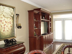
    Mock ups are always the best! Photoshop? I wish I could just snap my fingers and move things around for visuals! I do think they help balance out the entertainment stand. I'm sure you probably already figure this, but if you go with something else I'd just be careful it's not too light that it looks disjointed from your pretty room. The picture above the chest is lighter but still has depth with the richer colors. I like the idea of a horizontal piece. Comparing the location on the wall between your first two photos - The first photo looks like the art would look good horiztonal, larger, or maybe even a third picture. Looking at the second photo it looks balanced and the plant even appears closer. It's funny how different angles make things look in photos!

  • 10 years ago

    Sorry, I just saw this. Funny, I just use Powerpoint. Here is a mock up of the two pieces farther apart.


  • 10 years ago

    golden, I think you are right about the scale, I need something different there to go along with the rest of my pieces. The Ballard one are nice but I am looking to bring in some reds, blues and golds.

    laughable, I am going to retape the paper horizontally to see what it might look like. The only thing is would have to be at least 60 inches wide x 40 to 44 high to look right in that space I think, that is pretty big!

    shee, angles, is what makes it harder when giving advice based on photos, I wish I could invite you all for coffee and we could discuss my decorating dilemma in person!

    atkillery, thank you again for photoshopping. I do prefer them further apart but those arent the paintings for me. You have helped me make a final decision on that. Now I need to decide whether I should be looking for two vertical or one horizontal. Later on today, I will retape horizontally and look for something on line just for a try to see how it might look. Would you be so kind as to photoshop for me again.


  • 10 years ago

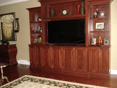
    You didn't post a photo of the entire room but I didn't notice any lamps. Are you considering adding an end table with a lamp next to the couch - or a floor lamp? If so that would probably influence what size art you would hang over the couch.

  • 10 years ago

    marie, I am thinking of a floor lamp, but first I want to get the big stuff in the room. There is overhead lighting in the room on dimmers as well. There are end tables in the room, they are round and goldish toned to pick up on the sunburst.


  • 10 years ago

    Here is a really crude mockup, of what might be a horizontal piece. The size there is 60 wide x 36 high, probably could go higher.

    so what do you think, two verticals or one horizontal?

  • 10 years ago

    No problem, let me know when you find something.

  • 10 years ago

    Thanks aktillery, what are you thoughts about shape? You do so well with your decorating, I respect your opinion.

  • 10 years ago

    I think I like the horizontal shape better...

    I don't mind the other prints either- I think they should be a couple inches higher than they're photoshopped and i like them better a little further apart... they're a lot of contrast for your wall though...

    I love your panther... I didn't realize it was you who had the cool panther I remember seeing a few yrs ago!

  • 10 years ago

    FWIW, when I saw the first photo, I thought the pictures were square - I'm thinking 2 square shapes that mirror the width of the couch would look more proportional - whether or not they are dark or light....

  • 10 years ago

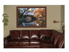
    I think a floor lamp that slightly curves over the sofa and a fuller
    taller tree on the other side would really help anchor the space. This
    way you are not just using only art to do so. I did a mock up just to
    get an idea.

  • 10 years ago

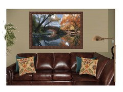
    I might add some pillows to break up the brown leather as well. These are likely not the right pillows but gives an idea.


  • 10 years ago

    busy, I am leaning towards horizontal too. It mimics the TV on the other side. Yes, I have that jaguar. Picked it up on one of our trips. In our last house, it was in the entrance, and I posted pictures because I wanted to paint the walls a deep red and I was looking for advice.....good memory.

    carol, I would never have thought of square looking good. I think it looks better than the rectangular shape, but I think I am liking horizontal best. It will all depend on the piece(s) that speak to me when I see them. I hope that will be soon because I hate looking at those blank walls.

    atkillery, you do a super job with photoshopping, wish I had your talent. Thank you so much for doing it for me. That is a gorgeous picture, wish it had red in it to go along with the red ottoman I have on order. Wow cushions really add alot, cant wait to get that far. My color palette for this room will be red, gold and blue. The tree that is there now is only temporary, I needed something there to distract me from the blank walls. I am thinking of adding a floor lamp eventually, probably curved with a black shade, so it pops against the white shutters to replace that tree. Since the sectional is floating, it would have to be on that side where the tree is to hide the cords. Wish I had a magic wand and it would be all done....