

Seeking grout color choice for backsplash
10 years ago
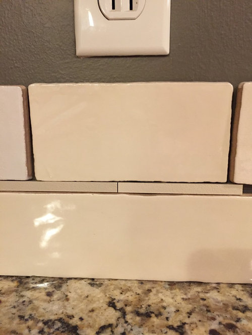
Featured Answer
Sort by:Oldest
Comments (17)
 10 years ago
Related Professionals
Elizabethtown Kitchen & Bathroom Designers · Cumberland Kitchen & Bathroom Designers · Fort Worth Kitchen & Bathroom Designers · Springfield Kitchen & Bathroom Designers · Ithaca Kitchen & Bathroom Designers · Youngstown Kitchen & Bathroom Designers · Minot Kitchen & Bathroom Designers · Rocky Mount Kitchen Remodelers · New Haven Kitchen Remodelers · Allentown Kitchen Remodelers · Saginaw Custom Countertops · Platteville Custom Countertops · Odessa Custom Countertops · Edmonton Custom Countertops · Queens Custom Countertops- 10 years ago
- 10 years ago
 10 years ago
 10 years ago
- 10 years ago
- 10 years ago
- 10 years ago
- 10 years ago
- 10 years ago


Related Stories
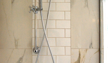
REMODELING GUIDES9 Ways Grout–Yes, Grout–Can Add to Your Design
Choose From a Palette of Grout Colors for a Warm, Unified Look
Full Story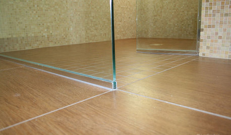
TILEEpoxy vs. Cement Grout — What's the Difference?
Grout is grout, right? Nope. Cement and epoxy versions have different appearances, durability and rules of installation
Full Story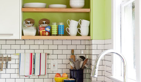
KITCHEN DESIGNSubway Tile Picks Up Gray Grout
Heading into darker territory, subway tile offers a graphic new look for kitchens, bathrooms and more
Full Story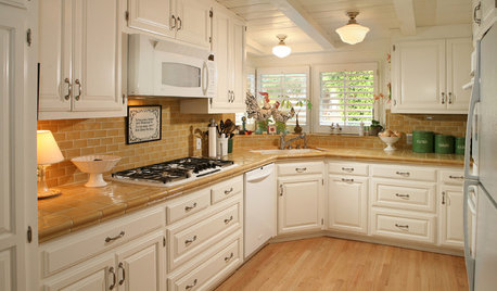
KITCHEN COUNTERTOPSKitchen Counters: Tile, the Choice for Affordable Durability
DIYers and budget-minded remodelers often look to this countertop material, which can last for decades with the right maintenance
Full Story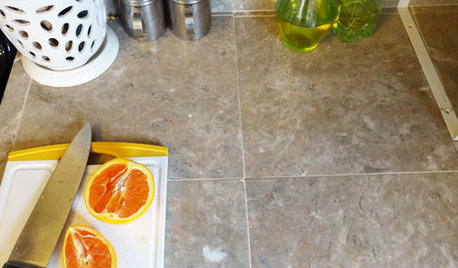
HOUSEKEEPINGHow to Clean Grout — Stains and All
If your grout is grossing you out, this deep-cleaning method will help it look new again
Full Story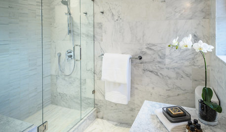
BATHROOM DESIGNConvert Your Tub Space Into a Shower — the Tiling and Grouting Phase
Step 3 in swapping your tub for a sleek new shower: Pick the right tile and test it out, then choose your grout color and type
Full Story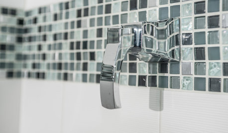
TILE3 Key Steps for Grouting That Looks Its Best
Get your grout right to keep your tile beautiful and for an installation that will last
Full Story
KITCHEN DESIGNThe Future of Backsplashes
Grout is out. Continuous sheets of glass, stone, metal and porcelain are saving cleaning time and offering more looks than ever
Full Story
KITCHEN DESIGNKitchen Counters: Stainless Steel, the Chefs' Choice
Professional-grade strength and shining beauty unite in classic stainless steel countertops for the kitchen
Full Story
KITCHEN COUNTERTOPSKitchen Counters: Granite, Still a Go-to Surface Choice
Every slab of this natural stone is one of a kind — but there are things to watch for while you're admiring its unique beauty
Full Story

klcharles