Software
Houzz Logo Print
amykath

Narrowed done please vote

10 years ago
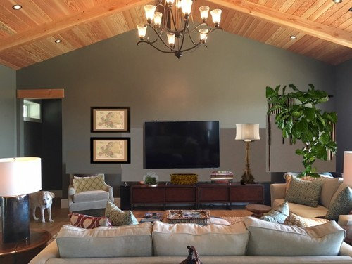
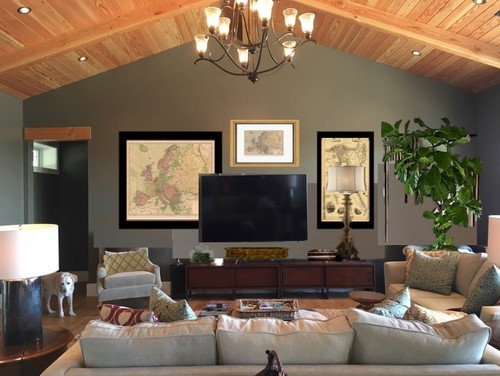
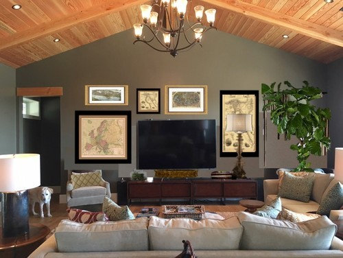
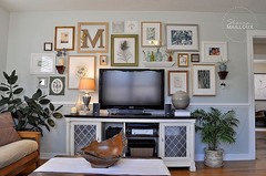
If these three which do you prefer

1 I'd add art behind the tree

  1. Not sure I could work the large square piece behind the wall mounted tv

3

Comments (73)

  • 10 years ago

    From my mock ups nothing is set in stone. I just threw them together for ideas.

    I'm wide open to suggestions!!


  • 10 years ago

    #3, because I love gallery walls and because IMO that wall needs filling. But this is all very much a matter of personal taste!

  • 10 years ago

    #1 as the wall isn't screaming "look at me, look at me". It's a quiet, tasteful view from any part of the room.

  • 10 years ago

    #1. But I would go slowly and add things judiciously and one or two at a time. I don't mind the art behind the tall skinny lamp but it will definitely depend on the lamp and the art together imo. Don't think you really need it. I would not put anything above the tv. On the console is where I'd use care in not adding too many distracting or small pieces either. A patina'd copper piece on one side might work.

  • 10 years ago

    I like #3 without the lamp; If the lamp has to stay then #1

  • 10 years ago

    Another vote for #1

  • 10 years ago

    #1 with the art behind the tree.

  • 10 years ago

    I like option 3. I like the symmetry, but, I don't care to much for the TV stand. I think something taller would be better.

  • 10 years ago

    Can you do a mock up of #3, but have all the art framed in the gold frames with the thin black fillet or double mat. I think you need some black detail in the framing, to tie it into the black TV, but not the mass of all black frames. I'll be waiting for mock up #4! :-)

  • 10 years ago

    None of the above. Someone posted a suggestion of wall sconces. They were were large and had large lamp shades. Or two lamps, as tall as yours, but with a bit more bulk.

    Sorry, but it looks like a lot of visual clutter to me. It's a TV wall, so I think that should be the primary focus.

  • 10 years ago

    I'd like something like 1 the best... I doubt if I would put a lamp next to the tv, but I don't think it looks bad tho... I would probably put something long and vertical there like in 2, but with no lamp in front of it. it would bug me not to have the cabinet centered under the tv- I would center that first. no art behind the plant.

  • 10 years ago

    What about #1 but with three pictures going down the wall instead of two pictures? I enjoy a mix of prints together and I enjoy symmetry of prints; I don't think you have to use only one style throughout your home. You have a great start, maybe start with what you have and live with that for awhile. Good Luck. Please post of picture when you get it all together.

  • 10 years ago

    Given the size of your wall, I like #3.

  • 10 years ago

    I like #1 single it's the least busy.

  • 10 years ago

    I'm just trying to figure out how tall the lamp will have to be in order to fill the space next to a 70" TV. I know the 70" dimension is measured diagonally, so how tall is the TV? Maybe wall sconces would work out better.

  • PRO
    10 years ago

    #3, it makes the TV less of the focal point.

  • 10 years ago
    last modified: 10 years ago

    Wow! So many ideas! I think I'm getting a migraine ;) The lamp is 47.5 tall and the tv is 36" tall.

    Im going to digest all of this and get back to you guys!

  • 10 years ago
    last modified: 10 years ago

    Amazing how good a 70" tv can look in a space (this tv is bigger than most people!).

    aktillery9, I think you've done wonderfully in the room already. With a tv this large I assume it is watched often? You might also try photoshopping with the football game on the tv and see if that makes any difference to you.

    1 - I like this the best of the 3.

    2 - Not for me with a wall-mounted tv. I think it would be fine if the tv were on a stand on the media cabinet.

    3 - Personally I like this the least because to me, this looks too busy -- a bit like maybe it is trying hard, whereas the others look less planned and more natural? For me the "part of a gallery wall" approach works better if the tv is smaller.

  • 10 years ago

    Thanks so much oak!

  • PRO
    10 years ago


  • 10 years ago

    I'm late to the party, but I prefer #1. I do love a gallery wall, but in this instance I think your beautiful room is a case of less is more :-) I would prefer to see the top of the highest picture aligned with the top of the tv in real life though.

  • 10 years ago

    I like 1 best for the same reasons already stated. 3 is my next choice as it looks like a nice gallery wall. Very balanced too IMO. I just love this room.

    amykath thanked User
  • 10 years ago

    1 and then 3

  • 10 years ago

    Firsts and last. First seems a little lacking while the last seems a little too much. All three ideas are good, but I think each needs some tweaking. You're close.

  • 10 years ago

    #1 with nothing behibd the tree.

    Mr. Fluffy concurs.

  • 10 years ago

    I did not realize until now that you are dealing with the same issue as I...my scale is slightly smaller, however.

    I had the TV off center of the peak, and it was driving me bonkers, so I moved it to the "middle", but now it looks off because of the doorway.

    I like #3.

  • 10 years ago

    #3. The large room, bold ceiling, impressive windows and even more impressive view - I think #1 would look too skimpy. I like the look of art behind the plant and the lamp.

  • 10 years ago

    I like #3 the best-it appears the most balanced of all. I'd tweak it a bit though, while in the process. For example the lamp seems really, really tall to me. But maybe it feels different when you're physically in the room.

    I like how you choose pieces that share the theme/color and don't distract too much..

    I had an idea of putting a painting or two next to my TV, but they were too intense. One was too funny. What if I'm watching something really serious and sad? And one had too much character, being a portrait. What if I'm watching something happy(which I rarely do, but still)? LOL

    In short I like what you're trying to do here. The room itself, being pretty magnificent, also helps))

    I also liked idea (I forgot who suggested it, sorry, and can't seem to find the post) of starting small, and adding new pieces from time to time.

    And the last but not least-can I just add I love the tree? I also have the same kind. They're so, so beautiful.

  • 10 years ago

    Thanks for the compliments April. Everything, the lamp and the tree etc is photoshopped in. Not a real tree here yet. ;)

  • 10 years ago

    #1 !

  • 10 years ago

    Less is good :-)

  • 10 years ago
    last modified: 10 years ago

    #3 with no reason. Just looks right to me. I could see myself in the room. Homey.

  • 10 years ago

    Sorry, none of those would be my choice. I'd hang the sailboat painting on the left and have nothing behind the plant.

  • 10 years ago

    Cindy, what would you place on the right hand side?

  • 10 years ago
    last modified: 10 years ago

    #3. I know there's a lot, but it's more like a wall of art, of which your TV is one piece. It stands out less "one of these things is not like the other." With fewer, it looks a little odd. Actually my first choice is none of these, maybe try some other arrangements?

  • 10 years ago

    #3

  • 10 years ago

    Just the lamp and plant.

  • 10 years ago

    I am leaning to more is less. haha I want to brighten that wall which is very blah and dark. I will take my time and slowly add what I can. I promise to post pics when I am done! Luckily hubby says "do what you want." Can't beat that!!

  • 10 years ago

    #3 hands down--but I don't "get" the lamp there.

  • 10 years ago

    More is less. Who'da thunk it?

  • 10 years ago

    Beautiful room:)

    I lean toward #1 as well!

  • 10 years ago

    If you go with #3 or some other "more" configuration, I'd skip the lamp on the console and find a nice floor lamp to go next to the chair.

  • 10 years ago

    Lovely room. #3! People will not always just be standing at the end of the room looking straight at the wall. They will be standing to the side, sitting in chairs, etc., so I think a wall of art would be preferable and the wide, blank spaces on each side will look bare to those not just looking straight on. And not everyone will always be standing where the lamp blocks the art behind it.

  • 10 years ago

    I like #2 or #3 (adjust that lamp, though). I am all for not making a TV a focal point (unless it is on, at which point that issue will take care of itself).

  • 10 years ago

    I am definitely going to make the wall an art wall. It definitely needs to be. It is a dark wall which needs life. I am going to take a while in making it just so. It will take me a while as I do not want to rush it. Thanks to everyone who commented!!! You guys are the BEST! Love this forum!!! Been here since 2001 and you guys have never let me down. Again thanks!!!!

  • 10 years ago

    I think just put the tree in the corner and *bam* you're done. The tv is huge and will always be an attention grabber. My mind registers "oh, wow, giant tv" and then forgets about it. Surrounding it with other items to look at makes me think "oh, wow, giant tv, and a map, and whoa there's the giant tv again, and look a lovely watercolor, yikes there's the tv again. Man that thing is BIG." Your room is beautiful and, if I remember correctly, your views are fabulous so I, personally, would be focusing on the overall feel & look of your room and outside views and not looking at that wall very long.

  • 10 years ago

    good! it's best not to get a bunch of stuff just to try to fill up the space!

  • 10 years ago

    Definitely number one. I also like the lamp and would not add a picture behind the tree or lamp. Number 1 matches the serene feeling of the room.

  • 10 years ago

    Synthesis (?) of 1 & 2. What's to the left of the TV (1) and what's right of the TV (2) except no lamp.

  • 10 years ago

    I think you are right to take your time Art is personal. It can take time to evolve. You have great taste and will pull it together just the way you like it.

    amykath thanked lascatx