

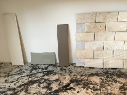
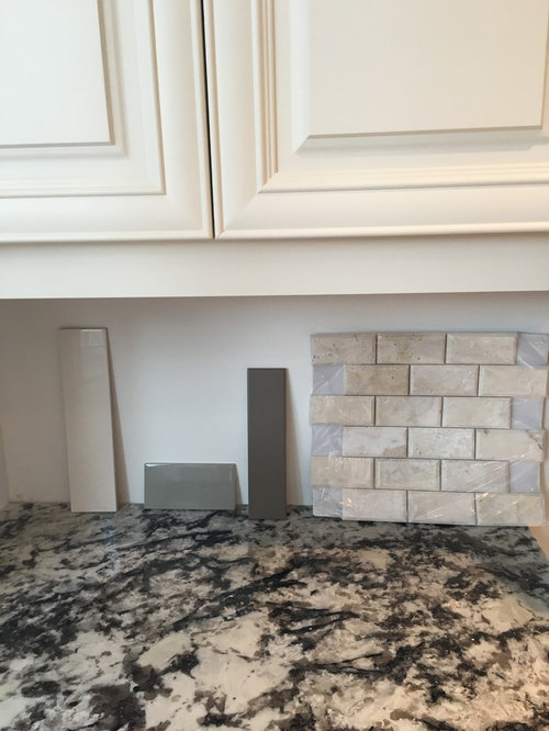
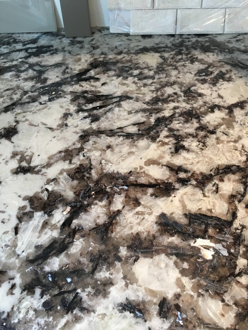
Yet ANOTHER backsplash dilemma
10 years ago
Featured Answer
Sort by:Oldest
Comments (26)
 10 years ago
- PRO10 years ago
Related Professionals
Wichita Interior Designers & Decorators · Southaven Interior Designers & Decorators · Ottumwa Interior Designers & Decorators · North Adams Interior Designers & Decorators · Brainerd Interior Designers & Decorators · Charleston Architects & Building Designers · Galveston Architects & Building Designers · Lafayette Architects & Building Designers · Ocala Kitchen & Bathroom Designers · Topeka Kitchen & Bathroom Designers · Baton Rouge Kitchen & Bathroom Designers · College Station Kitchen & Bathroom Designers · Lansing Kitchen & Bathroom Designers · Winona Kitchen & Bathroom Designers · Watertown Kitchen & Bathroom Designers- 10 years ago
 10 years ago
- 10 years ago
 10 years ago
- 10 years ago
- 10 years ago
- PRO10 years ago
- 10 years agolast modified: 10 years ago
- 10 years ago
- 10 years ago
- 10 years ago
- 10 years agolast modified: 10 years ago
- 10 years ago
- 10 years ago
 PRO10 years ago
- 10 years ago
- 10 years ago
 10 years agolast modified: 10 years ago
 10 years agolast modified: 10 years ago
- 10 years ago
- 10 years ago
 10 years ago
- 9 years ago

Related Stories
REMODELING GUIDESHouzzers to the Rescue: Users Solve Design Dilemmas
The proof is in the painting — and the pond. As Houzz users hit 100,000 discussions, see some of the results of their advice and ideas
Full Story
TRIMHow to Fix a Mirror-Above-the-Mantel Dilemma
Got an unmovable mirror over your fireplace? Use trim to turn it into a feature that will turn heads
Full Story
CONTAINER GARDENSSolve Your Garden Border Dilemmas With Planted Pots
Set your containers free from the patio — placed among plantings in the ground, they fill unsightly gaps, let you experiment and more
Full Story
KITCHEN DESIGNDesign Dilemma: My Kitchen Needs Help!
See how you can update a kitchen with new countertops, light fixtures, paint and hardware
Full Story
DINING ROOMSDesign Dilemma: My Dining Room Needs Revamping!
Watch a dining-room makeover unfold in the Houzz Questions forum
Full Story
MORE ROOMSDesign Dilemma: Decorating Around an Open Entryway
How Would You Design This Narrow Space?
Full Story
REMODELING GUIDESHave a Design Dilemma? Talk Amongst Yourselves
Solve challenges by getting feedback from Houzz’s community of design lovers and professionals. Here’s how
Full Story
BEDROOMSDesign Dilemma: How to Make a Bedroom Workspace Fit
Whether your bedroom is small or sleep intrusion is a concern, here's how to mix a good day's work with a good night's sleep
Full Story
SMALL SPACESDesign Dilemma: Decorating a Dorm Room
How to Create a Stylish Collegiate Abode
Full Story
KITCHEN DESIGNDesign Dilemma: Lightening Up a Kitchen
What counters and accents could balance the wood in this kitchen?
Full Story





barrowp