Software
Houzz Logo Print
cleepritch

Finishing touches living room

10 years ago
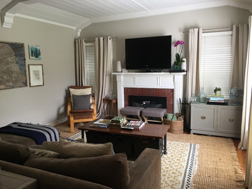
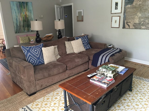
Our living room just doesn't feel like a polished space. We have two small kids so I won't be replacing the furniture until they are a little older but I'd love advice to style the top of the dining table and finish off the space.

Comments (20)

  • 10 years ago
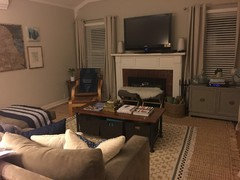
    I think you've done a nice styling job. Try moving the gray chest and the chair. Put the chest against the wall with the art, it doesn't look balanced next to the fireplace. I like the layered rugs and the lamps and the wall color - good work.
  • 10 years ago

    I would remove the smaller rug. You have a lot of colors in that room.

  • PRO
    10 years ago

    You've made a great start. I would run with the navy as your predominant accent color. You'll need to repeat it for it to take more of a starring role. Consider adding more art to pick up navy, and be sure to bring more navy tones to the fireplace side of the room to pull it all together. Nice work so far, tho!

    cleepritch thanked Mad Mod Home
  • 10 years ago

    Thank you Madison Modern Home...should I build navy in the gallery wall or replace the chair with a navy armchair? Navy pillows on the benches? Any ideas about coffee table styling? Thanks for your input!!

  • PRO
    10 years ago

    Yes, I'd add more art to the gallery wall -- bringing in navy there. I don't think the benches need pillows. Find ways to incorporate blue (even if it's a lighter shade of navy it'll work) into your accessories -- books, etc -- for your coffee table. I find that restricting your colors to a couple of accents works best -- In this case blue with added yellow (from the rug). Blue and yellow work very well together

    cleepritch thanked Mad Mod Home
  • 10 years ago

    You have red tones in your carpet that don't accent your wall color and create cohesion. I would paint your fireplace bricks, soft cream. It takes at least three coats of paint to cover those bricks, btw. You should choose one accent color, like gold, and stick with it. Your couch pillows aren't adding to cohesion in this space. think of all the elements in this space as needing to relate to each other in some way. Style, color, wood, and that may mean moving some pieces out.

    cleepritch thanked User
  • 10 years ago

    Puremichigan thank you. Those couch cushions drive me crazy too. Do you have any pattern suggestions that would work better? Should I go with a solid? I think about painting the bricks often but worry about making that jump!

  • 10 years ago

    Thank you Design Intervention. There is no overhead lighting options with our ceiling but I have moved countless lamps in and out of the space but nothing ever looks right

  • 10 years ago

    I put it off also, but once I did it I never regretted it. I have tried a few different colors, but that's also okay, because it does take some coats to get all of the brick painted.

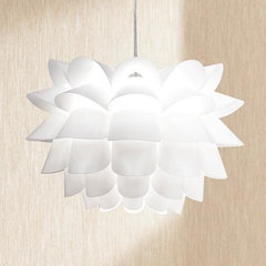
    I also thought about your lighting and accenting your beautiful ceiling with ceiling pendant lamps. Below is just an idea, there are lots of pendants to choose from, in all price points.

    Possini Euro White Flower 19 1/2" Wide Pendant Chandelier · More Info

  • 10 years ago

    When you get down to the details like couch cushions you should be going with a single accent color. I love your chair in the corner, would like to see it without any cushions. That's a gold/brown color? You have gold in your carpeting, I think gold would look good on your couch.

    cleepritch thanked User
  • 10 years ago
    I agree with many comments here. You have beautiful things - but it's all a bit overwhelming. Can you remove the 2nd carpet, take off the pillows from the chair and remove all the knick nacs from the fireplace and table to the right of fireplace? Then start adding accents back in slowly.
    cleepritch thanked Kim C
  • 10 years ago
    Also, the gallery wall could definitely use more pictures. It will look great!!
    cleepritch thanked Kim C
  • 10 years ago

    Tomash Would you art below the existing pictures or on the sides?

  • 10 years ago
    To the right forsure and maybe a bit below.
  • 10 years ago
    Also that little table by the chair and window should be pulled away from the wall because it's jamming the space and causing the curtain to get pushed in :)
  • 10 years ago

    Thank you to everyone for all your tips on the space. I am searching for some art to add to the gallery wall, considering a cream ottoman to lighten up the space, going to paint out brick, and grab a big plant for the corner. I'd like to add in some table or floor lighting but am having trouble finding something that looks right in the space. Here is it so far

  • 10 years ago
    I agree about moving the chest under the art. Your big long windows are great, and seeing the full curtain length will make it feel more polished and less cluttered. The stools and chair feel out of place in this room, but understandable if you feel you need more seating. And my go to trick is it only takes 1 plant to immediately make things feel more homey. It's magical. Even a cute succulent arrangement in a glass terrarium on the coffee table. They're easy to take care of as well.
  • 10 years ago
    Have you considered moving the tv and the couch? If you have hung the tv, you probably don't want to mess with it, but it might be worth a try. Switch the tv and the painting and try the couch on the wall that we can't see in the photos. Put the gray chest under the tv.
  • 10 years ago
    Oops, I see you Ave Windows or doors on that wall, never mind
Sponsored
Buckeye Basements, Inc.
Average rating: 5 out of 5 stars40 Reviews
Central Ohio's Basement Finishing ExpertsBest Of Houzz '13-'21