Software
Houzz Logo Print
sstrazisar

choosing a tile pattern

10 years ago
Hi all,

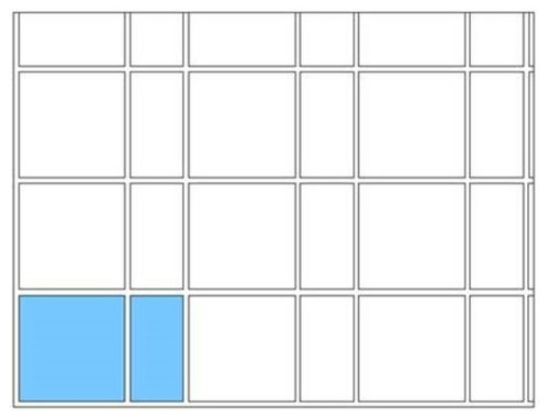
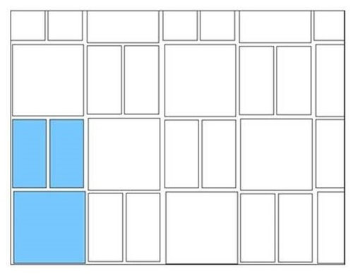
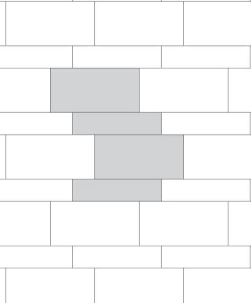
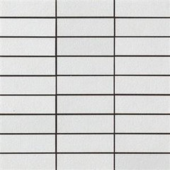
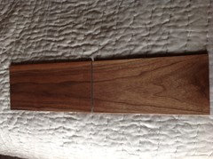
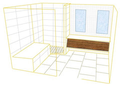
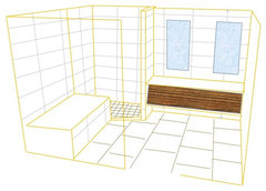
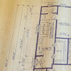
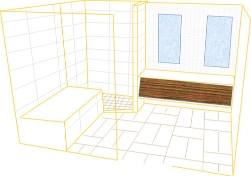
I am getting close to pulling the trigger on my MB remodel. One of the last remaining items is to finalize the tile layout. I've posted before, and mentioned how I'm trying for a modern organic kind of vibe. I'm looking at a floating grain matched walnut vanity, white quartz countertops, white tiles on the wall and a warm cotto look tile on the floor. I'm stuck on the tile layout, particularly with the floor. I think I'm good with the 12x24 tile on the wall, and the same tile in a mosaic behind the vanity (and in shower niches). The wall tile I selected only comes in these sizes anyway. Should I stick with a similarly large format tile on the floor as shown in my first diagram with the 12 x 24? Or would smaller 6.5 x 13 be more interesting, as there is a lot of variation in the cotto tile. Should I go with a stacked pattern versus offset to be consistent with the walls? Should I incorporate squares to tie in the shower floor, which is a 2x2 mosaic of the same cotto floor tiles? For the floor tile, I have access to 6.5 x 13, 13 x 13, 12 x 24, and 20 x 20. Any votes on the options below or others are most welcome! Thanks.

bath · More Info

bath · More Info

bath · More Info

bath · More Info

Comments (11)

  • 10 years ago

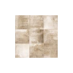
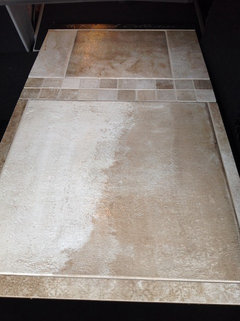
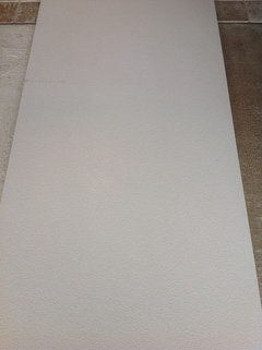
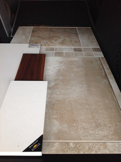
    And here's some pictures of the tiles.

    Villa Medici™ | Ragno USA · More Info

    Ceramic & Porcelain Tile page 4 | Allfloors Carpet One Floor & Home · More Info

  • 10 years ago

    If I am understanding correctly, the Happy Floors Chroma will be the shower walls and a mosaic behind sink. I am not sure I would do wall behind tub all the way to the ceiling, I would want some painted space.

    For the floor I like the pattern in you first picture

  • 10 years ago

    I would start with the floor since you know you're using the grain-matched walnut vanity. I might do the 20 x 20 because it provides a calm floor with no direction, whereas rectangular tiles create movement and "lead" you in a direction. They're path-like to my eye and I don't care for that in a small room. I think it's important to have minimal floor patterning with your walnut so I think I'd lay it in a grid. You could off-set the large squares though--I have both patterns in my home, with the grid in the bathroom.

    Do you have a sample of the floor tile? That one might be too close to the color of the vanity, and you can't be sure of the color variation from a photo. I'm not sure I like the cool white of the wall tile and mosaic with the floor. The stacked white tile seems like very rigid patterning for the expanse of wall it has to cover. But with the 20 x 20 in a grid, I'd want to off-set the wall tile. I think the wall needs the movement of the off-set tile.

    Just kind of thinking out loud here. It will be easier for us to visualize your plans when you have the actual samples. Right now it feels like a lot of rigid rectangular shapes--a very utilitarian bathroom.

  • 10 years ago
    Localeater, you have it right! Thanks for your vote. Only 2 of the 4 walls are tiled...I tend to like the all-or-nothing approach to tiled surfaces.

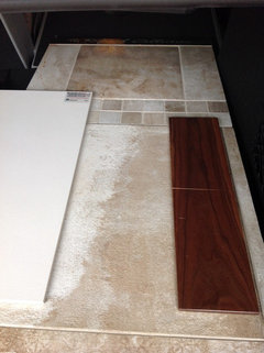
    Mayflowers, I purposely chose tiles that I thought suggested no linear veining/movement, so your comment is very interesting! I'm trying to let the vanity be the star, but thought the floor could be the supporting player. :) The room is 12'3"x 9'6", so I would call it medium sized? I like the contrast between crisp white and warm wood, but your utilitarian comment concerns me. I definitely don't want that adjective to spring to mind! Since the vanity floats 14" off the floor I thought I could get away with more interest on the floor, and in person the tiles seem to coordinate well. Pics attached. I love the floor tile, and keep coming back to it, but maybe it's too much? I see a lot of solid grey concrete looking tile used with walnut in photos, but I'm just not a grey person. And solid taupe tiles end up looking pink in my space. The white wall tile has a little sheen variation to it, but is otherwise quiet. I will mock up a grid floor with offset wall tile and repost it, but the mosaic only comes in stacked 1.25 x 4. Thank you so much for your comments! I find it so helpful to talk through with people (unlike husband) who are interested!
  • 10 years ago
    A few more together, including the Quartz in considering in one. It's white with slight speckling.
  • 10 years ago
    last modified: 10 years ago

    Thanks for posting the photos. There's a lot of tile variation so the floor will show movement even in a 20 x 20, but I don't think it's too much with the walnut. I think the concrete look is good with the walnut and modern design. I have similar floor tile in my kitchen where one tile looks almost solid and the other has movement. I have it with a plain quartz counter and cherry cabinets. It's off-set.

    Would you grout the 12 x 24 in white so it'd look like a solid surface? I think that would work. Then it won't matter if it's stacked.

    I'm not sure about the mosaic behind the vanity. Didn't want to go there yet but since the floor seems okay, we might as well! You'll have four different tiles in the room--busy for modern design. By using the cotto squares on the floor and shower floor, you repeat the color and shape but change the size, so I think that's good. I wouldn't put that white mosaic in the niche. Maybe do as localeater suggested and not tile the tub area to the ceiling but tile behind the vanity with the 12 x 24. But I'd probably want to do a smaller tile if you've got the large format floor tile.

  • 10 years ago

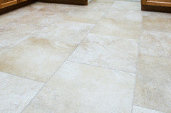
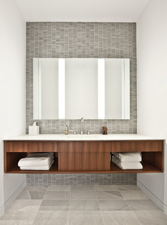
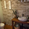
    may, your floor looks great, and nice to hear it works with plain quartz and cherry! My choices are similar in a sense. I have worried about the 4 different tile sizes, but was thinking since there are only two colors, one of which is simple white, and no "accent strips" it'd be ok. Maybe not? Good point about keeping the niches simple...I will nix the mosaic idea in them. I had tentatively planned to have a niche in the shower, and on the bath wall for storage, so I'm not sure how that'd look with an incompletely tiled wall? I did plan to do white grout on the walls so the pattern would be subtle either way. Here's my pattern mock-up of the square offset floor tile, with and without the vanity mosaic. Unfortunately this white tile, which I really like for its subtle sheen variation, only comes in the 12x24 (and mosaic) size. I've also attached an inspiration photo that I really like. I'm looking at different tile, but I keep gravitating to this picture. It's interesting, but not fussy. Thanks again for the advice!

    bath · More Info

    bath · More Info

    Mid-North Residence · More Info

  • 10 years ago
    last modified: 10 years ago

    I prefer the grid. I even like the 12 x 12 tiles shown, if you feel you need more variation as you select materials.

    I think the color relationship of the tiles make that work, while you will have white counter with white mosaic grouted in white. I would like to see a little of the warmer tones in the mosaic to tie it to the floor. Have you seen the mosaic? I would order a sample.

    I like the large simple mirror instead of your double mirrors. It cuts down on the amount of pattern from the tile. You could still use side sconces if that's your plan by mounting them through the mirror, as long as you don't put the sinks at the end of the vanity. I see that mistake a lot.

  • 10 years ago
    last modified: 10 years ago

    Are you using the BI or GR color of the cotto tile?

    I clicked and saw it's GR. Have you seen the BI? It looks like it has more white.

  • 10 years ago
    Hi mayflowers, when you say you like the grid, you mean the non-offset squares? My bathroom has no natural light unfortunately, so another reason for the white wall tile is to bounce the light around. I could do the cotto 2x2 GR mosaic behind the vanity, then it would tie to the floor. The Quartz is lightly specked, so not a solid white like the tiles. We need medicine cabinets for the mirror for storage, I would have otherwise done one big mirror. And the large horizontal medicine cabs are budget busters! Funny you mention the Bl color...it was my original plan. But when I brought samples home, it seemed too white. I think I need to do some more mock ups, as I'm terrible just visualizing this in my head! You're giving me a lot to consider, which is great.