

Is this an old lady room?
We did the whole griege thing at our last home. And before that we did beige. We consistently followed the trends and gave our home the HGTV makeover every 7 to 10 years.
Having said that, old standards like nomadic desert and revere pewter just didn't seem to do this new house justice.
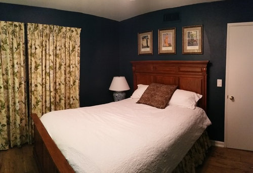
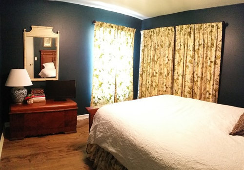
I wouldn't say I'm afraid of color or pattern. However I am afraid of over doing it. Two weeks ago my friend came over for the first time since I started this guest room. She called it the old lady room. Does it look like an old lady room?
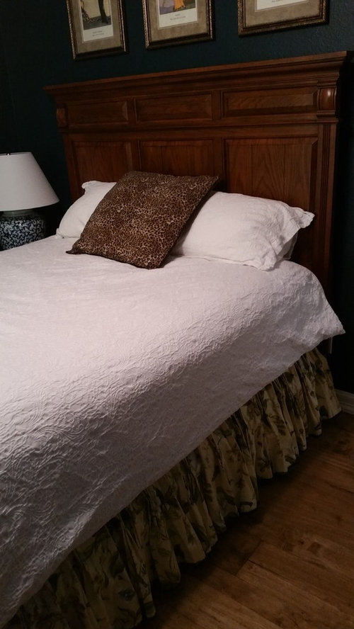
I bought enough fabric to make curtains and bedding. After I made the curtains and dust ruffle I decided a duvet would be too much. But I didn't think the room looked old lady.
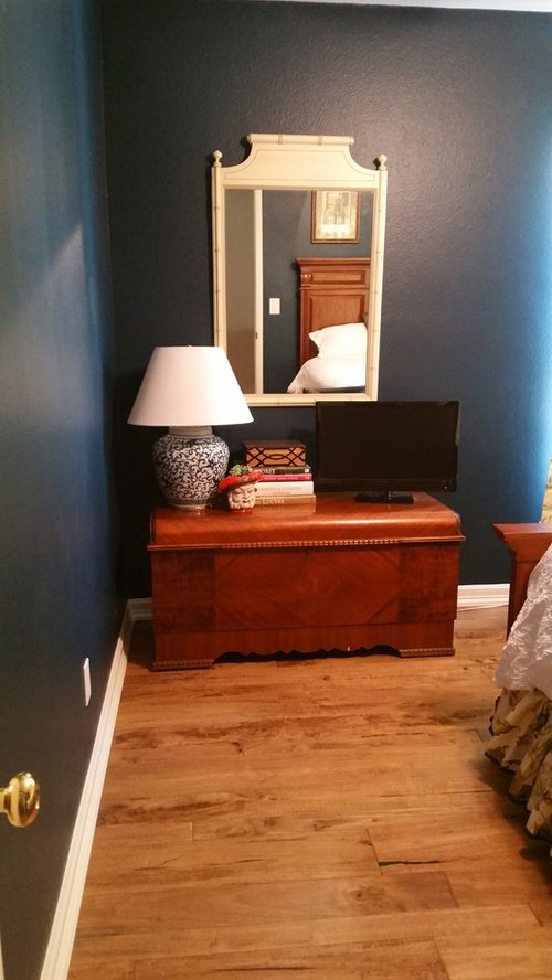
I have attached some photos. please let me know if you see room for improvement. I have children and animals so solutions must be sensible for an active house.
Comments (120)
 10 years ago
There are always going to be the two camps.....those that think antique furniture is "old" and stogey and those that love gorgeous antiques that are classic and solid and have a history and often, like yours, a personal connection. Guess what camp I am in. :-)
I love your classic, Waverly flowered drapes and your antique furniture. Dorothy Gale's photos demonstrate beautiful, classic rooms with flowered drapes and dust ruffles and they are fresh and "young" looking. The only difference is a lighter wall colour and some sparkly accessories like the ones Puremichigan reccommemded.
 10 years ago
Jennifer made some good catches, especially about the nonmatching tones of white. An easy fix. I also note that, while I like your lamps, the one on the nightstand is too low to actually use as a reading lamp, so something taller (and more modern? picking an accent color from the room?) would help there. Would definitely pitch the mirror, and I agree that the chest would be nicer if it could hold luggage, so maybe if you hang the TV and get a smaller mirror like the round one suggested above, that corner will do its job a bit better. You could probably do without the lamp there, too, since you seem to have overhead light.
As for colors, put me in the camp that thinks that the curtains could be fine if you take the room light and sunny, but otherwise something needs to change, either the shade of the wall or the type of window covering. Also, the leopard print pillow, but I'm a pillow minimalist anyway. :)
Related Professionals
Fort Myers Interior Designers & Decorators · Kansas City Interior Designers & Decorators · Leominster Interior Designers & Decorators · Toledo Interior Designers & Decorators · Fort Collins Interior Designers & Decorators · Lexington Architects & Building Designers · Nashville Architects & Building Designers · Boise Architects & Building Designers · Missoula Architects & Building Designers · Cowansville Architects & Building Designers · Saint Joseph Kitchen & Bathroom Designers · York Kitchen & Bathroom Designers · Wichita Falls Kitchen & Bathroom Designers · Glenwood Springs Kitchen & Bathroom Designers · Kennewick Kitchen & Bathroom Designers 10 years ago
I like everything in the room with the exception on the dust ruffle and curtains. I am sorry to say that as I am sure it was a lot of work and they look beautifully made. I like the ideas joannakyriacou fom Iconic came up with. Your chest and furniture are perfect for an eclectic look. Looking at the modern cool vibe your former house had I do think this will be a better fit for you. I would paint the mirror a glossy white as it does not play well with the other whites in the room.
 10 years agolast modified: 10 years ago
Don't listen to anyone who tells you to paint that beautiful heirloom bed or chest.
I do like the brighter green walls. And I especially like the idea of finding a coordinating fabric to the curtains for a pillow or two or even for lampshades.
My favorite thing about this room, (aside from the family love it obviously holds) is how many people are having fun decorating it. :)
 10 years agolast modified: 10 years ago
I really like the color I just think its too dark for the room.. Its making it feel smaller than it is. But.. please don't paint the whole room green lol. You've got the right idea with the lighter color bed clothes but I think that's whats giving off the "old lady" vibe.. Nothing about the curtain fabric or the rest of the color scheme is old lady! I actually love the fabric on the curtains.. and love the trunk!!
My biggest problem with the room is the layout.. Can we rearrange the furniture to move the head of the bed away from the door? Say, swap the bed to where the trunk is and the trunk to the wall you're facing when you walk in? And move them curtains up as far as possible? :)
- 10 years ago
love your post! I'm learning a lot, because it looks like my room too! Thank you Iconic, like your ideas. Please don't paint the bed,or chest. They're beautiful, and you may regret it in 5 years.
Susan Alenka
Original Author10 years agoAs far as moving the furniture around it really isn't possible. This room is along a corridor of former servants rooms. None of them are bigger than 12x12. If I put the bed on the opposite wall you walk right into the footboard with the door fully open. Also if it's on the other wall with flanking side tables you cannot fully open the door and you have to squeeze around the outside of the bed.
I understand what people are saying about the drapes. However, I didn't buy these at Target for $30 a panel. Fabric is an investment. I understand if you believe I made a bad investment but the drapes stay. To give you an idea of the investment: 3 yards per panel at 20 dollars a yard times 6 panels. That doesn't include the lining or the trim or the thread or the time. If I were to order these from a jobber they would also charge me between 5 to 10 dollars per pleat. I actually think that's why noone is pleating their drapes not because it's old fashioned. It is formal and it adds about $100 to every custom panel. That also doesn't include the bedskirt which is just a few yards. You couldn't sell a drape at pottery barn for 100.00 if you pleated them. It requires time and quality control.
Let me explain my thinking on this room when I put it together because there are so many differing opinions. Not everything in this room works. however, i didnt just throw it together. It may have been a misguided attempt but i was trying something new to me. I was always under the impression that you don't paint a dark room light colors because they tend to look dingy. So I chose a color out of the drapes. I read an article that said your colors should be about 45 percent one color and 25% the next and then two colors aprox. 15 percent each acting as accents. So that is what I tried to do. Even the leopard pillow which I thought was fun matches a butterfly perfectly as far as colors go. The mirror matches the drapes too. Other than the whites everything in here matches colorwise. However I understand that that doesn't actually mean it works together.
Also, hidden behind part of the drapes is a door to a small closet. There is a luggage stand in it and hangers for my guests belongings.
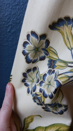
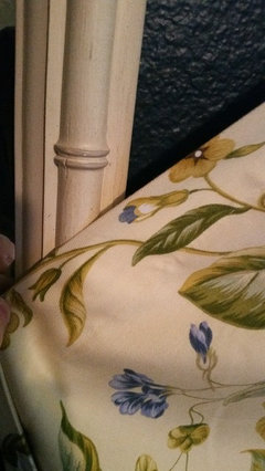
I like a lot of the ideas given to me on this post. I suppose this has helped me define that this house is more traditional than my last house. I don't think traditional has to mean old and I'm glad for the ideas from both professionals and design lovers alike.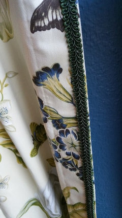

- 10 years ago
I'm with you on the drapes, they took planning and work and are pretty. Start there. And keep your furniture. Look at your bedding for an update. A layer or two will make it that much more interesting.
Susan Alenka
Original Author10 years agoI think I have an idea. I will post the updates once they are made. If people still don't like the room then tough! lol. but no seriously, Thank you. 10 years ago
I really wish I could have seen the last pics you posted first. The colours are much more true than your previous pics. And now your paint choice makes much more sense. Though I still think a dark lime would work nicely, I now agree that the tealy-blue looks good too.
I think your instincts are good and the room just needs a bit of tweaking like I described earlier.
Consolidate your whites- it looks like the curtains actually have a white background rather than a yellow, so that should be what you try to match. Put a shelf above your chest for the TV and decorations- even if it's not required as a luggage stand, it will let the furniture shine and put the TV at a good viewing height.
- 10 years ago
Susan, I don't think that you've made bad or frivolous decisions in this room.. I just think that a few of the elements not playing well together are whats giving it that "dated" look that your friend is pointing out and that you apparently weren't going for. To balance out the floral of the curtains and the vintage trunk you need to modernize some of the other things in the room.. The older style mirror matches great, but also has an antique look - the bed skirt matches the curtain, but is also an out-of-date feature - The lamps match perfect but wide based lamps like that are also vintage or outdated. I could maybe see your reference to the butterfly colors with the leopard but theres not enough of either one to feel intentional. I've never heard the "never paint a dark room light colors" rule.. I've always heard the complete opposite. Keep working and trying new "things" in here to work around those you have an attachment to (curtains and trunk) and you'll get it where you want it!
Also if that's the only configuration that's fine I just hate sleeping with my head near an entry.. I've always felt the "flow" of a bedroom feels better if the head of a bed is on a wall opposite the door :)
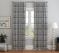
- 10 years agoI'm late to this, but have to say I love the duvet cover, lamps and walls. I think the culprits are the drapes and accessories. Someone posted a pic of dark blue walls with modern, graphic drapes. That was gorgeous. A chest of drawers would be practical for guests, with a bit more modern mirror, and maybe a bit more modern art over bed. Then I think it'd be perfect.
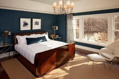
- 10 years agoThis is the pic that struck me as perfect for your room. The drapes are from Pottery Barn.
 10 years agolast modified: 10 years ago
Ps...I'm not a floral person per se, but your curtains and bed skirt is very pretty. Your room can look fresher and less "stodgy" with other changes. New wall color, transitional lamps, layered bedding.
 10 years ago
Please remember that we're all seeing your room and colors through our computers and accuracy may be lost. I think most of us "saw" your drapes as yellow, with white, blue and green as the secondary colors. Your most recent photos would lead me to believe they are actually ivory to white, making a huge difference. Your explanation of cost for pinch pleating is probably the reason that is now considered a "dated" look. No one wants to spend that much money, so simpler styles have become the "trend." I love dark colors and hope the walls will stay. We're all anxious to see what you do, so don't forget to come back with pix!
- 10 years ago
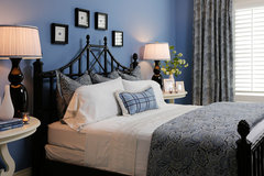
Lisa's blue room photo looks nice. This is very close to your room Susan! But notice how the top of the wall is painted white, like the ceiling, down to a line of molding which brightens the room. Also, the sparkly chandeleir, brighter art and taller night tables that lift the lamps higher. There is something to be said too, for the fact that the drapes are pulled back to let sunlight into the room!
 10 years agoYour colors are all off. You're mixing off white/cream (in base of fabric & mirror) with white lamp shades & duvet cover. Then the wood tones are competing with each other. The art (mating & framing) is also competing with the other wood tones. The lamps are too low. The only thing you see against the dark walls is bright white lamp shades. Pick a shade, I guess is what I'm saying. Monochromatic only works if the whole room is done. Floral are busy so give the eye something solid in color to rest on after looking at the corner/wall of floral. The mirror is a good choice since it reflects the opposite wall but it's again, miss matched with a white lamp shade & wood chest.
All in all, dk. blue, cream, white, green & tan don't mix when it's separate items. You have NOTHING in the room that pulls it all together. Most designers start with a fabric and pull the colors for the room out of there. Your Fabric doesn't have any of the wall color, white or tan (artwork & chest).Susan Alenka
Original Author10 years agothank you meisharocks225. I will take that and all the other advice under advisement.- 10 years agoI wrote my post before I saw the closeups of the fabric. I still think the cream/tan is competing with the bright white of the duvet cover & lamp shades. The curtains are very well done but when you step back they read in the green family. The blue is lost because busy patterns don't allow your eye to stop & pick up the subtle small color changes. I would try to pull a color out of that fabric. Even all those wall colors everyone is suggesting could be great on a duvet.
- 10 years ago
If you looked at the fabric closeup photos meisharocks, then you must have noticed that Susan DID pull a colour from the fabric and her wall colour exactly matches the blue in it! The first photo clearly illustrates that.
I agree with decoenthusiaste, that colours are not very well represented on computer moniters. And the amount of light in a room affects photographs very much. All the Houzz photos have the advantage of being taken by professionals with flashes and reflectors and the knowledge of how to best use light and so their photos make their rooms much more attractive.
 10 years ago
I love the wall color, but that is about the only current thing in that room. Sorry!
- 10 years ago
I'd flip the bed location and put it where the chest is now. Put the bedside table in front of the curtain.
- 10 years ago
I like your room, but then I am old womanish. My suggestions....would be....change the dust ruffle to match the white spread/duvet. Take the dust ruffle and made throw pillows for your bed. There....bed and drapes look good together. Now for your chest and the memories it has for you. A suggestion....could you have someone made a stand for your chest to bring it up about 4 to 6 inches higher? Would not need to attach it to the chest, just sit the chest on it. Your mirror will look more coordinated with your chest. If you have any more "dust ruffle" material, made a scarf for your chest. Center TV on the chest, put the blue and white lamp where it is now (though a thinner taller one might look better) and then put something small...bowl, box....even a small plant on the other side. A throw rug on one side of the bed and if room, a small chair with floor lamp in the corner where the window corner is.
 PRO10 years agoAgree with Leelee...flip the bed. Still center it on the wall. The drapes are lovely. Ruffled bed skirts are very dated. If it the fabric works, try making decorative pillows instead.
- 10 years agoI like the color but maybe some new art and throw pillows will freshen it. I've found trying to decorate for anyone else is no win. I bought ikea sofas and everyone said save for quality. By the time I save $5000 for sofas I'll be dead and I'd rather spend money on other things.
 10 years agoSusan, did you make those curtains??? I am super-impressed; pinch pleats are hard, and those look professional:)
 10 years ago
I just put my hand over your bedding and that totally changed the room. I think your draperies, paint colour and furniture are working together. The bedding doesn't relate to the colours in the draperies; it's too stark, I think if you changed the duvet it would make a huge difference. I'd also replace the lamps. Maybe a gooseneck wall sconce beside the bed. I love the idea of matchstick blinds mentioned earlier and also a sisal carpet. I think you are very close to looking Ralph Lauren; just need a few tweeks.
Susan Alenka
Original Author10 years agoTedBixby I asked her this afternoon what made my room feel old lady. It was the drapes. She said her grandma has comforter set in a very similar Waverly colorway that I have to admit I don't actually care for either. I hadn't connected the two fabrics in that way until she mentioned it today but now I do see where she was coming from.- 10 years agolast modified: 10 years ago
I wish I could sew well. Well done on the curtains.
Changing the bed skirt for a solid color one (without ruffles, lace, eyelets, etc., ), perhaps the dominant color (green?) of the pattern in your curtains, would remove a lot of the old lady look -- a plain bed skirt with square corners, perhaps like this Wayfair one:
Do keep the white covering for use as an extra blanket but see if you can find -- or sew -- a comforter or bed spread with matching pillow shams that match your new bed skirt and go well with your curtains. Alternately, you could use it as the inner side of a quilt -- perhaps green and white and usable with your curtains.
Since your mirror frame doesn't match the chest beneath it anyway, have you considered painting the mirror frame to match the dominant color (green?) in your curtains.
Something else to consider. If you're going to keep your current lamps, you could move the chest beneath your mirror and the mirror closer to the window so you could raise the level of the lamp -- perhaps set each of your lamps on sturdy wood bar stools or plant stands (straightest legs possible so they fit in a narrower space) so the lams would be the same height.
If you're wanting to change out the lamps for something more modern than a ginger jar style, you might consider either a narrow base floor lamp w/table combo...
https://s-media-cache-ak0.pinimg.com/236x/07/96/94/079694c6d057b210d39acf5a10d34db6.jpg
or a pair of swing arm wall lamps hung by the headboard.
http://www.homedepot.com/catalog/productImages/300/f3/f3074bd1-1342-415f-83fe-1edb937eeffa_300.jpg
You could probably reuse the same shades if shades don't come with the new lamps.
- 10 years agolast modified: 10 years ago
And now Susan, aren't you happy you posted a Design Dilemma??? So many opinions, so many "experts," so many judgements on your taste! One really does open oneself to a barrage of (mostly) well-intentioned but sometimes snarky comments here.
I have to say I just love the floral fabric--the closeup photo really shows the quality. And you made them yourself---Brava! I think they might look better with decorative hardware--maybe iron or wood rods and rings. Hard to believe that anyone would suggest you replace quality hand-made curtains with ones from Pottery Barn or Wayfair....
Susan Alenka
Original Author10 years agoThere are two sad little windows behind the drapes next to the closet. The closet is part of the reason why I can't turn the bed again the other wall. I just figured I'd cover all of it. PRO10 years agoMake those sad little Windows the jewel of the room. You just have to find your inspiration. What speaks to you? What's your style? Is this a guest room? If so make it a 5 star room. Don't worry about the cost. The right things for that room will just find their way to you.
Susan Alenka
Original Author10 years agothank you textbixby. I will be adding blinds to all the windows as that was a common suggestion. I do open the curtains. They were open all day today. I just happened to have them closed when I took the pictures. If I ever post something on houzz again I will be very certain to have the best lighting and most accurate colors because I believe that may have been an issue with this post.
pureMichigan06 (I hope I got that right) the legs if the bed are nice and substantial. I could definitely lose the dust ruffle. Thank you for all your wonderful suggestions earlier in this thread. 10 years ago
I have been out of town (visiting my mom) and tried to do a quick read through of the comments. You are correct. I have read in at least three places recently that florals are back. The fabric is lovely. My own preference is for bright sunny rooms so I tend to lighter walls - but fortunately all people are not the same or it would be a very boring world. You are just too early in your florals - wait and see.
My only concern is that you wrote you tend to decorate based on HGTV and trends. Some HGTV shows do design that is very overdone and um... silly.
I do like "Fixer Upper" and this season Joanna has done a good job of showing how her particular style can be merged others - with wood kitchens and other variations so one house does not look just like another. Tonights episode had colorful green walls and mid-tone wood cabinets!
If you decorate for yourself, with the colors and fabrics you love, you will move beyond trends to more timeless design. I see lovely homes done in designs that some would consider passé, like primitive style, but are totally appropriate to the style of the home. I decorate with colors, art, decor and a style that makes me happy. I use colors I love, and usually decor items that have some meaning - maybe a gift, something passed down from a loved relative, something of faith or just something I saw that made me smile. I feel "at home" in my home.
My mother passed down to me today some lovely dishes that belonged to my grandmother. "Old lady"? Maybe - but I think they are lovely.
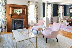
This Old House's most recent project - The Belmont Victorian. Notice the curtains:
 10 years agoThe room isn't that bad, I quite Iike it, definitely take away frilly valance and I would be inclined to take a lighter colour out of your curtains and paint the two walls with the curtains, it just feels a bit dark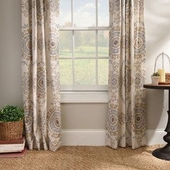
- 10 years ago
I read this last night and have studied your room more this a.m. I get your friend's comment but I think I may go a different direction than paring down. I think I might amp it up. It's difficult to tell with the changes in colors on the photos but I think I would try making a duvet and some pillow shams of the same fabric as your curtains. Now before everyone screams, matchy matchy, know that I am so NOT a person who normally matches anything. But here, I think it would work. Bringing the pattern across from the window onto the top of the bed would look more intentional.
I would also lighten up the frames and mats on the pictures above the bed. Use whatever color is in the background of the curtains for the frames and then something appropriate for the mats. They don't have to be expensive just something to create contrast between the wall and the pictures. I would also consider adding crown molding if that is possible just to dress up the walls. Paint them the color of the baseboards.
Another option would be painting the walls the background color of the curtains but since you wanted to get away from neutrals, I am not sure you'd enjoy that. I love the dark walls and the curtain fabric but Waverly tends to go very traditional with their fabrics (especially the florals) and it takes a strong, traditional hand to manipulate them in a room. You've got a great start. I just think you need to go further.
 PRO10 years ago
Wall colour is fabulous, whats dates it is the bedskirt, curtains & scale of paintings are off on bed. Remove them & group them on different wall, makes the ceiling height look very short! Opt for new linens, similar to bed cover, different textures of warm beige or weight with a pop of colour on throw pillow if you like. Change curtains to a graphic but subtle colour tone to coordinate with bedding.
- 10 years agoAfter re-reading comments and seeing your new zoomed in photos of fabric and wall colour, I see more what I think you were trying to achieve, traditional but then putting a twist on it to keep it fresh. The close up shows how beautiful the fabric really is, and coordinates beautifully with wall colour. In your first photos you couldn't see the blue in fabric, so it must just be a lighting thing like you say.
I did some playing around in Photoshop and added white and blue bedding in a more modern styling as others suggested. It still seems off to me. Then I read whynots comment about not taking it far enough, and I think she nailed it. I would try this:
-remove dust ruffle and drape fabric around some pillows and at foot of bed like in the other photo I've included to see how that looks. And do recommend taller lamps, blinds, curtain rods and maybe change or rework the artwork.
Darn, lost the example photo, I'll attach it in a sec.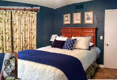
- 10 years agolast modified: 10 years ago
I like Marlene's reworking of your room. But of course, no Houzz discussion is complete without a starburst mirror! :)
ok, just kidding... I did take some of the yellow out of your fabric and give you a taller lamp.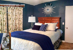
 PRO10 years ago
When I mentioned to a designer friend of mine that I'd like to redo my dining room with a new Persian rug and a red and white toile, she said "don't you want something 'of the moment'?" My response, "I like what I like, and I don't care if it's not the latest in trends!"
- 10 years ago
Sorry if this has already been mentioned...
-Raise the curtains to ceiling height. Add a solid color fabric to the bottom to add length to the floor. This is a modern look. Someone mentioned that above. You could probably do this using your existing curtains.
- Nothing wrong with your bed, but you might remove the foot board. A small touch but could add to the feel of the room (adds visual space). White bedding with a navy blue blanket folded at the end of the bed (also mentioned above). A few throw pillows on the bed using colors from your curtains. This could introduce another color into the mix and help to brighten the room.
-I like the idea above of removing everything from your wood trunk. It is beautiful, btw. And add large mirror over it.
- Larger lamp or wall mount lamp over side table. This will bring your eye up and help to make the room feel more spacious.
-Over the bed...find some beautifully shaped branches in your yard. Cut off all the small twigs and sand a bit to help smooth the surface. Use 24 carat gold spray paint from craft stood. Hang over the bed horizontally. It will look like a sculpture and add some brightness to the wall/room.
Did not mean to write such a long comment. But hope it give you some ideas. Don't think you need any major changes, just a few tweaks. My room is navy blue and I love it. I have white curtains with navy blue block at the bottom. I used the branch over my bed and people DO think it is a sculpture. Also have white bedding with blanket at the end of bed. Also throw pillows. My headboard is upholstered in gold and navy toile. Good luck
- 10 years ago
I think it is a mistake to keep the drapes just because you spent a lot of money and time on them. That money is spent either way, and you can't get it back. Keep them only if you really really love them. Then focus on the comments people made about how to make them look better by changing other things in the room.
 10 years agoI feel like you've gotten plenty of decorating advice. I love the color of your walls and don't think you need to repaint. I do think your room is screaming for molding on the top of your walls I think it would really make a huge impact and help create a more peaceful retreat. All fresh white bedding would look great in here as well. I love the idea of metal accents, i.e. Gold, silver, etc. please post after pics when you're done!








User