Software
Houzz Logo Print
moogers

Finally Tired of the Green...

10 years ago
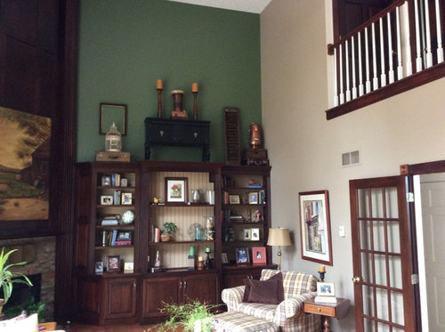
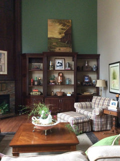
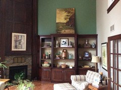
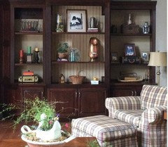
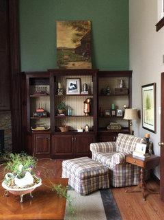
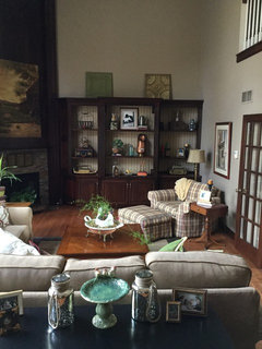
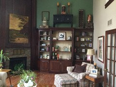
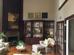
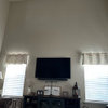
This green accent wall is really starting to get on my nerves, besides the fact that accent walls are dated. I'm thinking of painting it the same color as the rest of the walls and removing most of what's on top of the built in. Any thoughts?

Comments (105)

  • 10 years ago

    Have a nice dinner and no hurry on your shelves. We'll be around to chat about the updates as you make them. It's a slow and kind of painful process to tweak shelves:)))) I wish Houzzer Abbyjean was still around (I rarely see her anymore). Man, she was great with shelves!!!!

  • 10 years ago
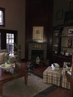
    Ann, thanks for your comments. I tried to take a few pictures, but there's not enough light....so, I'll be here tomorrow for more advice. I'm liking it better. Just need a push. :)
  • 10 years ago
    I did change out the picture over the mantel. I'll take another picture in daylight tomorrow.
  • 10 years ago
    last modified: 10 years ago

    You've made a big improvement already. I'm really liking it. I'd love to see the 3 valises stacked, and put on the bottom centre where the red and green candles are. And I think you need to have some things on the shelves that are taller, almost filling the height of the shelves. The brass vase/ewer is the perfect height but should not be centred. The bird cage will look good when you find a spot for it.

  • 10 years ago

    Looking good! Would you ever consider painting the shelving unit the same colour as the walls?

  • 10 years ago
    Family photos are important, but each does not have to be in its own frame, so are you open to scanning them into a digital frame and having the frame cycle slowly through all your photos? More photos on display but take up less shelf space!
  • 10 years ago
    So, I worked last night and did some paring down of the shelves, replacing bigger with smaller. Thoughts? Also, took everything down from the top. Looks bare to me! I put the big picture there to live with it a few days, but gotta say I'm really not liking it. Husband says it's growing on him. Thoughts again? Mramsey, yes, I would consider painting it. It's poplar, stained cherry. I would just have to really be confident that the color worked in my open space with the kitchen.
  • 10 years ago
    Another related dilemma: I have to make new backing covered in fabric. Do I go solid burlap, or the black striped burlap? Or another color?
  • 10 years ago

    I's looking much nicer! I don't know what my opinion is of the art up there? I think art would be fine, but maybe a trio across that wall would be nice, or three like art objects as Rina suggested. I think I would eventually paint that wall the color of the other walls, possibly painting the bookcase that same wall color, as has been suggested.

    I'll be anxious to hear how you are feeling about the change in about a week (about it looking bare). I'll just bet you won't feel that way anymore:)

  • 10 years ago
    So, Ann, if I put three pictures up there, is that picture overload with one above the mantel and one above the chair? Maybe I need to look for 3 of something other than pictures above the bookcase, but I'm not a fan of metal art or starburst mirrors or things like that.
  • 10 years ago

    Moogers, please don't let yourself get worried about the bare top shelf. You're not married to it. So far, it's a way to readjust your eye.

    I am not liking that stunning painting up there -- it looms.

    Shelf arrangement: it is often a very good idea to break a well established pattern. You have the highest item on all the shelves in the middle, which is a bit monotonous. Below I have rearranged the middle shelf.

    In the field in which I did most of my professional design, having a "line" that goes right down like that (your highest items right in the middle of the middle shelves) was called a "break". It was generally avoided because it weakened the design. There needed to be something that tied the two sides together -- generally some kind of solid line.


  • 10 years ago

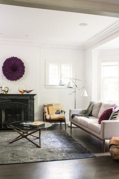
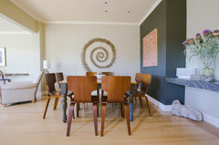
    I do think 3 of something other would be the best option, as Rina suggested. Try browsing lots and lots of Houzz pics to find ideas that appeal to you, as well as websites like Crate and Barrel which have some cool decorative stuff from time to time. I quickly looked in my ideabooks and none of these might be your style but I saved them just for this type of discussion. So, large African Baskets, Juju hats, and this super interesting idea which is dyed clothespins arranged in a spiral (I was just blown away by how cool that looked and how creative and inexpensive that idea was).


    San Anselmo Dining Room · More Info

    Wells Hill · More Info

    My Houzz: Earthy and Eclectic in San Francisco · More Info

  • 10 years ago
    Gotcha! Better?
  • 10 years ago
    last modified: 10 years ago

    If you want to keep the green ... three wall sconces? Not too big, but big enough to be seen. It would involve wiring, of course, but painting any visible wire to match the wall would probably hide it very nicely. Just think of what three pools of highlit green would look like up there.

  • 10 years ago

    Ja, but bring both the left and the right items in a bit. They look as though they are scared of each other.

  • 10 years ago
    You're funny! Interesting idea about sconces. Never thought of that. And there is electricity in that wall! Hmmm. Would that still work if I painted the wall the same color as the rest of the room? Thank you!
  • 10 years ago

    I think it looks great! Rina's suggestion was right on! I would still move the silver pitcher slightly into the frame picture (I'm sorry! I don't know why it bothers me!!)

    I think the green on the picture would do well on the light wall. The other picture on the fireplace looks good.

    I would leave everything off of the top for a month or so. At that point when you put something back up - you will know if you like it with stuff or like it bare.


    For those of us who don't see it daily, we think it looks fine.

  • 10 years ago
    https://www.etsy.com/listing/272153216/antique-pressed-tin-2x2-framed-tin

    How about 3 of these reclaimed tin tiles, framed alike?
  • 10 years ago
    I think that wall is too dark. need to brighten it up. change the walls to a lighter colour like a soft yellow almost white. Place a large colourful picture above the bookcase as a show piece.
    would brighten up the space and give the area a new look.
  • 10 years ago

    Would not paint the wood bookcase sides or front.

    Consider whether or not it would be practical for you to change the back wall of the center part, leave it open but add doors to the left and right side of your bookshelf -- perhaps frosted glass look -- rather than just storing your treasures or removing the bookcase.

    You could choose the same color for the visible back wall of the center part of the bookcase and the overhead wall, including the same wall color as the rest of the room.

    Would remove all the stuff from atop the bookcase, the, perhaps after you repaint the wall, you could add a single piece of interesting art above the bookcase -- not a painting but something more interesting.

    http://www.polyvore.com/cgi/img-thing?.out=jpg&size=l&tid=149727740

    http://cdn.antiquefarmhouse.com/media/catalog/product/cache/1/image/9df78eab33525d08d6e5fb8d27136e95/m/e/metal-tree-wall-decor-with-birds.jpg

    http://cdnll.touchofclass.com/images/xxl/Z848-001.jpg

    https://cdn-img-1.wanelo.com/p/57d/8bb/34a/7917dbef603db0151713796/x354-q80.jpg

    http://i5.walmartimages.com/dfw/dce07b8c-3dac/k2-_375d4c1b-9bdd-4ba6-80a0-d4a37da14fb2.v1.jpg


  • 10 years ago

    Wow, you've made a big improvement!

    You don't need anything up there. It detracts from the rest of the room by having the eye zoom up and then down. It's much more natural and pleasant for the eye to move more horizontally around the room, within the human-height living space.

    Put that gorgeous painting back over the fireplace, paint the green wall the same as the other walls, as Rina showed above. Looks great. Use fabric/burlap in a similar color too. A calm and restful background to showcase your pretty things.

  • 10 years ago
    The leaf print over the mantel and the painting over the chair might be spectacular!
  • 10 years ago
    Then the copper pitcher, the green plant and a short candle on the table by the chair to highlight the painting.
  • 10 years ago

    I think for now, I'd leave that space above the bookcase bare too. Especially if you plan to paint that wall the same as the others, give it a few months with nothing before you make a decision about whether or not to put a trio of something up there.

  • 10 years ago

    Those tiles are terrific -- what a lovely shop. But yes, sconces would also work on a light wall. But I agree with what most people are saying about taking a pause before making any decisions about either.

  • 10 years ago
    Thanks, everyone! Gonna take all of your advice and live with it a while. Will probably end up painting in a month or so, and will post back. Happy Easter!
  • 10 years ago

    To you, too.

  • 10 years ago
    Wow just checking back in and what you've done this far is fantastic!! I love how you've really pared down. So refreshing, relaxing, and just wonderful. Definitely consider painting that green out to the same as your other walls and you are there!
  • 10 years ago
    I'm late to this discussion. My initial thought was in line w/ BeverlyFLADeziner's suggestions. I'm very traditional, so I love the fireplace accent wall & built-ins. I also like the Hunter's green above the latter. It picks up green in your plaid chair. I agree w/ those suggesting removing art objects on top. My initial thought was to move the painting over fp to above built-ins. But that would make center of painting too high above eye level. Then I thought about a free-form sculpture w/ nature theme, i.e. pheasant taking flight or a deer. A free-form sculpture would cover much of the green while allowing some to show through, & a lighter metal finish would lighten wall.
  • 10 years ago
    BTW, I like wall sculptures b/c they add depth a 2-D painting can't.
  • 10 years ago
    Updated pictures soon. Wall has been painted and just waiting for another vintage ceiling tile (with 2 others) to sit on top of the shelf (or hang on the wall?). Will be interested in comments. Stay tuned.
  • 10 years ago

    Looking forward to your pics.

  • 10 years ago
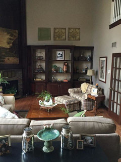
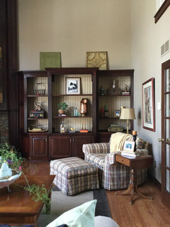
    Here is the wall repainted. I am waiting for a bleak vintage tin tile, which should be here by the end of the week. I'm thinking of putting that in the middle, between the green and the tan. Thoughts? Also, should they be hung? Right now, they are approximately the same height as the picture over the fireplace. If I hang them, they would be higher. Any rules on this? Still seems bad to me, but it was time for a change.
  • 10 years ago
    Meant to say black tin tile. Also, here the before picture.
  • 10 years ago

    It's looking SO much nicer and I'd hang them. It's fine if they are higher than the nearby art.

  • 10 years ago

    I agree with Ann. I love the way repainting has opened up that corner.

  • 10 years ago
    Ann, how high would you hang them?
  • 10 years ago

    Butting in on that question, this seems about right to me. Do you agree, Ann?

    I've also taken another liberty with your shelves. I absolutely get and accept your style, but would you consider simplifying just that top centre shelf? Look how the photograph comes into its own when it's not sharing the shelf with anything else. And the one simplified shelf allows the more heavily decorated shelves to be a kind of frame to it, and creates a breathing space.

  • 10 years ago

    PS I'm really glad the big painting is still over the fireplace. :-)

  • 10 years ago

    What do you think of this variation, Moogers? Ann? Bearing in mind that the middle tile will be different.

  • 10 years ago
    Rina, advice taken! I do like it better. And I do like the three tin tiles staggered. Thanks so much! Stay tuned. Should get the last tin in a few days.
  • 10 years ago

    Wonderful change to the shelves (Rina's suggestion). I like the tiles in a straight line better than staggered at the height Rina photoshopped. I'd space them apart just a tad more than Rina did (just a tad, though:).

  • 10 years ago
    Final look. Any thoughts? Does it need more color, or is it just me?
  • 10 years ago

    just you. you were used to the green.

  • 10 years ago
    Thanks for the reassurance!
  • 10 years ago

    Very minor suggestion: candles all the same color rather than three different colors.

  • 10 years ago

    Lovely. Well done.

  • 10 years ago

    Looks really nice! No more color needed. What a wonderful outcome to this dilemma - such a huge improvement to your home!

  • 10 years ago
    Thanks! I'll be looking for help with my bedroom in a few weeks... :)
  • 10 years ago

    Be sure to post a link or comment here so we don't miss it.