Software
Houzz Logo Print
timdiana20

What Colour for My 2-storey interior walls?

10 years ago

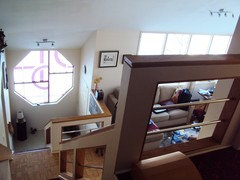
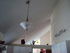
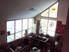
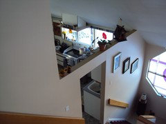
We are moving next month, the center wall on the main floor is 17' high and slopes downward to 8' - the 17' wall is shared with the kitchen & living room. We are repainting the whole space 2 days after we take possession. The basement is a walkout with a family room. We can't decide whether to put our green living room furniture or our dark brown leather furniture on the main floor so I need a neutral colour that goes with both. The new kitchen will be white with white/black speckled counters and gray floors. Living room floor is neutral parquet flooring. I don't really want tans/browns (have that now) and had greens before that. The 8' wall is all windows and one side wall has 2 storey windows. Any suggestions for colour and also possible accent wall and colour?

Comments (33)

  • PRO
    10 years ago

    Hi Diana, have you heard of mycolortopia.com? It allows you to upload a photo of the room you intend to paint and you can virtual splash it with color to see what it would look like.

    Diana M thanked Moceri Construction
  • 10 years ago
    last modified: 10 years ago

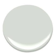
    Diana, if your kitchen and "living room" are open to each other, and you've chosen all gray and white and wood, the raked ceiling makes me think that you are going to want to have the green furniture recovered in a gray tone - depending on the green shade it is. Brown leather on a parquet wood floor next to a gray and white kitchen will make the room feel unbalanced ... only works if you add a lot of warm / wood elements to the kitchen (any opportunity to do butcherblock on the island only for instance?) and do a gray and white sort of hide rug in living room, adding lots of black and white there - all neutral sepia tones and black . . tough to pull off well. The gray (maybe a temporary slipcover so it feels new?) sofa in the living room will balance the kitchen .. the most successful wall color is probably one to go with the kitchen for now . . .a soft gray against white trim. BM moonshine or gray owl are both good non blue gray shades but the gray should be keyed off the gray floor you selected so the undertone matches .. I can't recommend an accent wall - thisi s just deep enough to look great against white cabinets and trim but still be light .. .still, take a tile to the ben moore store and get all the gray swatches then go look at them in natural, artificial, lamp light and see how they look together . . your eye can do the rest . . http://www.benjaminmoore.com/en-us/paint-color/moonshine

    Put the leather downstairs, look online for a gray slipcover or talk to your local upholstery shop about making you one . . consider using tangerine or orange toned accents with this palette for fun, maybe find a large overstock rug on sale in an unusual colour then buy a teakettle in that same shade . ..

    if you have an mls link or you can show us your green furniture, we can help more . do you have trim around your windows? White solid twill drapery will help balance the white cabinetry on the main window wall. . .

    Diana M thanked libradesigneye
  • 10 years ago

    That's a lot of great advice...but I hesitate to cover this furniture. Both sets are relatively new and the green stuff is in show room condition. This is an odd photo but it's the only one that really shows the true colour of both the green sofa and the leather stuff. I'm not sure if my photos are uploading. I've also attached the listing photos to give you an idea as to what the living room/kitchen space looks like.

  • 10 years ago
    You are correct...no photos and no listing link..maybe try again ..photos of the space also encourage more participation
  • 10 years ago

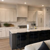
    trying again...this is looking from the same vantage point at the top of the stairs. (none of this stuff is ours and the kitchen is being redone) One is from the kitchen looking upwards toward living room. Unfortunately, no link to listing - it has expired.


  • 10 years ago
    Look at sherwin Williams Lantern Light...great neutral ...goes with green and brown beautifully
    Diana M thanked btydrvn
  • 10 years ago

    A lovely colour...my husband doesn't like any shade of yellow LOL - I have one bathroom painted that colour...that's all I'm allowed :)

  • 10 years ago
    Ask him for an approved list of colors and we can work from that..
  • 10 years ago

    :) I think I might just surprise him :)


  • 10 years ago
    Good girl
  • 10 years ago

    I am leaning toward BM Gray Owl. It has the slightest tinge of green but is very pale. I can add punches of colour with pillows and accessories (the kettle - what a great idea) to make it all works. Going to buy samples tomorrow and paint the sides of my big moving boxes, then putting them up against the furniture to see what I think. It's the only way I can think of to see the colour. Thanks one and all!

  • 10 years ago
    How close is that to what you have...
  • 10 years ago

    Ritasj, do you mean the gray owl colour? Currently, our walls are a light milk-chocolate colour.


  • 10 years ago
    From the photos the colors look very close...if you are only looking for a slightly different hue the owl gray is very subtle...if it was my house I would take it a little more toward "I LOVE THAT COLOR!"...walking into your home feeling it wash over you...a happy place...so good to be home..perhaps a few more minutes at the color wheel if that appeals to you...and search photos for homes like yours with a little color...maybe "contemporary homes with big windows"?...many people are gravitating to gray these days...but it really looks best when there is lots of white trim tossed in...
  • 10 years ago

    Ok - your new home is very contemporary in style. That makes it easier to work with neutrals overall and then add just one pop of color. I wish your photo of your green sofas had posted - there are so many different shades of green, and whatever it is I can help you pull together a great look. I think Gray Owl (if it works as the same undertone as the kitchen floor and looks good with your green) may be a wonderful choice here.

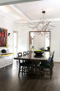
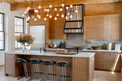
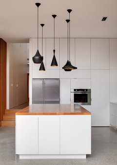
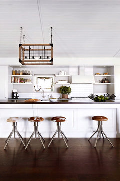
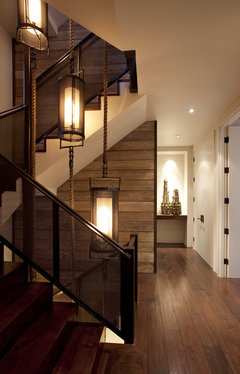
    May I suggest that you budget for some new light fixtures? Replacing the three light fixtures I see here with larger scale mid-mod or transitional fixtures (dropping into the space - a chandelier over the living area hanging around 9', a stairwell light that is a real architectural feature, a kitchen light that can drop into that space fully - hang even or just below the top of the dividing wall . . whether you use black to bring neutrals across, wood to add some wood element to the kitchen, a combo of both for some rustic industrial loft flair, or stick with nickel tones to echo the metal window frames . . you've got several choices that would work well. Here are some images to inspire -

    Wells Hill · More Info


    Huniford Design Studio, Holiday House Hamptons 2014 · More Info

    Frankengray House · More Info

    Country Victoria · More Info


    SILVERTIP RIDGE · More Info

    The Hillside House · More Info

  • 10 years ago

    Ritasj - you're right - that colour is very pale and it is the main reason for my hesitation. Gray is all the rage these days but I always find it to be a cold colour yet I gravitate toward it because it's a top 2016 colour. I think I will have to seriously rethink that. Right now, my living room is painted a very pale off white and my window wall is a Terra Cotta - I love that colour but don't think I can use it in the new place, I think it would be overpowering and for now I am going with same colour, all walls.

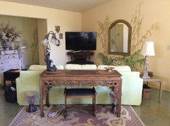
    Libradesigneye, these are the colours, I had a hard time taking a photo that showed the true green but this is very close. The brown in the background is our leather furniture. Love the warmth in those photos - I will have to keep those ideas in mind. Light fixtures are definitely in the budget! Almost all need to be replaced.


  • 10 years ago
    Your couch colors are very organic..earthy...if you loved the terra cotta in your previous home maybe look at very diluted versions of that color..it would definitely be unique in this situation..and earthy and a warmer influence to this architecture ...which could easily look cold with the wrong color..
    Diana M thanked btydrvn
  • 10 years ago
    Just a visual of the pale Tuscan gold..my fave
    Diana M thanked btydrvn
  • 10 years ago

    Good advice, thank you so much ritasj. I really like that tuscan gold - I think that could work. I will get a sample of it today.


  • 10 years ago
    last modified: 10 years ago

    Diana - I too love your green, but wouldn't head yellow (though the image of an easter basket living space could be sort of sweet, it doesn't feel contemporary to me). That green is great for this house - will work as it has a fresh mod feeling, but is still a terrific neutral grass green.

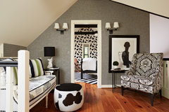
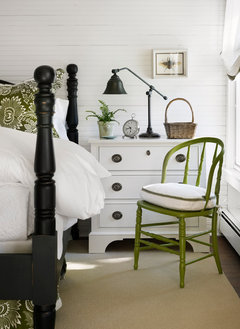
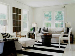
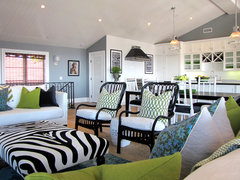
    Since the house is contemporary, I think you want to use the green with black and white and wood and some charcoal / pale gray. Let me show you some images.

    Portland Mid-Century Modern · More Info

    St. Paul Carriage House · More Info

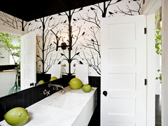
    See how the play of black and white patterns makes the green elements pop?

    It takes discipline to do a white and black room - but the result is really chic.

    Turn of the Century Cottage · More Info

    Shelter Island fisherman's cottage · More Info

    This house uses a blue gray wall - which I don't think is as successful - the blue and green pillow print tries to pull it all together ..

    The Sandberg Home · More Info

    You have a really citrus green. I love that - it is fresh, very contemporary and just needs the right backdrop. A pale pearl gray wall could work nicely for you - or you could go white and use the single dividing wall between the kitchen and living space as the accent - a deep charcoal gray or black wall there would be really interesting. Especially with white framed and matted sketch art - Picasso has some sketches that are in posters that could be amazing. Let me go looking at pale gray paint shades for you . .

  • 10 years ago

    I still like gray owl and moonshine - maybe also test Alaskan husky ... if you are bold enough for an accent wall - I do like the idea of a charcoal - one of the cleaner tones is bm gray http://www.benjaminmoore.com/en-us/paint-color/gray#ce_s=gray

    Add wood elements and green and white fabrics / minor elements to the kitchen(rustoleum spray paint is going to have a green that is near your shade - maybe spray an accent chair or metal bar stools? look at the younghouselove.com tutorial on spray painting successfully taking 7-9 layers to fully cover)

    Try a black and white graphic pattern rug in the living room - some of the morrocan options are good - or buy something inexpensive so you don't worry over it. Wool will be easiest to clean, but when it is done, your family will be at a different stage and can do something different. If you do the dark accent wall, don't do a predominantly black rug. Here's something neat and inexpensive for its size. .

    http://www.overstock.com/Home-Garden/nuLOOM-Handmade-Mod-Tiles-Wool-Black-and-White-Rug-76-x-96/10666237/product.html?refccid=MXVHJVUL3ZKYPLSLDH7ZWTGI7M&searchidx=176

    Your green is primary enough, about the only other color I would try to mix with it would be a navy. You can do navy and white with your green in the same way I suggest black and white - it is harder to pull off - but it might be something you want to try in a secondary bedroom for kids. Yellow and white for a girls room - very graphic elements. Navy and white for a boys room - navy like bm van duesen blue - a stripe all the way around the room . . . or horizontal stripes on a headboard wall . .

    Downstairs, the leather you have is lovely .. a real taupe rather than chocolate. Consider using some kiwi green accents there so the house flows (and so you can mix things up by moving things around in your home)

    Diana M thanked libradesigneye
  • 10 years ago
    Diana keep in mind the color I chose was not exact with the color posted.. If it shows too yellow just add a little beige to the formula
  • 10 years ago

    Love the sample photos, this is getting overwhelming. I just picked up 3 sample containers of three shades of gray including Gray Owl, Agreeable Gray and another gray that I've nicknamed Prison Gray. Not crazy about any of them! Heading back to the paint store tonight for more samples :) Thank you!

  • PRO
    10 years ago
    last modified: 10 years ago

    Pick up one more to sample...BM Par Four.

    You need a chameleon color for your walls. One that will work with either of your upholsteries. This color isn't gray, it isn't green, but works without making a commitment so, whatever you choose to put in the room will work as you add fabric.


    Diana M thanked JudyG Designs
  • PRO
    10 years ago

    Anything "Tuscan" will look dated as soon as it goes up on the walls. What you need to work with your furniture is a brown-gray and SW-7031 Mega Greige would be perfect. Not too light or dark. It was recently SW's color of the year. Keep us posted!

  • 10 years ago
    Dated can be a good thing...especially to the people in Tuscany ...
  • 10 years ago

    Okay people, no fighting over Tuscany :) I like Tuscany Gold, I really do. I'm just not going to use it. :) Interesting...the colour I picked up tonight is a bit like that Mega Greige but darker. In the store I actually thought is was a brown-gray, it was painted on the walls behind some black cabinetry and but on the sample it looks green-gray. Going to paint another moving box tomorrow :) to see how it compares to the furniture. I also picked up a sample of a purple and a blue both so dark they almost look black...I picked up the purple because of that stained glass window you see in one of the photos. Someday I'll kick a boot through it but meanwhile, my husband loves it. So instead of fighting it, I thought I'd match it.

  • 10 years ago

    wonderful .

    Diana M thanked libradesigneye
  • 10 years ago
    This could be very contemporary and chic...nice undefined color
  • 10 years ago
    Not gray...not green...not beige
  • 10 years ago

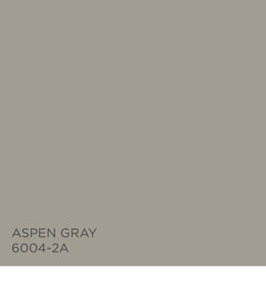
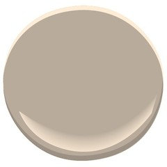
    Bought yet another sample last night...in the sunlight, Aspen was too green for me. I'm going with BM Rocky Road. Lowes had this colour painted on a wall with a kitchen that's exactly the same as mine except that my counter tops are lighter but still predominately the same colour. Goes well with the flooring and both sets of furniture. If we do end up with the leather on the main floor, I will add pops of colour with accessories. This has been a great experience, thanks all for your help, it is very, very much appreciated.

  • 10 years ago

    Diana, it is a super neat space - congrats on finding something that works for you. It is quite a deep shade for an interior - but you have a lot of natural light, and this will give you lots of drama.

    FYI - this has a pink undertone, so if you find it too dark as you are putting it up, don't just go up the card. At this depth the pink is no issue, but when / if you feel you ought to head lighter, that can show up in unexpected ways. Glad we helped you if only by providing a sounding board so you could find your best solution. We wish you happiness in your new home ..

    Diana M thanked libradesigneye
Sponsored
Wannemacher Interiors
Average rating: 5 out of 5 stars26 Reviews
Customized Award-Winning Interior Design Solutions in Franklin Cnty OH