Software
Houzz Logo Print
katie_webber14

Kitchen Decor Opinions Please!

10 years ago

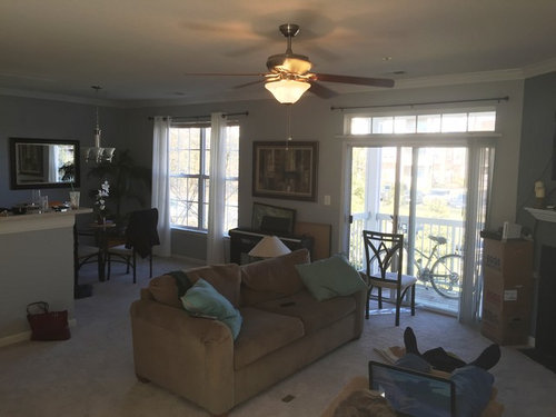
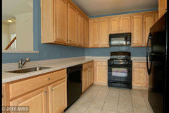
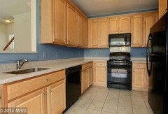
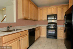
I'd like to do something with this kitchen but I'm not sure what (a backsplash is not in my budget). Should I paint it? If so, what color would complement the blue/gray color scheme in the surrounding room (work in progress, pictured below)? Should I add anything above the cabinets, like art or fake plants?


Comments (30)

  • 10 years ago

    These light cabinets need some contrast with the wall color behind them.

    I recommend that you use either : the same color that you painted as an accent color on your fireplace wall, OR a rich grey-taupe that will compliment your countertops. Try Sherwin Williams 7501 Threshold Taupe or SW 7503 Sticks & Stones. You do not have much room above your cabinets and the danger is that any accessories there will look cluttered while plants collect dust. It will look more clean and contemporary if left unadorned. If there are no under cabinet lights, consider adding a small lamps in each corner under the counters. If you still have significant under cabinet wall space exposed (after you put out any appliances or cooking tools) you can also put a couple of smaller canvas art pieces or texts standing on plate racks or hanging there- to add further color and interest. Just be careful not to have too much out or it will look busy and cluttered

    Katie Webber thanked Home At Last Decor
  • PRO
    10 years ago

    I would suggest painting the walls and changing the cabinet hardware to something with more contrast to the cabinets

    Katie Webber thanked Rachel Savage Design Management
  • 10 years ago

    Charcoal grey... splash of red highlights.....

    Katie Webber thanked Gina Haffie
  • 10 years ago
    Because your kitchen cabinets are high, I wouldn't add anything to the top. I've seen where people put a few pieces of decor, or cute word signs, like "family" in wood letters above the kitchen, and it works. I've also seen themed color flowers placed up there, and while it does add some color, I think it's more for a special occasion of party. They just gather a ton of dust!

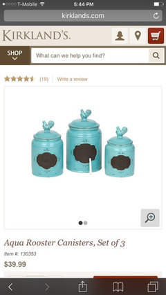
    For your kitchen to add some pops of color, try adding a nice canister set to your counters. And maybe a colorful small rug. I don't think you need to add much in here, and I'm envious of the lack of clutter you have and the nice clean slate. Less is more in a kitchen, and I wouldn't go overboard.

    Also--you can add vinyl stickers as a make shift backsplash if you wanted. I'm a military spouse, we move around, and I've done this, and it makes a bit more homey.
    Katie Webber thanked Liv Smith
  • 10 years ago

    Hi, Katie, absolutely paint! Do you still have any of the color left that is on the fireplace wall? That may seem a bit dark, AT FIRST, but stick with me here. I think part of your 'challenge" here, is that you have too much contrast between the black appliances and fairly light wood cabs. I agree with Rachel that changing the cab hardware would also make a huge difference...maybe a 'gun metal' or the oil-rubbed bronze to start to tie in those dark appliances..(and go WITH your existing curtain rods and dining set). Now, that many knobs isn't 'cheap' either, but try someplace like "pullsdirect.com"...the cheapest I've found anywhere, and it will be well worth the investment. As for the paint, I'd really try that nice grey blue, cadet blue, we used to call it. It will provide a nice middle tone, is the perfect complement to the 'orange/goldness" of the cabinets, and make your countertops really sparkle--it looks like there are some grey flecks in them too. Now, get a few simple wrought iron accessories, they make wonderful fruit bowls/stands, or say a paper towel holder...functional items as well as handy design. Perhaps some decorative trivets...you could even put them on the walls as 'backsplash' design. Try someplace like Hobby Lobby, you'll go crazy, as you can get lots of stuff for under $5-10. BTW, if the paint ends up just TOO dark, just add a little of the leftover grey to it to lighten it...but be daring, really. TRY the cadet blue first, and the darker knobs. You'll be amazed how this darker tone will make those cabinets shine, especially at the top near the ceiling! Also find a runner type rug with cool browns, beiges, the blue you have...and a black flourish to 'echo' the wrought iron type elements....perhaps even a pop of yellow, or coral too, if you feel daring, in it. It will ground the room, tame those black appliances and add warmth, and tie in your other LR furniture as well. What do you think? Have fun, and good luck.

    Katie Webber thanked texastinranch
  • 10 years ago

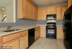
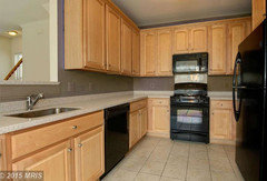
    Here's your kitchen painted a mid grey-blue (hopefully) similar to your fireplace accent wall.

    Katie Webber thanked Jennifer K
  • 10 years ago
    Select something rich to balance/counteract the black lumps of the appliances.
    Katie Webber thanked jbtanyderi
  • 10 years ago
    Put a rope of Tivoli lighting behind the cabinet cornice to brighten the ceiling.
    Katie Webber thanked jbtanyderi
  • 10 years ago

    No fake plants. And no blue. It will accentuate the orange in the wood. You could do a warm gray with those cabinets.

    Katie Webber thanked groveraxle
  • 10 years ago

    Hey! Thanks Jennifer K! The color I had in mind is "grayer" than that...but it could be my monitor too...but she can get the idea. See how it all looks more cohesive--even with the brighter blue? And how much better even the cabinets look. Great job Jennifer K! (And a PS, I would not paint the little 'return' on the opening of the wall there the new color...it starts to intrude on the other room if you do that...but if it is the same as the fireplace wall....? Well? One for the homeowner to decide!) Nice thing is, it's just paint.

    Katie Webber thanked texastinranch
  • 10 years ago

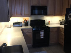
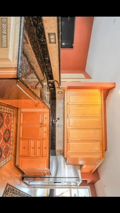
    Full disclosure: that picture is from the listing on realtor.com, just before I bought it. Here is a picture of what it looks like now, with new undercabinet lighting:


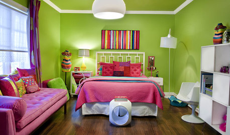
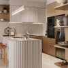
    Before I bought it, I imagined going with a coral color, like this:

    It seems like the general consensus is to go with the rich gray or maybe blue, but do you think that the coral color above would clash too much with the other rooms? I realize combining warm colors and cool colors is a big no-no, but I really like this color. Maybe I just need to let go?

  • 10 years ago

    a bright Darker color..... but a color you love is important too, I am not a fan of blue, yet I found a blue I love and have couple blue walls!! ya never know. lt looks like a nice coral .... not musty!!! i don't care for the blue above.

    Katie Webber thanked Gina Haffie
  • 10 years ago

    If you go with paint in the coral family, it will work better with some brown in it such as Sherwin Williams 7701 Cavern Clay. However, for the paint plan to "Flow" in your home and not appear to be disjointed with a different color in every room, I suggest that you repaint the fireplace wall to match.

    Katie Webber thanked Home At Last Decor
  • 10 years ago
    I think whether you go with cool colors or warm depends on the look you want. I live in Oregon and always use warm colors indoors to counter our gray winters. The coral color should be more to the earthy end and less peachy for it not to look like a bedroom color. The comments about changing the hardware are great. Maybe even black? That black of the appliances needs to be picked up somewhere I just a few details. Also, the picture you like has a nice patterned rug on the floor. Finding a warm multicolored rug would add a lot to your kitchen.
    Katie Webber thanked kierlakin
  • 10 years ago

    agree with kier.... look at a lot of choices and if you go with what You Love....more so than following Rules........ it'll be just right and maybe fall within the rules, or sometimes IT works altho we defy the Rules..... you are on the right track..... it's a process and you are working through piece by piece..... keep on and it'll come together and you will LOVE it. please don't choose something you don't love .... the last thing you think you'll love sometimes pops and you love it --- that's how you will know!

    Katie Webber thanked Gina Haffie
  • 10 years ago

    Katie! Who told you 'combining warm colors and cool colors is a big no-no'?!? No! Just the opposite is true...that is the most dynamic way to get "life" out of any project!! That is why there is what is called "Complimentary Colors" on every designer's color chart...red(warm) and green(cool), yellow(warm) and blue(cool) etc. The very basis for design, but yes, it needs to be done 'tactfully'. So you mute, lighten, or gray down one or both of the colors til the play between them is balanced. Now, not to 'dis' your choice, but I am going to give you a free color lesson here. Take another look at the photo with the coral color you 'imagined', and then at Jennifer K's rendering..(even though I insist the blue is WAY too bright and should be CADET blue, like your fireplace wall) Got it? Okay, now, which set of cabinets looks 'too orange' to you? The coral with the gold cabinets, right? Your cabinets however, with the (even) bright blue look more 'blonde'...not orange at all--(Sorry Groveraxle). Now, if you WANT the room to look that "warm", which is pretty intense...by all means, go for it! But if you are looking for a little better BALANCE, a cool(er) color needs to come in to offset so many (warm) cabinets...it is the perfect complimentary color scheme...warm and inviting, without getting too--hot--mediterranean/tropical feeling. Disclaimer: I love coral too...my previous house was a giant (over 10k sqft) Victorian charmer....salmon colored with cream, and lots of other colors...got invited to be in a "Painted Ladies" book. Soooo, that is a LOT of house to paint so rich a color....but it was the perfect COMPLIMENT to the lush GREEN yard and walnut and maple trees surrounding it....see? So, you see, I prefer (generally) the warm colors too....but I was trying to look at the rest of YOUR home, and take cues from there...even your beige sofa is on the 'cool' trend...not a warm brown. (Though I do love your red bag there ;o)) And was trying to give ideas for things like paint you might have already HAD to keep the budget low, the better to splurge on cabinet hardware or backsplash decor! If you go with the coral color--(decide HOW you will 'stop' it..going into the dining area--since those are open to each other)--be sure to pull in some cool accents, like some navy in a rug(notice in your 'dream' picture-the rug has that baluchistan navy color?)...be careful with shades like turquoise or it will begin to get a tropical vibe. (Unless THAT is what you want!) ;o) But always always...play with warm and cools together, even if it is just in accent pieces. This is why accent pieces are always a "pop" of color...they contrast/compliment the overall scheme...red or yellow against cool grey, a navy or turquoise against a warm brown...see? Just look around on Houzz, you'll see it everywhere. Well done, it's the designer's bread and butter...(and jam, please!) Good Luck.

    Katie Webber thanked texastinranch
  • 10 years ago

    Katie, also meant to add...you can always just TRY it! It IS just paint, and there's not much there to paint...or at least get a pretty good idea...know what you could do? Go to the hobby store, and get a little bottle of acrylic craft paint in the color you dream. Go ahead and paint a swatch right on the wall...and just see how it feels. Don't worry about painting over it....it is acrylic, same as the gallon paints...but a cheaper way to try a color. If you find something you just love, you can paint a chip and have it color-matched at your paint store. But I agree with other posters that the coral shouldn't be too bright, but like Home At Last said, more of a clay color, more cinnamon-ny. You have the greys there in the countertop and floor grout to pull that off...then a few tasteful plants...(green) to help balance it...(not above cabinets!! maybe like herbs in pots on the peninsula or dining console--rosemary and such) and like H.A.L. also said, maybe repaint your fireplace wall too, the same color. However I still would recommend the new cabinet hardware with either design plan! It will help also tie in your dining room furniture and window hardware into the kitchen.

    Katie Webber thanked texastinranch
  • 10 years ago

    Sorry, Texas. Don't know where you got your color education, and maybe you're right about complImentary colors (are those colors that tell each other how nice they look today?), but complEmentary colors each make the other more intense. So if you want to pop the orange in the cabinets, by all means use its complement blue. If you want to tone it down, then use an analogous color...like coral.

    Katie Webber thanked groveraxle
  • 10 years ago

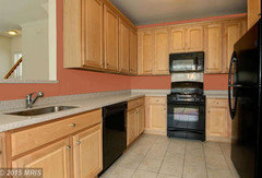
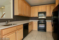
    Blue gray:

    Pure gray:
    Coral:
    Terra cotta:


    Katie Webber thanked groveraxle
  • 10 years ago

    Mocha:

    Chocolate:

    Katie Webber thanked groveraxle
  • 10 years ago

    Groveraxle, WOW, what a marvelous job you do with those renderings! Now Katie REALLY has something to look at. (My 'color education' is not on trial here, all I'll say about it is that it is National Award winning.) But now, everyone can see what I was trying to say, how the complimentary color BALANCES--(not JUST intensifies)--the plethora of warm tones in the wood. (Did anyone else actually LOOK at her fireplace? It is a darkish GRAY blue, cadet blue, I thought she might have some of it left-over for an easy weekend low-budget update) The coral looks nice too, but it makes the whole room veryVERY warm. Now if that is what you're "going for", great! But it comes with it's own design dilemmas...(where to stop it for the dining room, how to tie it into the rest of the open concept area, etc.) But that is not what she originally asked. I was taking cues from the REST of her home--with the info she gave at the time: "if so, what color would complement the blue/gray color scheme surrounding..." THAT is what the client asked for. I was listening to HER. Too many people on here interject their own ideas, which have nothing to DO with the poster's questions...I hate to think what they are like as 'designers'...we are supposed to work for the CLIENT. As for me..I like the Mocha version you rendered the best, (definitely a "cool" brown, like her sofa...not warm brown like chestnut or amber...I think that would be TOO warm) and I think it would easily tie in with the other grey and cadet blues...her sofa, wrought iron and so on. Hopefully she won't think it's "too dark"...I think it looks great, and ties in those appliances the best of the 3. Wish I'd have thought of it...but if I had suggested it--(with no pictures)--you think she'd have even considered it? You opened up a whole new possibility here., with the pictures. Perhaps she will see that as a happy middle ground, and as Gina Haffie added.."sometimes the last thing you think you'll love sometimes "pops" and you love it..then you'll know". You (Groveraxle) are really amazing with your renderings, and obviously talented and creative to come up with so many ideas! Keep up the valuable work. You help people visualize their dreams, and that is so important when big decisions are being made...it can be scary/overwhelming. Folks can get scared off from big dreams since they are sometimes hard for them to imagine....you take the "scary" out of it with your service. Thanks from all of us.

    Katie Webber thanked texastinranch
  • 10 years ago
    Wow Groveraxle those are great renderings! Fascinating to be able to do that! How helpful. I'm not a pro .... maybe I'm not supposed to add comments.... I'm trying support decision making- it's scary and overwhelming .... I don't wish to influence my opinion on someone either ..... Thank Goodness for you pros!!! Immense gratitude you all help us!!!!!!

    I try to look at options as fun, and keep open mind (like I said I'm not a pro), you'll soon weed through what you don't like and develop your scheme of how your aiming your home to feel - for me, it comes as I continue to work on my home. I wish it all came at once, but it develops and unfolds for me. That's why I need help !

    Like Grover said -- tying rooms together really really helps- even if for instance you decide to repaint the fireplace wall!

    I know no matter how perfect it is to others....If I don't feel the "love" of my decision, I don't often "grow" into Loving it.... That being said completely wrong doesn't work either !

    I hope those wonderful renderings above helps you see and feel closer to a decision. Wow!!! And keep having fun!!!! I think the fun part continues with adding a rug and jars etc to highlight your theme, which can Flow from one room to the other even with color changes!

    I think we have all repainted a mistake or two! It's a pain if that happens but better than disliking a choice for too long.... And better to move towards your desired scheme of things!

    It does come together sweetheart!
    Katie Webber thanked Gina Haffie
  • 10 years ago

    Thanks so much!! I was stuck before I posted this and now I have a ton of new ideas to think about! I appreciate all of the great ideas about the paint and also the ideas about the hardware and other things that I wouldn't have considered before. I'll have to post a picture once it's done!

  • 10 years ago

    @Groveraxle--heh--complementary...nope, didn't even catch it. Spell check wasn't reading my mind. Glad you knew what I meant. Think faster than I type sometimes. Sorry. Thanks.

  • 10 years ago

    Great Katie! Groveraxle's renderings are a sure help, huh? Be sure to check out pullsdirect.com for budget-friendly options, as regardless of color, a consensus seems to be new hardware! And it WILL make a big difference and is easy to change out in a few hours, and tie in your appliances and dining room furniture and curtain rods. And YES, pictures!

    Katie Webber thanked texastinranch
  • 10 years ago

    Texas, I'm sorry, I was a little hard on you and you are being so gracious. I scrolled back and note that you did say "balanced," but I don't know what that means. I can balance proportions, I can balance a composition, but the idea of balancing hues has no meaning to me.


    I've also seen way too many dilemmas where someone hates their orange oak and well-meaning folks tell them to paint the walls blue, the last thing they should do. This is just so very basic, and it frustrates me, and I wonder how many people follow this advice and then wonder why they hate their kitchens more.


    Anyway, complementary colors intensify each other, always, and this can be a good or a bad thing.

    Katie Webber thanked groveraxle
  • 10 years ago

    Gracious of you groveraxle, thanks. Balancing hues is just like balancing proportions, but think of it in proportions of color RICHNESS. Say if you have red and green. Pure red and green and it looks like a Christmas calendar. But if you soften the red to pink, (proportionally less-rich red) and gray down the green to a soft sage color, you have the makings of a soft pretty bedroom for instance...and not just for Santa Claus. But the two work TOGETHER...and complEment (thx) each other. If you had all warm tones of red only--pink, orange, and peach in that bedroom...well? It starts to be too warm...more of a BOUDOIR maybe!! But I couldn't agree with you more about the "orange oak cabinet" dilemma!! And you're right. Blue--any PURE blue can make those cabinets look like Chief Illiniwek (Illinois) lives there!! Haha! But a TONED-DOWN gray blue can take the edge off. The PROPORTION of toning down needs to be in relation to how 'orange' the cabinets are....the more orange proportion, the more toned down the blue would need to be...all the way to gray. Really! It can work. *You have to take in the WHOLE of the room together.* Would you paint the walls MORE orange to take the orange out of the cabinets? You COULD, but see what that would do the balance of the room? Now the cabinets would not look so orange, but the whole ROOM would. Or worse, they 'Clash' . Fine, if you love Halloween. See? Too RICH in orange...it needs something to offset it. A PROPORTION of something ELSE. Like adding salt when you make a chocolate cake...if you DON'T, it tastes horrible. For 'balance'. Grey can do it, because even a warm grey is "cool" compared to orange. (Which is why they also look great together!) ;o) Your Mocha and Chocolate renderings work, because the browns are not too warm. It balances light and dark, without REALLY addressing "color" so much. A warm Saddle, or rich Tea color would be too warm IMHO, and start to look too "country"--unless that is what one is going for. I agree that not every one can easily pick out the right 'blues' to fix the "orange cabinet dilemma", but that's why we are here to help, Right? Your color renderings do more than my "trying to describe cadet blue" could ever do. I'm new at this site, (and on vacation) and you are an 'old pro' here...probably (from what I've seen) with good reason. I was just offering my suggestions according to what she asked, and what I thought she might have on hand...since she advised the budget was wanting. But I still (myself) like your Mocha best, and Chocolate next. As I revealed earlier, I LOVE coral colors, but I think it would almost clash with her cabinetry...it's close is all. But they are pretty blonde, and not so orange...so it MAY work...only one way to find out!! PAINT!. ;oD

    Katie Webber thanked texastinranch
  • 10 years ago

    Just looked at her "dream" (coral) kitchen again...and the cabinets in there look REALLY WAY orange, even WITH the coral color, so maybe she doesn't mind that look? It seems to be a look SHE likes. On my monitor at least, it just looks coral and orange-yellow, the yellow light on the upper cabs isn't helping. The whole thing just looks ORANGE, (except the ceiling, which now appears soft blue.) To me, they clash...but it may just be my monitor. Fortunately Katie's cabinets are more blonde, they're not as orange as the "dream" ones are, so...Maybe? Some people (my bro) LOVE orange. Just thought we were working with "blue/gray color scheme surrounding". She could put some orange/coral/peach pillows in the LR...maybe, and recover the DR chairs in an orange/grey/white pattern?

    Katie Webber thanked texastinranch
  • 10 years ago

    A pic would be Great when you are done!!! good luck, have fun and play with accents and flow!! that can be part of the fun. Ya, I see what you were saying texastinranch...... fascinating...... thanks for the color lessons!!!! that is interesting. I see the ceiling looks tinged blue too!! huh....

    Katie Webber thanked Gina Haffie