Software
Houzz Logo Print
navymomma77

Need help picking paint color!

10 years ago
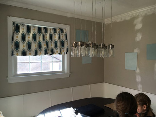
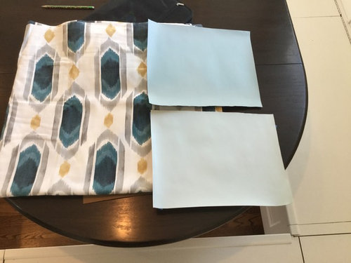
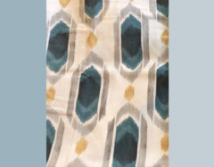
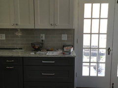
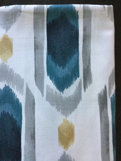
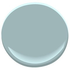
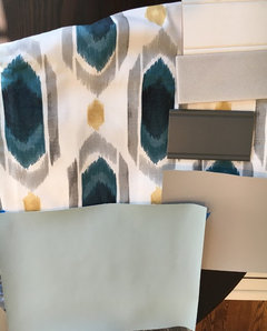
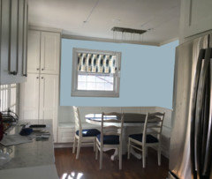
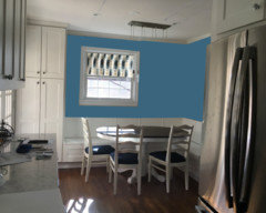
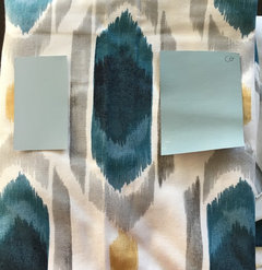
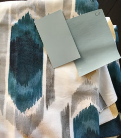
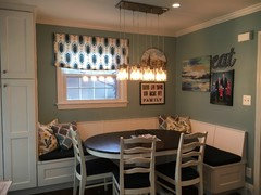
Looking at these 2 blues for my dining and a tiny spot over the kitchen window. Pictured with fabric that will be the Roman shade on both windows.

Comments (67)

  • 10 years ago
    last modified: 10 years ago

    I agree a grey would be nice. However, my base cabinets are a dark grey the adjacent room is already SW Essential Grey and I am not sure the essential grey is the right tone IMO with the cabinets and backsplash of the kitchen. It's just so much grey..... The cabinets are a warm brown based grey. I can't get a good photo now that it's dark out. That's why I was going for a blue.
    I can't repaint the adjacent room a warmer grey as we just had it painted in the fall and it extends into the hall, staircase, upstairs landing.....

  • 10 years ago

    Of your choices, the darker is better, but I think they are all wrong...not enough gray and wrong shade of blue (definitely too much toward baby blue). Palladian blue is very green and there's no green in your fabric so I'd definitely not go there.

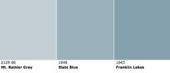
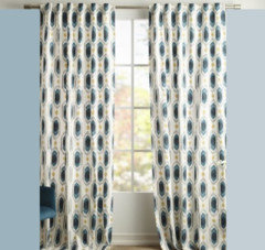
    On my screen, if I try to match the deep blue in the fabric, I come up with something close to BM Lucerne. As that is too dark for you, then move up to a lighter shade of that color like these below. Frankly I think a Mt Rainier would look great in your kitchen too.

  • 10 years ago

    I had also thought of BM Lucerne, which is a beautiful, warm blue, but it seemed darker than what the OP says she wants.

  • 10 years ago
    last modified: 10 years ago

    Slate blue on left, Mt Rainier on right

  • 10 years ago
    last modified: 10 years ago

    What would also work great would be a very warm cream. My fave right now is BM Capitol White. Gorgeous color in low light.

  • 10 years ago

    If you want to warm it up instead and go toward the gold tones, look at BM Montgomery White or Key West Ivory.

  • 10 years ago

    No cream. My kitchen is grey and white, and I am not a fan of white and cream together. Maybe a warm grey? I don't think most would notice the greys are much different since they won't be side by side? On my way to BM shortly. Will also look at Lucerne, slate blue, my rainier grey.

  • 10 years ago

    of the two, i like the darker of the two colors, but would also try sl darker- a little closer to the lightest blue in the fabric...

    you have to take into account all the other colors in the kitchen too-- to me, it seems that you're on the right track in terms of shade, but it doesn't hurt to try some others... to me tho, it seems like some of the blue grays, like mt rainier and slate blue won't look as nice with the teal in your fabric and the greige in your backsplash tile... you need a bit of green undertone, imo...

  • 10 years ago

    Okay. Just left BM store and the consultant there was very helpful. I decided on 2 samples, hypnotic for a grey, and Colorado grey for a blue. Will post more images with samples when I get them up. The Colorado grey is a by greener and ever so slightly darker than the gossamer.

  • 10 years ago

    If you don't want the room too dark, go w a lighter shade - just saying...

  • 10 years ago

    Ooooh, Colorado Grey is very nice with your fabric.


  • 10 years ago

    I like your teal idea a lot. I think it would be a great colour to blend your kitchen and dining together and work well with the grey, white and wood.

    I looked at the gossamer chip online at BM and the deeper versions look very similar to the darker teal in your fabric which to me indicates (if this is true in person, in your lighting) that they would work well together.


    I will tell you that I painted a room ocean air (lighter version on the chip) and it is a stunning colour that everyone loves...but a little on the beachy or boy's room pastel side of things, which may mean that you might like to go with a less saturated blue for your purposes. Maybe something adjacent like Smoke 2122-40...they call it a grey but it's a very blue grey.


  • 10 years ago

    Listen to @Tibbrix! She has never failed me with color selections.

  • 10 years ago

    I'm sorry, but I don't get it. I don't see any teal or green in that fabric at all.

  • 10 years ago

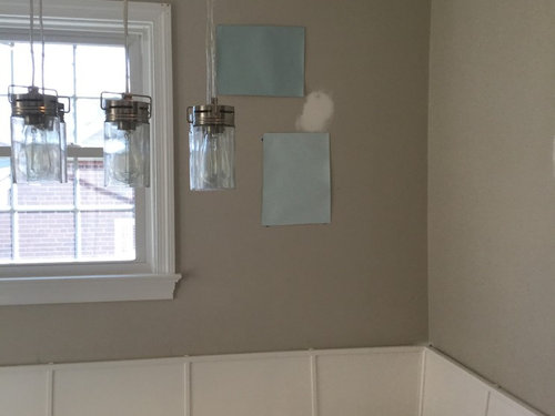
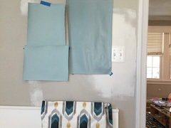
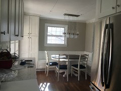
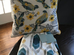
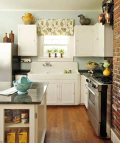
    Okay. I am realizing that I can't get a good pic to demonstrate the lighting. Everything looks much darker than it really is. So here is a photo showing the cabinet, backsplash, curtain, and both paint options: Colorado grey/gossamer blue or hypnotic (the warm grey).


    My 2 poster boards of the Colorado grey and gossamer blue are literally indistinguishable from each other on the boards that I painted of each one. Though on the chip I prefer the Colorado.

  • 10 years ago
    last modified: 10 years ago

    Basically the consultant said to go grey to play it safe and let the accessories/fabric shine or to go blue if I want to make more of a statement and have that be the focus. DH prefers the blue. I might be afraid and lean to grey.

  • 10 years ago

    Annie Deighnah, maybe it's just my monitor but when I sample the colours in the swatch I get a slightly greyed out greenish blue (sample colours pantone 7699, 5405). In RGB terms it's got about 2 parts red, 4 parts green, 5 parts blue (again just going by my monitor).

  • 10 years ago
    last modified: 10 years ago

    Interesting. I'm definitely seeing a deep, saturated turquoise - which, of course, has some green in it. In fact, I keep wanting to put something along the lines of BM Calypso with that fabric, but I know that's not at all what Navy Momma has in mind!

    (Or Galapagos Turquoise!)

  • 10 years ago

    Another photo more accurate with lighting and you can see the difference between the GB (left) and CG (right) colors here. Hypnotic up top.

  • 10 years ago

    TR I wish I had the guts to go that dark but I just don't with my tiny space.

    I am standing at the far back corner of the kitchen space (against the stove) and that's the entire space. French doors to the left and opening to family room to the right. It's pretty small, these cape cods!

  • 10 years ago

    yes, CG looks like a better color than the GB... i think i would go with a blue since your backsplash is greige...

    if you go with gray, look at it with your tile and your granite too...

  • 10 years ago

    I agree with TR. You have very little wall area, so a deeply saturated color would be gorgeous in there, and best in that low light anyway.

  • 10 years ago

    Ooooooh, I think you absolutely could get away with a deep, saturated color on what little wall space there is! You have a lovely counterbalance in all of the white cabinetry. I understand your reservation about going darker, but as tibb said, it would be gorgeous! :-)

  • 10 years ago

    I give up. On my monitor, neither one of the two colors look like they'd go with the fabric.The gray looks too blue and the blue looks too grey.

  • 10 years ago

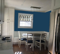
    Not very good paste up, but I think it's enough to give the impression of how lovely a saturated color would be as a backdrop to the nook. I agree with all the white woodwork, the dark color will be just an accent, esp after you add the fabric and add art to the wall.

    Slate

    Lucerne

    Marine Blue

  • 10 years ago

    The marine blue looks to be too blue, but of a good intensity...probably need something a touch grayer, but it's hard to do on line...

  • 10 years ago
    last modified: 10 years ago

    Dark colors recede. When a room is painted a dark to medium color, the color will actually make the room look larger rather than bringing the walls in, which is a common concern.

    Monitors are all differently calibrated... so, it is hard to see the true paint colors... however, not the drapery fabric ...if it were my room/s I would go with the darkest blue in that drapery fabric... the navy color...especially since you don't want to use another gray. Because I also think the dark gray would look great with it and with your kitchen colors.

    I do not think those lighter blues that you say are not matching the fabric but are meant to be used in a complementary fashion do anything, at all, for that fabulous fabric. I think you need a saturated color of paint. Besides, have you any idea how lightish blues can turn your existing grays blueish? Or more blueish if they already are.

    If not the navy, why not the other obvious choice? The gold... that color scheme of gray, gold and dark blues is very very attractive. It's also very popular in IKAT patterned fabrics for a reason! It looks damn good.

    There is no reason why you can't mix various grays, both light and dark with golds, mustardy golds, or even metallic looking hues, not actually metallic, just that gold look.

    Mixed metals look fabulous together. Silver, platinum, golds, both matte, brushed and polished.

    So, too, do warm and cool tones of colors as long as the colors complement each other. It is much easier to do this with metals, rather than paint, but it can be done.

    I think you will be very pleasantly surprised at just how fabulous that space will look with a dark, saturated color in either the navyish blue, the dark gray (that you have shown) or a dark or medium dark mustard gold or a dark metallic look gold.

    It's a great small space to GO BOLD. Don't chicken out! It will look fantastic.

  • 10 years ago

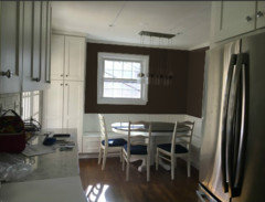
    Well, this won't surprise anyone here, but I think the most beautiful would be a rich chocolate brown. It will make the curtain really pop and look great with the navy chair cushions, and the contrast agains the white trim of the window, baseboards and ceiling would be gorgeous.

    Hang a large picture on the other wall...brown works so well because it creates more of an atmosphere than is "color", per se.


  • 10 years ago

    I just used BM Gentlemens Gray in a tiny 6'x6' powder room. Not a gray, but dark blue. With white bathroom fixtures, a small white free standing cabinet, white framed mirror, and blue/blue-green artwork it is so striking people compliment the powder room more than any other room in our new house. Don't be afraid of darkish saturated colors. Your dining area/kitchen would be gorgeous with that fabric

  • 10 years ago

    I love Gentleman's Gray and have been eyeing it for my front door and/or powder room. Also, have to say that at least in my house BM Lucerne is way darker than on that photoshop picture (and more greenish blue/teal).

  • 10 years ago

    I was up until 1 am playing around with the BM website paint tool with photos of my kitchen. I do like the idea of a deep navy. But my DH is very against. The grey I picked- hypnotic- goes well with the taupey tile and cabinets but it's really similar to the revere pewter already on the walls. In certain lights it looks the same. I think I prefer more contrast than I'm going to get with another gray room.

    DH prefers the lighter blues. I am looking at the Colorado gray (young house love used it in their kitchen once, if you want more photos). I also found a chip of RH light silver sage that is very similar but just grayer maybe. Thoughts between the two?

  • 10 years ago

    Also found these pillows for the banquette.

  • 10 years ago

    My first thought yould be to go darker -- more of a match to the fabric colors. YPU only have partial walls surrounded by whote trim, so you can absolutely go with a darker color. I like the Galapagos Turquoise -- or going totally neutral.

    At your kitchen window, I'd mount the shade at the top of the space and not really have wall space exposed.

  • 10 years ago

    Sounds like going darker is definitely out. Hey, your DH lives there too and his vote matters! :-) I still think the CG is the best of what you're now considering. I really like your banquette pillows too.

  • 10 years ago

    Sweet pillows!

    I like Tib's chocolate brown walls, but then, that's what I have in my dining room (above the 5 feet of white board-and-batten panelling). I do like the dark and dramatic, but you have to keep DH happy.

  • 10 years ago
    last modified: 10 years ago

    I am still into the original idea of a lighter greenish blue which will act as almost a neutral base for that lovely fabric.

    Glastonbury, CT Kitchen Renovation · More Info

    Ft. Worth Historical Residence · More Info

  • 10 years ago

    Your pillows look great with your fabric! Where did you find them?

  • 10 years ago

    TJ Maxx!

  • 10 years ago
    last modified: 10 years ago

    Thank you Navy Momma (I was just curious because they are so pretty).

  • 10 years ago

    The pillows are awesome. Don't you wish everything could come together as easily?

    I think the examples posted above by robo look really nice- it does look like it will all come together beautifully.

  • 10 years ago

    Thanks to all so much for your opinions, insight, and help. It is so much appreciated! I went with Colorado Gray. It is being put on tomorrow (today was caulking/priming/prep). I will definitely post photos of the finished space!


  • 10 years ago

    I love the pics of your kitchen and the fabrics you've chosen. I look forward to your finished photos! : )

  • 10 years ago

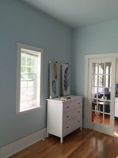
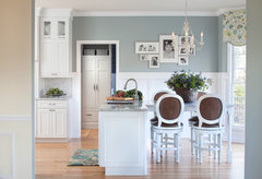
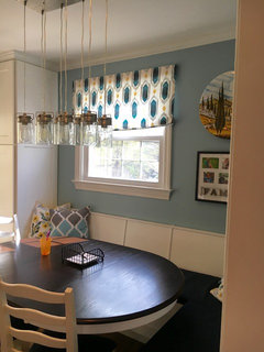
    All done.

    It looks greener in this photo than in real life.... But I'm very happy with it!

    Thanks again.

  • 10 years ago

    Very, very nice! I can see why you're happy with it.

    Navy Momma thanked nosoccermom
  • 10 years ago

    turned out beautifully!

  • 10 years ago

    Very nice. The curtain lightened up well on the window, and the accessories look great. The dark pattern in it really picks up the darker table top and cushions. I love the lighting over the table -- wish I could get my hubby to go for that light!

    Navy Momma thanked loonlakelaborcamp
  • 10 years ago

    Beautiful!!

    Navy Momma thanked decordummy_gw
  • 10 years ago

    Wow. Fantastic! Perfect choice!

    Navy Momma thanked User
  • 10 years ago

    That turned out beautifully!

    Navy Momma thanked Holly- Kay