Software
Houzz Logo Print
fiddleandco

Paint colors in home-thoughts?

10 years ago

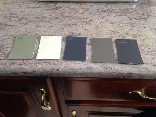
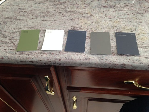
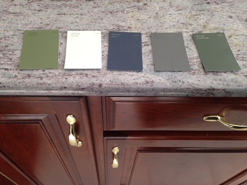
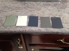
Here are a few photos of some potential paint color palettes for our home. I took the photos with our kitchen counters and kitchen cabinets for a little reference.....as they are staying as-is for now. The handles on cabinets will be 'rub n' buffed' a different color,.....to eventually be replaced. Thinking the black rub n' buff to darken. Our fixture is stainless, so perhaps will make them silver,....don't know yet. Feel free to weigh in on a rub n' buff color.

The cabinets and brass hardware are the same in the bathrooms too.

The paint colors shown are ones I have picked out and mulled for various places in the whole home....

Any of the combinations you like, dislike, have a recommendation for?

I am afraid of having things too dark, but beige depresses me and currently the whole house is white-also depressing me. I want color and love clean, dramatic looks, (think Fixer Upper, upping the 'drama' and depth of colors, with more white accents and darker walls?)

Our home is large, with lots of light and windows, and I find myself drawn to the far ends of the 'design balance'-light and airy: Fixer Upper styles, and deep, dramatic hues, nothing in between......

Has anyone used these colors with success/not success? Would love to see your photos!

Anyone that wants to weigh in on undertones and how to balance a 'busy' countertop that seems to be purple in some lights (and I have learned that yellow tones/undertones/things such as brass bring out purple! Thanks, Houzz!), cherry wood (what undertone is it?), etc. feel free. I am trying to learn more about balancing undertones and color.

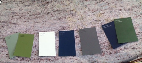
I will list the color names/# from left to right, so you can look them up if needed for a better look. I know my "Sea Salt" chip is blown out from the photo and looks white. It is not. All are Sherwin Williams colors.


Photo 1:

Retreat 6207, Sea Salt 6204, Naval 6244, Peppercorn 7674, Laurel Woods 7749


Photo 2:

Retreat 6207, Sea Salt 6204, Naval 6244, Peppercorn 7674, Anchors Aweigh 9179


Photo 3:

Oakmoss 6180, Sea Salt 6204, Naval 6244, Peppercorn 7674, Anchors Aweigh 9179


Photo 4:

Oakmoss 6180, Sea Salt 6204, Naval 6244, Peppercorn 7674, Laurel Woods 7749


Photo 5 below is all the colors-what group of them is best together? Is there a grouping between these colors that I haven't thought of? Any color you would definitely eliminate? Why?

Any color you would recommend adding? Would love to hear it!


Comments (31)

  • PRO
    10 years ago

    Of all the colors you've shown, Anchors Away works best. I think you'd have better luck by looking at warm grays. I don't have SW fan decks, so I'll list Ben Moore colors, and you can find similar SW swatches if that's your preference.

    Berkshire Beige AC-2

    Coastal Fog AC-1

    Brookline Beige HC-47

    Deer Path 1047

    Sandy Brown 1046


  • 10 years ago
    last modified: 10 years ago

    Thanks for the thoughts-to clarify, you mean A.A. works the best (out of the group) for the counters/cabinets, as would the ones you listed? As far as a whole home color palette, what are you thoughts on the other colors going 'with' each other as a group of colors used throughout the home?

    I did look up the colors you suggested:

    Berkshire Beige AC-2 and Coastal Fog AC-1 are OK.....not a huge beige fan.

    The last three, Brookline Beige HC-47, Deer Path 1047, and Sandy Brown 1046 seem very yellow.....not sure if that would fit in with anything, and as I said, trying to not bring out the 'purple' in the counters, so yellows are out.

  • 10 years ago
    I love those colors. We have Peppercorn in our bedroom and I love it. It's moody and looks great with my white lamps and dark wood dresser.

    My son has Naval in his room actually, and we have black and white art on his wall, a white bed that pops and a red and blue tent. The color is fabulous, probably the best in the house. I would use that on your lower cabinets!

    We love grays and blues in our home. All the living areas and hallways are painted SW Knitting Needles.
  • 10 years ago

    I would love to see some photos, Alyssa. Thanks!

    I was thinking of either Naval or Peppercorn in the master bedroom.

    What are the colors you used in your home? I am trying to get an idea of a group of colors that go well together, and would love some ideas.

  • PRO
    10 years ago

    You'll have to get actual swatches and look at them in your space rather than looking colors up online. Color changes dramatically in context, and actual color is very different from a digital rendering.

    I just think you'd get more enjoyment out of colors with warmer, dustier undertones. I can't get a read on your green choices, as they look like entirely different from photo to photo. Best advice I can give is to find similar colors that lean more warm or more have smoky undertones, tape them all up next to one another, and then step back a few feet and let your eyes glaze over a bit. Opt for the swatches that retreat rather than advance, they'll set a more serene overall tone but keep you in the same color family.

  • 10 years ago

    Will get swatches and paint areas of the walls,....just trying to narrow choices down so I don't have a ton of samples sitting on the walls!

    I am trying to get what you are saying, re: warmer/dustier undertones-what do you mean by that? What type of undertone is dustier? Can you give me an example of a "dusty" undertone and one that is not? What about when you say "smokey" undertones?

    Thanks!


  • PRO
    10 years ago

    Thanks - next time I'm near a SW supplier, I'll pick up samples so I have actuals to work with. Let me try my best to describe what I mean about undertones. You can have two colors that seem virtually identical, but when you put them on the wall, step back a few feet and look from afar, one will really advance at you and the other will not. The color that does not has softer, dustier undertones in it. These colors look less active on walls and are more restful to the eye.

    From what I can tell, the Retreat color seems on the right track, but I would still look for a version that's a bit more of a sage color. I'd add a warm gray either instead of Peppercorn or in addition to it. If you use each in different rooms that connect, you can play up the warm/cool contrast of seeing the two colors when you pass between rooms. It doesn't have to be as saturated a color (what some people refer to as "dark") as the Peppercorn, though it could be.

    In photo2, Anchors Aweigh color looks very gray, but in others it looks like a true Navy. Not sure which is accurate, but the grayer blue will give more flexibility when paired with other colors. Hope that helps for now.

    fiddleandco thanked Bespoke Decor
  • 10 years ago
    Knitting needles is everywhere and we love it.
    fiddleandco thanked Alyssa B
  • 10 years ago

    Thanks for the photos, Alyssa. Love the white/dramatic contrast.


    Bespoke-thank you for the explanation re: warm/dusty colors, I see that with the greens now....I think I am getting it. ;) I love to learn about this stuff. I am super visual, so it feeds that part of my brain to learn more about color! :D

    Another question-

    "......I'd add a warm gray either instead of Peppercorn or in addition to it. If you use each in different rooms that connect, you can play up the warm/cool contrast of seeing the two colors when you pass between rooms....."

    Would you consider Peppercorn a 'cool' grey? To make sure I am 'getting it', you are suggesting to change out the peppercorn to a warmer version of a grey. Could you provide an example of a warm grey I could see?

    And, you are suggesting to use a cool tone of a grey in one room, and a warm tone of a grey in another to play with the cool/warm contrast with the same color to balance/connect rooms, or are you saying go with all warm or all cool colors to connect the room, regardless of the actual color?

    (As in, does the warmth of the hue-whatever it is- connect the rooms, or is it the color?)


  • 10 years ago
    last modified: 10 years ago

    I am trying to steer away from purple (dislike the color), so any thoughts on subduing that undertone, instead of enhancing it?


    (We bought the house with the counter/cabinets...trying to live with them for now).

  • PRO
    10 years ago
    last modified: 10 years ago

    I am not as familiar with SW as I am with BM. But, I would like to comment on your kitchen counter; hardware and wall color.

    Your counter has a slight purple undertone to it. I think you should
    consider any gray which also has that undertone. I would use brushed
    stainless for hardware.

    Try SW Mindful Gray.

    Best of all, it looks great with cherry cabinets.

  • 10 years ago
    I used sage many times in my dinning room, kitchen and master bedroom and hallway. I have light wood floors, brown shades in the dining room, living room, and bedroom. They work well together. Just look out your window and see it in nature. I think the lighter green, Oakmoss, would look nice I shade down.
  • 10 years ago

    Yeah, Oakmoss was standing out (coming 'at' me, instead of retreating-thanks, Bespoke!), so I will change that. Here is 'one down' from Oakmoss: Artichoke.

    https://www.sherwin-williams.com/homeowners/color/find-and-explore-colors/paint-colors-by-family/SW6180-oakmoss/#/6179/?s=coordinatingColors&p=PS0


    Would you guys say that all of the greens on that (linked above) color line (with Oakmoss, etc) have yellow undertones?

  • PRO
    10 years ago

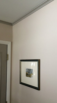
    Hi, sorry for the delayed reply (work, tax prep...). In answer to your question about the use of warm/cool colors, here's a photographic example.

    The walls are a warm gray (BM Litchfield Gray), while the door and ceiling trim are a cool gray (some color the previous owner bought from Home Depot). Proof that color is relative to the colors around it, as Litchfield looks very different in other photos on Houzz.

    My point is that you can get more subtle transitions from room to room, and more mileage out of a single color depending on how you use it. I can't tell you how many times I've used one color in three or four different rooms, and people will swear it's not the same color. And all I've done differently is change it from a dominant to an accent, or swapped out accent colors to something more subtle that affects how you perceive the color.

    I'll get my hands on SW swatches tomorrow, so I'll weigh in on your actual chosen colors then.

  • 10 years ago

    Wow, that is very, very, helpful. Thank you. I cannot wait to hear your thoughts on the SW stuff.

  • 10 years ago

    From your previous posting, I remember that Inkwell was a possible choice - have you ruled that out? I do like Naval and Peppercorn. How does the dark gray go with your Thomasville furniture? If I remember correctly, it has dark iron. Are you painting the fireplace wall? I just went through the process of picking a SW color for a room with many windows lotsa natural light and the colors would change throughout the day. I had samples taped up every where and at different times of the day we would sit in the room and survey all the colors. Then I did the actual paint on the wall - it was quite a process.


  • 10 years ago

    Thanks for remembering, eageree. I had Inkwell as a possible, but it really turned out too dark, very jet black on the walls, so I need something a smidgen less 'inky black'. I am also leaning towards using more color (hence the greens and blues), with some greys or lighter stuff (Sea Salt, hi there), to balance it out.

    I have not done anything with the dreaded wood wall, I am going to wait and just do hardware and paint for now, and deal with 'the thing' later. Ha. I am seriously considering pulling the wood and using Airstone or something similar to go over the wood wall and fireplace to create a stone wall/fireplace that is a very big, more modern statement. We'll see. ;)

  • PRO
    10 years ago

    Just got back from the SW store with your colors: Naval, Anchors Aweigh, Sea Salt, Laurel Woods, Retreat, Peppercorn and Artichoke. Bravo! They work very well together (and look far better in actual than on the computer).

    I found additional neutrals I'd recommend you consider adding to your mix, re our discussion about warm/cool. If you get sample chips and lay them out in combination with your palette, you'll see what I mean. In fact, you may even find that you like creating a palette of just neutrals, reserving your greens and blues for accents within the room.

    Cyberspace 7076

    Downing Slate 2819

    Folkstone 240-C6

    Westchester Gray 2849

    I'd include a photo, but I get the camera to reproduce the chips in accurate color. Better you get your own than be influenced by inaccurate representation.

    These can be mixed and matched with your chosen colors to great effect. Try laying them out and then adding and subtracting different combinations and you'll see how greatly certain colors shift in your perception of them. This allows you to use some as dominant in one room and as accents (or not at all) in others. Colors that many dismiss as "muddy" or "dark" or "brown" play really rich, vibrant supporting roles when combined with some of the colors existing in your palette.

    In some instances, you'll want to use these as paint colors for trim or feature walls. They can also be used as your guide when choosing colors you want represented in fabrics, rugs, or other additions to your decor.

    Don't be afraid to consider one color for baseboard paint and another for ceiling molding, or a mantel or door, in addition to the chosen wall colors. If you choose subtle gradations that complement each other, it simply softens and enriches the overall effect in the room.

    Let me know what you think, and if you have additional questions, please ask. Hope this is helpful in some way.


    fiddleandco thanked Bespoke Decor
  • 10 years ago

    Like all the colors in photo 2 and would add Laurel Woods to that group. Don't think they will be too dark but instead are deep and rich. That's something how sea salt washes out in the photo. It is a color that I recently set aside for future use when doing my recent color search. Think I'm going put it in a bathroom with white accents for a spa like feel. I find it very soothing. Can't wait to see these colors in your home.

  • 10 years ago

    Thank you Bespoke.

    Went through the suggested and appreciate the descriptive way of going about mixing these colors together in a home palette.

    I will play with these colors together today and see where it takes me.

  • 10 years ago
    last modified: 10 years ago

    Ok, so Naval and Anchors Aweigh are fighting each other,.....gotta choose one. I am leaning towards Naval-it's a little more blue saturated, and it one point higher in LRV than AA (4 instead of 3).

    Would Quietude (6212) play well? I am trying to find another lighter one to help Sea Salt balance it out. Quietude or Rainwashed (6211).

    Quietude LRV is 48, so much more saturated than Sea Salt, at 63. Rainwashed is between the two, at 60.

    ETA- After playing with the suggested colors from bespoke, here is what I felt:

    Cyberspace 7076-another dark, similar to AA and Naval......less color, very neutral. I think I don't want to include more than 1 super dark (less than 10 LRV) color in the palette, and just use the 1 dark color (Naval, AA, or CS) for wherever I want to use this dark of a shade.

    Downing Slate 2819-pretty blue! Undertone of.....purple? pink?

    Folkstone 240-C6-my favourite of the suggested 'neutrals', but again, am I seeing an undertone of purple or pink?

    Westchester Gray 2849-too cold for the house. I agree, re: warm neutrals, and this one feels too cold. I picked this one out initially, actually, so it's cool you suggested it, but when I was going through them to pick out the initially posted colors (from about 30 different swatches I picked up) this color ended up turning me off and making me feel frustrated. Funny, eh ?


  • 10 years ago
    It has been fun reading through all of these comments! My house is currently a blank slate and this summer I will probably start choosing cabinets, countertops, flooring and paint colors. I love your colors that you have chosen. I'm a huge fan of the greens and I really like seeing the blues and grays with it. It starts me thinking about how I could use them. At the moment we don't have a lot of light, but will be putting in new windows, so I can't wait to see how that changes my feelings about some of the darker colors. I have to be careful with too many dark shades since I live in Alaska and our winters can be pretty dreary, yet spring and summer are awesome.
    A difference between us would be that I love purples and yellows, so I would welcome some walls or accents in those colors.
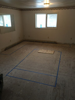
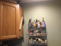
    We are currently living in our basement and I chose to paint the kitchen green, before moving our old kitchen cabinets and appliances down. I think it turned out nice with the honey oak cabinets. I've attached a picture of my future kitchen, with the island and cabinets taped off and one of my current, basement kitchen.
    Bespoke...your input was thought-provoking.
  • 10 years ago

    sunny- awesome for coming along for the 'ride'! I am learning so much too, very thankful for the professionals and their color advice/process.

    I am in a similar locale, with lots of snow and bleak outside for 6 months of the year or so.....you are much more extreme though!

    Coming from a more tropical area (no snow, green year-round), moving to our current place with snow, it is amazing how much it influences how we decorate our home......wanting cool breezy colors in the south, to craving these warm, saturated colors out here in the snow belt. ;)

  • 10 years ago

    my personal opinion,for what that's worth - like naval over AA

    quietude - like it, more saturation than sea salt. If your other colors have deep saturation this may be better than sea salt. But I still like sea salt.

    cyberspace - almost black

    Downing - blue/ Folkstone. look at the coordinating colors on SW website - Folkstone has a merlot which looks like the color in your countertop that you're trying to avoid. If you think there is even a hint of purple in the color, that's what your mind will be telling you.....at least that's how my mind works.

    Westchester gray - agree, cold

    when I was looking at colors I would do a search for the color on Houzz and it helped me to see how it would look in a room. Photos section usually gave me the best results.


    Also take a look at the colors on sunny days and cloudy or low light days - they could look totally different. Saw a pix of Quietude in bright sun and it was almost a pastel blue.

    fiddleandco thanked eageree
  • PRO
    10 years ago

    Thanks, sunnylyn! When you get ready for your project, reach out. I'd be happy to help if I can.

  • PRO
    10 years ago

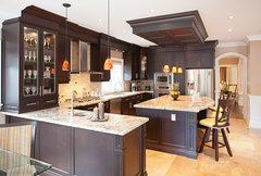
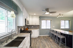
    Here are a few ideas:

    Sherwood Forest Residence - Kitchen & Dining · More Info

    Morton Grove Kitchen · More Info

  • PRO
    10 years ago

    Great palettes! Share your palette with others on www.painthunter.com or browse popular palettes created by designers like you.

  • PRO
    9 years ago
    First, aged brass is back in style, so a wash of rub and buff in black (light touch and rub off quick for just aged look). Your color palette is interesting but risky. Not sure how you plan to do the walls. If your furnishings are warm colors, these colors might not work. I like SW Sea Salt, Peppercorn, and Navy best. I would ditch greens. Also, there is a BM color called Sea Salt. The SW Sea Salt has clear blue green undertones. While I like that color with the navy and peppercorn you might want to try SW Sedate Gray 6169 or SW 0055 Lt. French Gray. Of course, the natural light in your home must be taken into account. Please make up sample boards to check the colors you lean toward so you can test in your light. SW has some boards, preprinted, that work especially well for samples. They are about 10x11" so big enough to get a fairly good feel for how color will work with all your elements. Worth price. 2 for about $5. Which is not bad for a good quality easy to use test board. Love to see more photos of your space as you move forward. Gives us better info for decision making.
  • PRO
    9 years ago
    One more thing, I would change out your kitchen hardware because even with a facelift, they look dated. Don't know how many you have, but it is small investment and these are the details that make a good look.