Software
Houzz Logo Print
sunshyne0111

Backsplash Ideas

10 years ago
last modified: 10 years ago
Hello,

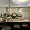
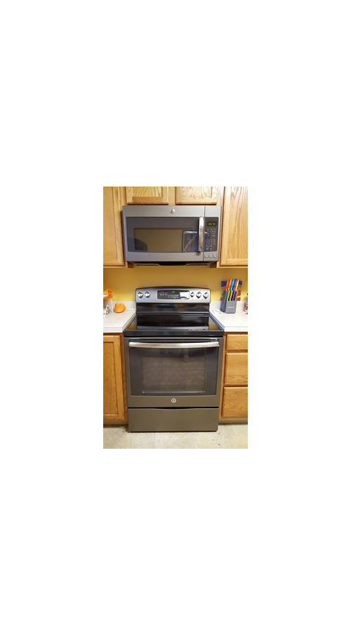
Was hoping if anyone has done something similar they could share photos or ideas with me... Attached is a picture of the cabinets/appliances (the cabinets aren't quite as bright as they show here, the flash was on and there was a lot of light already on in the room), and i am going to be getting butterfly green/verde granite next week. It's like a dark grey with some black, some silver/white, some gold, slight dark green undertones.

I'm thinking of doing a cream subway tile backsplash, with two rows of glass accent tiles which are grey/dark brown/light brown/cream colored. I don't like the idea of a dark backsplash, so trying to keep it light. The cabinets will be getting hardware put on them - the hardware is a slate color, just like the appliances.

Comments (14)

  • 10 years ago

    Can you take a photo from a bit further back to show more of your kitchen? Do you have natural light? I think cream or a soft white would look good. I'm not a huge fan of accent tiles in a backsplash, so someone else will have to help you with that.

  • 10 years ago

    yes - three windows of natural light. here is a photo - the cabinet on the right will be getting pushed back up against the wall & be the same depth as the others when the countertop is installed.


  • 10 years ago
    last modified: 10 years ago

    this is the new countertop - as well as the accent tile i was thinking about. for the cream/off white subway tile i was thinking of getting it in the color of the lightest piece of this accent tile. (the off white stone piece)

    my thought was, 1 row of 3x6 subway tiles, 2 rows of these little accent tiles, then the rest of it in the 3x6 subway tiles. I guess i could do no accent tile, but i thought this went pretty well with the wood and the countertop and the appliances and kind of brought it all together in the background.

  • 10 years ago

    Personally I still like the 4" band in the same material as the countertop.... To make you kitchen look swank like the granite, you'll need to declutter and purchase a different window covering.

  • 10 years ago

    decluttering and new windows coverings are on the list. ;)

  • 10 years ago
    last modified: 10 years ago

    Here's the thing....those tiny little tiles may not add as much punch to the bs as you might want, and two rows of it...you'll hardly notice it. Here is a similar set-up with the usual math (about as many rows as it takes to get 3", the height of one of the field tiles). Is this the look you are hoping for?

    Sometimes using bolder colors in bigger pieces gives you more of a lift.

    This image is credited to Laurie Gorelick Interiors from her blog.

    In the image above, the use of 1" squares of bolder color make a greater visual impact than rows of thin wisps of tile. Whatever you choose, be aware of the thickness of your mosaic and your field tile!! They should be the same...or you'll have quite a bit of work making them look good together.

  • 10 years ago

    Glass, to me, reads modern or contemporary. Your oak kitchen is more traditional.

    Also, although your new granite could appear as a solid, it will still have things going on in it, so for that reason too, I wouldn't do the muti colored accents. Looking at your kitchen, I'm not sure how much border you will actually see.

    After the counter is installed, you will have a better idea of the color of the granite in your space.


  • 10 years ago

    Disclaimer: not a fan of accent tiles borders, but I think especially in your case, it's a no-go. You have the low window and high stove breaking up the lines. Another line would make it look busy busy. The light cream field tile will help keep it calm. Add cute dish towels in a pattern and call it done!

  • 10 years ago
    last modified: 10 years ago

    Our last kitchen was golden oak with a whitish counter (with mauve and blue flecks - how do they compliment OAK?).

    We did a facelift and used uba tuba granite and a slate 2x4 backsplash. We had a lot of natural light and I really enjoyed how it turned out. Here is a pic just to give you one idea. It wasn't quite finished when I took this picture as you can see the cabinet front by the sink wasn't on yet. We also had black and stainless appliances.


    I know you said you don't like dark but there is also another slate that is lighter that I considered that looked really nice with the cabinets and counter as well. It was really hard to choose. It's Indian Autumn Tumbled Mosiac.


  • 10 years ago

    Your counter is very pretty and you have all that natural light. I think it will look much better without the decorative border.

  • 10 years ago
    last modified: 10 years ago

    eam44, i like the tiles in the 2nd one you sent!! regarding the rows, my parents just re-did their kitchen and their backsplash is like this. I was thinking of doing something similar but the tranditional subway look as opposed to the herringbone:

    eld, i agree on the contemporary. I'm trying to mix the two together with the upgrades - i went slate on the applainces, getting the granite, etc. I love the look of oak though, and this is a house from the 40's, so i want it to keep some of its original charm. ;) i think i will wait till the granite is in and then see how it looks in the space.

    autumn - I love that backsplash in your kitchen!! do you remember what it was called?

    everyone - thanks for the comments about the accent tiles. i appreciate everyones comments and ideas!!

  • 10 years ago

    I think one of the more important comments, which I didn't see acknowledged, is the lack of space for an accent row because of the low window and high stove back.

  • 10 years ago

    thanks mayflowers - this is why i wanted to just do one row of tiles, then the accent tiles, then continue with the tiles again, kind of like in the photo i posted. this way the accent row can go from all the way to the left, to behind the stove, then over to theright. It would stop at the right window, as it couldn't go under that. this is how my mind was picturing it, anyway.

  • 10 years ago

    I would shoot for something more in line with the cottage feel of your kitchen. That glass mosaic is a more contemporary style, especially the colors, and the brown and gray glass doesn't really have any relationship to the dominant green of the granite.