Software
Houzz Logo Print
mkuyekawa

Paint color idea too crazy?

10 years ago
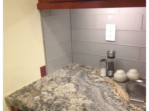
Sorry to deep bugging y'all but.....

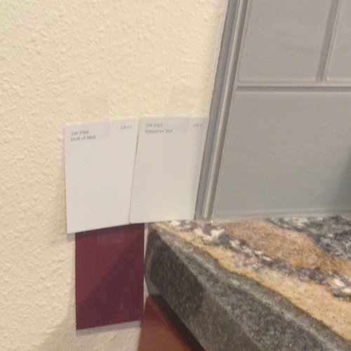
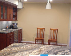
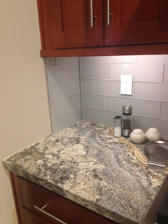
I am changing my paint color because it looked too yellow. I am going toward gray even though I'm not thrilled with Someone suggested color. Would this be too crazy? I love the color but think it might class with the cabinets or be too dark. Any other ideas besides gray? Or if gray, either of these? Thank you!

Comments (22)

  • 10 years ago

    I like the Gossamer Volt (???). I think the red would be 1) too close to the cabinet color and 2) overpowering. the whiter variety might work - but the greyer is more pleasing to my eye 9and the color rendering on my screen!)

  • 10 years ago

    Not the dark one! You can't possibly choose a paint color from a little chip. You gotta get some sample quarts and paint big pieces of foam core and move it around the space throughout the day.

    I'm sure some "paint pros" will chime in with some possible suggestions.

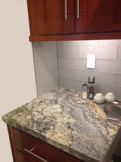
    p.s. gorgeous counter!

  • 10 years ago

    I agree the red is pretty.. My favorite color! But too close to cabinet color.

    I think I would lean toward one of the warm brown colors in the countertop. Not too dark, so the cabinets have their place in the room, but darker than the other two neutrals you have. Then you could accent with a darker or vibrant color with accessories.

  • 10 years ago

    No red. You will regret it. What about a light sage green? In my last house we used Avocado Valspar 50% and it looked great with our gray tones & dark cherry cabinets.

  • 10 years ago

    Have you tried taking a cabinet sample, counter sample and BS sample to your local SW or BM store? My local SW paint experts have been so helpful to me when picking to right paint color. I bring in the samples and they always seem to pick just the right colors.

  • 10 years ago

    Plum!! :)

  • 10 years ago

    haha Amber... Your suggestion of plum is what got me to look outside the neutral realm and consider the burgundy! I looked at plum but could find a shade that struck me.

    Thanks for everyone's feed back. Leaning to the darker of the gray but still contemplating going with more color.

  • 10 years ago

    That burgundy would be a great color for accessories. I'm definitely not a paint pro but the Gossimer Volt looks nice.

  • 10 years ago

    Forget the burgundy accessories - I love the blue.

  • 10 years ago

    That blue is pretty great.

  • 10 years ago

    It would be fun to use the sherwin Williams color snap app; take a pic of your counter and find SW paint colors within your stone. Might give you fresh ideas.

  • 10 years ago

    I did use the SW color snap app. I am finding that every color I grab from the granite either looks bad next to the backsplash or cabinet. The blue photo above is very intriguing, and you've got DH looking at blues, but there's no other blue anywhere and I am not feeling that brave. I do usually prefer the bold colors though, which is why the grays and beiges are not thrilling me. Still playing around with brown/butterscotches but actually, ready to give up and take a break. I have lots of samples of creams and grays if anyone wants them!

  • 10 years ago
    last modified: 10 years ago

    Do you have a lot of wall space to paint? Or is that bare wall most of the wall space in the kitchen? If it is and you like the blue I would go for it. If you hate it or get tired of it you could repaint it in an afternoon.

  • 10 years ago

    Here are three ideas trying to keep to a more beige/greige tone.


  • 10 years ago
    last modified: 10 years ago

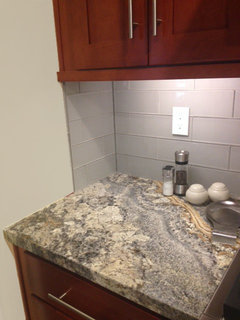
    Blue works because the gray in the stone has a blue undertone. Also, in the picture above, that front corner next to the wall seems to have green undertones -- sage-y or olive-y greens would likely play well with the creams in the stone anyway. I agree that the tans, creams and beiges aren't working.

    I liked the red, but that might be too much in the long run unless you can find the perfect soft red.

  • 10 years ago

    What is the third one cpartist? I like it the best of the three, but it almost looks like what is up there now. Maybe I am getting used to it!

  • 10 years ago
    last modified: 10 years ago

    What if you were to find a piece of artwork that has all of your colors in it for the wall where the chairs are? Would that help your eye accept the tan and gray combo better? Both colors are present together in nature, your stone is evidence of that, so it should be possible to find a landscape that incorporates your colors. Your counters are very pretty.: )They remind me of waves washing up on a stone beach.

  • 10 years ago

    I love the blue. Someone said this upthread, but I want to say it again: get samples and put them on the wall in big swatches. Every time we do this, we end up picking a completely different color than we thought we wanted. Photoshop and paint chips just don't tell you how the light in a particular room is going to work with a specific paint.


    Also remember that it's just paint. It's not that big of a deal to change it if you decide you don't like something.

  • 10 years ago

    I'm not sure what your granite is but it looks almost exactly like our granite in our last house. I had dark brown walls with mine but had white cabinets so I don't think that would look good with your cabinets. Two other colors I found that looked good with it were Ben Moore Van Courtland Blue and Sherwin Williams Anonymous (a darkish greige).

  • 10 years ago

    i like the idea of blue or green...i would probably get a color with gray undertones to tie it all together, green-gray, blue-gray... comments upthread are good ones., get samples and paint foam core and move around the room. so much depends on your lighting, artificial and natural. remember it will look different on sunny days, cloudy days, day and night... look at the samples for a few days/week and see what speaks to you. i agree with others, no burgundy.

  • 10 years ago

    Have you looked at greige colors? Revere Pewter or Edgecomb Gray