Software
Houzz Logo Print
enzaenza

Narrowed down backsplash; please help me decide

10 years ago
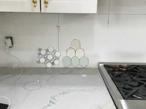
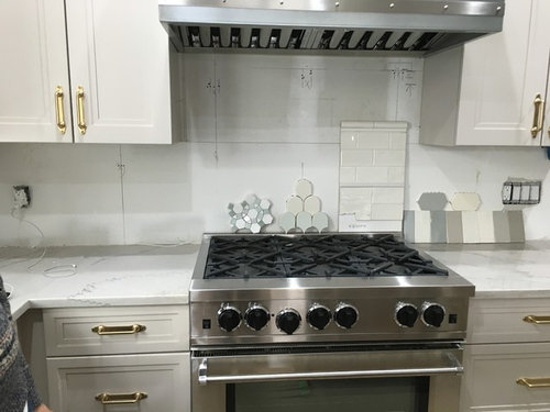
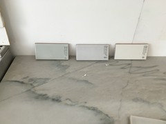
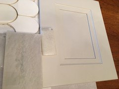
I *think* I've narrowed the backsplash options to two possibilities:

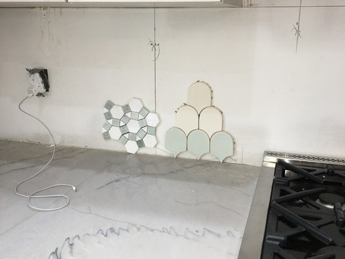
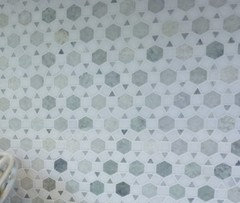
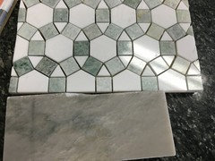
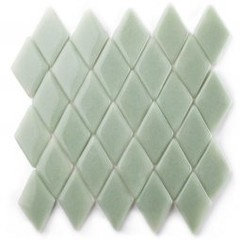
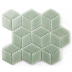
1) Marble mosaic with Ming green

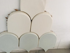
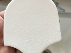
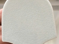
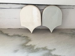
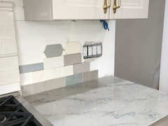
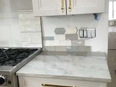
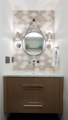
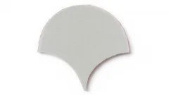
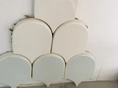
2) Ivory crackle fish scale (green at the bottom was just there to help w the visual, but now I'm wondering if a line of the pale green crackle at the bottom would look nice?)

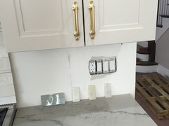
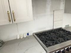
Kitchen - putty colored cabinets with walnut island; white macauba quartzite counters; wood floors; stainless appliances and brass pulls, faucets, pendants.

I've chosen mostly neutrals and tried to mix it up with brass accents. I was planning to try to add a hint of blue somewhere, but nothing worked as nicely with my counters as the green, imo.

Once the backsplash is decided I'll choose a fabric for the windows that adds some color! to the mix.

Now for a few photos!


Comments (47)

  • 10 years ago

    Exciting, Enza!! Is there color variation in the scales? The top looks like a different shade than the second row, but may not be irl.

    Im personally more drawn to the scales, but its because I tire of pattern very very quickly.

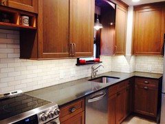
    I see subway samples behind he stove. Are you putting subway somewhere?

    enzaenza thanked sheloveslayouts
  • 10 years ago

    Benjes!! So glad to get your feedback :):)

    My fave is the scales as well, but wasn't sure if a marble would be a safer choice.

    i don't see any variation within the ivory, but the first row near the counter is actually pale green/blue called horizon .

    As for subway, I never found a color that I loved, so those are out unless everyone hates the back splashes I picked :0

  • 10 years ago

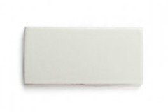
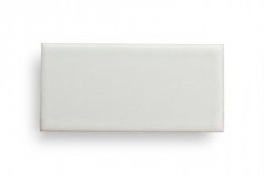
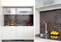
    Some of the subways I considered:

  • 10 years ago

    enzaenza -- We had Calacatta (cross-cut version of MW) installed recently, and are contemplating whether to do a full backsplash of the same material or introduce a bit of something (plus, at this point, I'm not 100% confident my fabricator can execute the full BS well). I can't get the marble mosaic w/ Ming green out of my head after seeing it online in another kitchen. It's very helpful to me to see your MW next to the mosaic. Here's a screenshot of the BS I saw online:


    Am also curious to hear what other GWers think in terms of color compatibility between this next to the MW tops.

  • 10 years ago

    Javiwa, I think your photo is of the same tile with the colors reversed. I may like that more since it's more subtle!

    Our counters are the cross cut as well, and the Ming is a perfect complement. We were also ready to do a slab backsplash using the macauba, but honestly didn't want to spend the extra cash at this stage of the reno.

    Here's a closer photo for you showing the Ming next to the counters

  • 10 years ago

    My first reaction was I love the one on the right (the scales), but that was before I read the post. I originally thought the scales had a pattern with green on the bottom, then ivory, then a pale gray. That could be very interesting! But I do like the scales even if solid especially the green.

    enzaenza thanked mkuyekawa
  • 10 years ago

    As by themselves-I probably prefer the scales

    But since the pattern of veining in the countertops is rather large, small mosaics might look better. They are quite beautiful too. Might be a bit harder on the eyes though..but I'm sensitive to strong geometrical patterns, everyone is different in this regard.

    Green scale looks very nice to me. I'm not sure about the crackle one-I happen to LOVE it, but was advised against using it in certain places..I'd ask the store about it.

    Yours is going to be a very beautiful kitchen.

    enzaenza thanked aprilneverends
  • 10 years ago
    last modified: 10 years ago

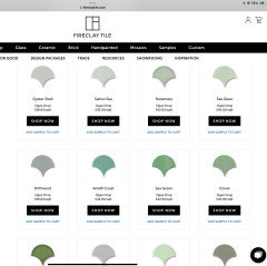
    If you really want glazed ceramics, consider Halite and Oyster Shell from Fireclay. They are available in dozens of shapes, and the colors may work better with those stunning counters than your other samples do.

  • 10 years ago

    eam -- And to think we were just in the SF area last week!

    enzaenza -- We were required the purchase the slabs for our job, and have remnants leftover. Of course, fabrication costs for BS from these remnants are much higher than installation charge for tiles, but then we'd need to pay for tiles. We cost it out that either option would run from $1,500-$1,700, so it'll come down to what looks best (and, again, our confidence level that our installer can follow through). Yup, the mosaic looks much more subtle with grout lines filled in. :) Where were you able to obtain a sample?

  • 10 years ago

    Hmmm, I've avoided glass bc I don't care for the look, but those above look so soft and subtle.


    Here are three Fireclay samples:

    oyster shell -French linen -halite

  • 10 years ago

    i love both of your choices but think I'm leaning towards the blue/green scales. Love love.

    enzaenza thanked cece673
  • 10 years ago

    Javiwa - the samples are from a local tile shop. I just called them and they said I could have the colors reversed, but with an 8 week lead time :0

    We bought two slabs and used them ALL up for our counters and a bathroom vanity. My quote for slab backsplash was $3900 installed which just felt too high!

  • 10 years ago

    $3,900...ouch.

  • 10 years ago
    last modified: 10 years ago

    Ha! Great minds think alike! Seeing them together I like Oyster Shell best, but I like Halite too. But you've seen and dismissed these samples. What were you looking for that they didn't give you?

  • 10 years ago
    Something about the fireclay tiles felt a little muddy. I think because the cabinets are a bit muddy themselves. The crackle scales have no variation, but something about the finish feels cleaner if that makes any sense!!

    With so many decisions behind me, I now have analysis paralysis... like there is a *perfect* choice out there, but I'm missing it!
  • 10 years ago

    WOW!!!! I love the first two options in you very first picture you posted!!! Seriously go with one of them - they are both beautiful. And be sure to share pics when you're done!

    enzaenza thanked User
  • 10 years ago

    I like the green scales....

    enzaenza thanked vpierce
  • 10 years ago

    Well there's no need to rush. It's worth it to wait till you have something you love.

  • 10 years ago

    My first backsplash love is the marble mosaic you have there (I think it's the same anyway). I've since decided I also love Jeffrey Court Gapstow Gray, so I need to decide soon. I really like the scales, too, though, especially with your granite.

    More kitchens with the marble mosaic (note, they do have quieter, dark counters):
    http://ths.gardenweb.com/discussions/2684360/its-done-and-i-love-it

    http://ths.gardenweb.com/discussions/2817825/scrappy25-renovation-part-4-final-reveal-white-inset-soapstone


  • 10 years ago

    love the ones eam44 originally picked out, the glass ones. so correct that the translucent glow from your counters is picked up by the glass tiles. they are ones in my book.... great choice eam44, you nailed it!!!!

  • 10 years ago

    Pretty! Love the cabinets, hardware and counter!! Is that quartzite hard to find? Haven't seen one in that gray/white color before! Gorgeous! And I love the fish scale backsplash, the blue-green is very pretty! Would you go with a lighter grout? Pretty! Congrats- almost done looks like!!

  • 10 years ago

    I also thought the upper scale was a different shade, and loved the color combination (think it would be perfect for my kitchen!), but thought the colors in the mosaic worked better with your counter. Yet, I don't love busy mosaics -- I am one who would tire of it.

  • 10 years ago
    last modified: 10 years ago

    FOLLOW UP -

    Hi again! Repeated thanks for your insight so far. Hoping to pick your brains a bit more.

    - decided against the pale green scales :/

    - ivory crackle scales are still in the running

    - added the Fireclay glass brick thanks to the suggestion from eam44

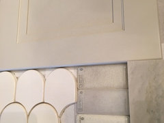
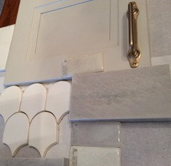
    So ....... ivory crackle scale OR glass subway?

    --------

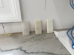
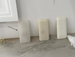
    Glass ( top to bottom )

    jasmine, hydrangea, Queen Anne's lace

    Next two photos have jasmine directly on the cabinet door :

  • 10 years ago

    :-( I sure would like to see some color brought into your BS.... I think it makes a space happier.

  • 10 years ago

    Would you take photos of the new tiles with the countertop in view, similar to your first post pics?

  • 10 years ago

    I like the depth of the glass. I would consider the lightest one that is on the bottom- I like contrast though. The tile on the wall under the cabinets will be in shadow and make it seem darker than it actually is too. My .02!

  • 10 years ago

    can u get samples of "halite" and "oyster shell", the ones that eam44 picked out?

  • 10 years ago

    I love all three of the glass tiles. Love them. Jasmine seems to be the same color as the cabs, Hydrangea appears to match the background of the stone, and Queen Anne's Lace is such a breath of brightness! I too could benefit by seeing them vertical, on top of your counter.

    How do you like them?

  • PRO
    10 years ago

    Absolutely the glass tiles! Subtle and very elegant as is you kitchen. Anything else is too busy. This is a sophisticated kitchen! Think Audrey Hepburn....Grace Kelly! Elegant, subtle, simple, sophisticated.

  • 10 years ago
    Thanks so much everyone! I will get over to the house this weekend so I can take some photos of the tiles against the cabs and counters.

    Someone from Fireclay is helping me think this through as well and she sent photos of the mixed neutrals to give me an idea of that look.

    Now I now why the term ABB came about!!
  • 10 years ago

    Subway is boring after seeing the fish scale tile and green ming tile. Boring also equals safe, but who cares!! BS isn't that hard to change in 10 years if you decide on a different look. You have such a beautiful space. Anything will look good.

    enzaenza thanked User
  • 10 years ago

    Glass tiles in situ ...

    Please disregard the debris that my "photographer" didn't think to remove :0


  • 10 years ago


  • 10 years ago

    enzaenza -- I'm sorry I haven't followed this thread closely enough to keep all the options/names straight, but I love the gray one on the left! (Please remind me what this is, as I might need to bring this sample home for my kitchen. TIA)


    I think it's just perfect with your qzite.

  • 10 years ago
    last modified: 10 years ago

    Well, you don't have to stick with subway tiles or even one color, although you wanted your quartzite to be the focal point, I think. One more variable: gloss and matte. You could go with Hydrangea in gloss and matte tiles and alternate them at random or on purpose for effect. The image below is from Heath Ceramics and it's called Argyle for obvious reasons.

    Regarding shape, with glass you can choose a diamond motif, or hex tiles, or the 2" X 8" in stacked, offset, or herringbone layouts. I don't think there's anything boring about these tiles.

    But if you want fish scales you're back to the glazed ceramics, and I'd go for the Fireclay ogee drop in oyster shell, although I know you thought it muddy; you'll lose the luminosity of glass tile (that's ok). Think about whether it's more meaningful to you to have the shape, or the (frankly amazing) color/luminosity match. And just because I'm familiar with Fireclay Tile doesn't mean there aren't other companies with other shapes you can consider. You're getting closer!

    enzaenza thanked eam44
  • 10 years ago

    Love the mixed neutral fish scales. But your kitchen is beautiful and all these options would work fine.

    enzaenza thanked mkuyekawa
  • 10 years ago

    javiwa - the color pictured in the photo with the arrow is hydrangea; the other two are jasmine in the center and Queen Anne's lace on the right.


  • 10 years ago

    eam44 - so what would be your top choice??? Hydrangea glossy and matte?

  • 10 years ago

    I think so, yes. But you have them in your space. Are they making you swoon, or could you take or leave them? If the latter, we should keep looking.

    enzaenza thanked eam44
  • 10 years ago

    I love the luminosity of these tiles. The Hydrangea is perfect with your countertops. The Jasmine is perfect with your cabinets. Two great choices. I also love the green glass ones eam44 posted, a beautiful color. These tiles are special.

    enzaenza thanked romy718
  • 10 years ago
    These comments have all been so helpful !! Feeling a lot less scattered.

    I'm really feeling the glass tiles more and more. Romy, your description is dead on ... it's the luminosity that brings these to another level. They are even more beautiful in person. Now I just need to narrow down sizes and color.

    I know I don't want one of the offered shapes and the thinner subway feel more modern. I think standard subway is my preference right now. Seems like hydrangea is the right color too, but all gloss or include the matte??? And more importantly, how do I get my husband and the contractor to get over the 3 plus week wait for these!!
  • 10 years ago
    last modified: 10 years ago

    Yay!!!! I'm happy for you and think it's a great choice. The 3" X 6" subway tile is a classic for a reason. I personally love the interplay with gloss and matte, so were it my kitchen, I'd absolutely do it, but it has ramifications for your layout. Do you want one pattern throughout, or do you want a decorative element over the range?

    Every time I add a touch of visual interest with tile, I try to simplify something else, so if I mix colors, I keep shapes uniform. With the color and shape uniform, I would absolutely mix glossy and matte, and I'd do it in a pattern. I love the argyle look.

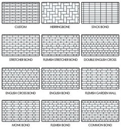
    If you want a complicated layout, however, you might again consider a single sheen. The classic subway has what is sometimes called a 1/2 step, meaning the subsequent row is 1/2 a tile offset. By contrast the Heath Ceramics image above has a 1/3 step. You should discuss the layout with your installer, show him pictures of what you have in mind. There are as many options here as you can imagine. Below are just a few of them; the offset bonds are called "stretchers" here....

    As for convincing your husband, I'm sure he will be relieved that you found something you love. Beauty is worth waiting for!!

  • 10 years ago
    last modified: 10 years ago

    Finally got my backsplash installed! Thanks to all on this thread who helped me think through and make the right decision. Shout out to eam for changing my perception of glass tiles fo' eva!!! I posted a sneak peek for anyone interested!

  • 4 years ago

    Please post your final kitchen. I have picked the same quartzite crosscut white macaubas and have to decide on cabinet color and backsplash. Would love to see your finished space and how the quartzite holds up after years of use.

  • 2 years ago
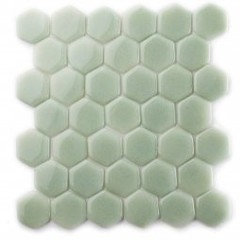
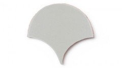
    I know this is a very old post…. Where are the pale green scale tiles from?

  • 2 years ago
    If you are asking about this tile,

    This is Fireclay Tile in Oyster Shell. They have many more greens to choose from.

    If you are asking about this tile,

    The OP never specified, but I am fairly certain from their elongated shape these are the Walker Zanger Robert A.M. Stern Crackle Glazed Ceramic Mosaic Tile Fishscale shingles. They are no longer in production, but you can find an occasional box for sale on ebay.