Software
Houzz Logo Print
ljsquishy

Bathroom paint color suggestions

10 years ago
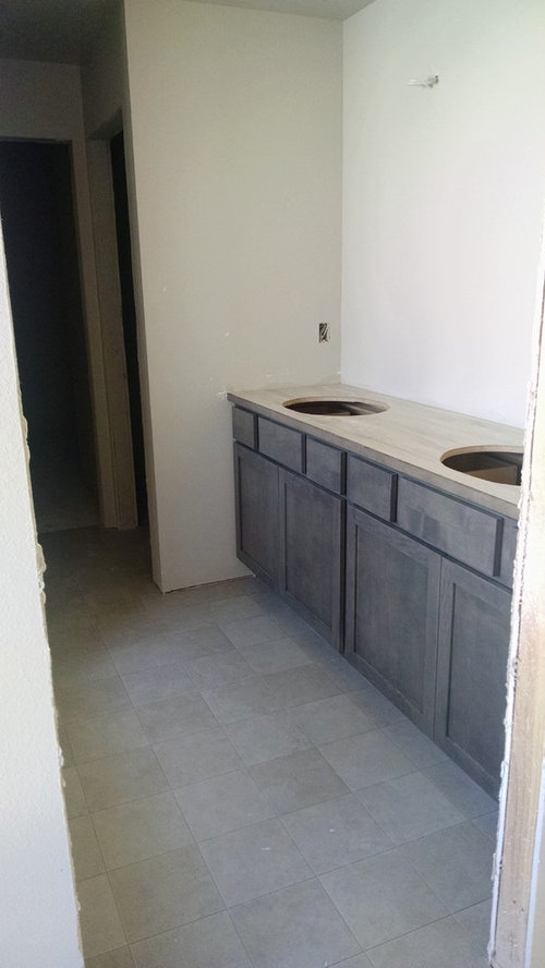
We're having a house built and had to make all of our flooring/counter/etc selections way before the house was even fully framed. We kept the bathrooms very budget-friendly (ie: did not upgrade anything) knowing that in several years we'll replace the vinyl floors with tile, etc.

So...our selections turned out a bit darker than what we envisioned when we held all of the samples together. The vinyl floor is obviously not awesome but we're okay with it since it isn't dark, but the counters turned out much more yellow/dark ivory than the pictures we saw online. The countertop is Formica 180FX Travertine Silver. The bathroom window faces northeast and is directly across from the vanity (approx. a 4'x4' window) which will hopefully reflect more light once the mirror is in. In person I feel like the bathroom is darker feeling that what the photos show.

The current color is similar to SW Agreeable Gray. I was thinking of even going white...or maybe some sort of blue/gray like Comfort Gray (although I think it might look very bright in this room).

ljsquishy's ideas · More Info

ljsquishy's ideas · More Info

ljsquishy's ideas · More Info

Comments (13)

  • 10 years ago

    I'm one of those (OCD?) people who buy a small can(s) and paint a sample board (after I've narrowed it down). Do all of the bathrooms have the same cabinetry/counter/floor or is the one pictured your master?

  • 10 years ago

    I love what you have there and also I like your current wall color. I'd go with accessories, towels, art, perhaps plants, floor mat. There are so many directions you could go, e.g. more organic with white, cream, beige, gray, and texture. Or with greens, off white, and plants; or white/pink orchid and some fuchsia.

    If you are worried it's too dark, I'd stick with the warmer colors, e.g. for white, SW Creamy, or the greiges, such as Agreeable Gray or Accessible Beige.

  • 10 years ago

    The bathroom pictured is our master bath but the guest bath has the exact same cabinets/floors/counters. The paint color pictured is a Diamond Vogel color called Hidden Cove which is very close to SW Agreeable Gray. I think it currently looks like unpainted drywall. LOL

  • 10 years ago

    I'm with nosoccermom..of course it's hard to judge only by the pictures, but I like how everything works together. There will be many more elements in the room that are still not there..they'll bring more light/richness into the room. Polished and reflective surfaces like mirrors and maybe hardware; soft fabrics(towels etc.)..maybe greenery and even small art somewhere. I feel it will be nice well balanced space in the end of the day.

    Love your vanity..simple and beautiful.


  • 10 years ago

    I like the current color, too. Looks like it goes well with your countertop (which looks very nice, by the way) and floor (which also looks nice). I'd be wary of going too dark, too gray, or too colorful as I think some colors will take away from the neutrality of the finishes and perhaps cheapen the look.

  • 10 years ago

    Thank you all for the kind comments. I like the idea of keeping a very neutral palette with using white/neutral towels. I don't think I should add any more gray to the room. Perhaps once the white trim is in it will help the wall look like it's actually painted! The faucets are chrome and the sinks are white. We didn't upgrade the backsplash at all (another project we'll tackle ourselves down the road) and chose a soft white 6x6 gloss tile (single row). The garden tub will have 6x6 light travertine tile.

  • 10 years ago

    I love it! It has such an earthy vibe yet still bright. I would change a thing. Once your sinks and faucets etc go in I bet you will really like it more than you do now.

  • 10 years ago

    lisa, do you happen to know what the flooring is? I'll be looking for a tile look linoleum or vinyl for a bath soon and I really like yours.

  • 10 years ago

    olychick,

    The sheet vinyl is Mannington Benchmark Studio in the color Graphite, #3893. It is not a very high quality vinyl I don't think (Benchmark collection is rated "good" with a 6yr warranty) and their nicer ones were very thick and cushiony. This is probably middle of the road I guess.

    We chose the Studio Graphite floor because of the thin "grout lines" vs the thicker wavy ones you frequently see with sheet vinyl. We thought it looked a little cleaner and you'd focus less on the floor. I see on their website that they describe it as concrete looking and I think it looks like tile but who knows. Lol I'll try to take up close pictures for you today.

  • 10 years ago

    Thanks, Lisa! I think the thin grout lines are what to appeal to me, too. It doesn't get much wear in my bath, so the quality might be fine.

  • 10 years ago

    olychick, Here are more photos I took today for you:

    This afternoon it looked more greige (like the photos show) and we just got back from checking on the house tonight and it looked totally gray on the leftover roll in the garage so it really changes in the light (at least at our house it does) which I like. The floors haven't been cleaned yet but I can't imagine they're too dirty, just a little dusty and obviously some random chunks of stuff.

  • 10 years ago

    Thanks for the pics. I really like it!

  • 10 years ago

    If you want to reach outside the normal comfort zone, how about pink like this design seed?

    Or you can keep it with the light neutrals or the darker neutrals