Software
Houzz Logo Print
carriebor

CarrieB - Back Again Kitchen "The Door" Paint Question!

10 years ago
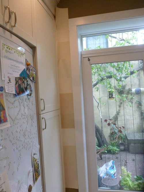
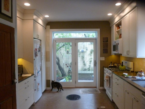
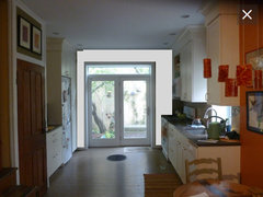
Many of you were with me (and with me...) when I was choosing a color for my new kitchen. I chose Sherwin Williams' "Sawdust", a greenish color. I really like the color, and it goes with the rest of the kitchen.

BUT, I don't think it contributes to bringing the outside in, which was one of my major goals. So, I've decided that re-painting the kitchen (or at least that back wall, around the door) a color that's similar to my back garden wall (which is actually the stucco wall of a neighbor's house) would be pleasing.

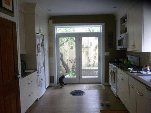
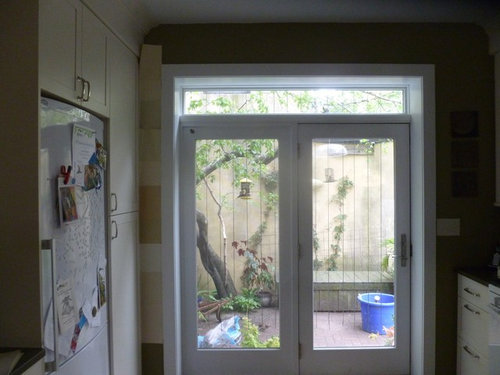
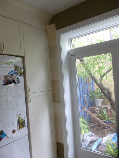
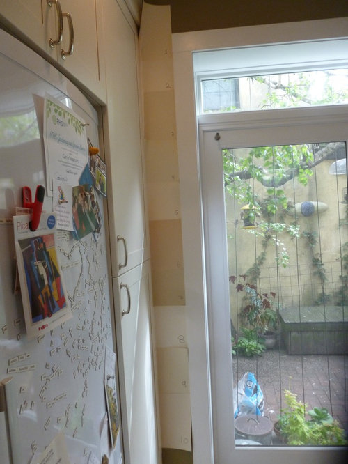
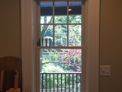
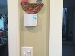
The only drawback is that I don't know if the paint color will be too similar to the cabinet color. I've taken a bunch of photos w/ 10 paint samples - the very beginning of the narrowing down procedure. These photos were taken @4pm, with & without lights. (Will take night time photos as well) Would love your input.

And numbered. Hard to read, but should have done this from the start:

Comments (26)

  • 10 years ago

    What I wouldn't do is paint that wall the colour of your neighbours stucco wall. That wall isn't the outdoors, that's a property demarcation line.

    If you really want to change the paint colour I would find a colour that matches or complements the tree or the climbing plant ON the wall. That is bringing the outdoors in (in my books anyway) and at the same time hopefully having the stucco wall recede into the background.

    Just a thought.

  • 10 years ago

    Hmm. Have you thought of a really dark color--navy/black? My theory is that the navy/black would be like the frame, the white window like the picture mat and the view the photo.

  • 10 years ago

    Blfenton - interesting. The back wall of my neighbor is my direct view, and my vines are growing up it. I feel pretty strongly that incorporating it is the way to go. There's just no way to de-emphasize it, so I'm pretty sure I want to go with it.


    Benjesbride - the current green (which I like) is pretty dark, and I definitely don't want to go darker.

  • 10 years ago

    Ok. I would think that the colour will have to flow with the backsplash and the floor. It's so hard to tell with the swatches.

  • 10 years ago

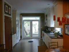
    Thanks, everyone. Interesting to hear an opposing view. I guess that back wall just looks kind of dark when the lights aren't on. Here's a photo, now:

  • 10 years ago

    I like the sawdust color best. Like Banesbride said, it frames your garden and patio door. I would not change a thing!

  • 10 years ago
    last modified: 10 years ago

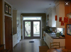
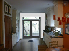
    Door darker?

    colorway · More Info
    colorway · More Info

    colorway · More Info

    Carrie B thanked Wendy
  • 10 years ago

    Thank you, Wendy. That was helpful. I don't think I like the door darker. Natural wood would have been OK, but since that's no longer a cheap/easy option... It seems like most people like it the way it is, well, that's certainly the cheapest and easiest!

  • 10 years ago

    Well, it is a kind of soft green, now. And in the winter... there's no green outside that window...

  • 10 years ago

    I like #4 and #9. 4 reads more green to me and 9 reads more like the brownish wall outside the window.

  • 10 years ago

    Essentially you want that wall to disappear right? sort of give the illusion that it just flows. in that case, everyone else is wrong and you should paint it #7.

  • 10 years ago
    last modified: 10 years ago

    First of all we cannot pick a color for your wall based on photos you took with a camera next to the outdoors. It will never look right. What looks correct on your monitor will look completely different on my monitor. Also look how poor the colors and the photos look on the monitor.

    I would look at a soft green with yellow in it. And you have green outside that window from March through November so most of the year there is green to bring in.

    I agree with the others, that the wrong thing would be to try and match the wall.

  • 10 years ago

    We painted our walls a dark green (BM Tate Olive) and did a dark cherry colour window frame which was a fantastic bring the outdoors in combination. As much as you don't like the idea of the darker frame, I think it might be the best solution. Oh, we live in Canada, so definitely no green outside in the winter.... and it was still good.

  • 10 years ago

    Thanks, everyone. Given that opinions are so varied... maybe I'll just leave it as is.... at least for a while. Much appreciate all your input!

  • 10 years ago

    Good plan. When in doubt, do nothing.

    Carrie B thanked daisychain Zn3b
  • 10 years ago

    I think I see what you mean. The green stops your eye at the wall instead of going beyond to the garden. Only going by the last photo, I think something like #9 could work. It looks just slightly gold, giving it some warmth. I would eliminate 6 and 7 as too dark and eliminate the too white ones.


  • 10 years ago
    last modified: 10 years ago

    Or put something dark on the wall that draws the eye outside, if your neighbor is okay with that idea.

  • 10 years ago

    I just realized the vertical lines are NOT on your neighbor's wall, which made it look like T-11 to me. :p

    Or put something dark on the wall that draws the eye outside, if your neighbor is okay with that idea.

    Of course you want to be neighborly, but isn't what's on your property (that side of the wall) yours to paint?

  • 10 years ago


  • 10 years ago

    What are the vertical lines? Does your patio/property go all the way to the wall? I agree that it would be nice to have something out there to draw the eye, like a trellis on the wall, if your neighbor allows it. Or in front of the wall if not.

  • 10 years ago

    Thanks, all. I actually really like the color of my neighbor's wall, so won't be painting it, even with neighbor's permission. I do have vines growing up the wall.

    The vertical lines are string, designed to prevent bird strikes.

  • 10 years ago

    No painting neighbor's' wall, I like it too! I was thinking of hanging something off it.

    Carrie B thanked cluelessincolorado
  • 10 years ago

    Ah, yes, clueless. In addition to the vines, I do have a ceramic piece hanging - visible in some of the photos.

  • 10 years ago

    Glad to see the kitties are still enjoying "their" window

  • 10 years ago

    Hi Carrie! Our kitchen is *almost* finished, and when I was having a hard time choosing color, I went with Farrow * Ball, which has only 132 GORGEOUS options. We chose String #8, which seems similar to the middle of the samples, but a titch lighter. We love it! Of course the photos are wildly inaccurate (the color is much more like the bottom photo), but I love that overall, it reads as a lighter color, but has a depth that is quite rich and not washed-out/pale. Plenty of contrast with our BM Cloud White trim.

    Carrie B thanked Emily Mathis