Software
Houzz Logo Print
alsimp

guest bedroom

10 years ago
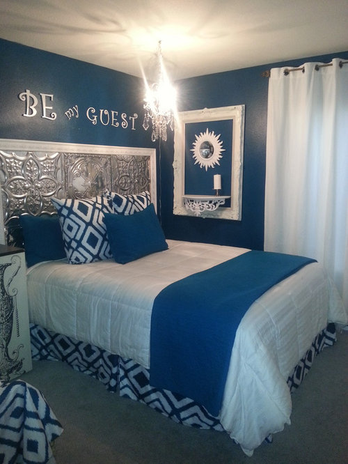
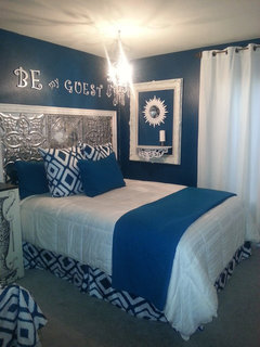
looking for advice to finish my guestroom. is it ok to only have 2 colors? or should I add another color? was thinking maybe plum or orange?#

Comments (17)

  • 10 years ago
    I would add orange not plum.

    your room is quite bold and your color match is impressive.

    I think that adding orange will give the room more depth. It would be interesting if you could find a pillow or throw that had the same blue color and orange. then, you would want to add an orange object to tie it to the pillow or throw.

    at minimum, you need to have at least two or three objects that have the accent orange color. yl

    adding the orange will be balancing act since the blue color and white are so prominent. The room feels like a piece of OP art.

    you might want to add a painting in place of the white picture frame on the wall. the painting could have the orange contrast color as a prominent color.

    Im not a fan of the words on the wall, but the lettering offers an opportunity to add orange to the theme.
  • 10 years ago
    Its a bit busy as it is. Perhaps if you remove some items another color of something would fit. The aluminum headboard is quite shiny, the white framed item on the wall is rather large. These areas might offer space for another color
  • 10 years ago

    Although the blue color is bold, I think just a bit of one more lighter color would be nice to add some variation. You could consider a little orange by putting an orange flower in a white vase on the shelf and then adding a little orange among the pillows.

  • 10 years ago

    You could also check on adding a small white drum shade to the top of the chandelier so the bulbs are covered but the crystals are still visible.

  • 10 years ago

    It's beautiful as it is! I love bold colors and you can either add orange, or aqua or turquoise would give you that depth of color you need as well. I love aqua and turquoise next to a deep, dark shade like navy blue or black!

  • 10 years ago
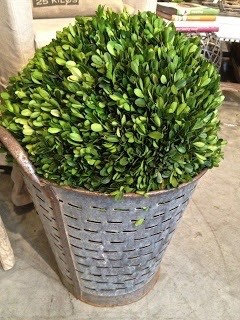
    I would add just a small touch of olive green, canvas, plants, pillow, you don't need much
  • 10 years ago
    I recommend no other colors be added to this canvas of decore via man made sources that you not risk upsetting the natural color balance of it all but consider an indoor plant or two, properly placed in the room so as not to boldly defer from the color theme. This will not only add balanced color but help clean and/or filter the air in the room.
  • PRO
    10 years ago

    There is no specific rule on how many colors you use. I think the room looks great as it is but if you wanted to make it a little bolder orange would look good.

  • 10 years ago

    you're not shy with your design statements, huh! very bold colors and patterns. no plum. maybe a little turquoise or orange but no need really. see if your guests feel good sleeping there. not the most soothing space lol

  • 10 years ago
    last modified: 10 years ago

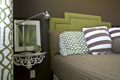
    the room color looks blue in this pic but it is actually a dark teal color. I just hung the chandelier yesterday and will be looking for some lamp shades this weekend. I would love to swap out the teal ikat for maybe an orange ikat? I have been looking for something orange and teal forever and couldn't find something I really love... I happened to be at big lots a few days ago and saw this fabric that was a perfect color match (it was actually a $5 shower curtain!) so I made the pillow cases and bed skirt. I am a mom with 2 boys so I really wanted a girlie feminine room. I really want to finish it so I at least have 1 finished room in my crazy house. I just wasn't sure if I like the all teal and white look and wanted some advice. I will call it good enough for now but will keep looking for something I like better and will post an update so you all can let me know which look you like better. thank you for your comments! I will take them all into consideration as I keep working on it...

  • 10 years ago
    last modified: 10 years ago

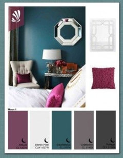
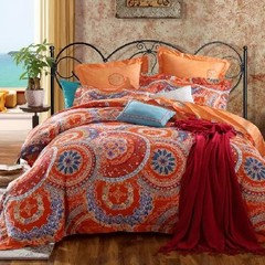
    This was my original inspiration... and this is the color I used in my room (not sure why it looks so blue in the pic above but probably just my old cell camera) the teal and plum/fushia type colors I saw on pinterest. but then I found this orange comforter that had the dark teal in it and I loved the combination with the orange. But of course, its been out of stock so I can't get it! Again, its a guestroom, so I wanted to go bold and girlie! I am building a small corner desk so I will also use it as a little quiet and creative writing space for me!

  • PRO
    10 years ago

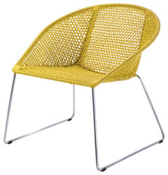
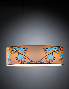
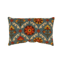
    Perhaps adding an item or two like this:

    Easy Chair With Low Back, Yellow · More Info


    Bloom · More Info

    African Felted Bowl, Forest Green/Gold · More Info

  • 10 years ago

    Love the orange or possibly coral. Also, agree that it's way too busy. Just a bit overdone with too much scrolly stuff.

    Recommend removing the wall wording and the whole thing with the picture frame/shelf.

    Pillows with orange. What is the other item in the left corner of the picture with the turquoise pattern fabric?

  • 10 years ago

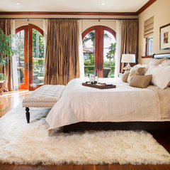
    While the teal and white are very restful colors, there is something "jangly" and agitating about this room. I don't think I could rest well in it, and that's not the reaction you want from guests. Its overloaded with texture and pattern - scrolly shelf, frame, and bedside table (which is too high - should be level with mattress top,) jagged starburst, heavy patterned tin and angular geometric bedding pattern. I would not add another color until the irritating patterns are calmed down. Personally, I could never sleep in a room with words that told me I was a guest - like I wouldn't know that! If you want a calming, inviting room, dress the bed in simple all white and your teal throw. Remove the words, the frame and the starburst. Get a second scrolly shelf and mount them to the wall either side of the bed, eliminating the table, and then pop in your bits of orange with a pillow or two, an orange clock on one of the scrolly shelves, and then add a flokati rug under the lower 1/3 of the bed. Do you have room for a bench somewhere - a place to take off shoes or place luggage?

    Guest Bedroom. · More Info

    Mediterranean Heaven · More Info

  • 10 years ago
    Decoenthusiast and I are in the minority here, but to me, this room feels ice cold, and I don't know that adding a bit of orange is going to fix that. What bothers me the most--apart from the lettering--is that there's so much of that metal.
  • PRO
    10 years ago

    An orange would be amazing - behind the bed (?). Consider Sherwin Williams Earthen Jug!

    Mix + Match - Interior Styles · More Info