Software
Houzz Logo Print
mhigueras

art gallery

10 years ago
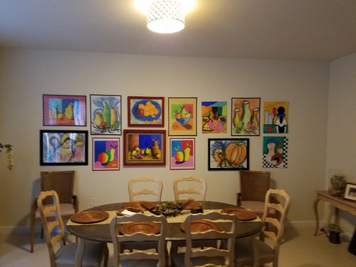
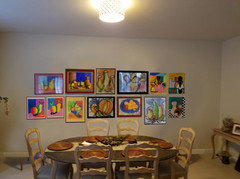
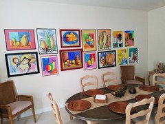
How does the artwork gallery look ?

Comments (36)

  • 10 years ago

    the colors and the paintings are just FRESH! love it! but not very well hanged... to be honest. love the frame game you played, works quite well

    find the center of the wall, hang your favorite painting in the middle, it has to be centered. then build on it. make sure the paintings end on both sides at -approximately- the same distance from the other walls.

    If I may, I'd like to talk about the furniture, too. (even though you only asked about the art gallery)

    I think this particular area requires a little bit more of... freshness. just like you art gallery.

    1. Replace small light fixture with a big modern electric blue chandelier.
    2. The last two chairs on each side of the table: change them. choose a nice vintage hipster kind of armchair (you can go for an electric color). don't hesitate to play with the material.
    3. the two lonely armchairs on the art gallery wall -get rid of them. at least for this area. or you can paint these in an electric color, place a small colorful cushion on each, and use them as a "vintage armchair" for the sides of the table (like explained in 2.)
    4. the wooden plates and the beige runner -I'd go for a 'naked' table, and a long very colorful flower bouquet.
    5. under the art gallery wall, I'd place a long wooden table (I call it a "buffet" table) that would be just a bit shorter than the total length of paintings. buy three nice backless and armless chairs (colorful in preference: like orange sitting and metallic structure), and place them underneath the "buffet".

    I know, i just changed the style of the whole house, lol. but I visualized it and just wanted to suggest it. your art made me wonder 'what if he/she would actually like it?'

    Hope I helped anyway!

  • 10 years ago

    Gallery walls are hard to pull off. I'm afraid yours is a little too static to work.

  • 10 years ago

    I love the colors of your art. I would love your gallery wall better if you had everything the same size and direction in the same sized frame.

  • 10 years ago
    last modified: 10 years ago

    Try the top row with the bottoms even and the bottom row with the tops even. Or this with all the mid points aligned.

  • 10 years ago

    Wow super impressed with grover's photoshop. Looks a lot better.

  • 10 years ago

    Here it is with a horizontal axis down the middle:


  • 10 years ago

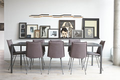
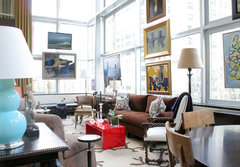
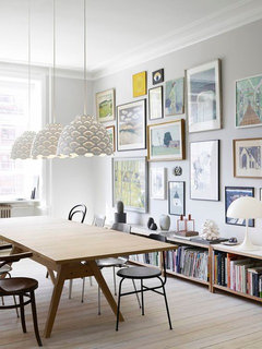
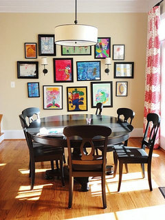
    i might have one or two that are easier to compose?

    Princess Street · More Info


    Unusual Interiors · More Info

  • 10 years ago

    Agree with the comments that you maybe have a few too many.

    I think you should line up the bottom row for a better look.

  • 10 years ago
    last modified: 10 years ago

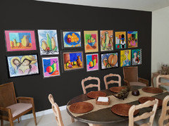
    OK- well, I like the art. I like Grover's horizontal axis down the middle, BUT, I think you should paint the backdrop wall a better color. Maybe white? I also see painting your chairs black and the side console table too. Remove the chargers from the table and a few of the decorations to give it more of a *fresh* look;)

  • 10 years ago

    i am with margo on the wall painting, don't know why i did not think of it. but, i feel your paintings would be better served if the wall were yellow or blue. i would paint sheets of paper and hold them up next to the art works. that is one thing i do , paint my walls to go with the collection on them.

  • 10 years ago

    mhigueras, are you out there? What say you?

  • 10 years ago
    I think thicker frames might look better,.
  • 10 years ago

    So funny...as soon as I read mhigueras' question I thought, "Where's groveraxle"?

  • 10 years ago

    Form a large rectangle with the edges of the frames being even -- like a jigsaw puzzle.

    OR, make the edges all uneven. But it doesn't look right to have some perimeter edges even and others not even. Looks like a mistake.

  • 10 years ago
    I like grover's photoshop with the horizontal axis. I also think the group would look more cohesive if you sprayed all the frames black (much cheaper than reframing).
  • 10 years ago
    I like GroverAxle's horizontal, too. I think you need accent lighting on gallery, but b/c of chandelier, not monorail or similar. If you have access from above, consider something like I used above mantel. They have optional lenses for different effects, & are on dimmer.
  • 10 years ago
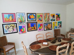
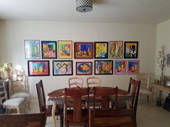
    Thank you for your comments, I know is a little too much artwork but is my kids art, and I love to display it, I made some changes , I hope I got better this time. Thanks
  • 10 years ago
    last modified: 10 years ago

    I still don't think it's working (although very cute). I have done a collage in my dining room and played around with it a lot on the floor until I got it right. Maybe an easier design is going more random vs in two straight rows.


  • 10 years ago

    mhigueras, I'll come back to this later, but I wanted to tell you your kids are very talented. Their art is fantastic, and I'm glad you are displaying it. One thing that might help is if you painted all the frames the same color. When I return, I'll try it and you can see what you think.

  • 10 years ago

    I agree with grover...great work from your kids, and you sound like a pretty special mom.

  • 10 years ago
    last modified: 10 years ago

    Piping up in case this helps: the hot pink seems too much an attention-stealer.

    Two in particular look almost identical and so maybe eliminate one.

  • 10 years ago

    Thanks for actually framing your kids work and giving it a place of honor in your home. (It doesn't hurt that the art is good, of course.) I think if you made all the frames black it would be more cohesive.


  • 10 years ago

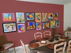
    For more drama, you could always paint an accent wall:


  • 10 years ago
    last modified: 10 years ago

    1st of grover's is like this 'rose wine' / 2nd too much like a classroom.... ;-)

  • 10 years ago
    last modified: 10 years ago

    Would the room be ok with a chair rail and color on the lower? or upper. Looked at your initial photo and seems fine.... and so does your second photo, now how's that.... it's a creative effort! For lower, Urbane Bronze?

    Paint Color SW7048 Urbane Bronze · More Info

  • 10 years ago

    I like the combination of GroverAxle's & EverDebz' ideas. I really like the chair rail idea w/ light below and the Urbane Bronze above. The dark background really makes the vivid colors of the paintings "pop", in the current vernacular. The chair rail w/ light bottom makes wall less imposing and classroom-ish.

  • 10 years ago

    Hmm. the art is fabulous, and I love that it's so personal, but everdebz's comment struck a cord with me. The way it's arranged does feel a bit "classroom-y", and doesn't quite do it justice I think. I'd love to see a more squarish, less linear arrangement

  • 10 years ago

    Love the art as well, very talented kids you have! Love the accent wall color suggested by Grover-- makes the art pop.

    I note that there are 5 pics that have people and the rest have fruit or vases. 4 of the 5 people pics do not yet have frames. You could have these matted and framed to be larger, then possibly group the 5 figures together for the dining room. Then maybe group the fruit pics together elsewhere, and the vases together somewhere else. In other words, spread the art all over your home, rather than just in the dining room?

  • 10 years ago

    LOVE this!!! Visually I think it needs to be taller not wider, does that make sense?

  • 10 years ago

    My classroom comment mostly referred to the 'black' paint on entire wall, and not the art.

  • 9 years ago
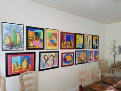
    Hi everybody, I finished my wall gallery
  • 9 years ago

    Nice. And keep encouraging your kids to paint. They really do beautiful work!

  • 9 years ago
    They look awesome! Good job!