Software
Houzz Logo Print
jewelisfabulous

No rhyme, no reason decorating?

10 years ago
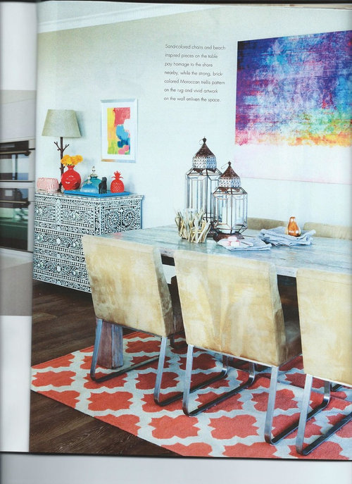
I recently flipped through a high end design magazine and became very puzzled. It seems that the majority of rooms featured had a mish-mash of colors and design styles. I've seen this done where it works, but the photos of rooms I'm seeing now just don't make sense to me.

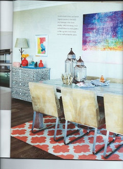
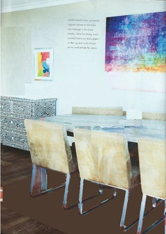
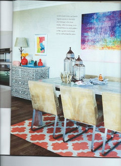
The pictured room is an example. What would make a designer (or the magazine it was featured in) believe these various items/colors should go together in one room? I get the Moroccan chest, lanterns, and rug, but then what's up with the rustic lamp, modern art, and industrial chairs?

The two page spread of the living room in this same house featured 9 different fabrics plus the rug pattern, none of which were repeated anywhere else in the room (i.e. an upholstered chair fabric wasn't used as trim on a couch pillow, for example). Each fabric was just used once. The colors were blue, lime, brown, red, yellow, aqua, and another blue. The patterns were solid, chevron, floral, and toile.

I'm so confused!!

jewelisfabulous's ideas · More Info

Comments (28)

  • 10 years ago

    That vignette does NOT look like a professional curated it.

  • 10 years ago

    What magazine is this in?, just curious.

  • 10 years ago

    The $100 rug doesn't help.

    Full disclisure...I have a $100 rug in my dining room temporarily as well. But it's not going in a design mag any time soon.

  • 10 years ago

    "Refined" magazine, but my confusion isn't limited to the photos of rooms I've seen in that mag alone.

  • 10 years ago

    Moroccan eclectic, ie;a mess.

  • 10 years ago
    last modified: 10 years ago

    I've seen this a number of times recently. Done by designers. Clash style. That one is tame. I hope it's not a trend!

  • 10 years ago

    I rather like it. A lot more interesting than the everything so very carefully co-ordinated rooms I see in many houses.

  • 10 years ago

    Rather a boho vibe to me. Eclectic.

  • 10 years ago

    I looked up Refined magazine online and several different possibilities came up. I am not sure that I would consider any of those I found actual design magazines--they seemed to be Lifestyle magazines, which is a bit different, imo.

    There are a few regional lifestyle magazines in this area, all of which have design or "interiors" sections, none of which are ever anything too great.

    But I see what you mean with this picture, it seems to be going for "eclectic" or accumulated, but I think the result isn't very satisfying. It may be a cheerful enough room in real life, but I am not sure it is special enough to get editorial coverage.

  • 10 years ago

    When I hide the rug it's an interesting room. The orange in the rug is just wrong.

  • 10 years ago

    Yes, the rug is the worst bit.

  • 10 years ago

    The worst part about this to my eyes is all the little stuff on top of the chest. The rest of it isn't something I'd be drawn to, but I don't think it's a horror either.

  • 10 years ago
    last modified: 10 years ago

    It's just not a good example. Styling is wrong, rug is wrong..the room should read very confident with this style, it should look like "devil-may-care", and then you don't see anything wrong, you just "wow, what a cool interesting room!". here they kinda tried and tried and still couldn't pull it off. Looks contrived.

    It's not the style, it's whoever tried to implement it. If they stopped on time-this might have been a good base to work with.

  • 10 years ago

    There is nothing of the owner's personality or interests depicted in the picture. To me, it is what people do when they have no clue....they buy all this interesting furniture and tchotchkes that don't really work together but it's sold together at Homegoods and Pier 1 and increasingly upscale stores.

  • 10 years ago
    last modified: 10 years ago

    To me the cheap orange rug could work but the big wall art is wrong. Very wrong.

    Found this on a quick Google search.

    Its not necessarily what I would pick (I wouldn't ) but it would blend better. The small canvas art near Moroccan chest needs a small painting with a dominant color in the chairs or a vintage wood plaque the color of the chairs or...

  • 10 years ago

    I thought one of the recent Ballard Designs catalogues looked like this as well.

  • 10 years ago

    I subscribe to Architectural Digest and in most of the magazines over at least the past year or so have found almost nothing to admire. It's almost as though the decor is designed to shock rather than please, but there must be people living in those rooms who like the garish colors and often very weird pieces and ensembles that do absolutely nothing for me. I don't expect to see my kind of style depicted over and over, but would like to see beautiful, personal and livable rooms where you can feel comfortable and enjoy your surroundings. I don't see ugliness and the shock of the new and weird as something that would attract most people, but that's what I see month after month.

  • 10 years ago

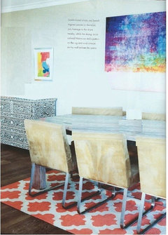
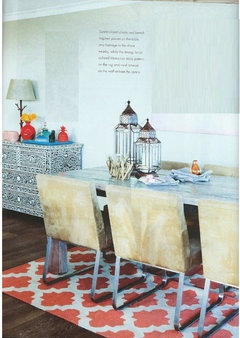
    Accessories gone

    Art gone

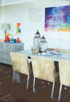
    Rug gone:

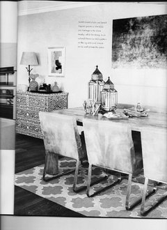
    Rug and accessories gone

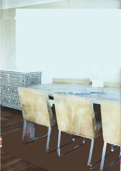
    Art, accessories and rug gone:


    I think it is the Accessories and the Rug

  • 10 years ago
    last modified: 10 years ago

    Yes, I agree Pal. However , it looks to me like a lot of this room was done on a budget (excluding dining chairs maybe). So, keeping that in mind, just changing the wall art to some other inexpensive wrapped canvas and other ...to me is an improvement .

    Before (keep in mind the art above is not really my preference but a quick google pick).


    Edited to add this.


  • 10 years ago
    last modified: 10 years ago

    I guess it could be a modern nod to Bohemian but Bohemian is earthy and comfortable, with roots. This is missing that vibe. It looks very commercial, like a shopping trip to Z Gallery.

    Things do change and a 'twist on' can be inspiring and fresh but I prefer the good old-fashioned Bohemian style.

  • 10 years ago

    palimsest, thank you for that illustration. exactly what i was trying to say

  • 10 years ago

    I prefer more traditional furniture and old things, but actually like the bright colors of the artwork :)

  • 10 years ago

    Pal, thanks for the visual edits, those are great. For me it's the rug jarring with the colors in the large art and all the clutter on top of the Moroccan chest, and the Moroccan lanterns being so near the chest that jumps out at me as wrong. But my favorite part of your post was this line "It may be a cheerful enough room in real life, but I am not sure it is special enough to get editorial coverage."

    I love that line because it points out the difference between having a perfectly lovely room and having a design-inspiring room. I have no pretense to design in my own home--I just buy things I like (or sometimes that I have to settle for on account of budget) and try to make the place pleasant. I don't have to aim for a look worthy of editorial coverage, even though I may get lots of great ideas from others who do. But yes, those who are designing and getting magazine coverage for it, should be able to do something less catalog-y.

  • 10 years ago

    (About Architectural Digest..I don't subscribe to it, but I traditionally buy it(or other magazines) while traveling..I find it often too high-end, not relatable at all, and at the same time not inspirational enough..and full of advertisement, and I rarely remember presented works after( of course there are exceptions, always).

    But every(well I guess not every but many) country has its own edition of AD..I usually don't like magazines in on-line format, because it somehow looses half of its meat so to say..everything kinda shortened, bullet-pointed..too many ads..

    But I sometimes do exceptions for AD España....

    very different. I didn't check it as of lately, but. I still remember some interiors I saw there a year ago..

    http://www.revistaad.es/

  • 10 years ago

    I love mixing, when done right

    I hate my new kitchen faucet that matches-more or less- appliances etc. OK I don't hate it, it's okay. But it's blah.

    I wanted a copper one. A copper looked nice but wasn't great quality. DH wasn't on board. Had no money for high quality one. Sent it back. Got this stainless steel, tried and true, Kohler and all. Each time I look at it-I wish I'd go with not that great quality copper)) This stainless thing brings me down..

    The house is not ready yet-and I already dream how in several years I'll change it. Even though of course I won't, because who has time and money for changing a perfectly good faucet..


  • 10 years ago

    PS it's not a trend..most of truly great houses look like they were lived in for years..and things get mixed, because years pass by, something old stays, something new is brought in, life happens..

    Now when somebody tries to do it all at once-he should be good in it. Or he should be really patient and wait..)) for life to happen.

    Here, they obviously weren't that good. And they didn't wait))