

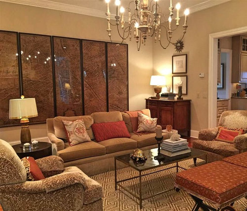
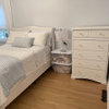
Monochromatic Comfortable Elegance
10 years ago
Featured Answer
Sort by:Oldest
Comments (18)
 10 years ago
 10 years ago
Related Professionals
Greenville Interior Designers & Decorators · Bartlesville Interior Designers & Decorators · Lawton Interior Designers & Decorators · Florence Interior Designers & Decorators · Corpus Christi Interior Designers & Decorators · Newburyport Interior Designers & Decorators · Potsdam Interior Designers & Decorators · Liberal Interior Designers & Decorators · Tacoma Interior Designers & Decorators · Orlando Kitchen & Bathroom Designers · Platteville Kitchen & Bathroom Designers · Pittsburg Furniture & Accessories · Coldwater Furniture & Accessories · Lincoln Furniture & Accessories · Merced Furniture & Accessories- 10 years ago
- 10 years ago
- 10 years ago
 10 years ago
- 10 years ago
 10 years ago
- 10 years ago
- 10 years ago
- 10 years ago
 10 years ago
 10 years ago
- 10 years ago
- 10 years agolast modified: 10 years ago
- 10 years ago
- 10 years ago
Related Stories

HOUZZ TOURSHouzz Tour: Comfort and Elegance in Manhattan
Step inside a chic and modern home designed with kids and entertaining in mind
Full Story
TRADITIONAL HOMESHouzz Tour: Historic Home Combines Elegance and Comfort
The restoration of an 1880s clapboard home preserves classic features while adding contemporary function and style
Full Story
ROOM OF THE DAYRoom of the Day: Elegance and Comfort Strike a Balance
A high-traffic Philadelphia family room combines rustic and refined elements with stylish durability
Full Story
HOUZZ TOURSHouzz Tour: Comfort and Elegance for 5
Casual and Formal Looks Combine in an Evolving Family Home
Full Story
TRADITIONAL HOMESHouzz Tour: Country Comfort With a Touch of Chic
A neutral color palette with warm textiles and traditional furniture creates an elegant yet relaxed family home in the Cotswolds
Full Story
HOUZZ TOURSMy Houzz: Elegant Colonial in North Carolina
Sophisticated yet sturdy enough for kids, this Raleigh colonial has a calming and comfortable feel
Full Story
DECORATING GUIDESRoom of the Day: Adding Comfort and Style to a New Jersey Family Room
Layers of natural textures and pops of color help create a welcoming and cozy space for a couple and their baby
Full Story

GARDENING GUIDESMonochromatic Garden Magic Done 7 Ways
Discover intriguing ways to use color in your garden by unlocking the secrets of monochromatic design
Full Story
DECORATING GUIDESI'll Have the Same: How to Design With Monochromatic Color
Indulge the eye, offer a break from visual chaos and make decorating easier with single-color rooms in any shade you like
Full Story


UserOriginal Author