Software
Houzz Logo Print
hzdeleted_587055

So tired of this living room!

10 years ago
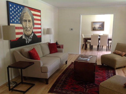
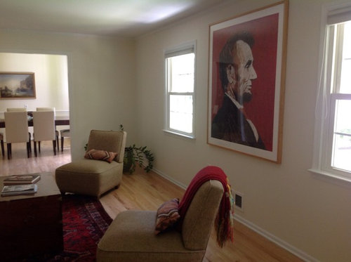
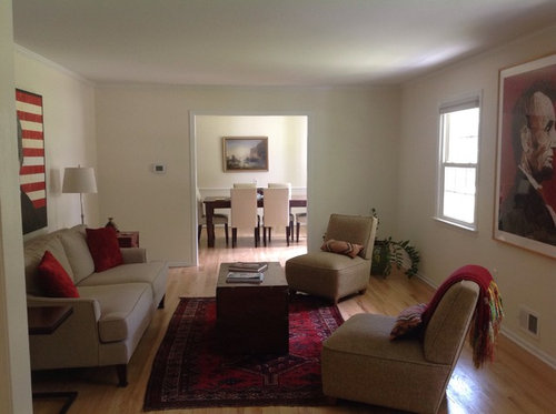
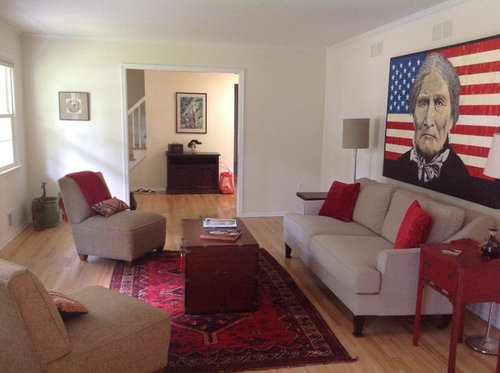
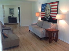
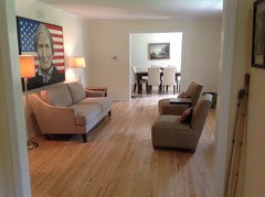
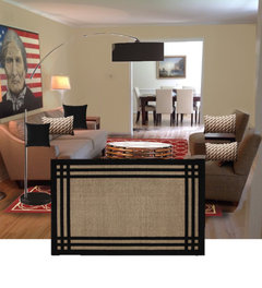
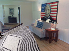
Our living room needs a facelift. Any suggestions for what is wrong? Larger rug, new paint, bookshelves? We would like to keep the art and furniture, but the arrangement, etc is off. Thank you!

Comments (49)

  • 10 years ago

    ONE large scale piece is all the room needs. Place the other elsewhere. The room doesn't have 18' ceilings. You need some smaller scale art and accessories that fit the scale of the room.

    Perhaos you could get together with the poster who has the small ladder shelf full of small scale items in a room with 18' ceilings and arrange a swap!

  • PRO
    10 years ago

    You need a larger area rug. Look for a brighter pallette when choosing as the dark hue of the rug, makes the room appear smaller. I personally love you artwork. Consider using different lamps. Something with a little girth. Wrought iron, perhaps. Adding simple linen panels with a lead edge of red would tie it up.

  • 10 years ago
    A few things: do get a larger rug in a neutral color. do you really need a coffee table there, It seems like it is on a walkway to the dining room? If so maybe make it a leather covered Ottoman and make it lower. Move the two chairs closer together and put a small table between them. With the artwork and colors in the room you have a strong red white and blue vibe going on. I would lessen that, the artwork makes a strong enough statement on its own. What I would do to lessen it is take away the white walls and paint with something richer like a deep steely gray or chocolate brown. This will make your art work look awesome! Then maybe look for a way to highlight you art with lighting. Definitely do some curtain panels after you paint. I see other things too but these are the biggest things.
  • PRO
    10 years ago

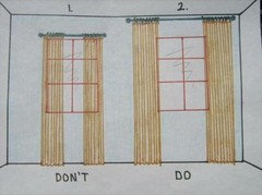
    I would add drapery panels off the sides of the windows, hung high. Also the rug is too small for the space, add a larger one and pull the chairs back a little. Add items with height to the corners they are too bare (plants, small cabinet with art over it, etc. Other groups of smaller items on the walls near the doorways will help the 2 very large art pieces. They are not bad, they are just lonely. All seats should have a place to set a glass. So add small items that can be used for that purpose. Complete the room and it will all fall into place.

  • 10 years ago

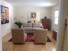
    Maybe go back to your other arrangement.

  • 10 years ago
    Thank you all so much, I am very appreciative of your help! These are great suggestions that I can easily do.
  • 10 years ago
    last modified: 10 years ago

    Have you ever tried one of the big pieces in the dining room as a focal from the foyer? I see you haven't tried drapes yet.

  • PRO
    10 years ago

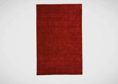
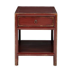
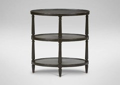
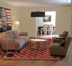
    First I'd like to say I love the artwork. What a statement. If you want to revamp the room I'd suggest getting a larger rug in red. Put your two arm-less chairs facing the sofa square not on an angle bringing them closer together. Put bookcases in the two corners on the sofa wall. Get matching side tables for next to the sofa with lamps. Choose one of the floor lamps to put in the corner next the window closest to the doorway where the staircase is. Get two small oval tables to put next the your arm-less chairs. In the other corner find a beautiful plant or tree or some larger foliage. I'm including some pictures to help you visualize my thoughts for your space. Hope this helps!

  • 10 years ago
    last modified: 10 years ago

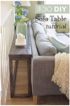
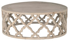
    My first impression is that it feels too square/straight lines all lined up. Seems like you prefer a minimal look, so you may not want to add too much? Wondering if you moved your couch more into the room onto the rug (so you don't have to buy a new one - plus it is lovely) and add a console table behind. Push the chairs back a bit so they are nearer the wall/flanking the trunk which would now be under the Lincoln picture. Add a basket or two on top of the trunk and I would add a round coffee table to soften the room. I think these changes will warm up/make the room feel more inviting and rattan roman blinds could also be very complimentary.


    Clover Coffee Table · More Info

  • 10 years ago
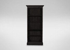
    Hi Nicholas. Thank you. Are the bookshelves from Ethan Allen?
  • PRO
    10 years ago

    FYI original art does not have to be certain size in a space I happen to love the 2 pieces together you do need a bigger rug and I like the old set up for the space better

  • 10 years ago

    cg97, Can you post an image of the room with the two chairs closer together, angled slightly, centered on the artwork, with the sofa end table placed between them?

  • 10 years ago

    If you're hell bent on keeping that art work, then there is no amount of furniture placement that is going to make that room look better. Furniture placement is not the problem ... those "art" pieces are, way too big, too bold, too abrasive, too off putting in color and content.

  • 10 years ago
    New blue and white rug and new no red throw pillows
  • 10 years ago
    Hello. Attached is a picture with the two chairs closer and an end table in between
  • 10 years ago

    I'm with decoenthusiaste upthread--go back to your original layout. Here's why. If you float your seating to the middle of the room, anchor it on a rug, add a round ottoman-style coffee table, then you get a gallery effect for your large artwork and a conversational group in the center of the room. If you do that, add an arc lamp over the center of the room or an impressive pendant in the middle. Why did you change the original layout?

  • 10 years ago
    last modified: 10 years ago

    I agree the art is a problem...they have an almost pop art quality to them, then the rest of the room is very neutral, traditional. Then there's this classic art in the dining area. It's just not working for me.

    Since you want to keep the art, I think you need to bring a touch of that boldness into the decor. So a bolder, more contempary rug perhaps to start?

  • 10 years ago

    Would you consider painting the walls?

  • PRO
    10 years ago

    A dark paint color would look amazing here. Graphite, navy, royal... Love the art!

  • 10 years ago
    last modified: 10 years ago

    Camel walls:

  • 10 years ago
    last modified: 10 years ago

    Appreciate your patriotic fervor but I'm NOT a fan of the patriotic art you have in the room. Being better suited for a much larger and more public space, it overpowers your living room. Lincoln and de faced flag need to be relegated to the garage wall or sold. Find another, less dominating, way to incorporate red/white/blue into your room, including, of course, using red and white and blue for throw pillows colors.

    You have white blinds, you could add blue drapes with red and white striped tiebacks. Use a double rod (wider than the windows so the blue drapes, when open, cover only the side framing of the windows rather than the windows, letting in natural light. Use the inner rod for white sheer curtains with the blue drapes and add red tie backs.

    When you replace the art, choose pieces for over the sofa that make you feel peaceful and rested. Instead of actually replacing the Lincoln portrait with other art, consider adding a cabinet with glass doors there for use as a curio cabinet. What you put in the cabinet to display can change with your mood and/or the seasons.

    No one actually likes sitting for very long in chairs without arms. When you replace the chairs you have, keep that in mind. Comfortable chairs with a light background and a blue print would look good with your neutral colored sofa.

    If you have a metal box for your overhead light, consider replacing the light you have with a ceiling fan with light. Many styles and colors and even different materials for the blades are now available.

    Note: You could use a patio umbrella stand to hold a flag pole with an actual flag in a well lit corner, even use a (holiday product) light projector to project light on it continuously.

  • 10 years ago

    I would move each chair to the side of the couch at a 90 degree angle. Am I explaining that well? A small u shape with chair, couch, chair and coffee table in the front. That will give you a specific walking space.

    I do not like drapes that are hung a foot above the window. It does not relate to the window. It has been done well when the window is very tall, but does not do well with small windows, IMHO. When the drapes are open you have a foot of wall.

    I like the camel wall color and I like the rug that doctornancy did. I am not a fan of the round table. I like the coffee table you have.

  • 10 years ago
    last modified: 10 years ago

    Try placing the chairs at each end of the coffee table, facing each other. This will allow a pass through

  • 10 years ago

    Thank you Heather, that was what I was trying to say!!

  • 10 years ago
    I like the furniture floating with the sofa perpendicular to the wall. Put the trunk back as a coffee table and place a small table between the armless chairs. I like you rug and art and what matters you like it.
    PS I wish there was a "don't like" button for some of the comments.
  • 10 years ago

    teejaysawards...:):):):):):)...That is funny - but so true - your PS.

  • 10 years ago

    Great minds think alike @ Kathy Steele..lol :)

  • 10 years ago

    One other thing, why do you have floor lamps behind the side tables? It just looks odd, you could benefit from a couple of table lamps, they don't have to be fancy.

  • 10 years ago

    I do agree with cpaul1 that the art may be the issue here. Something about both pieces makes me uncomfortable. Both are stern and judgmental in emotional tone, and neither the sofa nor the chairs feel cozy and welcoming. I couldn't relax in this setting. Could you introduce additional big leafy plants to soften things up? Too much red, which is energizing, not relaxing. If you simply must have the two art pieces, I would bring in some whimsy or humor in a quirky lamp, sculpture, or side table such as a fuzzy sheep foot stool or other Americana accent to bring comic relief. Lamps are too wimpy, need some visual weight! Add a throw, and fabric treatment to the sides of the windows to make them appear to be larger and in proportion to the other elements. Do you spend time in this room? It doesn't seem personalized.

  • 10 years ago
    The room is really great, maybe try some new throw pillows. Sometimes ones you have had for a while can get tiring! Just a suggestion!
  • PRO
    10 years ago

    Your welcome and yes. They are part of our Villa collection. They are 36.5 wide, I'm not sure how much space you have, but we have other options not as wide if you need them.

  • PRO
    10 years ago

    Your art and placement of pieces is fine, what's missing is dramatic wall color to pull it all together. Paint the wall with the sofa a deep, saturated color like Ben Moore Ebony Slate 2118-30, and all other surfaces a pale gray-tinged off-white, like Swiss Coffee OC-45 or Intense White OC-51.

    Your decor is modern, so paint molding and trim the same color as the wall so it disappears. This will calm the space and put the focus where it belongs - on your art and furnishings.

  • 10 years ago
    I appreciate the unsolicited feedback on my art. You are too kind and thoughtful! Thank you so much!
  • 10 years ago

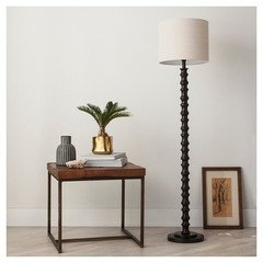
    I love your artwork. Not sure why some folks want to turn this into a cookie cutter space. Rules are made to be broken! Your current rug appears to be a 5x8. I'd look for a 7x9. I like the idea of moving your armless chairs so they're perpendicular to your sofa to form a U shape. You can then put your C table back on the end of the sofa. I like the rug doctornancy posted. I would like to see a table lamp on your nesting tables and a beefier floor lamp, as suggested above, behind your C table. I also like the idea of a linen drapery panel on either side of your windows with a tape edge of red or navy. This floor lamp from Target has some nice visual weight to it.

    I'd also consider adding another set of pillows to your sofa, something with a subtle print to sit on top of the red ones you currently have. Maybe something in a kilim or ikat pattern. Hope this helps!

  • 10 years ago
    You have bold, assertive artwork in large dimensions. Your furniture is polite, tailored, lightly scaled and meekly toned. Maybe that's what disturbs you, not the arrangement but furniture that doesn't stand up to the art. Heavier pieces in darker colors, leather in black or brown would work with the art but probably overwhelm the room.
  • 10 years ago

    cgraham97, ignore the comments!! Try to rearrange the furniture and see what you think!

  • 10 years ago

    I liked doctornancy's suggestions. However, perhaps instead of a red rug we neutralise the room. I think that there is enough red, white & blue in the art. They are dramatic pieces of art which you personally chose because you loved them so perhaps we should let the art do the talking. Also really liked the coffee table & floor lamp of doctornancy & removing existing lamps. I'm thinking neutral floor rug with a touch of black & beautiful highly textured throw pillows in beige & black. No more patterns! Mock pic below using doctornancy's pic as a basis. Sorry I don't have photoshop - hopefully you can see what I mean..

  • 10 years ago
    I love your room - especially the art work. Makes me smile. If I were going to make a change, it would be a larger rug.
  • 10 years ago
    last modified: 10 years ago

    some great ideas. I like the artwork, both of them. I agree about a bigger rug. Also agree about a new color. That pale yellow or beige tone is too meek.

    Not really digging those chairs tho. For sure some diff pillows or a throw on the couch. I like the black accents on the above comment.

    I was thinking this room could benefit from a mid century modern piece. wood. maybe some mcm chairs or a mcm credenza under Mr Lincoln? I think there should be a vertical something to bring the eye up. everything looks so flat. Those floor lamps or even a fig leaf tree in the corner would be cool.

  • 10 years ago

    I like your art! Keep it! You definitely need a bigger rug but not a red one. You need another neutral. Add in some blue (similar to the Flag color but not exact) in a smallish patterned pillow on the sofa. Get some different lamp shades that are bigger and a darker color- maybe brown so they don't blend with your walls. maybe add a blue blanket over the back of one of your chairs and call it a day! not much needed here. don't over think this one!

  • 10 years ago
    I love your artwork too. Others have made suggestions about rug and furniture placement . The only thing I have to add is that you might want to move the Lincoln piece to the dining room- where you currently have the landscape. This would continue the drama into the other room and give you a great view through the two rooms. If you are tired of the room, this would certainly change things up.
  • 10 years ago
    Break up the red and taupe with a third color. Switch out the red pillows with some charcoal and navy. Paint one wall in a shade of grey. Definitely move Abe to the dining room and I love the idea of bringing in full floor to ceiling drapes - lots of fullness , but still very simple in styling.
  • 10 years ago
    last modified: 10 years ago

    First, I LOVE your art! Here is a new rug from West Elm...

  • PRO
    10 years ago

    Love it! Art is meant not only to admire but also to stimulate, provoke, and contemplate. Trust me, people are doing all the above with your lovely pieces. You need some darker pieces, not necessarily wall color, to freshen things up.


    Calle Chiquita La Jolla · More Info

  • 10 years ago

    OK I am going to risk appearing stupid but go ahead and ask my question about the art - first off, it is not to my taste but I do love that you have these statement pieces, keeps the space from looking cookie-cutter. Whatever you do , with that art on the wall, the space will always be uniquely yours.

    But as to my question - the one picture is Lincoln, but the face on the flag - is that supposed to be a particular person? Just curious because I am not "seeing" it. Also who is the artist?

    And I would love to hear your reason for loving this art and your interpretation of it. No none of this is helpful to your dilemma, just trying to satisfy my curiosity.

    Ok, I will add one design observation - your view from this room into the dining room is to what appears to be a more traditional painting. It would be great to have a large signature piece there, whether moving one of these pieces or another, since the space is so nicely framed by the doorway.

  • 10 years ago
    Barbara Griffiths is spot on! The paintings are wonderful as is your furniture. But the paintings have a lot of visual weight and seem "lonely", as she said. Get some visual weight up on those walls -- tall draperies for the windows, art of some kind (paintings, dishes, carvings, a small mirror) on the flag wall. Then, as others have said, get a larger rug for the floor to add visual weight there, too. You got this!
  • 10 years ago
    Thank you allanaspree. I appreciate everything you suggested. Perfect. So excited...thank you!
  • 10 years ago
    Hi Susanallenandwriggley I appreciate your question about the art. The artist is Tomas Lasansky and the person in the flag is Geronimo. There is deep emotion in this piece and it had an impact on me.