

SW 6206 Oyster Bay is blue?? What now? I'm stuck.
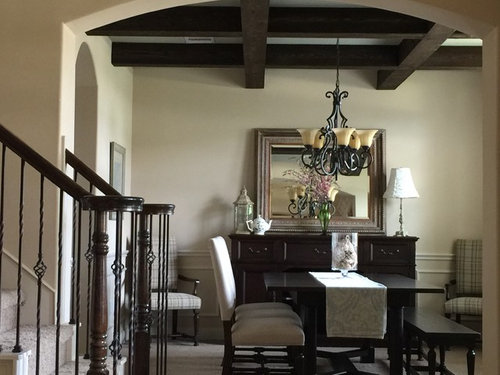
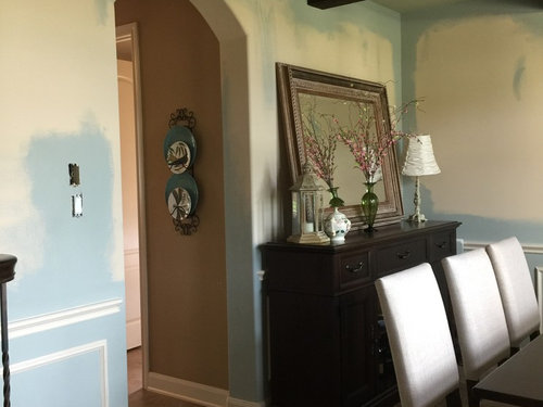
Considering painting my whole interior SW Oyster Bay (open-concept w/ 20' ceilings). I love a sea glass type color scheme and thought the gray-green-aqua hue of Oyster Bay would be the perfect neutral. Painted it on poster board, moved it around home and loved it. Started painting dining room, but it is SO blue on the wall that I thought they mixed it wrong. (I checked it against the poster-board but it's correct-just looks baby blue on walls.) I like the color OK in dining, but now thinking it's way too blue for whole house. Struggling with what I can paint rest of house to create the seamless feel I was going for. My trim is throughout is beige (Pittsburgh Paint Botany Beige) not white so don't know if that's what's causing Oyster Bay to look so blue. Flooring is a deep tan. Wood tones throughout home are dark. Lots of sunlight throughout house, but dining is a northern exposure--I know, bluer daylight. (also, light paint colors seem to fight with the trim making it look dirty or peach.) Suggestions? I want something neutral enough to go everywhere but NOT tan/beige. photo:1 is of dining room before I painted but gives an idea of trim, flooring & wood. Photo 2: shows the blue Oyster Bay. Foyer & family room have high ceilings and are open to top floor.
Comments (40)
 PRO10 years agolast modified: 10 years ago
Many things affect the color that paints show in a space, was it cloudy , did you have your furniture there and rugs drapes etc, the same bulbs in the lights these are all things that affect paint color that is why i always try to keep my clients from insisting on wall colr before the rest of the decisions are made.Maybe talk to the paint shop to see if some green can be added
johnsonzoo
Original Author10 years agoThanks for responding. I had painted a large poster board and moved around in the room for weeks before I painted to see all light/weather. Color appears much greener on board even now in the same room w/ same light. That's why I didn't believe it was the same until I painted some of the current wall paint onto the board. But it is the same. The board is white. Walls are beige. Don't know if that's the issue. I'm struggling with which way to move in the paint deck to get back to something that comes across more neutral. The next card over seems super green. The card behind looks gray but I'm afraid will end up being more blue. I work in graphic design so I understand color in the digital space...I just can't get it right in my living space. :)
Related Professionals
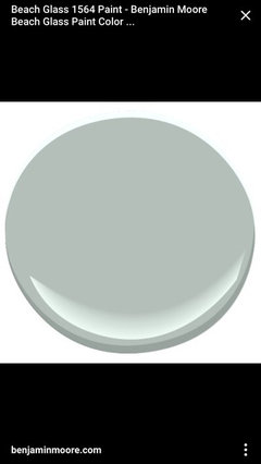
Muskogee Interior Designers & Decorators · Norfolk Interior Designers & Decorators · Enfield Interior Designers & Decorators · Syracuse Interior Designers & Decorators · Fresno Interior Designers & Decorators · Tampa Architects & Building Designers · Topeka Architects & Building Designers · Southaven Architects & Building Designers · Abilene Architects & Building Designers · Bartlesville Kitchen & Bathroom Designers · Elk City Kitchen & Bathroom Designers · McAlester Kitchen & Bathroom Designers · Oneonta Kitchen & Bathroom Designers · Montrose Kitchen & Bathroom Designers · Bend Kitchen & Bathroom Designers 10 years agoBM beach glass and SW sea salt or rain washed are some of my not white/gray/beige go to neutrals. I love the subtle change of color from room to room depending on light and decor.
johnsonzoo
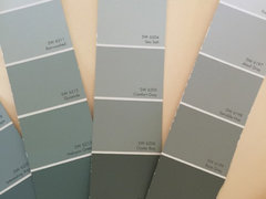
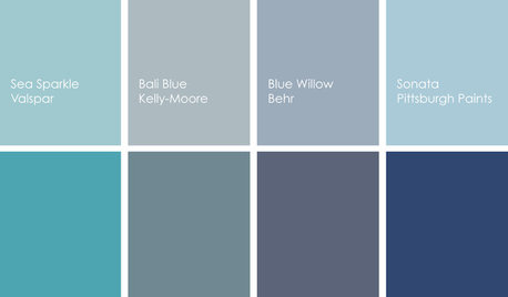
Original Author10 years agoThanks for responding! Yes this is exactly the vibe I wanted... but Sea Salt (SW 6204) is on the same color family card as Oyster Bay (SW 6206). See how green/gray it looks here? Then I paint it on the wall and it's baby blue. (I went with the deeper color in the color family because I've learned if the paint is too light it fights with my beige trim.) So if I want it to look like the color you sent instead of how it looks on my wall where in the paint deck do I head? More green? More gray? Thank you!
 PRO10 years agolast modified: 10 years ago
The grass is always greener on the far hill.......................the paint on your walls was spectacularly sophisticated and now you're going blue?????
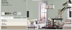
Not quite sure in looking at this color on line you thought it wouldn't be BLUE.
I like what you had on the walls.
- 10 years ago
Repaint the dining room back to the color it was before. Do not start painting your entire house blue.
johnsonzoo
Original Author10 years agoOK I hear you both. You like the beige walls better. And I concur with cpaul1 that I do NOT want my whole house blue. BeverlyFLADeziner, I realize oyster bay has blue tones, but more subtle teal undertones--that is consistent with my test board (which incidentally looks nothing like SW's online photo.) On the wall it looks like Wedgwood porcelain--an entirely different blue. But it is what it is... I need a new plan.
My reason for painting in the first place is that everything in the house is beige...I do not have hardwoods and cannot put them in right now as I'm about to put a kid through college. I am very limited in the funds I have to spend on my projects. :) Hardwoods would make the beige more sophisticated, I agree. But I have carpet..tan carpet and tan ceramic tile..and beige walls and beige trim, the result isn't sophisticated--it's flat. Everything blends. I have beautiful wood trim accents throughout the house that you can't see because the trim blends into the walls. There is no white--it's all beige, it's all warm toned. I actually was looking at Accessible Beige or Outerbanks as possible all over colors thinking they would highlight the trim, but am afraid it will all blend even more into the floors and carpets. The family room has large floor to ceiling windows looking out over pool, gray stone walls and landscaping so I thought Oyster Bay would be more of a gray that would pull some of those blue green tones in. But we know how that worked out.
So, how to give the home some life on a shoestring budget? I cannot change the trim color as I don't have time to do it myself and there's so much trim throughout it would cost a fortune to bring a pro in to change it all to white. If I go with something like Accessible Beige, will it all become an endless sea of beige?
- 10 years agolast modified: 10 years ago
I would hire someone to help you. They will be able to suggest colors based on walls, furniture, everything. Right now we only have a small amount of info to give suggestions. Open floor plan should be just one color to keep it cohesive. I would stop now, and figure it out before spending any more money or time. If you want blue, I would add it through your decor and accents. Your first pic with the beige/tan walls look great by the way.
 10 years agoJohnsonzoo, what a lovely room! I pulled your OB and it is a fairly saturated green/blue! I think your original room is very pretty but I can understand how you may be suffering from the beige blues. Maybe painting a more optimistic blue inside the coffers of your ceiling will give you the lift you are searching for . BM quiet moments, BM pale smoke, BM Brittany blue are a few.
- 10 years agoOf course you could just lighten up the oyster bay that you have and put that on the ceiling;) I would of course put your walls back to the original color.johnsonzoo thanked Business_Name_Placeholder
 PRO10 years agoI think you need some contrasting wall color. Why not try a deep blue or gray on the long wall behind your buffet to affect the blue snd give the room some depth. Then, carry that color in small doses in other rooms to tie everything together. That would be fairly easy to do and give you a "change" but keep nice look you have already. If you like that idea, we can give uou some colors to try.
- PRO10 years ago
Here are some "looks" that might inspire you again! I hate it when things don't go like you "see" them, so perhaps you can create a new "vision".
This room uses a dark brown stripe with blue and white. This could work in your room. You have the chair rail, so everything below could be white, ceiling spaces between coffered sections could be blue or sea color you want etc. If that doesn't work for you. Here is another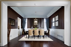 Jane Lockhart Interior Design, Kylemore Model Home "Dublin" · More InfoPaint room back to previous color above the chair rail, and think about doing a darker blue below the chair rail, with white trim. Add accents of the blues and golds to give yourself a fresh start.
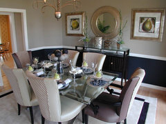 Forest Manor Model Home · More InfoNice dark grey would change up things.
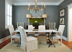 244 · More InfoI love the blue on these chairs. If you could imagine your dining room with that color on the far wall, and then a creamy color everywhere else, with some color on ceiling in between beams, that would be stunning. You have a great dining room that is basically separate from other rooms so you can take some chances in there. Then perhaps pull that blueish-purple into a pillow or two, or some element in the room on the other side of what looks like the entry? Or a wall hanging, etc. Shop in your house for accessories you have, but don't use and see if any of those give you inspiration. I think that is what you need right now. See if any of these ideas spark a new flame of creative juices for you.
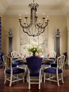 Private Residences · More Info
johnsonzoo thanked Flo Mangan - 10 years agoOr you could just put that pretty blue on the ceiling and leave this picture perfect room alone!
- PRO10 years ago
That might work too. I also think, in looking at the room, the chandelier could be updated. Once you get the room colors figured out and if you want a bit more casual then you could find a different chandelier that would continue that theme. We will tackle that on another day!
- 10 years agolast modified: 10 years ago
I think you already pegged the problem. Oyster bay doesn't play well with a yellow beige.
I have oyster bay on exterior. Sea salt on some interior walls. Neither work well with yellow undertones.
They both look great with my grey whites and bright whites.
I think you need to look at the undertones of the trim, and either pick a new color, or paint it back to the original.
johnsonzoo thanked oliviag55 - 10 years ago
Paint will get you where you want to go inexpensively but not oyster bay. Think you want to paint ONLY the dining room, as the neutral you have makes your house feel expensive and flow .It does not feel like beige, it feels like a creamy off white that resonates perfectly with your dark wood elements here.
Let's find a complimentary neutral for the dining room and talk a bit more about what is great about your house. From here, think you are worried over the wrong things.
Given the arched doorways, the timber ceiling and the stair railing, I find that the traditional panel wainscot trim in your dining room is not something I would want to have the trim elements read out from the wall color - that is a colonial detail - your overall home architecture is more Mediterranean and interesting and unique - you don't want contrast back to the elements in your panel moulding in this room, you want the entire bottom half of the wall to appear as casework / trim that has been painted together. Try this deep neutral historic shade on the bottom half of the walls . . http://www.benjaminmoore.com/en-us/paint-color/oldsalemgray Paint the trim, the chair rail, the baseboards, everything - don't worry, it can all be eggshell or matte or semi or gloss - the higher the gloss, the deeper the color will appear.
At the archways into the room, paint the inner face of the arch the color of the trim you have now (as the transition - use the edges inside and out to be different). Above the wainscot, in this room only, you could take the deep color everywhere but for most people that would be too dark . . possibly test bm senora gray (made to set off your dark wood - relates to the old salem gray perfectly - a wonderful neutral). Now you will have added drama, but neutral and appropriate to your architecture.
While I understand the desire to maybe use a blue green gray . .this is not the house for it - your architecture is one thing and blue greens are another . . maybe in a bedroom you could try a muted mid tone like sw rain, or a tad lighter like bm mount saint anne .. usually with blues, bm has more of them, so you can get more subtleties . .sw will make bm colors just as bm will make you sw colors ... professional reciprocity .. HD will even make both SW and BM colors, though their pigments are not keyed to make them as accurately as the other two ..
But pulling off blue green on the walls throughout the public rooms in a house is tough to do well on any house . . you have great architecture, and classic, tasteful furnishings so the focus automatically goes to your textiles and art. If you want more pizzaz, start with textiles instead.
johnsonzoo thanked libradesigneye - PRO10 years agoLibradesigneye has right track here. It is my pet peeve too. I see people rushing to grays like lemmings and gray is tough color if you don't know color. Same in your situation. With your trim and other gold elements, that is why the bright navy blue accent wall would work. Even just in the ceiling above between beams/coffers. Paint back to your original color and let's take safest step. Ceiling first. I will find some colors, other Houssers chime in here (Lynartist) and start there. Also, one of the reasons I suggested chandelier change is because those glass shades/globes are very gold/brown. That also affects things. Take those off and let's see room without that color impact.
- PRO10 years agoAlso, it is a blessing your dining room is separate. We can make it jewel box and scatter other jewels around very in expensively.
- 10 years agoI think our OP has left the building! Jeepers ; she hasn't even finished repainting and you all have her doing it all over again! Maybe just curb the enthusiasm a bit and see if she would like to paint the inside of the coffers in the ceiling. Oyster bay is more green than blue; so it could be that it is just reading that way next to the gold. The room was only partially painted with one coat. Not a good judgement on the finished color. I still prefer the original color non the less but I do not have a problem with these colors clashing in any way. As this is a very warm blue(green actually) there is no reason it should not look good with this original wall color. If the OP would like to see color on the ceiling it would not hurt to try a sample of the oyster bay to see how it reads. Keep in mind though it will read darker than on your walls as the ceiling does not receive direct natural light but reflected light. If this is too dark but the shade is good it can be lightened a bit. If you feel this is not the right shade then you need to find a different color altogether.
johnsonzoo
Original Author10 years agoHa! I haven't left the building just had a design deadline myself today & no chance to get on Houzz. I appreciate all the ideas-- you've all been super helpful. I'll process through the suggestions & respond when I'm not so tired.- 10 years agoJohnsonzoo, your an artist; if you still want to paint this room I suggest you go back to the paint store. If you add a bit of orange tint to this color it will knock it back a bit. You could try doing a small sample yourself until you get just the right shade. I have custom mixed shades many times and then had them color matched at the paint store.
johnsonzoo
Original Author10 years agoAgain, THANK YOU all for your creative responses and patience waiting for me to respond. I am looking at your suggestions and considering ideas. I've come to terms that I will be repainting the room. lynartist, I'm an artist but apparently only in the digital world. :) I've lived with the partial paint for a couple of weeks. Even if I could get beyond the more pigmented blue than I was anticipating, I don't think it works against the plaid chairs which have a lot of sage & brown tones. *sigh* So, starting over.
I do not have the original paint to put it back as it was builders paint. So even if I go ivory I need new paint. Would I do an ivory just a smidge darker than trim? I'm intrigued by the darker/bolder accent that some of you have suggested either on accent wall or below chair rail while keeping that unified open feel. Keep the ideas flowing. I love it!
Background info: I want something that will work with the overall openness of the house which has many warm tones--dark wood, ivory-beige trim. Psychologically orange-based browns/tans make me feel weighted down/heavy. Don't care for the spicy golds, deep forest greens, burnt oranges that seem so popular in homes around here. Don't mind dark colors (my MB is SW#6244 Naval which I LOVE with the ivory trim--so love the pops of dk blue in the examples from Flo Mangan. Also like the painted archway ideas from libradesigneye. Incidentally, I did hire someone to help with colors--and Oyster Bay was one of her suggestions along with Outer Banks. But she also wanted me to spend $10,000 on custom window treatments which I just can't do right now. In terms of picking paint, here's what I'm working with.
New Venetian gold granite in kitchen/LR
tan carpet/tile throughout
ceiling of DR ( between the beams) is currently painted SW#6164 Svelte Sage (which blends nicely with plaid chairs but it's hard to tell it's painted.)
Wall niches throughout 1st floor are painted SW#6125 Craft Paper.
House has lots of natural light with large LR windows facing south.
Attaching some more photos to illustrate "flow". I change out pillows and accessories seasonally. (Some pics are a little darker bc a storm rolled in.)
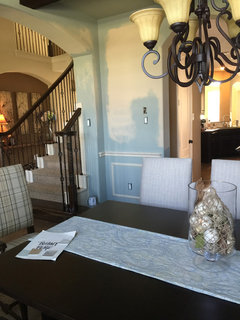
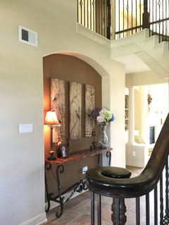
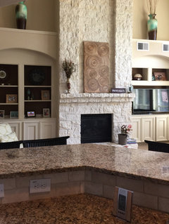
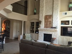
 10 years ago
You can always take a little piece of the current paint/wall and have it matched, so that's a separate issue from whether a different color would be better.
- 10 years ago
Why not test one of the warm grays / olive undertone grays that will flow with all your granite and existing colors for the dining room wainscot and put ivory up top. I posted a few, but you might also like bm Chelsea gray.
Can't see navy over ivory work well here, but you might like to try a deeper muted blue green gray like bm templeton gray - and do the wainscot in your standard trim color .. I would change out the lighting fixture if I did . . sorry, even that feels very traditional and not in a good way to me . .I liked the deeper warm grays for the wainscot since they echo the dark beams above . .
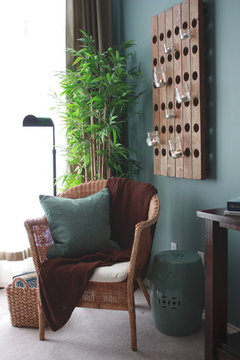 Our Home · More Info
If you want the drama of the color there, I think it is more modern / better to paint the entire wall this color - using gloss for wainscot trim on down and matte above since they will see tonal differences but flow ..
That would add drama and yet still muted and sophisticated enough to work in your neutrals house . .
Go to this link at Gloucester sage to see what trim in a deep shade would do for you here . .this one too green for me to recommend, there are some terrific historic shades provided in my first post ..
but you can see the idea that I was trying to convey . . . http://www.benjaminmoore.com/en-us/for-your-home/rooms-by-color/sunny-sophisticated-green-entry
- PRO10 years agoThanks for posting the other pictures. Helps to integrate things. I am leaning toward a teal color in your dining room for two reasons. The plaid chair colors would work better and the other colors in house you showed would blend better. You could carry that color into the niches too. Second I noticed some plates on the wall between the dining room and butler's pantry with a teal/blue color? Perhaps that might help you imagine. I love deep colors in dining rooms. So intimate and cozy and chic! With a lot of natural light in your home, this can be the jewel you want it to be! Looking forward to next steps.
 PRO10 years ago
One color? B.M. gray cashmere. The perfect color throughout the house as it is a chameleon…sometimes blue, sometimes green and sometimes gray. I have used it many times and have never been disappointed.
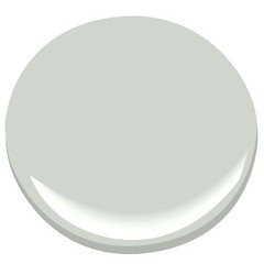
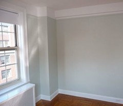
- PRO10 years ago
I love this color too, but I just see a little more drama in your dining room with a deeper color. Of course, this is your decision. Empty nest, time to shake it up! lol BTW, there is no such thing as an empty nest! They come back and with others with them! So fun!
johnsonzoo
Original Author10 years agoSo teals, olive grays, whichever I'm going towards I have a question. I look at a paint strip and think the lighter values fight with my darker beige trim. So I slide down thinking I'm getting the same "color" but darker. However, in the case of OB I get more pigment (saturation?) How do I go deeper and still get a soft-muted color? I like softer colors (light & dark) I'm not a big "bold & bright" color saturation person--except for small pops. (I know this is probably color 101). I could do a deep teal but not if it is super bright. I don't want to mess up again!
My nest won't be empty for awhile yet, I've got 2 more behind the college-bound one--all 2 years apart--which is why I'm not allowed to sink $ into expensive projects. But yes, it's a fun stage right now! Constantly on the go. Maybe that's why I'm yearning for "restful" color in my space. :)
- 10 years agolast modified: 10 years ago
You are discussing how "muted" the shade is .. no, just sliding down the card won't always do that. Best solution is to start by looking for a deeper shade, then google images or houzz images to see if you like them in a photo. The reason there is a market for color specialists - people who make a living selecting colors - is because it is sort of a science, but also an art. It is a relatively inexpensive way to get a new look, but only you can decide how bold or classic you want that look to be.
It is a good idea to always test color in your space by putting it on a foamboard that you can carry around and watch for a weekend. Color will look different from morning to afternoon and you want to like them all. Color also depends on the exposure (N,S, E, W), it depends on the color of your light bulbs at night, it may depend on other colors being bounced around in the space because they predominate. Even your own latitude can affect the way color reads. So, although we can aim you at some options, until you test, test, test, and review google images, you won't know if you love it.
That said, historic colors are often sort of time tested and are rarely too bright for their traditional application. More muted colors often are found in historic palettes, although some classic jewel tones and brights remain (think of Victorian painted lady houses and the accent colors used strategically in small doses on the bric a brac).
johnsonzoo thanked libradesigneye - PRO10 years ago
libradesigneye is right on point. I have been looking for a color for you and you might try a deeper tone, just on the lower part of your wall and the ceiling. So look at BM 2123-30 Sea Star which is a green/gray/blue tone with the BM Gray Cashmere above. I think these two tones would work well together and with your furnishings, etc. BUT, you can't tell much from Houzz photos (color on monitor issues, not Houzz per se) so you do have to do samples for your space because of light. If you do plan on changing chandelier, take those golden glass shades off to test in the artificial light in your home at night. I would start there and see what you think. These colors are from the BM Color Preview paint deck.
johnsonzoo thanked Flo Mangan - 10 years ago
Sea star is a nice mid tone and the Benjamin moore link shows a bath wall with it . . I'm not sure it is deep enough for casework. If you want to go for a casework tone for the wainscot and - deep, and a muted blue green on the top - more formal but also more vibrant, go deeper on the wainscot.
Test bm equestrian gray for the wainscot - in gloss it will echo the dark beams and wood on the stair. Up top, you have many choices then - you can go as deep as the LRV for equestrian or as light as you would like. the wainscot won't ever have to be painted again and you can change the color up top . . If it were my room, I'd use a color around 40ish LRV - a rich midtone. Test bm azores (deeper, a tad more teal than my taste), historic Stratton blue is a lovely deep blue green tone, or you might love something softer . .muted by a tad more green . . bm pleasant valley ..
johnsonzoo
Original Author10 years agoI know you must be sick of me, but following libradesigneye suggestion of Equestrian Brown... If I'm going for the casework look, I would be painting chair rail down through baseboard trim, right? How would I blend into existing trim color where the walls lead out into other rooms? (It wraps around into foyer to lead into trim surround on front door.) Also, if I put the deeper shade on the bottom does that blend too much with my dark furniture that also visually takes up the bottom half of room? I WILL get this figured out.
- 10 years agoThis is SW Silvermist mixed at 50% strength. It has lots of grey and green undertones and never looks baby blue at any time of the day.
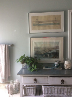
- 10 years agolast modified: 10 years ago
I thought the original wall color was perfect. Why do you want to change it? It works so nicely with all the other elements in your space-the dark and dramatic table and chairs, beams, and rug. And, it is still neutral. Sorry.
johnsonzoo
Original Author10 years agoDon't be sorry. It's the truth. I knew it while I was painting--that's why I quit & got on this board. Truthfully I was changing it not so much because of that room, which I think works well with the light walls, but because I was trying to find an all-over color that would carry through the home. It was easier to test in that room (that I can paint myself) than in the two-story rooms where a mistake would be more costly. Thank goodness I did because I think I would have died if I painted those rooms in Oyster Bay! I'm trying out some colors today--but headed back in the creamy neutral direction for at least the majority of the walls.
- 10 years agolast modified: 10 years ago
Johnsonzoo, I'm so glad you have decided to gravitate toward the creamy neutral direction. I think you will be happy with a neutral, since it complements your space so nicely.
 7 years ago
Hello Johnsonzoo, I know this is an old thread. But if you see this, can you please share the paint color name and brand of your dining room before you painted it Oyster bay. It's very pretty. Thanks.






SG