Software
Houzz Logo Print
beth_collingwood

Backsplash dilemma

10 years ago
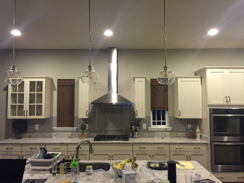
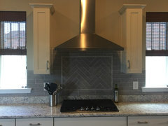
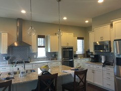
Looking on feedback on whether we should extend the backsplash past the top of the hood -- to the top of the cabinets. Something feels "off" about where the backsplash currently ends. Thanks for any suggestions!

Comments (40)

  • 10 years ago

    It seems to me what's off isn't the tile, but the contrast of tiny dark window coverings and also tiny cabinets in a light neutral. It looks choppy. I'd consider somehow staining the current blinds similar to colors already there... sorry.

    Beth Collingwood thanked everdebz
  • 10 years ago

    I always like pulling my colors for the kitchen out of the granite. Obviously one that has multiple colors. You may have done that with blinds I actually like the brown.. The two skIny cabinets to the left and right of the hood are a little quirky and takes away from that beautiful stove hood. Last critique I think that's dark tile underneath the hood and I think it's hard to tell if they are black or grey being shaded by hood. Regardless you have great opportunity to make a really nice centerpiece with the stainless stove flute, pull in some colors you have. I like the grey color of the paint with the rest. But yes take your backsplash up to the cabinets maybe some grey sub way tiles it would help break up all the grey if you wanted to stick with grey. You even extend them to over the stove, but again beautiful kitchen.

    Beth Collingwood thanked cmuntz64
  • 10 years ago

    And I really like your hanging lights

    Beth Collingwood thanked cmuntz64
  • 10 years ago

    To me what looks off is the four or three inch countertop backsplash below the tile backsplash. It is not a good look. You also have the worst kind of sidesplash. One that is attached to a cabinet. I also do not understand the brown shades. Is there brown somewhere else in the kitchen?

    Beth Collingwood thanked emmarene9
  • PRO
    10 years ago
    last modified: 10 years ago

    @beth collingwood

    Its not the tile....... This is what happens when kitchens are simply poorly designed. I'm so sorry, but the wall is a jumble. It is choppy, nothing was fully considered with regard to scale and proportion, and the tile is the least of the issue. The hood, meant to be a focal point, can not be. It is getting "lost" in poorly thought out cabinetry and sizing of appliance as well, because the cooker is too small..

    Remove the two very narrow cabinets completely, tile at under- the- hood height for the whole space between the larger end cabinets, and PAINT THE WALL THE IDENTICAL SHADE OF THE CABINETRY. Ditch the dark brown window shades too. If you must have coverage, something in a cabinet match is in order. You will have a much better look, if a tad less storage. If budget allows, replace the two remaining cabinets with taller, or move them up, match the far right cabinet height, and re trim/re crown all with something beefier, allowing ONE consistent height on the wall. In combination with the first concept, a far, far, far better result, for the entire wall and your tile.

    Beth Collingwood thanked JAN MOYER
  • 10 years ago
    Can you post a few more photos of your space, including the floor? You have a nice big space, I agree with most of the above comments. Did you work with a KD? There are a few things that may help make the window wall appear less busy. I would start by removing the skinny cabinets, granite strip of backsplash, and brown window coverings. It's hard to tell the colors, your cabinets appear creamy white, your tile is grey, what is the granite colors?
    Beth Collingwood thanked User
  • 10 years ago
    Maybe it's because you have that accent piece (where the tiles are laid differently) and it goes to a different height than the rest of the tile!
    Also remove the two cabinets near the hood. Then I think you'd be set
    Beth Collingwood thanked J D
  • 10 years ago
    Also I'm wondering if people agree: after removing the two skinny cabinets, would it look good to widen the windows in the direction towards the hood?
    Beth Collingwood thanked J D
  • 10 years ago
    I agree with Jan Moyer, but could have been said nicer (esp if you designed the kitchen!!). I think issue is of proportion and weight. Here are some ideas. Stopping the backsplash at the top of the cabinets might exaggerate the weighed down look-consider going all the way up to the ceiling/moulding with the backsplash at least in the channel where the decorative hood is. Consider raising cabinets or taking them all the way to the ceiling. Consider a deep crown mounding to pull down the ceiling. Play around with paint-it's inexpensive. Try painting the moulding the same color as the ceiling or maybe if you love the brown try painting it brown to see if it ties it together...here's a risk that's not expensive and easy to fix if you don't like it-paint a brown strip at the top of the wall about and third or halfway to the cabinets (all the way down might make you feel crushed under it but not sure how tall that ceiling is). Good luck!!
    Beth Collingwood thanked Caryl Behmoiras
  • 10 years ago

    Beautiful kitchen, love the herringbone inset!

    Remove the skinny cabinets. Install the backsplash to the top of the cabinets. Add open shelving where the cabinets were.

    Beth Collingwood thanked Jillian - Interior design student
  • 10 years ago
    Absolutely the skinny cabinets are messing up this whole look. For the life of me I cant understand why your designer wouldny have just widened the skinny windows to flank the range hood. As it is, you have a choppy look of skinny window, akinny cabinet, nice range hood, skinny cabinet, skinny window. It clear this cost money and yes its unfortunate. Window coverings arent helping. Tile, cabinet and wall colors are just muted and not giving any contrast. All that said, this can be fixed. Remove skinny cabinets, change wall color. New wider windows. It will be beautiful
    Beth Collingwood thanked shiningautumn8
  • 10 years ago

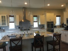
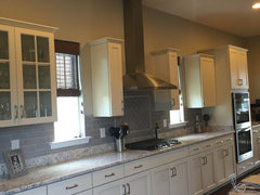
    Thank you so much for all of the suggestions. Our issue is that we JUST moved into this house. I too have struggled with these skinny cabinets....I don't know why the builder designed like this. I don't think my husband will go for the capital outlay of removing the cabs though. I am struggling with the "choppiness" of it so that's why I thought extending the tile to the ceiling or top of the cabinets might help? I've attached some more photos below....so you can see the color of cabs a bit better in daylight. Floors are dark wood, granite is bianco romano, cabinets are called painted silk (creamy white). Take a look and let me know what would help the most...if skinny cabs can't be removed (now anyway). Please ignore the mess, as we're still getting organized! Thanks so much for all of the suggestions and feedback!!

  • PRO
    10 years ago

    It does seem a bit off. I know what you mean. You can try extending the tile just a little higher. Maybe 6 inches or so. Then you can add a row of accent tiles to essentially end the tile so it just doesn't end abruptly behind the hood. possible Pencil tiles, Bullnose or Aluminum trim that's a different color. You can Angle to tile towards the cabinets as well so it ties the hood and Cabinets together.

    Beth Collingwood thanked Logistics, inc
  • 10 years ago

    What a beautiful kitchen though - enjoy it!

    Beth Collingwood thanked everdebz
  • 10 years ago
    Okay, you just bought this house, I wondered that after I posted. Your kitchen is lovely and big. Removing the skinny cabinets would not be that much of a job. Just have to repair the drywall and repaint. You may even consider removing the other cabinet to the right. Then when budget allows retile the wall and add open shelving.
  • 10 years ago
    The kitchen is beautiful! Even if not right now, set a goal to remove the skinny cabinets when affordable ( maybe even the one to the right of the window too) then continue from there. I think even with the backsplash taken higher, with those cabinets in place it will still look off to you. Good luck. Husbands can be stubborn ;)
  • 10 years ago
    last modified: 10 years ago

    It's seems it would be a lot more expensive to tile that wall to the ceiling than to pull the skinny cabinets and patch the holes. I'm not sure tiling to the cabinet tops would help, since they also have a staggered height, unless you added molding, as Jan suggested, to even it. And I'm not sure either is a good fix with that grey tile.

    I'd also suggest repainting the kitchen walls. I think painting them to match the cabinets would help with the choppiness of so many elements.

    It wouldn't be hard for you and DH to pull the cabs, you can easily patch the walls yourself, and then DIY tile all the way across (to the bottom of the hood) between the two windows.

    You must be overwhelmed. Tackle this down the road a bit. :)

  • 10 years ago

    Removing cabinets is no-go right now. What are your thoughts on taking tile all the way to the top of the cabinets all the way across? That might break up the weird choppiness between the cabs and windows? So add tile on each side of the windows to top of cabs.....etc. Thanks for your super helpful insight!

  • PRO
    10 years ago

    I agree with most of the above - but SandyC, is right - removing the skinny cabinets is not much work. I think a fairly easy solution would be to remove the skinny cabinets and then using the matching grey subway tile and take it all the way to the top of the cabinets and to include the areas of both the windows. That way the entire area will be encased and look purposeful. Then the only other thing that is really needed for a finished and polished look is a nice heavy (as in deep - not overly ornate - crown moulding. It will finish and "enclose" the wall. Then the brown window coverings could work as I see your floor is brown as well as the dark wood on the bar chairs. I would love to see the finished pictures, what ever you do! It is a lovely kitchen. (You could rehang the skinny cabinets in the garage, laundry room, or even a large walk in closet. I am sure they could be repurposed). :)

  • PRO
    10 years ago

    I just saw you say that removing is a no-go right now. Not sure why, (smile) but if so, they bringing the tile all the way to the counter heights and including the window would help with the choppiness. Then possibly placing matching décor on each of the skinny cabinets to act as a focal point for the range hood. Crown moulding is still a must to finish out the look.

  • 10 years ago
    If removing the cabinets us a no go, don't do anything at this time. Working around the skinny cabinets will only accentuate the choppiness. Perhaps you could contact the builder? The cabinet boxes are just screwed in to the wall.
  • 10 years ago
    Removing the two skinny cabinets should not be a big deal. They are typically just screwed into the walls (hopefully into studs!). I agree - take them down. Then you could run (lighter coloured?) subway tile up the wall to height of bottom of range hood. This will help to better balance above that counter curb that is there. Repaint above, and your look will be greatly improved. And if the shades aren't necessary, I'd lose them. If they are needed for privacy, consider something lighter. The dark ones really draw attention to the small scale of those little windows.
  • 10 years ago
    I agree with Judy, the blinds are drawing attention to the skinny windows. Why do builders do that? The windows would have looked better if all three were the same size, oh well. Better to not draw your eye to the problem. Kind of like when we're choosing an outfit, we don't want to accentuate our problem area.
    Down the road you may want to have some pretty cushions made for your stools and then have coordinating Roman shades made for the windows. Something in a pretty fabric to bring in some color and texture.
    What's your dining area like? Or would you rather not show us, lol.
    It really is a lovely kitchen, just needs a few tweaks, but nothing that needs to be done immediately, enjoy!
  • 10 years ago
    One further thought - a really interesting idea might be to remove all four cabinets on this sink wall. Then run nice chunky *open* shelving (stained wood?) right across those problem windows, from stove gable to edge of range hood on the right, and from the wall to range hood on left, with bottom shelf at bottom of hood fan height, and two more shelves evenly spaced above - top one finishing at same height as stove gable. Pretty glasses and mugs, stacks of plates and bowls, serving dishes then become art in your kitchen, the windows become backlighting possibilities for glass, and the small scale of those windows becomes a non-issue. The backsplash tile would run the width of the wall, ending at the underside of the first shelf/range hood.

    It is a bit of a bold solution, but if that was my kitchen, I'd do it. The great thing is, you have a fully functional kitchen now - your issues are just aesthetic, so you've got the luxury of time to think it through. If you have any friends who are good at design and/or drawing, you could ask them to generate some sketches for you of the various options that you are considering. Visualization is very helpful.
  • 10 years ago
    Oops - meant to say stove wall...
  • 10 years ago
    Makes no sense... tiling up to the top of tge cabinets is probably more work and cost than just removing the cabinets. What do you mean "hubby says no"? Is this not your home too? If u really cant remove skinny cabinets than do nothing. Adding a bunch of tile is not gonna solve anything here. Much better to use that money for something else or save till you can rework the cabinet/windiw situation. Its still a beautiful kitchen and certainly livinble with.
  • PRO
    10 years ago
    last modified: 10 years ago

    Removing something costs next to nothing. Ditch the skinny, repair the drywall holes. . Just because a "builder" put them there, does not make them right for the space. Your LEAST expensive solution is removed them, fill in all the "missing" tile to just under the hood and all the way across, and in between the equally skinny windows. . Grab a paint roller....and presto it is all fixed. The skinny cabinets don't hold enough to worry. Do it now and in two days you will wonder why they were EVER there. That's a guarantee. And nobody is staring in. Take the shades down......please. : )

    Beth Collingwood thanked JAN MOYER
  • 10 years ago
    Your kitchen is beautiful! I actually think the skinny cabinets are functional. It's perfect for storing cooking oils and spices. Your fortunate to have such an amazing space!
    Beth Collingwood thanked loudon1
  • PRO
    10 years ago
    Hi there, my suggestion for the simplest fix would be to remove the 3 small upper cabinets, change out your Roman shade material to something lighter (with less contrast) and consider painting the wall above the tile a lighter color. I think this would not be very costly to do, but would make your space shine.
    Beth Collingwood thanked Robert Frank Interiors
  • 10 years ago
    It's not the tile, it's the design. First off, you have two backsplashes - the four inch one plus the tile one. Then you have the skinny cabinets on either side of the hood, plus the skinny Windows, with the dark shades. Then you have the skinny chase to the hood. It all looks a bit odd. Don't add another element. Leave as is, but remove the dark blinds unless you absolutely need them for privacy
    Beth Collingwood thanked km kane
  • 10 years ago

    Thanks for all the ideas. In terms of the windows, we need some sort of light blocking shade as the family room with TV is directly across from these windows and they cause a really terrible glare. Please offer any recommendations as to better window treatments - in terms of color and functionality! Thanks so much!!

  • 10 years ago
    I am being lazy here, did not read all the comments before responding. I understand you moved into the house recently. If removing the thin cabinets are not planned for now, a quick fix would be to paint out the thin cabinets the same color as the wall and do window treatments in the same color as the wall. I do not think adding backsplash tile will solve anything. By having that whole area one color will draw attention to your hood and unite the area as one.
  • 10 years ago
    last modified: 10 years ago

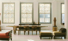
    PRO /Delia Shades -- Our shades are made of Greenguard-certified material that is specially woven so that it doesn't crack or fade under UV exposure. It's lead-free, made in the USA, and has the highest ratings for resistance to mold and mildew, as well as being fire-resistant. If they do become dirty, you can wipe them clean with a gentle detergent solution without damaging either the print or the fabric. (Which means you don't have to remove them to clean them.)

    That's one reason they're so popular in kitchens.

    So yes, you can clean them -- but not by machine. It's never necessary.

    Contemporary Roller Shades · More Info

  • 10 years ago

    Now that I did that - need to determine if they are light-filtering - must be...

  • 10 years ago
    last modified: 10 years ago

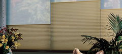
    I've seen this type at Home Depot - pulls up/down and they're connected.

    Energy Efficiency Interior Design Solutions · More Info

  • 10 years ago
    A custom Roman shade wider than the window could fool the eye to make the window look wider. Then get coordinating cushions for your stools. I wouldn't do this or go to the expense until the skinny cabinets are removed. It will not help much as things will still be too choppy.
    I would do a beautiful lined linen to bring in some texture.
  • 10 years ago

    Just leave it "as is" for now. Relax and enjoy your new, very nice kitchen. After time you will be able to judge what needs to be changed or not.

  • 10 years ago
    what if you framed out windows?
Sponsored
Mary Shipley Interiors
Average rating: 4.8 out of 5 stars34 Reviews
Columbus OH Premier Interior Designer 10x Best of Houzz