Software
Houzz Logo Print
lkplatow

Last minute paint color dilemma - please help asap!

9 years ago
last modified: 9 years ago
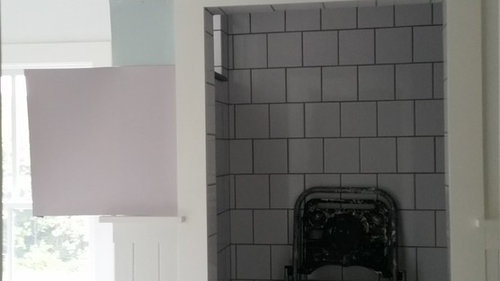
I am down to either Benjamin Moore's Slip or Benjamin Moore Ocean Air for my master bathroom remodel. I want to buy the paint today because I really just need this project over with. We haven't had a master bathroom since March.

Slip is a grayed out lavender from the affinity colors while Ocean Air is a light blue with maybe a little bit of aqua in it. I have been literally 50/50 flip-flopping back and forth between the two of them for the past 2 weeks. I think they're both beautiful. Every bathroom I've ever had since since I owned my own home and could paint has been blue so the Ocean air is a safe choice. That said I really am attracted to the lavender and would like to try something different but I'm a little scared of it looking too feminine or possibly clashing with the bedroom color which is kind of an apple green.

Has anyone used either of these colors? If so I'd love your opinion or to see some pictures. And if you want to just come in with an opinion that would be great too.

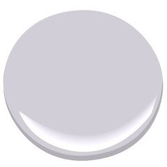
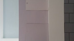
Here is a photo... Slip is the big chip on the bottom left and ocean air is immediately above it.

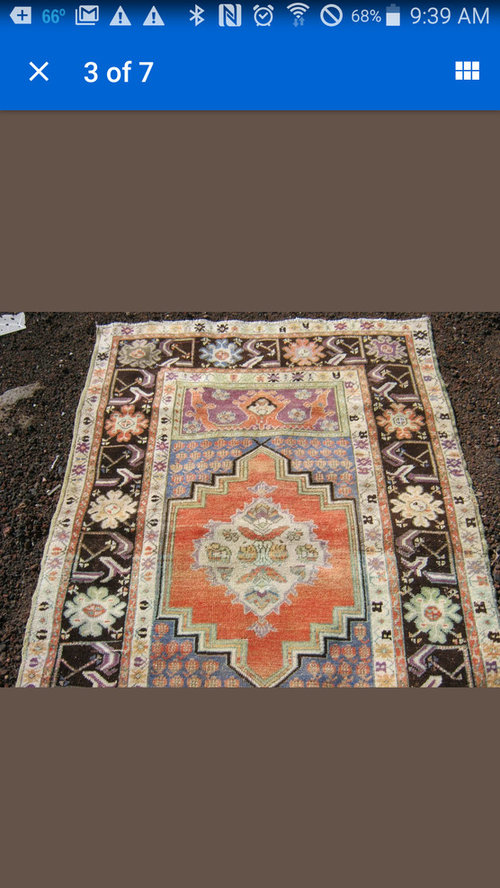
Here is a rug I ordered for in there but do not have yet.

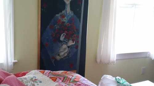
And here is a shot showing the bedroom paint color and quilt. The quilt has both lavender and aqua. Ignore the mess - construction debris is everywhere.

OK fire away!

Comments (57)

  • 9 years ago

    Slip!!! Go for something different than your norm. At my pushing, my aunt used slip in her living room. Stunning color. She loved it. Has an ethereal quality.

    lkplatow thanked theclose
  • 9 years ago

    She's painting her bathroom, not her bedroom - which will remain that gorgeous fresh green shade.

    lkplatow thanked User
  • 9 years ago

    Just to clarify it is for the bathroom only. And really only the top 3 feet of the walls... The wainscoting is Ben Moore simply white. The bedroom is staying the apple green color.

  • 9 years ago

    Sorry Jen... Saw we cross posted. Sorry for any abruptness... I'm posting on my phone and I stink at typing on this tiny keyboard

  • 9 years ago

    Just based on the rug and the samples, I'd vote for Slip. But could you buy a sample of both and try them on the wall with the rug before you make a final decision? It appears Slip would go great with the rug but without seeing both on the walls in the true light I'd really want to make sure.

    lkplatow thanked outsideplaying_gw
  • 9 years ago

    Another vote for Slip.......and that rug is gorgeous, btw!

    lkplatow thanked raphaellathespanishwaterdog
  • 9 years ago

    On my monitor the slip looks more mauve (of which I am not a fan, but it's not my room) than lavender. But if it's what you like in the space, you should try it. If you love it, great, if you don't, it's only paint (as they say). It does look like a good fit with that gorgeous rug.

    lkplatow thanked Olychick
  • 9 years ago

    I do not like the purple of the Slip at all. It looks way too "little girls room" too me. I would not like lavender in my bathroom. I would go Ocean Air 100%!!

    lkplatow thanked mark_rachel
  • 9 years ago

    On my monitor, the Slip looks kind of old lady mauve. But you are the one who sees it in your room. Worst case, you have to repaint.

    lkplatow thanked nosoccermom
  • 9 years ago

    I'm not usually a lavender fan, but I'm leaning to the Slip too.

    lkplatow thanked always1stepbehind
  • 9 years ago

    I'm a lover of purples, so slip is my choice ....

    lkplatow thanked pamghatten
  • 9 years ago

    Thanks everyone! I know I should do samples but the rug won't be here for 2 more weeks
    and I really just want all the painting junk out of the bathroom so we
    can use it -- we've all been crammed into the very small hall bathroom for 6 months
    and I'm so over it LOL. There is construction/painting equipment and displaced bathroom stuff shoved everywhere throughout the whole upstairs and I can't take the chaos anymore. It is getting.done.this.weekend!

    So I'm back from the paint store with a quart of
    Slip in hand. I decided on Aura Bath & Spa which is really spendy so I'm really hoping I
    like the color and that a quart is enough to do it all (there's really
    not that much wall space because of the wainscoting and all the
    doors/windows/cabinets). At any rate, I will post a pic once I have a
    coat on the walls (hopefully later this afternoon)....stay tuned and
    thanks for all the feedback!

  • 9 years ago

    Well I have painted half the room in one coat and I think it's a no go. The room has a southeast exposure and gets a lot of light and the paint just looks too "little girls room" I think. It might darken up a smidge with another coat but I don't see much of the grayed out effect.... It looks like a Crayola lavender.... What do you think?

  • 9 years ago

    Well darn. On my computer monitor the color looks amazing....like what I hoped it would look like. Not at all what it looks like in real life LOL. Weird. Well, if it looks like a grayish lavender to you, picture a much brighter version!

  • 9 years ago

    Yeah - on my monitor it is stunning! I know what you mean about things not looking the same IRL though. I think I'd go ahead and do another coat to see if that deepens it up, and remember it will look different when completely dry. You might as well, and you might be pleasantly surprised. I really want it to work for you!

    lkplatow thanked User
  • 9 years ago

    i was going to suggest this earlier but didn't want to introduce another color considering your situation, but do try BM Violet Pearl

    Bottom color is your Slip, so you can see how much softer the Violet Pearl is.

    lkplatow thanked User
  • 9 years ago

    Ooooooh, Tibb - yum.

    lkplatow thanked User
  • 9 years ago

    Annie Deighnaugh deserves the credit for bringing Violet Pearl to my attention.


    lkplatow thanked User
  • 9 years ago

    Too "little girls room" to me too. Do you want a gray with a purple undertone? What are you going for here? I suggest getting some samples first.

    lkplatow thanked mark_rachel
  • 9 years ago

    Oh Slip definitely looks violet vs a grey with purple undertones. Bummer.

    lkplatow thanked always1stepbehind
  • 9 years ago
    last modified: 9 years ago
    I had Googled images of slip and it can really go pink in some rooms and light. Google images helps me see a color in multiple locations and gives a wider perspective.

    lkplatow thanked ravencajun Zone 8b TX
  • 9 years ago

    Take a look at BM Winter Gray.

    lkplatow thanked ravencajun Zone 8b TX
  • lkplatow thanked ravencajun Zone 8b TX
  • 9 years ago
    last modified: 9 years ago
    Whoops...sorry, ok bathroom, but I still don't like the slip or purple grays.. :c(

    lkplatow thanked User
  • 9 years ago

    Thanks for all the suggestions. I did seriously consider After the Rain, which is one step down from Violet Pearl on the color chip. But violet pearl looked like a more blue/coooler lavender and I really wanted more of a pinkish/mauve one. At any rate, I don't think Slip is it. I bought another quart of Ocean Air and painted the other half of the bathroom, but I am losing the good light in there now so pics will have to wait til tomorrow or possibly Sunday since I am going to be tied up from 7-2ish tomorrow and the good morning light may be gone by then. From what I can tell, Ocean Air looks really really aqua -- almost a tiffany blue. Definitely looks way different than the pics robo posted!


    Which reminds me -- I did google (and pinterest and houzz) both paint colors as well as a few others I was considering. There wasn't much for Slip (and also sometimes pictures appear that aren't actually that color -- you have to really click on each pic and try to find the name of the paint color). And ocean air looked totally different in every photo. And honestly, just judging by the difference in how Slip looks in my photo above vs. how it actually looks in the bathroom, I am quickly discovering that internet pics are not super reliable!

  • 9 years ago

    You just put that color up like a few hrs ago? Try to not judge it until its completely dry - can take a few hrs even days for the color to settle down and really be what its going to be.

  • 9 years ago

    My grad school-aged daughter painted her stairwell BM Violet Pearl and it is a lovely, sophisticated grey lavender. Not mauve, not little girly. I can't recall the name of her bedroom color, but it's a clear, gentle green. Very pretty combination.

  • 9 years ago

    If you do end up seeking out alternative lavender gray options, Sherwin Williams 6267 "Sensitive Tint" might be worth trying. Looks like a beautiful bathroom. Good luck!

  • 9 years ago

    I agree that waiting a bit for it to truly dry would be good, which is why I'm not horribly upset that I'm otherwise committed for most of the day today. If I decide I really love the lavender, I may try a sample of violet pearl (if neither of these work out I'm calling uncle on my resistance to samples) but I suspect the Ocean Air will look fine and my hubby preferred that one from the beginning -- I was the one who was all "blue again? ugh!" I did look at a few grays-with-purple-tints (including winter gray, ravencajun) but my hubby wanted an actual color that was cheerful -- he is anti-gray. I have so many paint chips upstairs that I suspect I could assemble my own fandeck LOL (Handy because I was able to go find violet pearl and winter gray in the stack immediately,). Eastautumn - I do not have any SW chips - the nearest store is much further away than BM and I'm a little afraid to give myself even more options!

    One thing I did notice is that Aura paint dries really really crazy fast. Like once it had been up on the wall for 30 seconds, I couldn't go back and brush out a glob -- it has already mostly set up. So by the time I finished a 3 foot square area, the part I painted first had already significantly dried/darkened compared to the part I painted last. And the darkened area was true to the chip when I held them up next to each other -- I just think the light and the fact that there is so much white trim in the room is doing funny things to intensify the color.

  • 9 years ago
    last modified: 9 years ago

    Want an incredible , cheerful, luscious, oo la la color? looks like your bathroom gets good light. So, BM Capitol White. I'm starting to think it should be a law that everyone have that color somewhere in their house! '-)

    My broker just painter her adult daughter's bedroom and bathroom in it. It is absolutely stunning. In high light, you want to spray some chocolate syrup and whipped cream on it and lick the walls! It is really gorgeous.

  • 9 years ago

    Love the idea of a gray with lavender undertones, but it does look a bit too lavender on the walls. Violet pearl looks perfect!

    DH mentioned Aura Bath dried very quickly in our guest bath, which made it harder to work with, so I went back to BM Regal for our other bathrooms.

  • 9 years ago

    I hope you end up liking it! It looks lovely on the computer but I understand it isn't so in person. It looked divine in my aunt's living room. Not as saturated as it appears in your picture, and she has tons of white trim, furniture and the like! So crazy what light does to paint colors.

  • 9 years ago

    I just compared my SW Sensitive Tint chip to BM Violet Pearl and they're almost identical; Violet Pearl is ever so slightly lighter and bluer, but they're very, very close so definitely not worth a special trip to a SW store. Hope you're able to make the pale purple work in that room. It does look gorgeous in the picture!

  • 9 years ago

    So I got home in time to look at the colors but didn't get a good pic as the sun had already moved away from that side of the house. Without the sun, the Slip didn't look so quite so flaming lavender but it's still pretty girly.

    I'm not sure I'm liking the Ocean Air either - dh does, but I'm not a fan. It seems to have darkened and intensified. So I went back to the Ben Moore store and borrowed the big chips for Violet Pearl as well as the colors above and below it on that strip. And by then it was too dark to see anything. So look for another exciting update including pics of Ocean Air tomorrow!

    Sigh....looks like my bathroom won't be done this weekend after all!


  • 9 years ago

    So I've been googling for pics of Violet Pearl and I pretty much only find the bathroom that Tibb posted. Has anyone else used it and if so, do you have pics?

  • 9 years ago
    last modified: 9 years ago

    OK so it's pretty cloudy outside so all the colors are looking kind of grayed out today....figures. We are in a drought here and it's been clear and sunny every day for weeks but the day I need good light to take photos, it is actually supposed to rain. But anyhow, here's some pics for what they're worth.

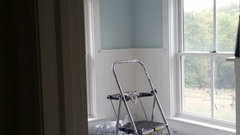
    Ocean air - this is kind of accurate, I think. I did two coats on the edges and one very light brushed one in the center. So the true color will be closer to what you see on the edges. I am a bit worried that it clashes with the stone on the tub deck -- it's a more gray blue stone and the ocean air is kind of green blue.

    Ocean air with a pic of the rug.

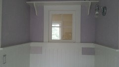
    Slip - again, the slip looks nothing like it does in real life here. It is much brighter. The chips taped to the beadboard are Hampshire Rocks on the left and Violet Pearl on the right.

    And a closeup, with Hampshire Rocks on top and Violet Pearl on bottom. As a bonus, you can see ocean air in the background. This photo gets closer to what Slip really looks like.

    I was thinking of taking my can of Slip back to the store and seeing if they could get it closer to violet pearl (they are very close and I would think they could just add some gray to get there...), then painting that over the "Slip" side of the room to get a sense of what it would look like. DH is still lobbying hard for the Ocean Air though. Again, all opinions welcome! At this point, I am tempted to do it all in a dark gray to match the grout and be done with it, but DH really wants happy/cheery. His fear is that Violet Pearl and Hampshire Rocks will look too gray, but honestly Slip looks gray on the chip as well, and we see how that turned out LOL!

  • 9 years ago
    last modified: 9 years ago

    I can not see much difference between violet pearl and slip and I still like the idea of a lavender grey a lot. The blue or grey would be the safe choice but it is overdone, this from someone who just painted her bath and bed room a spa blue grey color. I like your classically unique yellow with a greyed down violet idea so much more than my blue that I am sitting with paint chips in my bath to try and get something more unique colorwise in my space. Is Hampshire rooks too light? I think the right lavender grey will be stunning in your absolutely beautiful bath!


    lkplatow thanked roarah
  • 9 years ago

    I love the Ocean Air! So light & bright @ airy! The Slip looks so depressing to me.

    lkplatow thanked mark_rachel
  • 9 years ago

    Okay, bail on both the violet and the blue and pick up a can of BM Capitol White. You will not believe how gorgeous it will be in your bathroom, against the crisp white of your wainscoting and trim and the granite of the tub surround. Cheery, happy, but also calm, creamy, luxurious. It's a truly great color.

    lkplatow thanked User
  • 9 years ago

    Tib, so you like BM Capitol White??? Ha! It is a lovely color.

    On my monitor, slip and violet pearl are almost identical. I think either will look so beautiful with your rug. If it were me, I would use slip, get the rug, finish accessorizing, etc. and then wait a few weeks to decide. I know repainting is a PITA but it might surprise you once everything is in place. And I really want to see it all done with that rug!! We did this with our master in a former apt. We did end up repainting after 6 months (which is probably not what you want to hear) but I am glad we waited to see what it was that we didn't like.

    I agree that Ocean Air is fine but somewhat pedestrian.

    lkplatow thanked theclose
  • 9 years ago

    I'm tellin' ya...

    lkplatow thanked User
  • 9 years ago

    I would go with Hamshire Rocks.

    On my monitor Violet Pearl and Slip are too similar. Ocean Air is pretty but you can always choose the ubiquitous spa-like gray-blue (and on my monitor, Ocean Air seems to be walking that fine line between spa blue and baby boy blue).

    Your rug is much too fun for a spa color. Hamshire Rocks is my vote.

    lkplatow thanked User
  • 9 years ago

    Maybe you need to cleanse the pallet & either step away for a week or so, or go with something different. Have you looked at Gray Owl? It's S light gray with s blue undertone. Or Revere Pewter?

    lkplatow thanked mark_rachel
  • 9 years ago

    OK another update. I took the can of slip back and had them tweak it -- they tried for Violet Pearl but because there were already pigments in there that weren't supposed to be, I ended up with something darker that looked a lot like BM's Piano Concerto instead. I used it to repaint a few of the slip walls and liked it better -- it went from little girl's room lavender to a darker lavender with a bit of grapey tinge. But it was still pretty intense and not grayed out enough.

    So I went back to the store and grabbed sample cans of Hampshire Rocks, Violet Pearl, and After the Rain - the three lightest on that paint strip. (After the Rain had been a finalist in my earlier deliberations.) Hampshire Rocks was an immediate no -- in the room it looks pink with a gray tinge -- not lavender at all (and -- STOP READING NOW IF YOU HAVE HAMPSHIRE ROCKS ANYWHERE IN YOUR HOUSE CAUSE I DON'T WANT TO RUIN IT FOR YOU -- awful as it sounds, it reminded me of the color a dead person's skin after the undertaker makes them up for the viewing - yikes!).

    Violet Pearl and After the Rain have serious potential though. The sample cans are some other kind of paint that takes MUCH longer to dry than the aura, so I painted some largish swatches and am waiting for it to dry down fully. More pics tomorrow I guess!

    I brought home a chip of Capitol White during my first paint store trip and it is beautiful -- it's like the color of vanilla ice cream. But the trim paint is Ben Moore's Simply White which has a creamy tinge. And really, it's a color match done into a different brand of paint that is ended up even creamier than the real Simply White. So when I held the Capitol White up to the trim, there didn't seem to be enough contrast -- it looked like a slightly "off" version of the trim color. I will keep Capitol White in mind for future projects though - it is pretty!

    LisaD82 - funny you say that about Ocean Air - I wouldn't call it spa blue or baby boy blue -- in real life, it's more like a tiffany box blue. It's pretty but somehow it seems to fight with all the gray in the stone, grout, etc. And Roarah -- I think your room is beautiful and not boring at all!!!!

  • 9 years ago
    last modified: 9 years ago

    Okay, so my trim is white dove, which has slightly less contrast with the Capitol White than would the Simply white. Look on the "Show me your room" thread, you can see the contrast between the Capitol White on my walls and the ceiling, which is BM White Dove. I know what you're saying, but I strongly urge you get a sample can of the Capitol White and actually paint a large swatch up against the trim, let it dry, then look at it.

    I know I"m being a pill here, so sorry about that. I just think you'd be very happy with it.

    Or

    What if you went more bold with something like BM Vintage Charm?


    lkplatow thanked User
  • 9 years ago

    Just wanted to follow up. I painted the room Violet Pearl today. It is pretty though can definitely go gray in some lighting. I think it's a keeper though. I'll post pics in a few days.... Trying to get all the drop cloths and painting stuff put away.


  • 9 years ago

    Good to know. Definitely post a picture!

  • 9 years ago

    Good for you! I know it must be a relief to have it done and LIKE it! My painter will be here Saturday. I do NOT have my paint selected yet :o 8 samples on the walls. Four 60 mile round trips to Lowes for samples. My head is swimming and I as too sick to go back to Lowes today for another sample color.

  • 9 years ago

    Yesterday Lowes perfectly matched the color of a set of sheets. They NAILED it! I'm done! I have found my paint :) Put it on the wall and OMW...not good! I don't know if it was a difference in vertical vs horizontal and/or fabric vs drywall. Too bright. BUT the color of the paint in the can (WET) is perfect! DH was standing next to me when I put a sample on the wall and he agreed, that was the color :) No color match on the SW or BM color deck. Sooooo, my idea is to take the paint back to Lowes and see if they can do a color match of the wet paint. Keeping fingers crossed!

  • 5 years ago

    This is an old post. How did the violet pearl turn out?