Software
Houzz Logo Print
imsum1

Oh please help me !!

10 years ago
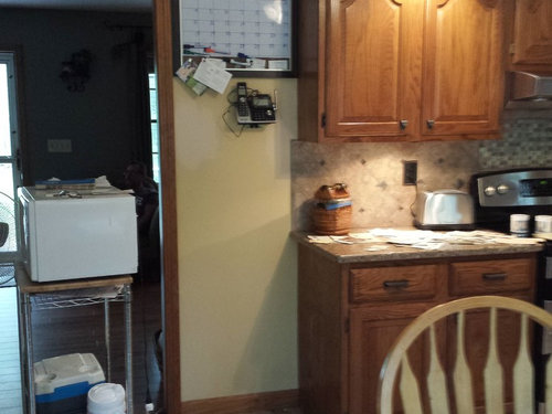
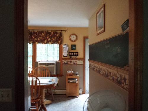
I am going crazy... trying to paint my tiny eat in kitchen and I am lost..

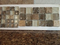
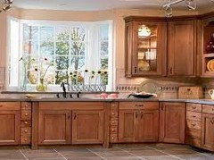
please try not to critique the way it looks in the pics.. I know its awful.. I wanted to try to get some color in.. prior to the pics it was all tan with the wall border... I recently had quartz installed and installed my very first tiled backsplash..also tan.... I have greens of various shades in the other rooms and wanted a different color in the kitchen.. I have tried farmers almanac cream (yellow) and pumpkin cream(pale peach)...both awful...

I really am lost... and already have alot of tan.. help please !!


Comments (20)

  • 10 years ago
    last modified: 10 years ago

    Do you want to keep the wall border?

    I have oak cabinets and find light creams and light tans work best to keep the room light and balance the wood. Then use decor to bring in color. My oak kitchen is in my "my pics" idea book.

    sum1 thanked jhmarie
  • 10 years ago

    Thanks for the input... no the border can go.. lol things are a bit dated to say the least.. I wanted to add a bit of color, I have tan everywhere.. maybe an off white will be my best bet

  • 10 years ago

    How about a nice sky blue?

    sum1 thanked msmeow
  • 10 years ago

    pick a white [not stark white] with gray-blue undertones. Don't care for tan/cream with oak....oak has a lot of amber or orange undertones. cool it down. we did a basic white in halls/entry/ living room/etc where oak is the trim and the oak detailing becomes really nice to live with.......no cream or almond or anything like that.

    sum1 thanked herbflavor
  • 10 years ago

    One thing that did help me was painting my trim work white - cabinet and doors remain wood. My trim is not oak - it was dark stained pine so I had no problem painting it. Several of my friends and family have the oak trim and it does not bother me - not too concerned about the whole "dated" thing.

    I really like the white trim with soft blue that I have in some areas of the house.

    sum1 thanked jhmarie
  • 10 years ago

    I think you may be falling into the same "trap" I see some of my friends fall into. :D - - They come to me wanting my help because they like that way I have my home decorated, but when we start evaluating colors, they begin to fall into the same old habits that essentially handcuff them from reaching the heights they want. "Can't we get that warm effect without using a color that dark?" "Maybe we should go a few shades lighter, or how about this one with that is more neutral?" See? I love them, but they will not get the feeling of my house, without embracing the color, or the effect strong contrast colors have.


    When I look at your pictures, I see that darker color on the bottom, but can't help think.... hmmm not deep enough, not enough contrast, another 'safe' color pick. If that curtain is one that you love, you could use that dark brown/red(? can't tell) on the bottom half of your room. NOT a lighter version of that color, but the actual color match. Then you have richness on the bottom and the upper half, where you still want your light reflecting, will look less blah, and more complementary.

    On the other hand, if you do not want to go darker, the idea of adding white may be the ticket. The white contrast will add richness to the tans. You could even paint the walls white and the quartz would begin to pop out. :D - - See? it is embracing the contrasts..... Also have fun! it is just paint!!!!!!

    sum1 thanked dainaadele
  • 10 years ago

    Keep in mind that colors next to each other change what a color displays! For example, I love a gray green. Next to brown cabinets, it can look as green as grass.

    Without going into my own painting fiasco, let me just say that paint samples and cardboard are your very best friends.

    Also, remember: It's JUST PAINT, for goodness sake. Not a life-long commitment.

    sum1 thanked CEFreeman_GW DC/MD Burbs 7b/8a
  • 10 years ago

    First off, relax. Ya gotta love the kitchen for what it is so you "augment it" with color. Your kitchen is fine, nothing wrong with it. It could use a little less "busy" and a little color to make your time in it more enjoyable to you.


    I think the light blue that CP suggested is actually a great idea. I would keep it a nice light color.


    Lose the wallpaper border looking stuff going on, that takes away from the kitchen and makes it busy.

    Get it so you can see more of the countertops.

    You have a wonderful kitchen, but YOU have to like it first, then you can think of ways to make it "better" but ya gotta first see it as "good".


    R


    sum1 thanked Russ Barnard
  • 10 years ago

    Remove the border, and change that valance for something that is not brown ... then pick a paint that makes the valance look good.

    sum1 thanked User
  • 10 years ago

    I used SW Sassy Green in a house with orangey pine wainscot and it looked awesome. Good luck!

    sum1 thanked mabeldingeldine
  • 10 years ago

    I'm a tan/neutrals kind of girl, it drives my husband nuts! LOL. But, I can completely change my accent colors for less than $100 whenever I get bored with my current scheme, so it works for me.

    Chose a neutral color with undertones that match your cabinets and back splash tiles. Then buy yourself a colorful throw rug, new curtains, towels, place mats, maybe new cushions for the chairs, add a nice colorful centerpiece to the table. Oh, and maybe change the artwork above the chalk board to 3 pieces of something with colors that compliment your new colors.

    Good luck and try to remember this is supposed to be fun. :) It will work itself out.

    sum1 thanked lferg92
  • 10 years ago
    last modified: 10 years ago

    Sandy Hook Gray by Benjamin Moore is a pretty gray green that would look great with your wood cabinets. It is a color that is recommended to complement orange wood cabinets. It's one of the Historical colors. You may want to google the paint color and you can see it looks with wood.

    Id also take the border down and paint above and below the chair rail the same color. My personal opinion is that using two colors in that area dates a room.

    sum1 thanked sis2two
  • 10 years ago

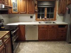
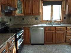
    Wow !!! Thank you ALL for the advice/ input !! I removed the border & chair rail on the window wall ...and am contemplating my paint .. I did paint over the lower dark paint with the pumpkin cream just to see the contrast not the color with the oak trim and I can tell you I absolutely despise it. I love the warmth the darker paint brings out of the trim.. so I will likely go with a warm color... I was afraid the room will shrink with that facing wall being dark but find the pronounced oak trim with light shades smacks me in the face, funny thing is that entire wall was supposed to be removed for an addition but the contractor we had consulted with fell off the face of the earth and were in the process of trying to retain another.. lucky for them they're all very busy , so that project will have to wait until after winter : (. so I am attaching the before and after of my counter & backsplash install so you can see the colors im working with , the backsplash was a big project for me .. I have never done one before but I wanted something unique to my taste...

    BEFORE

    AFTER

  • 10 years ago


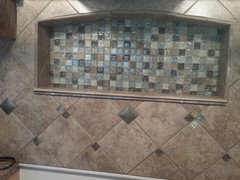
    Niche over range

  • 10 years ago

  • 10 years ago

    That is very pretty! There are many pretty surfaces in your kitchen and I think less is more for adding to it. Take a pretty light color out of the tile and try that.

  • 10 years ago

    That was my plan ... so i thought the pumpkin cream would be nice it's a very soft cream color with just a hint of melonit looks like this color, I really love the hue that cast

  • 10 years ago

    the floor in the picture in my house is going haven't decided on what the next flooring will be but that is definitely going to be gone when we have the addition put on

  • 10 years ago

    The color I have in my kitchen is Valspar Churchill Hotel Ecru - but it might be lighter than you want. In the morning it has a slightly rose undertone - perhaps a reflection from the undertones in my cabinets, but it might give you some of that softer undertone you were looking for with the pumpkin. My sister has Sherwin Williams Practical Beige which is darker, but warm and pretty. She has some similar tones in her backsplash as you do in her kitchen though her cabinets are darker. You might grab some sample bottles of those.