Software
Houzz Logo Print
abigailca

Need help on bedroom wall/bedding colors (contemporary style)

13 years ago
last modified: 13 years ago
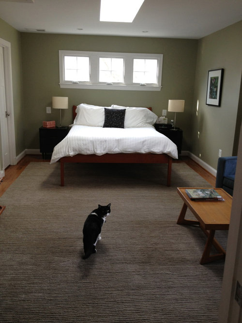
Previously, I asked for help on the size of a rug for our bedroom. I am now starting a new thread because I am looking for help on selecting a color for our bedroom walls.

Here are the things that I *can't* change:
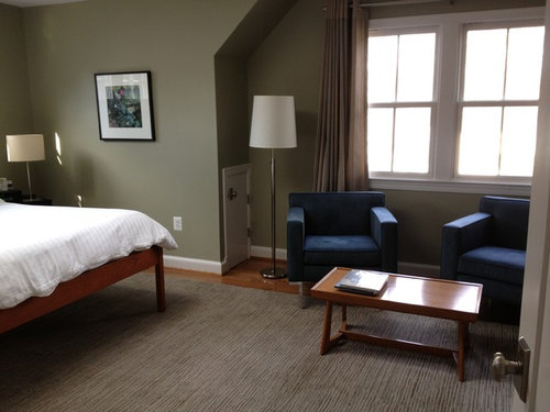
1) The blue-grey chairs, custom-made drapes and the brown/grey/taupe wool rug because they are all new - purchased at different times.
2) Placement of the furniture - the chairs do not look right at the end of the bed or directed at the TV. We have tried it and this is the way it looks best. (Someday we would like to add a chest at the bottom of the bed.)

What I can change is:
1) the wall color
2) bedding
3) pillows and
4) artwork.

We have a contemporary style.

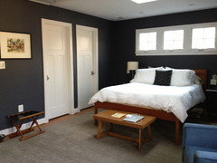
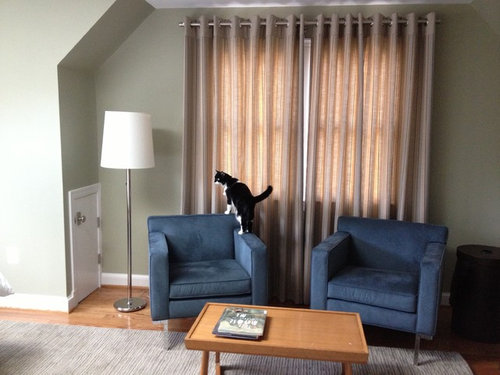
The wall color/bedding/pillows is where I need help. Right now, the walls are a svelte sage, which I have loved on its own but it doesn't really work with the chair/drapes/rug combo. I would like to show off the drapes more, because right now they feel a little "mushy" to me. In the past, I have had a kilim beige on the walls and the room felt a little drained of color ... when we put the sage on, it felt "richer" which I liked. We have a fair amount of light in the room (skylight plus several windows), so I'm not sure if we could go dark (and have it look good) or go light (with the possibility of it being washed out). My goal is to bring it all together if that is possible. I'm attaching several photos.

Thanks in advance for your help!
ACA

Comments (130)

  • 13 years ago
    That pop of light green and the yellow are nice, Ann. Thanks!

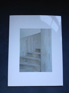
    The photo my husband took is of a round staircase - it is sort of silver. It is beautiful but I wonder if I'm going too somber?

    Alternatively, he has a picture he took of figurines of Whirling Dervishes that is kind of cool. There are pops of white and red in the image and it is more playful.

    Or maybe I stick with a colorful abstract?
  • 13 years ago
    last modified: 13 years ago
    Since you're planning a large piece of art on that wall, I think it will be important in determining the direction you want to go with accents, etc. I think all your ideas sound great, it just depends on what feel you want to create. If you choose a lively accent color, I'd definitely incorporate it in the large art (at least a little bit of the color). Red would work well as an accent color too. Do you want to post pictures of the art you're considering for a whole discussion? That would be a fun one :)
  • 13 years ago
    I'm thinking about the other questions but I just have to say that I ABSOLUTELY LOVE THAT COLOUR in your room. Really, in capitals!!!! There is something so sexy about a dark wall colour. It is gorgeous. I'm so glad you took the step to go dark. Whoohooo!!!
  • 13 years ago
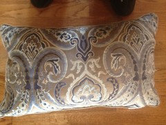
    If you don't end up using the picture what about a sunburst mirror in white. Here is a pillow I have in my blue room that would look awesome on your bed or chairs.
  • 13 years ago
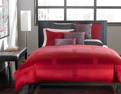
    Here is an example of the red. I know you won't be doing all red bedding like this, but notice just the bit of red in the art and with red pillows, that would be nice.
    [houzz=
    Hotel Collection Bedding, Red Frame Lacquer Collection · More Info
    ]
  • 13 years ago
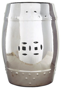
    Love the paint! I am happy to see that you took my suggestion and moved the coffee table to the foot of the bed. Looks great! When you replace the table with a bench, keep in mind if you will need added storage or not. There are so many options out there. Remember, it doesn't have to be matchy, matchy, it just has to work with the other pieces. They make metallic garden stools and you can find them at places like Home Goods, which is not expensive. I would love to see the same curtain panels that you used behind the chairs hung behind your bed for added drama. It will make the bed the focal point, not the windows behind it.. To help bounce the light, get mirrored beside lights. I saw some pretty ones at Target. They look like mercury glass. Very pretty. You just need some throw pillows, a couple of euro shams and perhaps a bed throw or quilt to tie everything together.

    Again, art is subjective. Don't fell compelled to get something right away. If you and your husband travel, look for something on a trip or have him take more photographs to either blow up or arrange in a series. It should be personal and speak to you both.
  • 13 years ago
    last modified: 13 years ago
    Here is a lamp. One of the biggest mistakes people do when they purchase bedside lamps is getting the wrong size. Many times, when we install a bedroom we get several lamps, to test the light for reading in bed, and return the ones not chosen.
  • 13 years ago
    last modified: 13 years ago

    @dachdesign - yes, you and a couple others suggested putting the table at the end of the bed. Great idea! It works, particularly since the bed is kind of high and looks like it is on stilts.

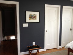
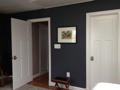
    I'm thinking of putting a leaning mirror where the current piece of art is, but am afraid that it will look like too many long door-like shapes. That spot is kind of difficult because it is only about 40 inches in between the closet door and the entrance door. The rug is kind of close to the wall, so putting a pot or console there would be kind of tricky. But it is an odd space.
  • 13 years ago
    We have a few clients where we purposely didn't hang art.. We tasked them with finding items that speak to them. For one client in particular, we installed a live edge mantel over their fireplace. We suggested to them to increase their pewter collect on their world travels and we would help install their "growing "art piece. We will started with 3 pieces and we add to it as they collect more. It is such a story on their wall and creates wonderful memories.
  • 13 years ago
    last modified: 13 years ago
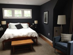
    Here's the tricky spot (where I'm considering putting a leaning mirror) plus a photo of the photo my husband took that we might blow up for the opposite wall next to the bed.

    We have an upcoming trip to South Africa, so my husband will take pictures there. The art can wait.
  • 13 years ago
    It looks very dramatic and modern and it makes the rug look more warmly taupe! Very nice choice :-) Your plan for the B/W photo sounds great. Love the silvery accessories that Dach Designs posted. I looked at the C2 palette and noted that they suggested pairings with a chocolatey brown and deep brown red with this color. And I could see lighter cushions on the blue chairs. http://img0.etsystatic.com/013/0/7117303/il_570xN.445558744_jez5.jpg
    or these on the bed: http://img2.etsystatic.com/008/0/7117303/il_570xN.396601906_c371.jpg
    Like Linda's posted cushion too. Congrats!
  • 13 years ago
    last modified: 13 years ago
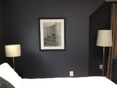
    love the table design/shape/material by carolin above but wish that it were smaller, no? love the cushions too by lessismoore..

    idk why but adding red would break the atmosphere so beautifully achieved with just that brilliant paint colour choice.. how about shades of brown with hints of varying shades of grey n blue in cushions & throw (lessismoore's cushion example above)..

    your rug, seats all look great now and they stand out too.. the textures are visible now..
    the art is nice but sombre... maybe we can't see the details through our screens.. that happens.. silver end tables will really lighten the corners..
  • 13 years ago
    gorgeous, I love it... the photo of the stairs is so unique and the whole room pops, looks crisp and modern! Nice job!
  • 13 years ago
    last modified: 13 years ago

    Maybe if the photo had a taupe coloured frame back ground (edging i mean) it'll be better rather than that stark white all around it!!! As the subject of that photo is great.. It won't appear sombre for the room then!!
    Even light chocolaty-milk sort edging.. As it is your window frames n door frames are white! Try the photo on a coloured A-4,before enlarging
  • 13 years ago
    last modified: 13 years ago
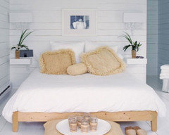
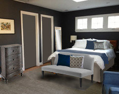
    Hi - I was wondering what a little dresser might be like below the print - something with a bit more weight. While I was there, I figured I might as well "add a few things" - just to see how'd they might look. I really think a custom drop skirt for your bed would add a lot to the room. Have fun!
  • 13 years ago
    @lessismore - you are so generous with your time. The little couch looks nice! Where is that from? Thank you for your help as always.
    I'm loving the room color - when I walk into the room, I feel instantly at peace. It makes all the other projects not as vital because I'm not fighting the overall feeling. Thanks again for all your support.
  • 13 years ago
    That was a custom made piece from Patricia Gray, Inc. ...
    http://www.30elm.com/accounts/PatriciaGrayInc/blogs/2987
    I used it just for the idea of a banquette bench there, something with a back, but no arms, instead of the basic bench that had been discussed. Just wanted to see how that might look.
  • 13 years ago
    I think it looks like a bench for a child's room. Looks a bit odd to me. And I don't like the bed skirt either. There, I said it. Sorry lessismoore. I like the clean look of the bed legs, the white doors and the wood.
    But since it's not my room... :-)
  • 13 years ago
    last modified: 13 years ago
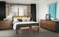
    @carolins, you're right that the couch would be a little small for that space, particularly since the chairs are somewhat bigger. Even though it's not necessarily what we are going to do, the couch gives an example of different kinds of ideas for the base of the bed. I do appreciate the idea. (I was thinking something more like a bench with some kind of leather or cool print on top (Knoll.) I believe Room and Board has some.) But a bench is not a priority right now since I think the table is a good proxy.

    Agree about the bedskirt. Bedskirts wouldn't work on the bed and we aren't really bedskirt-inclined. I have considered having the bed cut down, but that just feels like a huge, scary hassle that might not be worth it and it might not look good!

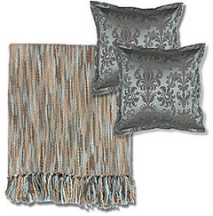
    @lessismore, I really like the blanket (we might go a bit more grey) and I love the pillows that you put on the bed! I checked out the East meets West website (formerly Posh Street Pillows) that was posted up above and found some really cool pillows. Can anyone vouch for their quality? I liked the dark blue, taupe and silver combo that you used.

    Pillows, mirror, lampshades and art are the what I'm considering. And painting the side tables, which makes me nervous because I've never done a project like that. It will probably be some time before I get to that!
  • 13 years ago
    Nothing I added there was "specific" to any product per say - (thought I'd explained that near the image, that it was more about scale/colors, but seems I failed ...)
    I painted in the doors as there seemed to be a voiced concern that there were too many "door shapes" what with adding a leaning mirror (I added a "generic" one) - so I wanted to see how that would look (which is neither a yea or nea or doing it).
    Sometimes, it's easier to get a general idea before you go ahead and paint or buy. Ironically, the "blanket" is the one image that exists nowhere - just me drawing one! But now you know you want one more gray than blue.
    As for the drop skirt ... that was an afterthought, but ( filled with irony and regret here ...) the part I thought gave the most cohesive element to dressing the bed as it blended, rather than accentuated, the rather tall legs (without having to saw it up, which seems too extreme to consider).
  • 13 years ago
    @lessismore I appreciate yours and everybody's insights! It is so nice to come to a place like HOUZZ and for professional and informed opinions on decorating. Thanks, everyone!
  • 13 years ago
    No time to read through the thread, and I can see at a glance you've received lots of good suggestions. I just wanted to say I love your bank of three windows over the bed, and your kitty!
  • 13 years ago
    There used to be a shade of paint called silver sage by Sherman Williams. It was available at Lowe's. I think using this color would provide you a lighter (more light reflection) & more "neutral" shade of green. I can't tell you how many people literally raved about the beauty of the color. It is a color that is appropriate for most rooms which is a strong pro to me. I am hopeful that Sherman Williams still offers this color. We had to sell the home we built where we used this color about 2 years ago. The new home owners loved that color and the red we had used in the dining room. We used "Silver Sage" in our living/great room, kitchen & short passage between the 2 rooms. Several of our neighbors fell in love with it and used it in various rooms of their homes. I guess you can tell how much I love "Silver Sage". We are remodeling the home we bought about a year ago. The remodeling is going to take @ least another year. I hope "Silver Sage" will be available when we get to our kitchen, keeping, and dining room. I'm undecided about our living/great room color but I know what I want for the other rooms. We are tied up doing flooring in bedrooms and bathroom updates. My husband does all the work himself (& it is beautiful-mostly because he is so picky!) so progress can be slow. I hope that my suggestion will be helpful-sorry about the run-on.
  • 13 years ago
    last modified: 13 years ago
    @jerisengland - thanks for your input. If you scroll up a little, you will see that we painted the room a charcoal color. It is very dramatic and peaceful at the same time ... I'm so happy with the outcome. Thanks. I wish I could update the original post now so others know that this thread is now really updates and tinkering.
  • PRO
    13 years ago
    last modified: 13 years ago
    A vanity in a bedroom will add charm and elegance into any atmosphere
    http://www.kathykuohome.com/

    This sculpture will add romance and delight into your room.

    http://www.kathykuohome.com/Product/Detail/4010-Roswell-Medium-Petrified-Wood-Fragment-Sculpture

    For more ideas visit http://www.kathykuohome.com/
  • 13 years ago
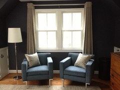
    I wanted to update briefly. I bought two pillows from Room and Board that I love for the chairs. At first, I tried a bolder design, but they didn't look right in the room, which is now quite peaceful. These pillows have a sheen where the flower is (which is sort of a light blue/grey) and the flower design is a welcome break between the stripes of the curtains and the stripes on the rug. I'm really happy with how they look.

    We are still going to buy some pillows for the bed and a quilt for the bottom of the bed (indigo), and a floor mirror. I feel so happy with how the room is now. I think that the ample amount of light that we get in the room (skylight plus two large windows and three windows above the bed) allowed for us to use a really bold color on the walls. The beige color that we had in the beginning washed the room out and made it feel cold and uninviting. Then the svelte sage didn't work with the drapes and carpet. So glad that we went with the shale color. Third try is a charm.

    Hope everyone is enjoying their July, wherever they are!
  • 13 years ago
    Those pillows are absolute beauties. Looking gorgeous in your room. And the picture is perfect too. I'm so glad that you were bold enough to go for the dark colour and that you really like it.
    A Aguirre thanked Carolina
  • 13 years ago
    I deleted the picture of the enlarged photo because it didn't look as nice in the photo as in real life!
  • 13 years ago
    Oh darn - I'd love to see the picture! The pillows do look great!
  • 13 years ago
    It must look great or carolins wouldn't have said so :)
  • 13 years ago
    last modified: 13 years ago
    Here's the photo, Ann. :)

    PS The pillow on the chair in the first photo is blue and not the one I ended up keeping.
    Also - the rug is 100x better in person than in these photos.
  • 13 years ago
    last modified: 13 years ago
    Here's a picture of my daughter playing around in a laundry basket on the rug. (Those are temporary swim team tattoos on her arm.) The lighting gives a better sense of the rug. It is deliciously soft. Sorry to send so many posts!
  • 13 years ago
    Oh, the picture looks great, the room looks great, and your daughter is adorable!
    A Aguirre thanked Ann
  • 13 years ago
    Agree with Ann on all points :-)
  • 13 years ago
    Love the color you chose! Still think this bed needs either a bedskirt or to have the covers flow down to the floor.Those skinny legs of it sticking out even though matching in style with the chairs are of different material and feels strange. The bed needs to be more 'grounded'.
  • 13 years ago
    last modified: 13 years ago
    I agree with carolins on the bedskirt question. I've never been a fan of them, and don't like quilts or bedspreads that come down to the floor either. Both feel more old fashioned to me, whereas I like the clean modern lines in your bedroom.
    A Aguirre thanked feeny
  • 13 years ago
    last modified: 13 years ago
    Thanks for your comments everyone. Instead of a bedskirt, one day we will get a bench or chest for the base of the bed. A bedskirt wouldn't work on the bedframe.
  • 13 years ago
    the bed looks unbalanced. If it had sturdier legs it would be fine, but now it looks -to me at least-top heavy with tiny legs that can not 'hold' it's weight. Not only aesthetically but also energetically. Look at the difference in feel this Scandinavian style bed has for example
  • 13 years ago
    last modified: 13 years ago
    @manoux - I have gotten similar comments before about the legs of the bed. We have considered taking it to a furniture repair store to take off a few inches, but I'm nervous to do so because I don't know how it will look shorter. Also, it will reduce the height of the headboard in the back, which might not look good under the windows.

    The wood is solid cherry and the bed is from Pompanoosuc Mills, so it is good quality, but I do know what you mean by the skinny legs. We have tried to address the problem by putting something at the end of the bed to divert the eye from the legs. A bed skirt doesn't work on the bed because it is not a flat bedframe. (Also, in truth, I'm not keen on bedskirts.) Thanks for your input.

    aca
  • 13 years ago
    PS Thanks for posting the bed up top ... to me, that bed looks cut off at the knees ... too short. Wouldn't it be hard to vacuum under? I was thinking somewhere in between if we were ever to do anything about it.
  • 13 years ago
    last modified: 13 years ago
    No worries about the bed. It looks fine. Check the new Room&Board bed collection. Tall skinny legs.
    Tall? Skinny legs? Your bed is a supermodel ;-)

    Parsons Bed with Mason Collection by R&B · More Info
    A Aguirre thanked Carolina
  • 13 years ago
    As the French say "les gouts et les couleurs ca ne ce discute pas": the tastes and colors can not be discussed. It is how it feels right for you. If it feels right then this is your bed!
  • 13 years ago
    I think the color looks wonderful. Have you thought of putting matching drapes on the windows above the bed.
  • 13 years ago
    nice! loving the photo shot specially. it stands out so well on your wall colour! glad you used it.
    loving the mirror recommended by mkmort above.. specially the blue shades in it. where do you intend to keep it? between the two doors across from the framed shot?
  • PRO
    13 years ago
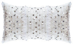
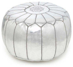
    you can add some great moroccan accents they are available here www.vintagebydounia.com
  • 13 years ago
    last modified: 13 years ago
Sponsored
Mary Shipley Interiors
Average rating: 4.8 out of 5 stars34 Reviews
Columbus OH Premier Interior Designer 10x Best of Houzz