Software
Houzz Logo Print
paris2004

keep or not

10 years ago
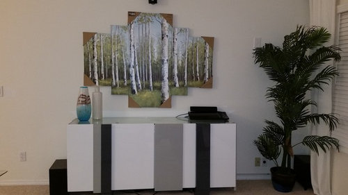
What do you think of this picture?

Comments (106)

  • PRO
    10 years ago

    From your ideabook!

  • 10 years ago
    Great thanks. Will look for softer art. I actually said to myself that the black/ white framed art would make my house feel like a library.
  • 10 years ago
    Did you decide on Art?
  • 10 years ago
    Haven't gone back shopping yet. kind of tired from looking but will look a few more places on the weekend?
  • 10 years ago
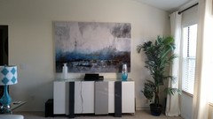
    I know this looks a little big, but it's really pulling the room together. I kind of like it. Thoughts? Thanks
  • 10 years ago

    Your beautiful sofa makes the picture look cheap.

  • 10 years ago
    it's actually not cheap. oil painted close to $200.
  • 10 years ago
    Actually not cheap. close to $200.
  • 10 years ago

    I follow a blog designer from time to time. She has similar taste as you..big complement! I think she is about to start her third home. The living room that I am comparing you with has a white couch with a similar painting behind it, lovely. Bliss-at home.com. Check her out.

  • 10 years ago

    And check out her white painted fireplace.

  • 10 years ago
    last modified: 10 years ago

    nduthu, all that matters is whether you love it. I agree that this last piece works nicely with the other elements in your room. Personally, I love over-sized art and think the colors and composition of this piece are very nice.

    Keep it! It also complements your console table nicely.

    You may want to consider updating the lamp on your table next to your sectional or at least replacing the patterned shade with a white one. It distracts the eye from the art.

  • 10 years ago
    If you are asking whether to "keep it or not", then I vote "not". If you loved this piece of art, you would not care what any one else thinks about it - whether it fits, or the colour/style/subject matter/frame/etc. is pleasing to anyone else's eye.
  • 10 years ago
    No
  • 10 years ago
    Too contrived.
  • 10 years ago

    Find a gorgeous print on Minted and have it framed. You can't go wrong with Minted!


  • 10 years ago
    it looks much better when you see it compared to the picture. Looks and feels contemporary and I do t have to add anything else on that wall.
  • 10 years ago
    last modified: 10 years ago

    I think the size and look seems fine -- in rooms with open space whether ceiling, etc.. a larger piece, even finer.... enjoy it!

  • PRO
    10 years ago

    Love that Art! I would push your console over a bit more to the left....remove tree in pot......and put a small accent chair angled next to the console on the right....hang art in the middle of the wall not centered over console...I really think it would give you the wow factor!

  • 10 years ago
    Mary Trantow · More Info


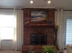
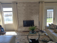
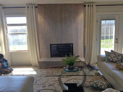
    Thanks. Glad to hear that. Will make those changes. Next project is fireplace. Will this go with my room? Thanks
  • 10 years ago
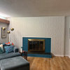
    Current look
  • PRO
    10 years ago

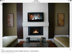
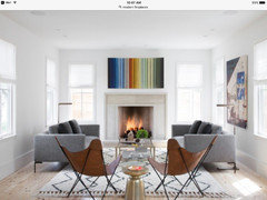
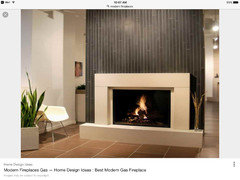
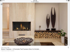
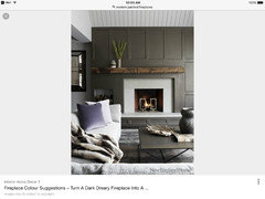
    I think for your space a little less traditional is best...here are a few inspiration images...

  • 10 years ago

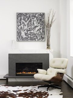
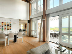
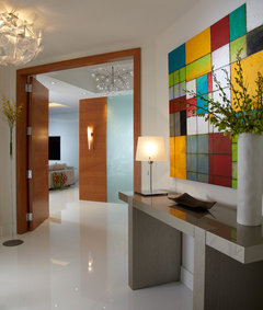
    The console is very modern. The fireplace you posted is traditional. I'd keep it simple and clean. The fireplace below goes with your style and wouldn't be so overpowering in the space. I'm also posting a few pics with ideas for art over the console.


    NY Loft · More Info


    Maywood Ave. Home, Ann Arbor · More Info


    Living Room · More Info


    By J Design Group - Modern Interior Design in Miami - Miami Beach - Contemporary · More Info

  • 10 years ago

    Paint the fireplace a right white for the room.

  • 10 years ago

    to me you have a very odd mix of very modern and very traditional but that is just my humble opinion and you need to be happy in your house and make it yours!

  • 10 years ago
    ya. House was very traditional when I got it 2 years ago. updating one thing at a time. Need to update fireplace, kitchen cabinets, kitchen floor, railing, etc.
  • 10 years ago
    Didn't know the fireplace I posted is traditional. I thought as long as it's not all red brick it's modern. Will look at the designs suggested or simply paint it white.
  • 10 years ago

    Isn't it "all red brick"? Some like it, and don't change it. But in your room, seems a good idea...

  • 10 years ago

    I think the new art is too big above the console but I do love the art, I agree with HIWE... I'd move the console slightly so the art isn't directly above it. Then it should fit better : )

  • 10 years ago
    It's big, but I love it too. Will move the console a bit.
  • PRO
    10 years ago

    You a you can really save a ton of money if you just paint the brick fireplace out a soft white and paint the mantle a soft gray...


  • 10 years ago

    Have fun finding the right " white " for the fireplace...soo many choices.I agree with a warm gray mantel as I see you have some accent pieces in gray as well & the gray in your new painting. With that in mind I would paint out the frame on the picture above your fireplace to another gray but not the same gray as the mantel. It's coming together nicely, thanks for updating us.

  • 10 years ago
    I'll probably do a mixed pattern of white and off white to match, not bright white.
  • 10 years ago

    something like this. Someone photo-shopped it for me.

  • 10 years ago

    or a more expensive style like this one.

  • 10 years ago

    In one way, I see keeping the brick and its texture, because wall-to-wall carpeting has none.

  • 10 years ago
    True.
  • 10 years ago

    Yes, but the whole wall.

  • PRO
    10 years ago

    Like them both..first whitewash looks nice saves money but still has a traditional look.....second one is gorgeous if in your budget I would go for it!!

  • 10 years ago

    Just thinking that $200 is, well, I won't use the word cheap, but try going to a gallery with original works and prints by the same artist as the originals. $200 won't get you very far. You might think about one of the prints from the National Gallery of Art:

    https://shop.nga.gov/category/5100/prints/prints-posters/1.html?all_results=1

    Some of these are a pretty good size (I'm attracted to Van Gogh's "Flower Beds in Holland" or the Kandinsky "Improvisation" for you), and you can afford to have it framed nicely!

  • 10 years ago

    Does the second one fit the style of the house.......

  • 10 years ago
    will paint it first. if I don't like it, I can always cover it up with tiles.
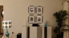
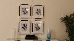
  • 9 years ago
    Trying out another set of pictures instead of the large canvas. Any thoughts? Looks like they are leaving a lot of empty space on the wall.
  • PRO
    9 years ago
    Not really crazy about it. Sorry.
  • 9 years ago
    Do you like the large one better?
  • 9 years ago
    last modified: 9 years ago

    Scale and proportions are wrong. It might work with 6. The items on your console, are also oddly spaced. I'm surprised you are still working on this.

  • PRO
    9 years ago

    I think they would look better if they were a set of 4 larger Horizontal pictures for some reason seem to tall and skinny...I thought the over sized canvas was kinda interesting...looked much better.

  • 9 years ago

    Did you try moving the console off centre to try it with the large canvas art?

  • 9 years ago
    yes I did.
  • 9 years ago
    Thought I would try one more set of pictures. Like the canvas look better also. Thanks for your input. My hubby liked them, but I was in-between.
  • 9 years ago
    The best proportion and size posted thus far for your console, was from Liz Duer Studio. I would strive for that.