Software
Houzz Logo Print
jennlehr

15 years ago
last modified: 15 years ago
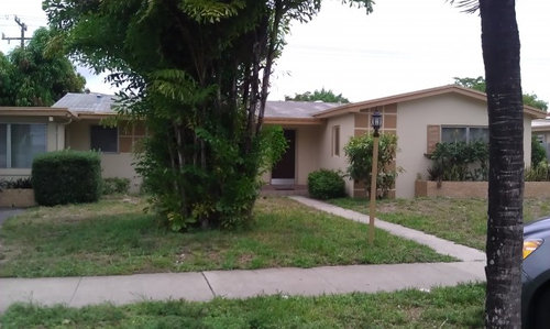
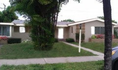
What color to paint the house trim: Need help with Exterior house paint color. This is a rental and we can only repaint the trim color (which nauseously is called peanut butter) THe base color is like an almond butter color with a yellow value but sometimes when i stare at it i notice a pink value, its weird. FIrst, what color accent would you use? second would you do all the lovely squares one color or use three complimntary colors, thirdly. we need to leave the roofline painted in that horrible gold so it needs to be something that will marry with that pallette. We were thinking a taupe/mushroom. a soft sage, or stone/parchment .... please advise...

Comments (45)

  • PRO
    15 years ago
    Where is the house? If Florida (which it looks like it could be), something bright would be nice. And before painting anything the bushes, etc. all need cleaning up, trimming and removal.

    Have fun!
  • 15 years ago
    I agree with bud_dietrich. If you could convince your landlord to (or permit you to) at least remove the bush in front of the verticle squares and the replace the taller bushes in the above ground bed with ornamental grass or something similar, that would have a dramatic impact on the overall exterior of the house. Once you have done that, it might be easier to get a feel for a trim paint color that would make the house standout.
    Good luck!
  • PRO
    15 years ago
    cruise on over to the benjamin moore site and look at their exterior idea books for color ideas on what might go with the beige color. I suggest keeping the trim you can paint all one color, particularly since you are limited in what you can and can't paint.
  • PRO
    15 years ago
    Maybe you could paint all the accents white. Also, the shutters are 2 different colors. I think if you paint the trim, all the shutters, the door(?) and the light pole white it could give it a clean look. Then, as April mentioned, go for the landscape! Trim-trim then you could color it up with a few brightly colored flowers. Have fun & Post afters please! :)
  • 15 years ago
    Thanks everyone. its been pouring here so haven't been able to prime the trim even. I think once we prime all the gold trim white, we will get a better sense of what the base color is. Of course we are going to pull out all that awful brush and replant the planter boxes. My basic question was if this base color is like a nut butter color would you go lighter or darker on the trim accents. we want to keep it neutral. my other quest. was do we do a pallete of neutrals on the squares or keep it one color. thanks for all the imput
  • PRO
    15 years ago
    Ok, so this might possibly be the worst retouch job I have ever done...but I wanted to show you the white.
  • 15 years ago
    thnaks. i couldnt do that correcty on the computer as hard as i tried. It looks better already. its those darn sixties squares that will be the focal point. i agree that once we lighten up and neturalize the trim color the base color will look totally different. thanks for your input!!
    so you think the door and trim work there should be painted the same as the accent color we choose?
  • PRO
    15 years ago
    You know, I thought yes but looking at it no...you? I do like the roof trim light. Maybe your sage (meduim) on the shutters etc and a really really light almond/cream on the trim?
  • 15 years ago
    that sounds great. I have to ask again if we can repaint the roof line. i was thinking the squares, shutters, door and planter boxes and lightpost would be enough to offset the horrible trim. the pallette we picked is a sage, a stone,(off whitish, grey) and a mushroom(taupe with a green value) we will have to prime it first. and then get a feel for it i think.
  • PRO
    15 years ago
    Post Pics of after-I would love to see what you create :) Have fun!!
  • 15 years ago
    Thanks so much for all your help. As soon as it stops raining we will get to it!!
  • 15 years ago
    btw we love the flowers you put into the planter boxes!!! Off to Home Depot we go to buy impatience!!!
  • PRO
    15 years ago
    A dark red or a dark - almost black green looks nice w/stone exterior colors - depending on your location. "Sayward Pine" from Ben Moore is a great trim color.
  • 15 years ago
    Since they're there, I have decided to like the accent squares. One color. Every now and then you can entertain the neighbors by painting one a slightly different tint... ;)
  • 15 years ago
    thats what i was thinking.. thanks
  • 15 years ago
    If you could remove the bush in front of the 60's squares altogether, you could do a beautiful climbing flowering plant (think bougainvillea or clematis or climbing hydrangea) on an iron support. It would totally hide the squares, esp in Florida. There are also 'living wall' frames that you can purchase (and take with you eventually) that would make those areas green and interesting. http://www.PlantsOnWalls.com/default.asp Good luck!
  • 15 years ago
    what a great idea. thanks. ill look into it
  • 15 years ago
    I do like the white post-modern roofline. Perhaps a stone grey or similar for the accents as well as the squares? Are you able to paint the planter box also?
  • 15 years ago
    if it were me, I would do those tiles in 3 different shades of white or cream (or both), and the house trim in one of those colors with Burgundy shutters. Just a different approach to color. :o)
  • PRO
    15 years ago
    Paint those blocks all the same color and close to the color of the home so it blends in and perhaps disappear. I think getting rid of them would work best, but since its a rental, that may not be an option. Paint the shutters and trimmings white. Good luck. Hope I helped.
  • 15 years ago
    Sage green or cream.
  • 15 years ago
    thanks everyone. sunday is painting day!! i will let you know how it goes
  • 15 years ago
    I have an idea that will make this the jewel of the street.First,you want to enhance that almond butter color,make it your friend.You have two choices.First one,a semi gloss black,or a deep aqua blue.These tones will cool down the almond blah color.Next,the squares,keep simple.Paint these a medium aqua blue,with a short boxed hedge in front of them,then ask if can have in-ground lighting installed,to show off the squares at night time.Next have all the shutters paint out the almond color,as well as the planter box.In the planter,have,say white,or yellow roses put in,along with tall grass,both easy to take care of.Next,have the lawn refreshed,trim out the trees,& clean up all the other plants,install a cement border around tree,painted out the dark aqua color.The landlord should also take care of the sidewalk,say a tan flagstone,& the door,if the aqua roof trim,one tint lighter,in a gloss finish,if black roof trim,then paint the door in the deep aqua blue gloss.These colors will update,& give the house some life again,which will please the landlord,& you.Goodluck!!!
  • 15 years ago
    thanks for your input. we cleared away brush today and will replant the planters on sunday> i think roses might be too high matenence but ornamental grasses should do the trick and maybe in one some colorful impatience. its florida and hot here so watering is always a challenge. I like the lighting idea, and we did have plans to plant a little cirlce around the tree, but i was wondering, do you think its better around the lamp post instead. (we of course are going to change that fixture on top)
  • PRO
    15 years ago
    A slighty creamy white trim such as BM Navajo White would look nice then make the accents in an BM Templeton Gray HC-161 and front door in BM Knoxville Gray HC-160. I suggest embracing the mid-century squares and removing the shutters. Look more toward Eichler designs for inspiration.
  • 15 years ago
    i don't know that i can really suggest anything more than the other posters, but i have to tell you that i laughed and laughed over the "nauseously peanut butter" comment!!!
  • 15 years ago
    Please come back and post a photo of your progress as you go!
  • 15 years ago
    mousemaker I laughed too when i saw the Behr paint chip labelled Peanut Butter, and i said Yup thats it!! Banana Cream with Peanut Butter accent!
  • 15 years ago
    I would paint the trim a burnt orange or terra cotta and paint the front door 'aruba blue' (Benjamin Moore).
  • 15 years ago
    The shutters need to go. You should be able to reinstall them if you move. I would paint the front door a warm color-something with reddish tones and the accents the same color or a shade lighter or darker than the rest of the house.
  • PRO
    15 years ago
    It is notoriously hard to evaluate colors online, especially beiges. But it appears from the photo that your base color is a pinky beige. If that's the case, only cool colors will look good against it: i.e., colors that do not have noticeable yellow tones to them. Blues, grays, plums, cool browns, blue-reds, cool off-whites. Watch out for green, it will only make your body color look even more pink.
    I do like the idea of the shutters and fascia being a different color than the squares. Choose a couple different color palettes, and mock up LARGE areas of the house. Apply one scheme to one side, another on the other side, then evaluate.

    I'd say embrace the 60s mod style rather than fight it. Look for era-appropriate light fixtures at Rejuvenation.

    It also feels like the house wants to go a bit more tropical. Put a splash of something fun on the door, repeat that color in a flower or a pot, maybe stick a banana tree in place of the squared-off shrubs on either side of the entry. I'd probably remove the bush in front of the squares, if the landlord allows.
  • 15 years ago
    Hi:
    What do you think of painting the squares and the shutters different shades of goldenrod and farmhouse yellow. Yellow is such a happy color. And then keep the flowers and plantings in shades of pink, fuscia, coral, and a spot of red. (The yellows need to be rich and buttery: no pastels and no greeny yellow. Keep it in the rich, warm and golden hues. ) On this house I wonder if the taupes and the grays would be a bit ordinary.
  • PRO
    15 years ago
    I agree with those who have said to embrace the squares - they definitely are original/age-appropriate to the house. The shutters, however, are not. They are "colonial" and the house is mid-century modern. As far as a color scheme, beiges, either towards the grays like taupe, or towards the warmer neutrals like camel, pair beautifully with aqua tones. Again, I would play up the age of the house and paint the trim either a pale aqua or a brighter aqua, depending upon how adventuresome you are. You could keep it more monochromatic with a deeper, gloss aqua on the door. Or, I think it would look interesting to do the door in a bright orange and do a section - 4 squares together - in the same color or maybe a shade lighter. Also, I would recommend replacing the light fixture on the post with something more contemporary. Something like this could work http://www.lightinguniverse.com/post-mount-lights/quoizel-jo9010ib-jonathan-large-post-mount-light-imperial-bronze_g640520.html?linkloc=cataLogProductItemsName. Add some large, oversized address numbers on the house and it can be a knockout!
  • 15 years ago
    terracotta and teal might work with it. The terra cotta would play to the pinkish shades if it was the right one and then the teal is a great contrast color.
  • 15 years ago
    Well we have made a lot of progress. We have painted the squares in the following colors. sage green, stone, and mushroom. the shutters were done in the mushroom. the last thing to tackle is the planter box. What color do you think? Stone neutral (blend into the house) slightly diff shade than the base color of butter. or the dark mushroom to match the shutters (we couldnt take them down) or the sage (my feeling is bricks arent naturally sage green so...) suggestions please!!!
  • 15 years ago
    last modified: 15 years ago
    The house is looking great!! The planter paint same color as the shutters. A couple other items. First if you have not painted the door yet, do it in the sage green, as it will give a nice cool feeling to the house. Below the window next to the door, an easy way to clean up that area, & take away the plain look, is to put three or four terra cotta or cement planters, paint them same colors as the squares on the house, plant small citrus trees in each one. Say like a lemon, lime, orange.These are easy to find at a garden center, & since you live in a tropical area,i t's a way to have fresh fruit nearby, & when you move, they can move with you. Also a nice topper over the soil, is to put crushed rocks & shells in same colors as house, & or plant small flowers under the trees in the pots. Next, put in led garden lights behind pots. they will give a bit of distinction, & security in the evening time. Also if the light post cannot be replaced, paint the whole fixture sage green, same as the door. This will connect it nicely to the house. If you can have it replaced, use a simple mcm, early american type. Square sided, slight taper toward the bottom of the fixture. Once in, paint the same sage. Make sure the glass of the glass is frosted, as it is easier on the eyes in the evening, & shows less dirt, or other items in the air. And also, all the plants around the house, & yard, help to cool the house down in warm weather, they're for lowering energy costs as well. And from your photo, the squares look like mosiac tile, the way you painted them out. Very nice!!!!!! Hope some of my ideas can help you out, & have fun as well.
  • 15 years ago
    thanks for your help. i thought we should do the planter same as shutters. we will post the update tomorrow. BTW i have done all this work myself, never painted before. (a house at least!!) er bought new light fixtures for the post and the entry in nickel finish. a modern squarish look (no more "bewitched" lights) we will try to put them up tomorrow.I am waiting to see what the owners agree to on the front entry, it really needs complete removal and replacement. so we have to wait on an answer for that. so now i have the pole painted a buff/beige color to make it dissapear. Do you think it should be sage ? the area under the kitchen window is annoying. its too narrow to put a bench or seating there and it puddles with water, and is painted a horrible green color. we could paint it but thinking of some other kind of DIY project for there. I am going to plant around the lamp post. Probably tomorrow. will keep you all posted. thanks so much for everyone's input!!!
  • 15 years ago
    Hello,the new lighting you bought sound's great!!! I had suggested the sage for the lamp post,for it will blend well,& now it will look rather modern with the nickel finish.If your outside entry is cement,paint it,but ask the person you are buying the paint from,what's the best,and a finish that is not slippery,in wet weather.In the entry,if you have a storm,or screen door,you could also match the frame to your new light fixture's,or paint it the same color as the front door.And also,since the area below the kitchen window sound's like a dump,put up a modern looking trellis,painted the sage green,& put a shrub of some type,to grow though it,& plant the trellis longwise into the soil,& use bracket's to mount on the wall.Then as I suggested before,put large pot's in front of this,if you don't like the miniature citrus idea,try some palm in the pot's,Also the pot's will help with the water problem.And for the seating use a couple of butterfly chair's,like in a aqua color.They all so comfy,and still give's you that mcm look to the house.You can find online,by putting in butterfly,or Hardoy,the original designer's last name.You can find the fold up one's also in store's,but the wrought iron non-folding chair is more sturdy,& will out live you.Hope these idea's will help you more,to make your house a home to enjoy.
  • 15 years ago
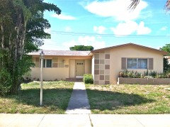
    WELL THANKS ALL!! HERE IS THE FINAL REVEAL.. we had great fun. did all the work ourselves, and this is what we learned. Paint is a different shade on wood than it is on stucco!!!
  • 15 years ago
    Hi @jennlehr, this looks great! I love the spectrum of tan squares you incorporated. I especially love the new front door! Thanks for keeping us in on all of your hard work.
  • 15 years ago
    K so since i'm a bit OCD, do you guys really like the green door? i think because the shade is different than the stucco it stands out funny. Should i repaint it? perhaps the taupe or light stone color?
  • 15 years ago
    You're standing right in front of it so you have a better view, but from here, I think the green helps detract from the "peanut butter" color you wanted to neutralize. I think if you didn't have that accent, the focus would go back up to the roofline.

    But maybe now it's grown on you some?
  • 15 years ago
    well i will live w it a few days and see, i think the shade is off. meaning its not a nice sage green like the stucco squares, its a more yellowy bile green!! i may paint it over again..
  • PRO
    15 years ago
    Green door needs to be deeper color to make it more of a focal point. I agree that it needs to be grayed down and less yellow.