Software
Houzz Logo Print
maries1120

Benjamin Moore Brandy Cream, Sonnet, or......

10 years ago

I'm starting a new thread since the search for the perfect color changed quite a bit from the original one of an off white. Maybe not drastically but now I am looking at colors with a little more depth to them than before.

After many, many sample boards we are looking at Brandy Cream but then I tried Sonnet and thinking this could be a better option.

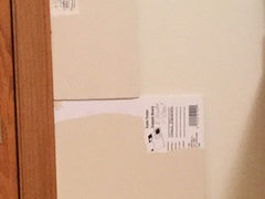
What I've learned is how things look on the little paper card is not always a good indication of how it looks in the room. For some reason we have a slight green cast in this room that shows up with the off white/creamy color paint.

Brandy Cream looks a little too pink. I tried an adjusted version with a little less red but it was too close to Muslin. I liked Muslin but a little too warm/peachy. I think I need that ever so slight pink to counter the green cast but don't want it to be too obvious. I was going to have the sample of Brandy Cream adjusted to put a little more red back in to see how that works. Amazing how a little drop makes such a difference.

Anyway, out running errands and had HD mix up Sonnet and this also looks like an option. The board I painted looks a little more gray but it doesn't look gray at all in the room when I hold it up on the walls.

The carpet is kindof a taupey color (maybe a bit on the warmer side) with some brown and rust in it. I had a photo of it on my other thread although it wasn't the greatest and didn't really give a good representation of the color. Furniture is oak.

Anyone have experience with either of these colors? Or did you try these and go with something else? I know every room is different with the light and other things.

Thanks.

Comments (26)

  • 10 years ago

    Take a look at BM York Gray.

    maries1120 thanked User
  • 10 years ago

    I can post some pics tonight. There are 2 windows - one facing south and one west. Northern climate so, other than weekends, not a lot of natural light. Summers blinds and drapes can be closed to help the AC.

    Bulbs in the room are halogen.

    Brandy Cream is a little too pink which is why I am adjusting it. However, it does look pinker on the chip than when I hold my painted sample up.

    Tibbrix - I will take a look at York Gray. Sonnet was a big surprise to me from how it look on my sample board compared to seeing it in the room.

  • 10 years ago

    Sounds to me like you might benefit from a warmer color? a tan maybe?

  • 10 years ago

    Definitely a warmer color but not too warm. So the pinky ones are warm and seem to be a little better than more yellow warms but I don't want the pink to be obvious. I haven't had luck with peachy ones either. I was hesitant on the pinky undertones but it seems to help minimize things looking green. I like Muslin but it seems to go a little khaki-looking in the room.

  • 10 years ago

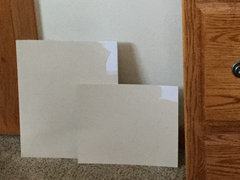
    Here are some pics

  • 10 years ago

    Brandy Cream and BC with less red

  • 10 years ago

    Muslin and Muslin 75%

  • 10 years ago

    Double Sonnet, reg Sonnet and double White Mocha (Behr color)

  • 10 years ago

    I don't think these photos do a good job representing the paint colors but would appreciate any suggestions or thoughts on these.

  • 10 years ago

    maries1120 thanked Hockeymom84
  • 10 years ago

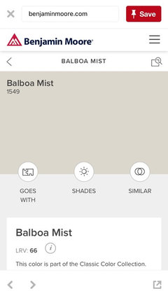
    Hockeymom- have you used Balboa Mist? It looks more gray on my iPad. I was playing with Muslin this morning and have those drying. I now have at least 40 sample cans. Is that a record?

  • 10 years ago

    I have not used it but it definitely more beige on my iPhone without leaning yellow or pink. I know others here have used it.

    I have heard from several people that it is better to choose a true color rather than mess with formulas because you will not get a match for touch ups later. Something to think about.

    40 is a lot and is probably cluttering up your mind rather than clarifying.

    Existing wall colors will further muddy the colors you are looking at.

    I don't think these beiges are playing nicely with your carpet to be honest but again that could be monitor differences.

  • 10 years ago

    The color specialist was here and liked the warmer colors but I like the warmth to be more subtle. She thought the Brandy Cream and Muslin were the closest so we have been playing with those. Than I added Sonnet and some others I played with. The colors weren't photographing close to what they look like.

    the store keeps the formula and I never plan to repainted once the color is right. Most of the cans were one try and a definite no for being too yellow or orange or pink.

    Ill check out Balboa Mist.

  • 10 years ago

    I feel for you- I don't know how many beiges I looked at before I took the leap and did Shaker Beige (and I absolutely love it in my kitchen/family room). I several different beiges in various rooms and I often wonder if I had just used one, if it would have been a mistake.

    In any case, for what its worth I think I like the muslin.

    maries1120 thanked User
  • 10 years ago

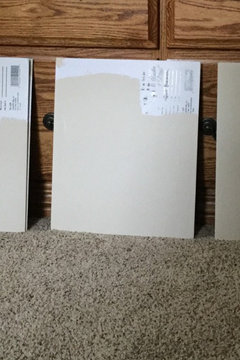
    These are my modified Muslins

  • 10 years ago

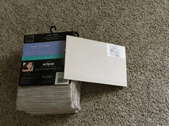
    This is Sonnet with the curtains I am looking at and against the trim

  • 10 years ago

    I like Sonnet in the bottom pic but it looks a little pink in the top pic. Has anyone used Sonnet? Maybe a drop of yellow. This paint color decision is making me crazy! I can still see a green cast with many that are lighter like Maritime White so it is either lighter with a pink tone like Sand Dollar or something a bit deeper but then trying to find one that really looks neutral - or neutral enough for me and still more beige than gray. So far Sonnet seems to be the closest or one of the Modified Muslins.

  • 10 years ago

    Any opinions on Sonnet?

    Painting (or re-painting) is being done Nov 9th so I have until Monday (11/7) to decide. Gulp!

  • 10 years ago

    Stopped stopped at the paint store and this is the one they like the best. It is a combo of Muslin and Sonnet

  • 10 years ago

    Here here are the 2. Bottom looks a bit khaki and top maybe needs a little warmth. Thoughts?

  • 10 years ago

    With monitor differences it is impossible to see what your seeing, you keep changing formulas so no one has seen in real life what you are mixing and there are no pics of more of the room so lighting is impossible to tell.

    they all sort of look the same at this point.

  • 10 years ago
    last modified: 10 years ago

    Only the one is a mix. The other color is BM Sonnet. I would think some have used that color. I can't paint the colors on the wall so this is the best I can do. Thanks anyway for trying.

  • 10 years ago

    I like the Sonnet. It feels warm, but also weightless.

    maries1120 thanked powermuffin
  • 9 years ago

    Just ran across this post, as I am looking for something in the Muslin / brandy cream family. What did you decide to do ?!

    maries1120 thanked Julie Locati
  • 9 years ago

    We went with Brandy Cream the 3rd time the room was painted. A lovely color but we still have the green issue. It is the room not the color. Brandy Cream has enough color that it isn't white but was still soft and creamy. But chech these out in your space since lighting and other factors will make the color unique to your room, Wednesday the room is getting painted for the last time and we are going darker. The new color is Bar Harbor Beige but 25% lighter. Probably not that much of a difference but DH thought BHB was too dark. I am not seeing green in my sample areas so my fingers are crossed that we solved the problem. Muslin and the colors on that strip seemed a bit more yellow to me.