Software
Houzz Logo Print
dancewithme

Baffled over Bathroom

9 years ago
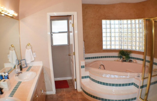
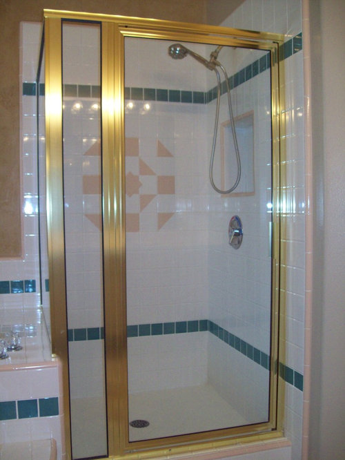
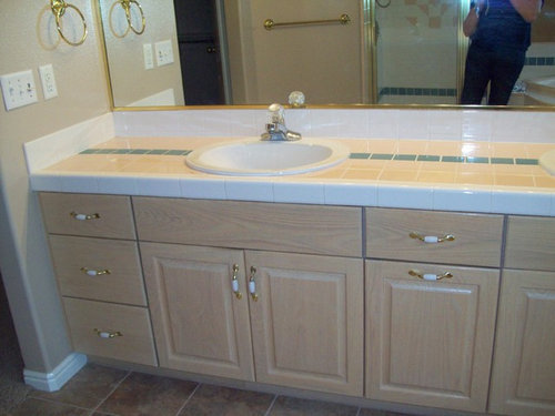
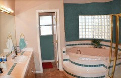
Bought a 20 yr. old house earlier this year (out of state), which we have rented out until we sell our current house and can move. We will repaint all the walls before we move in, so I'm trying to make a color plan, with specific shades to be determined when I can see samples there. The master bath is a room that has me a little baffled. Here are a few pictures:

I find all that brass quite jarring on the eyes, but may have to live it for a while. I do plan to darken the cabinets; I'm thinking maybe a dark mahogany gel stain. But...what to do with the walls? Can't stand pinky beige, and don't know what that color is around the tub, but there is some kind of texture there.

Should there be one color for all the walls, or a different one around the tub? Do I need a shade of green on the walls, or would a coordinating color be best? Never had any green rooms, so am not sure I could love it.

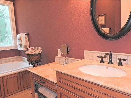
Here is a picture of my current guest bath walls in BM Tawny Port. Do you think this, or a similar color may work with both the green and the pink? What about some type of fabric window topper in a green stripe, or green and rose floral print?

The vanity lighting is horrible, and while I enjoy all the reflective light of a long mirror, I guess it will have to be removed, because I'm determined to have vertical LED lights, with no over-mirror light.

By the way, in case the bathroom colors should be compatible with the master bedroom - I'm hoping to use BM Stratton Blue on those walls, with a gold loveseat, and bedspread print of gold, sage green, and light blue.

Thanks in advance for any and all input!


Comments (21)

  • 9 years ago

    I would keep it as simple as possible - one color for all the walls. You already have quite a bit going on in that bathroom. I'd probably go with a pale gray.

  • 9 years ago

    Thank you - simple sounds good!

  • 9 years ago

    I have what looks like the same pinky beige tile in my 1978 bathroom. We painted the walls BM Ice Cap, a gray/blue, and now the tiles don't have a pink hue anymore. MUCH better!

  • 9 years ago
    last modified: 9 years ago

    Thank you, pipiep, I like that wall color much better than my pinky beige walls.

  • 9 years ago

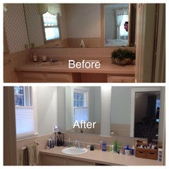
    Here's a before/after pic. The wallpaper had pink and blue, which made everything look so completely pink. Even just taking down the wallpaper made a huge difference!


  • 9 years ago

    That really did make a big difference! The eyes are really drawn to the bright, crisp walls. Maybe that's all I need, with some green towels.

  • 9 years ago

    I just went through a similar discussion on how to deal with pinkish kitchen counters.

    I'd go with a white that's the tile color or a beige/gray.


    http://www.kylieminteriors.ca/how-to-neutralize-pink/


  • 9 years ago
    last modified: 9 years ago

    You've gotten good advice.

    A warm wall color will accentuate the pink hue of the room, so going away from that will help you get rid of the pinkish hue. I am a fan of strong colors...bot all are...but a strong color related to the dark tile; blue, green, blue-green? That'd cause the pink to recede.

    If you want to change the color of the brass shower frame, you can do that with spray paint. Remove all caulk, sand the metal frame of the shower surround down to de-gloss, clean it with TSP, mask it off, then repaint with a metallic spray paint. Rustoleum has a good selection in spray cans. Cover with several light coats, almost misting coats. Don't try to get opaque coverage in one coat or you'll almost be certain to end up with runs here and there. Recaulk.

    You can do the same with the brass towel bar and rings and other brass hardware.

    The sheer volume of tub tile can be toned down and hidden with potted plants or a stack of folded towels, etc.

  • 9 years ago

    Mongo, thank you - and you've all convinced me that the Tawny Port color will only emphasize the pink. Initially, I was influenced by the idea I've always had that white walls are "boring", but I think I can see that it some situations, it is the best choice. The floor color and darker cabinets will provide some contrast, and as you say, I can get some color with towels and greenery.

  • PRO
    9 years ago

    I would paint a dark shade of the blue tile. I think the bold color catches your eye and makes other things less noticable. jmho

  • 9 years ago

    mdin, you know, this is the kind of pow I was hoping would work. The tile is green, but may have a bluish base to it. I have been so wanting to use teal in the house - I do plan on using it for the dining room walls. I guess my final decision will have to wait until our renters leave and I can get into that room again. I would love it if something like that shade would work! You don't happen to know what color it is, do you? I've got a long list of BM teal colors I want samples of.

  • 9 years ago

    Perhaps if the color is vivid enough, it would carry more weight and draw attention away from the less saturated, pastel pink. Not that I even hate pink; I would just like the colors in the bathroom to work well together, and hopefully even be sort of pretty!

  • PRO
    9 years ago

    Sorry, no idea what color it is. However, I think it's more important to work with the tile color. I'd look for that color or shades darker.

    Learned how dark walls can grab attention when I painted my kitchen a very dark grey. Everyone compliments it before they notice my great inset cabinets & awesome drawer pulls.

  • 9 years ago

    Right - and I'm happy to think I may not have to rule out a dramatic color. Can't wait to get in there and try it.

  • 9 years ago

    I agree with mdln, a dark wall might look really good in that bathroom. Too many people are afraid of color. It doesn't sound like you are.

    The best way to find if a more dramatic color will work would be to paint a sample color on a poster board which you could move around to different locations in the room. This will give you a better idea than just a swatch on the wall.

    I love the colors teal/blue green. The outside of my house is a blue green color and so is my master bathroom. The granite in my kitchen is Verde Peacock which has splotches of blue/green in it.

    On line it's hard to tell exactly the blue/green color of your tile but you should be able to find a close match in a paint color. Remember to look at blues with green in it as well as greens with blue. It can make a difference in finding the right color. I found that out when looking for a blue/gray color. I had picked a blue/gray color and without doing up a sample board, I had the painter use it in my lower level. It was not at all what I wanted. The painter adjusted the color and painted another coat but it still wasn't right. He's told me to look at grays with a little blue in them. Third time was the charm.

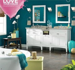
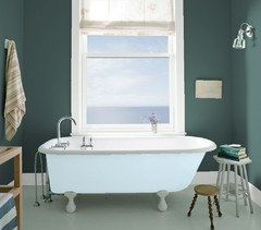
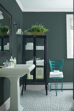
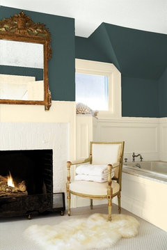
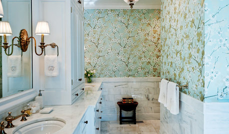
    Just for fun I chose a Benjamin Moore color and tried uploading your bathroom picture to their visualizer tool. It didn't work because of the picture size so I just added the color to the bathroom pictures they had. The color is called Hidden Falls. I think it looks fabulous on the walls of these bathrooms. I did not attempt to change any of the other painted areas of the bathroom.

    Good luck trying to find the perfect color for your space and be sure to post a finished picture.

  • PRO
    9 years ago
    last modified: 9 years ago

    Like that color. May have just the place for it. ty

  • 9 years ago

    Beautful! I might need that chair, or have to lay in the tub just to stare at the walls! Thanks, badgergal, for taking the time to find and post the pics; I'm adding that color to my list. I'll definitely post a photo when we move and I make any changes.

  • 9 years ago

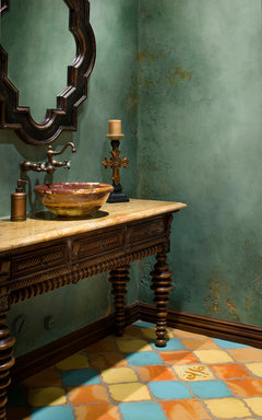
    Maybe I'll do this - green on the tub walls and toilet room only. I don't think I want green reflecting onto my face when doing make-up, but green in a towel and some art above could work. I do like the rich green around the tub, perhaps textured something like the second photo.


    Villa Mia Italian · More Info

  • 9 years ago

    The color in your mock up looks great. If it were my bathroom I would just use that color for the whole room. You have the tub area a different color in your current setup and it seems to break up the room and put too much emphasis on the tub. In my opinion in will look more cohesive if you use the same color throughout. I'm not sure about the texturizing. The example you show while very nice does look kind of "old world" and elements in your bathroom don't look at all old world. The texturizing might look out of place.

    Good luck in the figuring out exactly what you want. Be sure to pictures when you are finished with the project.


  • 9 years ago

    More good points, badgergal. Thank you for sharing