Software
Houzz Logo Print
felicedecorate

Desperate for paint color help!!

9 years ago

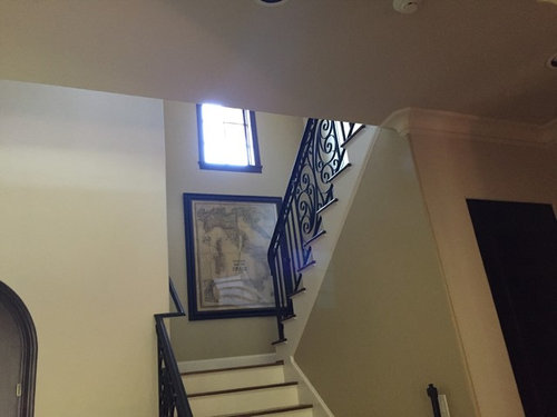
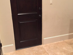
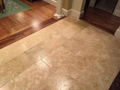
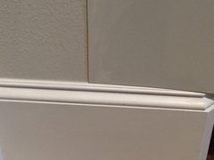
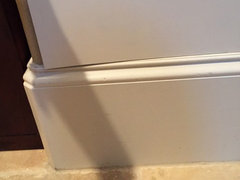
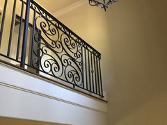
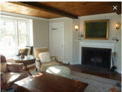
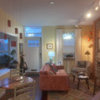
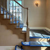
I just can't get our foyer paint color right!! I welcome your suggestions... the current color is SW sand beach, what the builder put in. It has always looked dreary and dirty to me. You will also see in the photos my previous misguided attempt to add accent walls to "brighten" it up -- don't even remember what color, but a beige color. If I went with all walls this beige, it feels too-- saturated, maybe? I know the accent walls were a mistake and would like to do one soothing neutral in the whole space. I tried painting poster board samples of SW Wool Skein (which ended up looking almost exactly like Sand Beach and feels chalky and dirty to me again) and SW Moderate White, which is the trim color, which I think could be okay but might have a pink undertone-- which I am ok with but not sure if it works with the travertine. The travertine, super textured walls (which is what I now think is contributing to the chalky, dirty look) and dark wood are all pretty bossy. Please, please wonderful GW folks, I am definitely a novice in desperate need of your help!! Also, I know many of you are non-pros with an extremely good eye and amazing taste-- I am not, and would love your advice!!

Natural light

Comments (34)

  • 9 years ago

    A few more photos

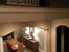
    At night with lights on

    Continuous with dining room in SW Willow Tree, which I really do love, so I know I need to complement that color too (I guess another bossy element....)

    Wool Skein on poster board (I think the smooth texture of the poster looks different than the paint on the wall)

    Moderate White

  • 9 years ago

    It's hard for the photos to convey how dreary and blah the color feels. I don't know if it is more the texture than color

  • 9 years ago

    I actually think it looks very good , everything coordinates well. I don't see dreary I see a calm neutral . I like the Willow tree also , would you like to add the willow tree in this area with your white accent trim? It would flow well . Certain colors will make travertine read pink so you do definitely need to be aware of that with paint choices . A buttery creamy yellow would go good with the willow tree and might give you a feeling of more brightness than what you have .

    G Sm thanked ravencajun Zone 8b TX
  • 9 years ago

    Maybe in person it seems dreary but in these pictures it doesn't. I had that in my last home. I always felt the "warm beige" color I picked brought the room down instead of making it warm and cozy

    G Sm thanked decormyhomepls
  • 9 years ago

    Thank you, raven!! Any creamy colors you recommend? I've definitely given some thought to Willow Tree everywhere though worried a color is too much (2 continuous stories) .

    I am kind of craving the look of Laura's recent post of her kitchen repainted with Capitol White, though I think that color may be just a bit too white for this space. Capitol White users out there.... any thoughts?

  • 9 years ago

    Yes, decormyhomepls, that is exactly it! When I took the pics for this post, I was a little surprised-- the color looks lighter and happier in pics than in person.

  • 9 years ago

    finding the right cream color is really hard IMHO. It took me about 20-25 different samples to find the right one in my last house. I almost gave up. I am so glad I did not.

    I had DH prime big patches of the walls so that I could paint the colors right on and see it in the light. and then he had to do that about 3 times! either they were too pink, too grey, to brown, to orange to blue, etc.

    I used BM though, so I don't think any of my suggestions would be too helpful.

    G Sm thanked Boopadaboo
  • 9 years ago

    If you want to head in a cream direction check out BM Mascarpone. I used it in my mom's north facing dining room (one window) and found it to be a nice warm cream that didn't go dingy and played nicely with other colors. It will have some contrast with white (trim, etc.) I don't have a pic but found one on the web here: http://www.atthebeachwithkris.com/the-beach-house-part-ii Scroll down half way, there is an 'after' of a bathroom (yellow floor) and a bedroom done in Mascarpone. My real life experience was it looked more like the bathroom photo, the bedroom photo looks a little on the yellow side but that might be lighting or something.

    Also check out this one, the walls & floor in pic G are Mascarpone with the cabs in Simply White so you can see the contrast w/white and there are dark chairs similar to your dark wood against the wall: http://www.inthewhiteroompr.com/benjamin-moore/006/

    G Sm thanked Moonshadow
  • 9 years ago

    It seems to me in some lights like your cooler wall color is fighting your warmer tile. Do you get that impression in real life?

    G Sm thanked robo (z6a)
  • 9 years ago

    Robo-- yes!! Sand Beach has always looked gray or green to me (cooler). I can't pinpoint the travertine undertones, but it might be both yellow and pink (depending on the light and the stone's natural variations). Any suggestions on how to deal with that problem? I feel like if I go too yellow, it will fight with the pink and vice versa.

  • 9 years ago

    Beautiful home.

    What color is the opening to the dining room?(or is it the same color, different angle?))

    I agree with the suggestion of cream buttery yellow..since I have travertine(or so I think) myself, and buttery yellow seems to work very well. You have very high ceilings like I do now...while your current color doesn't seem dreary to me at all, I can imagine it doesn't bring enough ..coziness? I added a lot of warm accents, to an existing yellow, and went with a very, very warm floor, to bring the house down to earth so to say, and get that feel of scale that is more intimate. Gorgeous can be a bit intimidating..your house is very, very beautiful and grand, with columns and these amazing wrought iron balusters, and everything..maybe warmer color that's what you need to experience it not only as an extremely beautiful house, but as a safer, relaxing place.

    Doesn't have to be yellow; but what do you think about the warm color suggestion?

    PS none of your surfaces reads to me as bossy..the floor is quite an amazing mid tone, that will support any color scheme; the travertine is quite beautiful and subtle(and I'm not a travertine fan, usually)..depends what you compare it to of course. Very textured walls? They might be "orange peel". It's textured-but it's the lightest texture of them all. Before that-just skim coat. I can't see the texture of course as well as you do.

    G Sm thanked aprilneverends
  • 9 years ago

    And the wood floors are slightly orangey but the dark doors have a bit of purple/ red. I can probably paint some of the dark wood the trim color to decrease the purple/ red but there is a lot of it sprinkled throughout the house, so I can't quite get rid of it all.

  • 9 years ago

    (I can't pinpoint the undertone of your travertine as well..on different pics looks different..but you're there..you think it's pinky-beige for example..while you don't want to mix pinky beige and yellow beige in hard finishes, yellow paint is not hard finish. It can work very well. Of course you'll need to try several until you get to the right cream, or yellow, or whatever color you choose to go with. They will also will behave differently in different homes and in different rooms too.)

  • 9 years ago

    Aprilneverends-- thank you!! I do like the idea of a creamy or warm color. Any suggestions? The kitchen/ family room that connects is a yellow-gold (BM Honeymoon) with the same Moderate White trim and cabinets in SW Steamed milk (same color strip).

  • 9 years ago

    Oh and the color of the opening to the dining room was my failed accent tan/ beige that I can't seem to remember the name of. I mean failed in the sense that I see now I never should have chopped up the color that way. The color-- whatever it was-- was ok but does also have a slight green-tan undertone that I think is not quite right with the travertine.

  • 9 years ago

    SW Creamy but I'd also sample BM Capitol White.

    G Sm thanked nosoccermom
  • 9 years ago
    last modified: 9 years ago

    no suggestions from me unfortunately, since in our current home the colors already existed, and we color matched..also I'm not sure you'll like them-they're a bit on a sunnier side..lets say they're more true yellows than neutrals. as for the new place-our GC highly preferred us to work with Dunn Edwards and it seems nobody uses it here. I also was dealing with a totally different house this time, so can't give helpful advice.

    I used Everlasting by BM in our current master bathroom, but it changes so much through the day I'm a bit afraid to recommend it..even though they all do. It's a wonderful warm white. That can go peach really fast in certain light-generally, in the mornings (which is helpful for applying make up I must confess, lol).

    But I did google a bit and found an article for you, about warm neutrals-that's quite a helpful blog that was recommended here recently, and I read some of it, archives and all..I think tibbrix mentioned it? I liked also how travertine is mentioned there too, right in the article. Here you go:

    http://www.kylieminteriors.ca/best-benjamin-moore-warm-neutral-paint-colours-yellow-and-orange-undertones/

    G Sm thanked aprilneverends
  • 9 years ago
    last modified: 9 years ago

    I love paint and trying out different colors...if you are leaning toward creamy yellow, check out BM Devon cream. It doesn't get a lot of "publicity" like some other BM colors (meaning if you google it, you will get very few results) but it is a great color. It is warm, creamy and clean. I've used it in my previous house, in my parents' apartment, my friend's flip house, using it again in my new house, etc.. I've furnished rooms with taupe modern sofas, gold drapes, dark woods, etc. Devon Cream sits very elegantly in the background without drawing too much attention to itself. It will look more intense when you paint a small patch on the wall than when the whole wall is painted. I will see if I can post some photos. Just FYI BM classic gray, horizon, gray owl, nimbus, balboa mist, linen white wouldn't work in your space. I've tried them all recently and they are not saturated enough. So they have a greater chance of appearing dingy. Good luck!

    G Sm thanked St561 W
  • 9 years ago

    Another vote for Capitol White. Sherwin Williams lists their Alabaster as a complementary color for Willow Tree so that might be another white to try.

    If you're considering a yellow, I'd suggest you work with a professional color consultant.

    G Sm thanked barncatz
  • 9 years ago
    last modified: 9 years ago

    This thread when I was looking for a cream color has a lot of good info from Lori on undertones. You might find it helpful. APologies the links to my pics are broken. when I moved I put them all in to a subfolder....

    cream paint saga - info and tips from funcolors

    G Sm thanked Boopadaboo
  • 9 years ago

    ah..not yellow at all, and actually I don't even know how to call it lol (I tend to like the colors I can't really define..first, they're complicated, second, I'm probably not lol)..but I'm madly in love with Kangaroo by BM. It's definitely deeper though...darker..it does change a lot, but I love all the incarnations so to say.

    I used it in our current master bedroom. Then wanted to paint next master this shade again, and had to play with Dunn Edwards colors to find something similar that would feel the same in a totally different room with much less light. Was not successful-I custom mixed it in the end. Couldn't replicate.

    It might be kind of a taupe?

    Anyway, it's a wonderfully sophisticated warm color. Not sure how it will work in a big space.

    G Sm thanked aprilneverends
  • 9 years ago

    "If you're considering a yellow, I'd suggest you work with a professional color consultant."-barnkatz, why? neutrals are actually very hard to choose, they're no easier than colors, they're more complicated I'd say..also some colors can play successfully role of neutrals, and few yellows can as well I believe..as long as it is a yellow you can find in abundance in nature..

    the process is the same-you think, look, try to narrow your choices, sample, watch..widen your choices again))(well sometimes)..

    G Sm thanked aprilneverends
  • 9 years ago
    last modified: 9 years ago

    (more than that-we already know that kitchen and family rooms are yellow gold, and it seems felicedecorate is pleased with the color. other choices look good to me as well. of course big space is very intimidating when you think about painting it..well. so you are afraid a bit more. it doesn't mean you'll do bad choice in the end. )

    G Sm thanked aprilneverends
  • 9 years ago

    Wow, such great suggestions! Thank you so much April, nosoccermom, raven , St561W, barncatz, and boopadaboo for the great links and suggestions.

    There are definitely many on those lists I'd like to try. Not quite sure how to do that without breaking the bank on samples though!

    April-- you are right, this large space is intimidating.

    St561-- thx for the list of "too dingy"!

    Boopadaboo-- if you do have a pic of your space, I'd love to see it!


  • 9 years ago

    Btw, finally remembered the accent beige I had tried-- Kilim beige-- a little too green and contrasts a bit too much with the neighboring Willow Tree.

  • 9 years ago
    last modified: 9 years ago

    Hi april, I suggested getting pro help because I think finding the right yellow would be be hard, harder than choosing the right white. She has to work with her chameleon pinky floors, a reddish undertoned dark wood, an adjacent green room and a chimney shaped room she feels is dingy when painted beige. I'm definitely no color expert but in researching colors, I've been told that yellow is tough to get right, e.g.

    "While few colors have yellow’s power to brighten and uplift, it’s not easy to pull off.

    “Yellow is absolutely the trickiest color to get right,” said Alexandria color consultant Jean Molesworth Kee." Washington Post article

    G Sm thanked barncatz
  • 9 years ago

    The green wall in the dining room looks nice. Would you consider extending that color in the foyer?

    G Sm thanked graywings123
  • 9 years ago

    Check out some articles online by Maria Killam. She is a color expert that goes into detail about how paint undertones can affect the rest of the room or other objects. Many people find her info to be very helpful!

    *I am not affiliated with her at all, but like some of her advise.

    G Sm thanked User
  • 9 years ago

    oh reading Maria's blog helped me a lot, definitely

    (even though last post, with its comments(including mine lol), was interesting but rather irritating..rip out this, drywall that..that's what happens when 80 percent of population does the same exact thing, and is extremely bored of it after 10-15 years. )

    barnkatz, thank you for the link!

    I don't know..maybe the hardest color to get right is the one you've never tried before, or tried less times? Because I'd definitely say that it's red))

    you never know. but the more you practice-the more you know about a color..and yellow happens to have less fans, generally. I've read this is because it has this tricky influence on you-it makes you happier if you're already happy..or lets say just fine. But if you go through sad time, or hard transition-it might trigger bigger sadness in you. So they avoid putting it in psychiatric hospitals, for example..As far as I remember.

    So it's controversial color by itself.

    I do know though couple people that love yellow most of all.

    Interestingly, I had every color of the rainbow in my top three favorites, one time or another..but it never was yellow. And I never thought of it until recently.

    Together with that- I like my current house's yellow..it IS very uplifting. Like it less in artificial light though. Looks like it's a very morning-afternoon kind of yellow..less light, or artificial light, and already something like caramel might work better.

    OK. All this to say: The most amazing book I've ever read was Janice Lindsay's book "All About Color"..recommended by Maria Killiam btw ..it's fascinating to a degree I find difficulty to describe.

    G Sm thanked aprilneverends
  • 9 years ago

    GW-ers, thank you soooo much!

    I have a hopefully not too dumb question-- I am looking to try something like SW Creamy (and a few others) but I noticed the LRV is higher (80's) than my trim (SW Moderate White, LRV 70's). Will that make the trim look dirty?

  • 9 years ago

    hm. look what i found. regarding yellow too. how interesting. sorry I know you want to try cream..just ties into previous discussion about yellow

    http://thelandofcolor.com/lrv-light-reflectance-value-of-paint-colors/

    frankly, no idea. i think the trim might look darker. not dirtier, just darker. but i hardly know anything about LRV..never looked at that.

    G Sm thanked aprilneverends
  • 9 years ago

    A lighter cream I love is Behr Hazelnut Cream. For something with a bit more color but not yellow, you could look at these Benjamin Moore - Ionic Column, Sonnet, Featherstone, or Ballet White to start with. It will help if you can narrow down the depth of color you want and the undertone in the floor. There are so many options. I think the Affinity Collection has many beautiful colors and neutrals.

    G Sm thanked maries1120
  • 9 years ago

    I looked at one of the links and saw Tibbrix living room in


    white sand by BM. It looks just perfect.

    G Sm thanked amykath