Shop Products
Houzz Logo Print
erica_hagen0

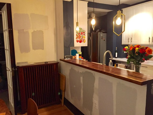
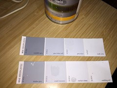
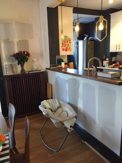
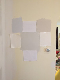
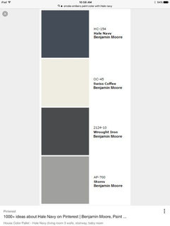
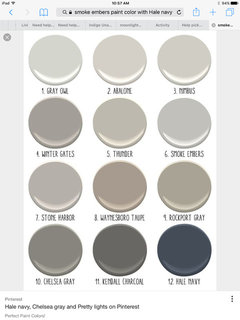
Help pick gray paint, cool or warm?

Erica M
7 years ago
I've posted about this before but I think I'm close now to picking a paint color for our dining room. Unfortunately every time I think of taking a pic it's dark out so these are only sort of representative.

Where I'm stuck is whether a cool or warm gray will work best overall. The colors here l-r are Ben Moore Metro Gray, Smoke Embers, Metro Gray 50%, and Light Pewter. Repeated above the radiator. We are leaning toward the lighter tones due to the room being small and without direct sun.

As you can see I have dark wood trim (which might be painted white but we aren't sure yet), the kitchen is white and navy (Hale Navy). To me, the light pewter is reading greenish while the Metro gray is reading blue. Having read a lot about gray and undertones I'm thoroughly confused which works for our colors. I don't want the paint to look too blue that's all I know.

Comments (26)

  • calidesign
    7 years ago

    Light Pewter (the farthest right on the lower cabinets and top right on the taller wall?) is the only one that looks like it will work with your blue walls, reddish wood trim, and warm floors. Does it also blend with colors in other rooms nearby?

  • PRO
    Beth H. :
    7 years ago

    if you want a true gray, with no undertones, you have to find one that is tinted only with black (no yellow, blue, red, etc). You can make your own with a quart of pure white and pure black. However, BM "Gray Cloud" is a light gray with only black. I know because I watched them mix it and I have it on my walls

    . It's a light gray. sweet innocence is nice too


  • PRO
    Beth H. :
    7 years ago
    last modified: 7 years ago

    You kitchen and dining area is super cute.

    I have a black wall in my room and bordered it w/gray cloud.

    because of the yellow in lights, its going to read a little on the blue side. it really isn't

  • Lisa G
    7 years ago

    Light Pewter looks good. Both of the Metro Grays look totally purple.

  • Erica M
    Original Author
    7 years ago
    Thanks, yes I'm finding the Metros to be purple at night especially. They look better during the day.

    I guess I'd like to try one or two more samples and then decide. I will check out one of these pure grays to see if they work. While I like Light Pewter and think it should work, I'm also not sure if the slight green tint will get to me. So far we are leaning toward that one though.
  • Erica M
    Original Author
    7 years ago
    Oh also we probably will repaint the adjoining rooms in whatever I pick as well.
  • msliu7911
    7 years ago
    Light Pewter looks good. How much does the green undertone come out in natural light or even brighter white lights (appears you have warm tone light bulbs)?

    I have Mindful Gray throughout my house and it's known for green undertones, but you really can't tell since I have cool white light bulbs and in the day with natural light it looks more warm grayish. With warm bulbs you can see the green more, but only if you really stare. :)
  • Erica M
    Original Author
    7 years ago
    Ok! Photo in daylight. Any updates to recommendations ?
  • Lisa G
    7 years ago

    Light Pewter is still my pick. :)

  • Erica M
    Original Author
    7 years ago
    I do like light Pewter. Think it's maybe worth getting a sample of another light or two in the neutral range just to be sure, but I am excited to make a pick!
  • kimberlysc
    7 years ago
    Sw colonnade gray
  • Erica M
    Original Author
    7 years ago

    Going crazy with gray tones! The colors look so different next to each other and in various lights. I'm still leaning Light Pewter in spite of its green tinge since my other options seem to be brown tinge or blue tinge.

    Check out these pix with some new swatches:

    Upper left: Gray Cloud (supposedly no undertones as it's just plain gray); upper right: Balboa Mist; middle, Light Pewter: (the white paper taped around is attempting to help reduce the yellow paint effect on viewing the color)


    current house · More Info

    The colors are, clockwise from upper left:

    Metro Gray, 50%; Light Pewter; Gray Cloud; Balboa Mist (tiny swatch); Coventry Gray; Balboa Mist again; Metro Gray; and in the middle is Smoke Embers.

    The craziest thing to me is how different the two Balboa Mists look. I'd say that's my current contender vs. Light Pewter. Do you think the bottom right one looks so different because it's painted on white not yellow? I did do each swatch two coats, at least. If so, I need to probably prime the walls first, right?


    Thanks!

    current house · More Info

  • PRO
    Home Interiors with Ease
    7 years ago

    I found that any gray name that has the word Pewter in it will look silver/blue when on all walls..so unless you are looking for a bluefish gray..I would stay away from it.

    also you can not get the correct color representation when you have them up all next to each other...you need to put each one separate on a white board and place In the room one at a time....

  • Erica M
    Original Author
    7 years ago

    Thanks Home Interiors, actually, Light Pewter I chose because you suggested the one below it Smoke Embers! And LP was on the same card one or two spots lighter. So it is definitely not a blue tone while perhaps not identical to Embers, it's also on the chip with Revere Pewter which is a darker version of it...

    I am having the rooms painted tomorrow! I have just enough time to play around with them today before buying my paint this evening latest. I will try to do them one at a time maybe just cover up the others with lot of white paper.

    (do I need a primer?)

  • PRO
    Home Interiors with Ease
    7 years ago
    last modified: 7 years ago

    BM Storm or Smoke Embers would be beautiful next to the Hale Navy!

    These are colors very complementary to Hale Navy.....

  • PRO
    Bates Design Associates, LLC
    7 years ago

    Light pewter would be beautiful! I think it may be reading greenish to you because of the contrast with the other grays, but once you have it on all white walls, it would be a lovely choice with your very well selected navy paint! Good luck on your project.

  • Erica M
    Original Author
    7 years ago

    Thanks Home Interiors and Bates. I know I love my Hale Navy I wish I could use more of it all over the place but, not enough light :)

    Smoke Embers was too dark, by far, given this dim light situation. That's why I tried to lighten it. But I am fussing over this choice since it will go in most of my downstairs and maybe even upstairs hall.

    I do love that first paint strip combos. I wonder if I can get away with using any further dark tones in the house, since I love how they look, but don't want to overdo the accent walls and could not do a whole room dark.


  • PRO
    Home Interiors with Ease
    7 years ago
    last modified: 7 years ago

    I really believe you could do the outside wall looking into kitchen in the Hale Navy...if you want very light gray look at Nimbus for all the other walls...it might just be the perfect light gray you are looking for. storm is another gorgeous deep gray...maybe could be used in another space as an accent!

  • Erica M
    Original Author
    7 years ago
    Yes I'm definitely doing the outer wall facing kitchen in hale navy. Will post pix when it's done!

    I think after this we will decide if we paint trim and fireplace all white. If so I could get away with another accent wall in the LR. I don't have any other rooms ha.
  • PRO
    Home Interiors with Ease
    7 years ago
    last modified: 7 years ago

    Sounds great! Can't wait to see the results.....consider SW Shoji White or BM Swiss Coffee for a soft white mixed with the blues and grays...:)) for trim and fireplace.

  • Erica M
    Original Author
    7 years ago
    New question: could I go a shade darker in my entryway or typically rooms darker than hallway? It's not closed off it's like this
  • calidesign
    7 years ago

    I would use the same color in the entry. You typically want to keep hallways light, and it will appear darker due to less light anyway.

    Erica M thanked calidesign
  • Natasha Sindoni
    7 years ago
    Use BM Gray Owl !!!!! Or SW Refl cation to go with Hale Navy. You will love t!
  • Natasha Sindoni
    7 years ago
    Oops I mean SW Reflection
  • PRO
    Home Interiors with Ease
    7 years ago

    2016 post